


WBeltz
-
Posts
897 -
Joined
-
Last visited
-
Days Won
1
Posts posted by WBeltz
-
-
1 hour ago, Gary said:
It does, but I received a DM from Mike Jurecki saying that theres a good chance that the unveiling may happen either this weekend or next week. So stay tuned and buckle up

-
35 minutes ago, TruColor said:
Not speculation for either the Cards or the Panthers. Both are happening.
I need them to announce it ASAP. I’m getting antsy.
-
 1
1
-
-
6 hours ago, TruColor said:
I'm now hearing that the new White helmets will have the undertone-metallic flake (or whatever that's called), like the Black alt helmets.
Would that also be similar to the Jags black helmet from their set with the toothpaste piping? Seems like a weird finish to have on a white helmet unless you had red flakes mixed in there. Even then I don’t think that’s a good sounding look
-
 1
1
-
-
So far on adidas’ official website only Columbia has a men’s size jersey available. I need them to release that Germany one out in Men’s sizes ASAP
-
1
-
-
those adidas jerseys:

-
2
-
1
-
-
Honestly, if the Cards just did the Jaguars set but in their colors I wouldn’t hate it. Add the number outline and boom, I think it would be the perfect (or at least safe) set.
-
8
-
 1
1
-
-
So this year are we expecting Arizona (based on the discount of jerseys), Carolina (based off the timeline of the teams sale) and Houston has something in the works based off tweets from earlier.
hopefully their good

-
13 hours ago, MJWalker45 said:
They have Sky on them now.
Why is Ireland the only international team that has an advert? They don’t play with it on field from what I’ve seen, is it just for revenue for replicas?
-
7 minutes ago, kmccarthy27 said:
Is the NHL like the NFL at all where one or two companies really make the on field (ice) jerseys (like http://www.riponathletic.com/) and they just slap a Nike logo on it? It could just be that the people who make the jerseys take the same and they slap a Fanatics logo on it.
That’s what a UNI-watch article was saying. They plan on using the same adidas plant for making the jerseys until something new comes up is how I understood it
-
On 3/17/2023 at 5:07 PM, WestCoastBias said:
Totally agree, the blue ruins any green uniform they have. The Under Armour deal does end in 2024, I would love to see ND switch to Nike.
Nike would treat them like a big school, much like they do with OSU and Bama.
i wouldn’t be against seeing adidas again, since they’ve done better recently, but they still got some fixing up to do.
Other than those two, there’s not too many others who could take them. Maybe New Balance but that seems like a stretch
-
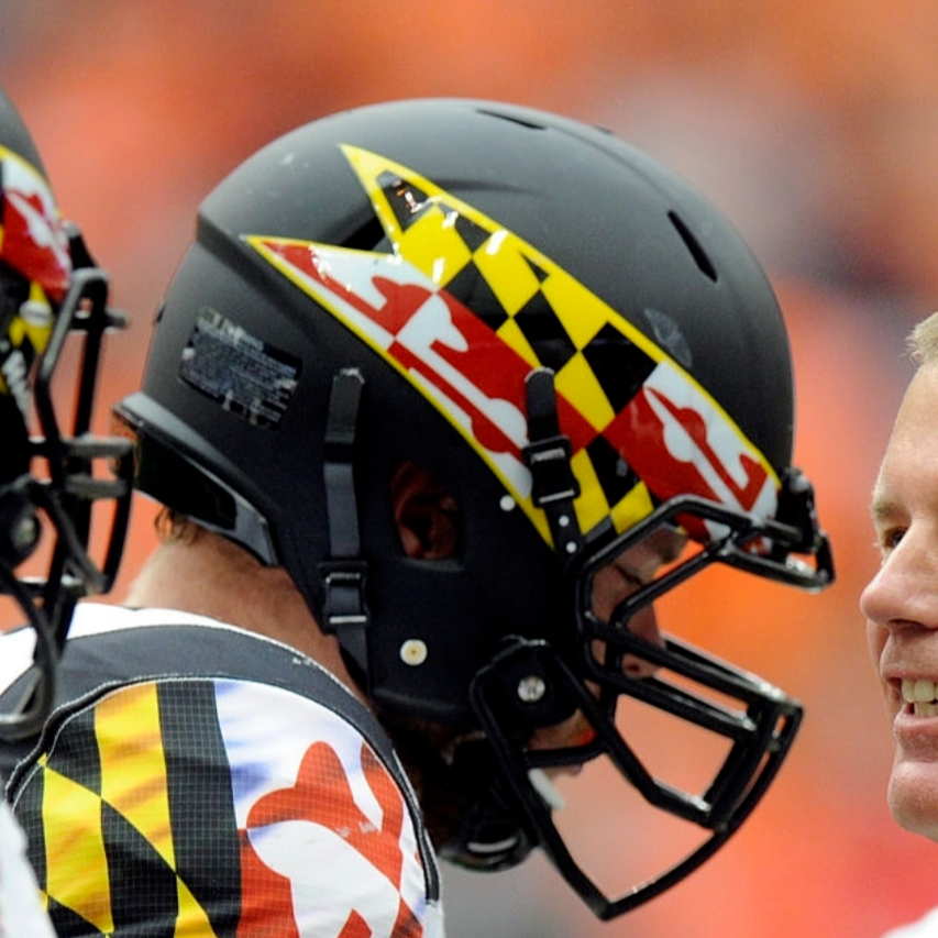
7 hours ago, leopard88 said:
I would be up for that.
The rest of the uniform is actually fairly subdued. It's the helmets that push it into "overly garish" territory.
In practices and the spring game they usually(?) wear white helmets with numbers on the side and a Maryland flag stripe. I would be more than happy with this.
I think I’d be fine with that. Or they pull out the pennat style ones again on a black or white helmet and call it a day
-
7
-
-
On 3/12/2023 at 9:37 PM, Carolingian Steamroller said:
Please.
That's the least controversial opinion on these boards.
I mean the Washington Expos has a nice ring to it. That and I’m sure you could make a “w” logo in the same vein as the Montreal “M”

-
I like the numbers, but I’m not a fan of the badge being just the lion head. If anything I would still prefer the circle but just exaggerate the head a bit more instead of just doing the lion head straight up.
-
1
-
-
The thing that kinda grinds me gears with the new kits is that teams will play in them so frequently you forget that it should be the alternate kit but instead plays out as the new home in some cases
-
It fits their vibe if they want to throw back to prior logos. It looks a little too much like a St. Patrick’s day calendar sticker or stock logo. If they did anything I think going without the words on the kit and having just the cloverleaf by itself would be a much more solid choice
-
Montreals kit issue is I think a valid point for a 3rd jersey. Even if it means you’re carrying over last years home/away kit and labeling it as an alt like several clubs used to do. It would then allow Montreal to wear their black kit with the new logo and dub it as a 3rd. Even if it means you only wear it “x” times a year.
also what happened to the rumored 3rds we were getting for Seattle, Austin, LAFC and others? Or did that get dropped?
-
1
-
-
San Antonio FC made a change to their home kit, with the benefit going to the sponsor so it is a little more legible than prior.
EDIT: Also a winners patch on the sleeve for San Antonio for being USL champions
-
1
-
-
After watching some of the games:
- Austin’s home kit has grown on me. I don’t know if it’s the wackiness or what but seeing on TV has made me
like it more.
- St. Louis looks nice, wish they would’ve had a bit more color on their away kit to pop.
- Some teams should’ve worn their aways because I wasn’t a fan of CLT/NE as an example
-
Dallas is wearing black shorts and socks I believe
-
From a presentation standpoint I’m not a huge fan of the Apple TV + presentation. The score bug is a little bland, I don’t know what their MLB bugs looked like but it could use some creativity.
-
1
-
-
With Hummel’s UK branch going bankrupt, Bristol City has moved to Irish brand O’Neills with some classy kits to finish off this season and carry off into the next.
https://www.footyheadlines.com/2023/02/no-hummel-oneills-bristol-city-23-24-home-kit.html?m=1
-
1
-
-
Seems as though Montreals home kit has leaked. Not sure if that’ll still be what it is or if there’ll be any kind major changes. I do like how it looks otherwise with the stripe pattern.
https://www.footyheadlines.com/2023/02/cf-montreal-2023-home-kit.html?m=1
-
47 minutes ago, upperV03 said:
Minnesota’s shirt has leaked and it’s… not good. Fantastic idea, horrible execution.
If the color just went down a little farther, it would be such a hit. But it looks like the AC Milan jerseys from this year that had the stripes on a white shirt
-
1
-
-
You know I think so far, ALMOST every single kit has been a hit. There has not been an over abundance of all black or all white or just lazy designs. They all have a pretty nice look and are creative to what we’ve seen. I know there’s still teams to reveal tomorrow but they’re all so far winners for the most part in my book.
-
7
-


/cdn.vox-cdn.com/uploads/chorus_image/image/69181975/_big_042421fball27.0.jpg)
NFL 2023 Changes
in Sports Logo News
Posted
So are the Cardinals going to announce the changes, or are they going to shadow drop them like the Bucs “Alarm clock” uniforms? Because they’ve been quiet on social media and haven’t posted anything.