


WBeltz
-
Posts
883 -
Joined
-
Last visited
-
Days Won
1
Posts posted by WBeltz
-
-
27 minutes ago, Cujo said:
Here they are...

The Marron ones aren’t terrible. The Commanders name could be just a tad smaller and the lines could be removed.
the white jersey is a white jersey. It would fit better as a Cardinals away for a do-over, but the weird patterns aren’t necessary.
the black isn’t necessary, I would’ve rather seen a yellow jersey in the style of the red one instead.
-
 2
2
-
-
6 minutes ago, AgentColon2 said:
You know what would have been nice? White socks that had the matching shoulder stripes.
You know what else would've been nice?
Silver pants @ home.
-
16
-
-
6 hours ago, upperV03 said:
Prediction mockup of the Union primary, based on @KitLeakBoi’s description:
It's not the center stripe they've had in the past, but it's a start back to that design.
-
5
-
-
27 minutes ago, upperV03 said:
The Galaxy are going without a sash on their primaries for the first time since 2010/2011:
The cuffs are a nice tough, but the rest is underwhelming. Sad to see the sash go in favor of something as plain as this.
Hopefully they use blue shorts to avoid a full white look. I know that they did all white before but that would be nice to seperate.
-
1
-
-
Inter Miami’s jersey has leaked and, well it’s pink.
https://www.footyheadlines.com/2021/12/inter-miami-2022-home-kit.html?m=1
-
18 minutes ago, burgundy said:
I've always really liked this look too. I think it works better than the Titans for a few reasons:- The grays aren't competing for attention with another light color like Columbia blue.
- It uses the sword bevel within a traditional stripe framework. It's creative without being wacky. The gladius/xiphos shape with beveling just makes it too cartoony for me. Maybe a straighter blade shape would look better, but I'm not sure.
On the other end of things, Rutgers has had some nice attempts at using a sword shape without actually being a sword:
I prefer when teams take inspiration from an object, but don't cross into straight up imitating it.
Personally. If the Titans wanted to use grey/silver/sword colors, I would not have minded them pulling a Nike era Rutgers and having the brushed chrome helmet if they wanted to do silver/grey. Would it look great? Probably not but the story they try to tell with the uniform would make more sense than the random use of grey swords in the jersey and pants
-
4 hours ago, TacoCat83 said:
Highly doubtful they get a third this year as jerseys get decided 2 years out. Entirely possible 2023-24 they get one.
Interesting thought, when do the teams gets the 3rd jerseys? If they sold 100,000 (or whatever the number) in the 2021 season, do they receive the jersey for the 2022 season, or the 2023 season, since the turnaround for the jerseys are 2ish years? Or do they meet with each team prior to the season when they brought back 3rds (or made that decision) about what they would want it to look like? I would be interested in that process, because otherwise they could keep the old jersey (home/away) that gets replaced and use it as a 3rd.
-
When the thread gets jacked again.
-
16
-
-
When I get on here only to see people still arguing about the Browns/Ravens and Sonics/Thunder when you just wanted to see Washington mockups:
-
26
-
-
16 minutes ago, Digby said:
I know it bores some folks but I like Austin leaning into their colors as much as possible. Even their first-year away kit, though a boring design on that awful 2020 template, was better than most of its cohort by virtue of that vibrant green color really "popping". Unlikely, but I'd like to see a third kit that's just all in that verde color.
I was hoping it would essentially be an All-Verde kit with Green socks. They could use either black font or white (preferably white) and use black socks. I think it would be definitely unique.
-
8 minutes ago, tBBP said:
Thread done got jacked.
This is more than your typical Clevejack, though...I don't know what to call it. It's some kind of jack, though.
I would say "RelocationJacked", but that's just me.
-
3
-
-
On 12/9/2021 at 7:30 PM, fouhy12 said:
Speaking of red pants, I always thought the Pats old uniforms looked really good with them. I wonder how the current road uniforms would look with red instead of blue pants.
The current roads don't have enough/are not dominate in red in them, so I think it would be a little off putting. The navy pants is fine because it at least fits with what thier last set was. What they really need, as mentioned several times before is grey pants with the home look. HOPEFULLY next year they give that to us.
-
9
-
-
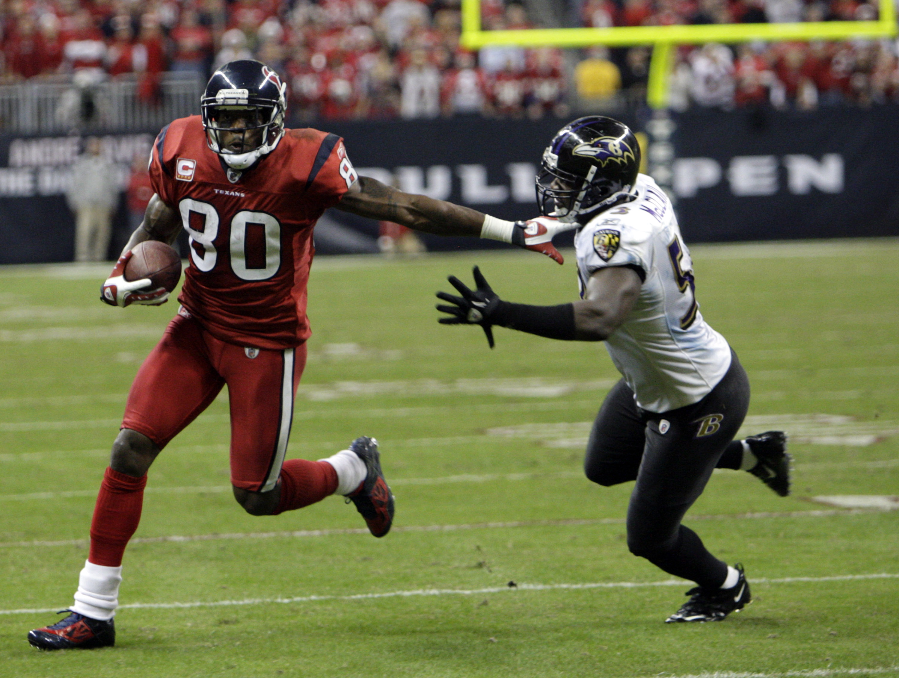
On 12/6/2021 at 3:58 PM, DCarp1231 said:
Houston should absolutely be a red-first team
This should be the Texans home look.
1 hour ago, LA Fakers+ LA Snippers said:They already have some.
I am firmly in the camp that the Texans should be a red home team. Much like everyone else has said with the navy of the Titans, Royal of the Colts, Teal/Black of the Jags, they play in a heavy blue division. I would also see the switch to red jerseys at home and more frequent use of red pants away as a way to differentiate themselves from the Cowboys. I know those two teams don’t really ever meet up enough, but having a very solid and separate identity would help. And with Houston moving to red would help Dallas see itself as a blue/white brand and own that look in the state.
-
12
-
-
6 hours ago, spartacat_12 said:
It looks like the state outline with an MN abbreviation on it. Kind of like this patch from the Rangers Winter Classic jersey:
God I still love that jersey/set. The merchandise was also excellent. All around a 10/10.
-
2
-
-
Fenerbache third kit leaked with the new PUMA 3rd design. I don't hate it & I get the concept, but this should be more of a fan jersey rather than an on pitch one.
-
Venezia released their home kit. I would not mind seeing teams that don’t have an advert/sponsor on the front of their shirts put their name or nickname on the front of the shirt like this.
https://www.footyheadlines.com/2021/07/kappa-venezia-21-22-serie-home-kit.html?m=1
-
2 hours ago, BBTV said:
why would it blow your mind? I wouldn’t expect anyone other than us dorks to truly understand it.
regarding Eagles Kelly green:
“An Eagles spokesman said the team is “excited about the possibilities and is beginning to look into its options, as the policy was just released. Any new developments will be announced at the appropriate time.”
But sources with the team said the NFL deadline for uniform selection for the 2022 season has already passed, and the Eagles submitted their black alternate jersey. Any new helmet the team could wear would have to work with those uniforms, so barring a change from the league, fans won’t get to see the Birds in kelly green until 2023 at the soonest.”
It will always blow my mind that the Eagles brass are all “we want to bring back the Kelly green throwbacks” and make a fuss out of it, when they could easily change their uniforms to Kelly green if they want. I know they probably won’t because of the Super Bowl win in the current set, but if you want the change just go through with it.
-
8
-
-
7 hours ago, officeglenn said:
New Barcelona home kits pretty match what had been leaked:
Jersey goes with half-and-half blue and red shorts and hooped socks.
The shorts color needs to be flipped. Red on the left and blue on right. But god I hate this. I know there’s only so much you can do with stripe designs but JESUS.
-
2
-
-
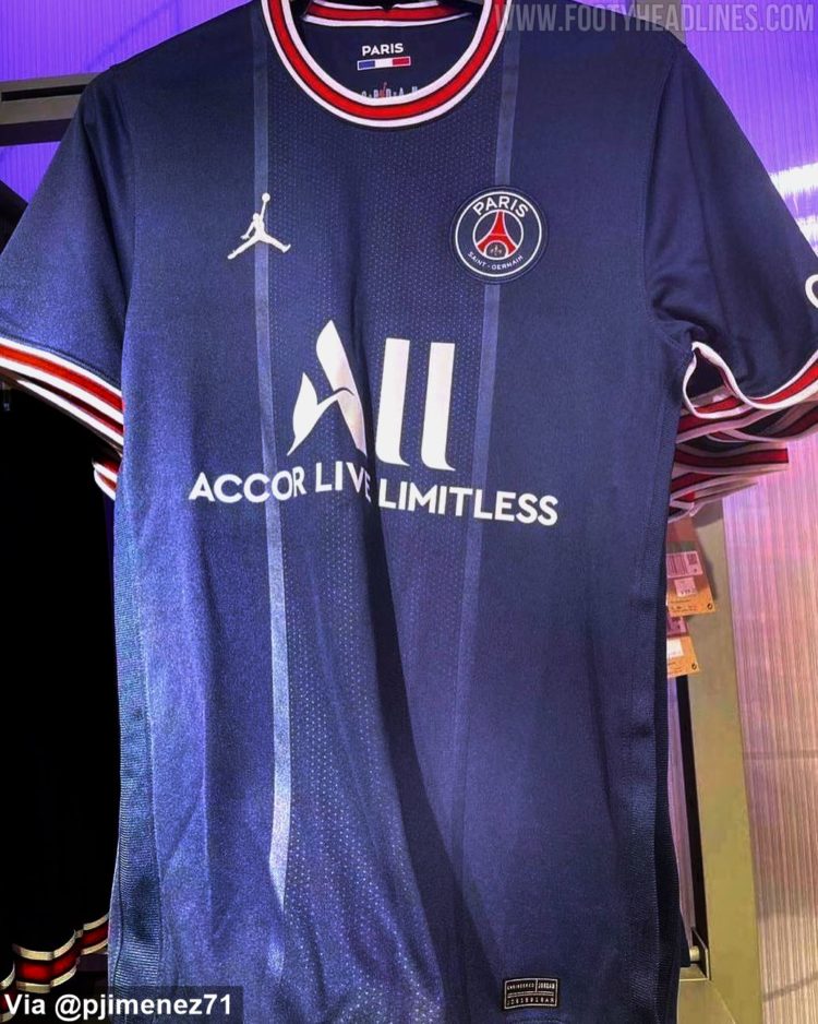
On 5/8/2021 at 12:03 PM, officeglenn said:
Paris Saint-Germain (Home)
Philadelphia Union PSG

Getting rid of an iconic piece of their kits for no reason. (At least PSG's is rumored for 1 year)
-
1
-
-
2 hours ago, JayMac said:
I'd agree that this future Chelsea kit is an abomination but I have liked most of Chelsea's Nike kits.
The away kits have been pretty nice. The home and thirds have been VERY hit or miss.
-
1 hour ago, insert name said:
how did Puma look at this and say it was acceptable as on-field kits?
I think if only one or two teams did it (BVB and Man City) it would be OK. But the fact that all of the club Puma teams are doing it is what the problem is. I don't mind it in a vacuum of a couple of teams taking it on. But Puma's entire roster??
-
10 hours ago, phutmasterflex said:
Maybe it’s because I got into football when these uniforms were around, but I like them.
-
1
-
-
8 hours ago, Andy said:
It's the "Tim Couch Number" to me. A harbinger of poor QB play to come.
Well, at least the Colts could be looking at a Top 5 pick for a QB next year if this is a sign of things to come.

-
1
-
-
8 hours ago, colortv said:
I think they should make red the primary color and blue the secondary to further carve out their own niche/fandom from the Cowboys who are so dominant in Texas. Plus, Chiefs are the only red dominant team in the AFC.
Like this concept.
Here is all Houston needs to do:
- Switch to red jerseys as primary, paired with white pants and either blue or red socks.
- Use the red pants they used to have on the road with blue socks
- Make all navy their alt (can be the current or the CR)
Considering how blue/dark color heavy the AFC south is, the Texans being red would definitely break up the Royal (Colts), Navy (Titans) & Black (Jags) that is primarily worn.
-
2
-
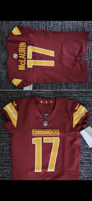


Washington Commanders to debut new NFL identity
in Sports Logo News
Posted
Honestly, I really liked the Washington Football Team name/branding. I know they were essentially the leftovers of the [REDACTED] name and image. But the name was ironically, funny & very soccer esque. But if you think about it, the numbers on the helmet were a great look, and it still retained the classic look that was left over from the [REDACTED] and it didn't hurt anybody in that essence.