


WideRight
-
Posts
1,902 -
Joined
-
Last visited
-
Days Won
18
Posts posted by WideRight
-
-
SInce I have everyone thinking about the Invaders (waiting on the unis), a question for you:
Let's assume that the Invaders will eventually leave Oakland due to stadium issues. I think they will most likely end up in Santa Clara, sharing a stadium with the 49ers. If they do that should they...
1. Remain the Oakland Invaders despite playing in Santa Clara?
2. Become the San Jose Invaders?
3. The Bay Area Invaders?
Is there a better location name? NorCal? Golden Bay? (Does that bay have a name or is the SF Bay, which would not work)? East Bay? California? Golden State?
It seems weird to me to have 2 teams sharing a stadium and have one called San Francisco and the other Oakland, but I cannot say that I really like any of the options I have come up with yet. I am open to suggestions (except for the suggestion that they move to Las Vegas).
-
And our third team, with a bit of a tweak to the main logo. Here is the original logo:

And here is the 2000 revision of that logo.
Thoughts? Upgrade or downgrade?
-
 10
10
-
-
Hello all, two things for you tonight.
First, the Birmingham uniforms. They are a pretty traditional team, so the only really "modern" touch is the Bronco-styled tapered helmet stripe. Otherwise a pretty standard look for the Stallions for the Milennium.
And, just because I recently whipped up the 1999 Summer Bowl Logo, here are the past 4 Summer Bowls in NY/NJ, San Antonio, Columbus, and now Los Angeles.
1996-Meadowlands
1997-San Antonio
1998-Ohio Stadium in Columbus
And finally, 1999, in the stadium shared by the LA Express and LA Raiders (remember, they never move back to Oakland because they get a stadium deal in LA with the USFL's help). This is about as CALI as a logo can get without having a raisin in it.
-
8
-
-
Still waiting to hear back from Rick Backus (the original designer back when the Bronocos were reimagined) because I really want his blessing on this before I make it official, but just for you all, here is my reworking of one of his Bronco designs from the mid-90's, now the potential new identity of the Birmingham Stallions.
-
6
-
-
Really keen eyes in this group. Cannot get anything past you guys. Yes, very much inspired by the twin-blue Seattle Seahawks of the Matt Hasselebeck era, still my favorite look ever for Seattle (The light grey just captures a rainy day in Seattle perfectly). The LA monogram has a touch of Memphis Express to it as well, yes. I did not think of the Texans here, but perhaps the font (which I think is actually the St. Louis Rams font, if I remember right.)
Birmingham up next, and yes, the tapered stripe trend will continue (we are approaching the era of the XFL after all).
-
4
-
-
And while we are discussing the LA Express, this is what their uniforms likely will look like. Can you identify the real world club that inspire these 2000 uniforms?
-
3
-
-
I always viewd the Avengers' warrior as looking a lot like Hermes, so for me the connection seemed pretty direct. However, I can certainly see how others might not view that figure as Hermes. Perhaps I need to blend it a bit with my Athens Olympians logo (for a fantasy football team. Seen here. (Yes, the owner is a huge Dolphins fan, which explains the colors and the secondary logo having a very dolphinesque sun-hoop.
-
And, since Brian in Boston guessed it, here is the first look at a USFL 2000 logo change. The new primary logo of the still-struggling Los Angeles Express, still trying to find an identity and build a winner in a market that has not embraced them.
This will be paired with a new monogram "LA" logo. I am toying with the idea of bringing back a red/orange color to add some contrast. I like the twin blues, but it does make for something of a dull color scheme. Think early 2000's Seattle Seahawks without any pop of neon lime green. Uniforms coming soon.
-
5
-
 1
1
-
-
19 hours ago, Brian in Boston said:
So, it would appear that the Birmingham Stallions' new identity package is going to be based on this mark that Rick Bakas submitted to the Denver Broncos...
Meanwhile, I'm of the mind that the Los Angeles Express is going to be sporting a new logo package inspired by that of the Arena Football League's Los Angeles Avengers.
Nothing gets by you Brian. Inspired (very heavily) but with some alterations of course. I wrote to Rick Bakas via LInked In and hoping he gives me a green light to use a modified version of his design, since his is not an official logo from a real team I don't feel as comfortable using it without permission. With actual logos from actual teams, I think it is fair game to say that instead of being used by this or that team IRL, if the USFL had survived the same logo would have ended up as a USFL logo. Seems viable to me that this could happen.
-
2
-
-
Not quite ready to reveal items yet (have to get through the 1998 USFL playoffs first), but here are two "hint" images to whet your appetites.
-
3
-
-
Gearing up for the 1999 USFL Season, which means that the new uniform manufacturer for the 2000 season, Reebok, is going to start revealing the clubs that will get new looks when they take over uni design for 2000. For 1999 it was Pittsburgh, Portland, and St. Louis. Who will it be for 2000?
Well, we know Birmingham is getting a new look, postponed 1 year. The question is which of these elements from real life will make it into the new Stallion look?
- Unused St. Louis Stallions logo?
- Unused designs from 1997 Broncos overhaul?
- St. Louis Stampede Arena Football league logo?
- Milwaukee Mustangs influence?
One of those 4 will be key to the reimagined Stallions in 2000.
And I will hint at one other reimagined USFL franchise. One of the other teams gets a brand new primary logo based on a very popular but somewhat short-lived Arena League team. Not a new nickname (sorry VooDoo fans), but one USFL club is about to go "classic" with a logo very different from their original USFL look. Can you guess who?
And a third club will join the Reebok Redo for 2000 as well, though perhaps not as dramatically. Coming soon.
-
1
-
1 hour ago, Digby said:
Agreed. Totally backwards! Tweak the logo by brightening it up (silver was a better idea in theory than reality) and change out the team name wordmark around it, obviously, to Impact. It's a shame that one of the legitimately clever and original designs in MLS is being thrown out and tarred by association with everything else bad about that club.
I agree, the logo is solid, maybe a little dark (lighten the blue?) but it's a fine logo. The name is not great. Even just Montreal CF is better.
-
On 4/29/2022 at 6:32 AM, stumpygremlin said:
This rebrand is fantastic. I've got a couple of TINY nitpicks.
-
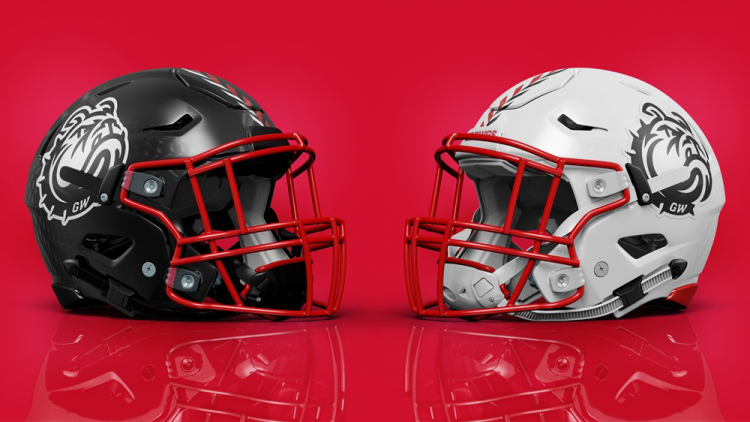
They should've designed left-facing marks as well. That way you could have the bulldog face forward on both sides of the football helmet. As it stands, I have a sinking feeling that they'll go asymmetrical (probably numbers on the left), and asymmetrical helmets need to die.
-
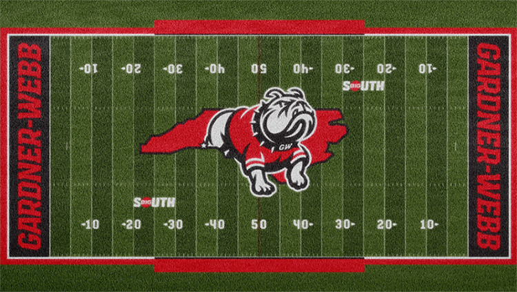
The territorial mark is not centered on the football field. Notice it goes from the 22 on the left to the 28 on the right. They should've centered it on the 25's.
Other than that, they really took the ball and... ran home with it.
That may the most ridiculously huge midfield logo I have ever seen. From the 22 to the other 30? What the what? Why not just cover all the grass?
-
They should've designed left-facing marks as well. That way you could have the bulldog face forward on both sides of the football helmet. As it stands, I have a sinking feeling that they'll go asymmetrical (probably numbers on the left), and asymmetrical helmets need to die.
-
And now the biggest redesign of the 1999 USFL season, the St. Louis Knights.
So, with this whole USFL Alt History I have tried as much as possible to not go hog wild on original logos, opting instead to modify or repurpose actual logos from the WLAF, XFL, Arena, etc. as real designs that were appropriate to the period more or less, basically on the theory that these designs were really used and that perhaps had the USFL survived they would have been used for that league instead of the league they ended up in. With St. Louis, for example, the original logo was the NY Knights of the WLAF. When I decided to go a new direction, I tried looking at other real world options like the Scottish Claymores, NY Knights Arena League team, even looked at the early 2000's designs of Rutgers and UCF, but really did not like any of them. So, in what I expect to be a rare departure, I decided to mostly go with a new logo. Here it is.
While not 100% original, as it does take a small amount of inspiration from the Tennessee Titans' secondary sword logo, this is a predominantly original logo for the Knights. I wanted to somehow get the Gateway Arch into the logo because the Knights are struggling to fend off the Rams as St. Louis's top football club, so they would want to heighten the connection between the club and the city. I decided that using the arch as a form of shield to go behind the sword made sense, though I also think it tends to look more like a Gothic arch or cathedral window than a shield. The new Knights look will give more emphasis to the purple and gold, and downplay the silver a bit more than the NY Knights' inspired look did. And I can already promise you that this is not the look they will keep until 2022 or beyond. I have ideas for the 2000's as well. But, the horse is gone for now and the sword becomes the dominant image for the club.
So let's take a look at the new St. Louis Knights Uniform.
This should take football fans, especially XFL fans very little time to pinpoint. The bib jersey allows the St. Louis Arch to again make a "somewhat subtle" appearance once again. The design is straight out of the LA Xtreme, but rendered in Knights colors. I opted to go for a purple helmet, several shades darker than that of the Pittsburgh Maulers, because the USFL has a ton of metallic silver/gold helmets (Express, Bulls, Bandits, Showboats, Blitz, Stars, Stallions, etc.) and only the 1 purple helmet. I went with metallic silver primarily in the pants and the dark jersey's numbers, while gold becomes the primary accent color. Still not 100% sold on the 3 letter monogram as the chest wordmark, but wanted something a bit different. Here is what it looks like on the player models.
Thoughts? Feedback?
Working on 2000, and a big part of the story is that the USFL will opt for a new leaguewide uniform, sideline and fan apparel company, so new looks for some clubs as the new company comes on board.
-
8
-
-
Not a fan of the striping or the thin outline logo. A single red stripe (like NY Giants) and a solid m-bird logo would be a good minimalist version of this basic idea.
-
2
-
-
Pausing with my STL design as I am opting to go in a very different direction with my logo concept. So, in the meantime, here are the reworked Portland Thunder.
If you recall, the original Thunder were basically a relocated Orlando Thunder (WLAF) club, same logos, uniforms, everything. With this second generation look we make some changes.
1. The electric lime had to stay, so the colors are not different at all.
2. The new Thunder logo pays homage to a different WLAF/NFL Europe Thunder squad, as I am sure you all noticed.
3. Found a way to add the electric green to the helmet logo.
4. Decided that if anyone was going to go with a sublimated color shift in their jerseys, it would a be a club not afraid to pull out electric lime green jerseys, so that is what you get, color shifts from lime to yellow on the jerseys and in the pant stripe.
5. Decided the Thunder needed more than just the white pants, and lime green pants just did not work for me. So we get some navy/dark royal in the look.
I feel like 1999 may be a bit early for this look, but not by too much. Working from the premise that the USFL's presence simply led to greater innovation from the sports branding and uniform companies, since they were competing to get both USFL and NFL money. I guess that is my half-hearted attempt to say I am going to play a bit fast and loose with the style elements of the late 90's (NFLE, Arena) and the early 2000's (XFL 1.0).
And here is the look on our two players.
-
10
-
-
48 minutes ago, gosioux76 said:
I liked the Breakers helmets in pictures, but not as much on the field. I’m not enjoying the big block of royal blue in the back of the helmet for some reason.
The older Breakers had both better colors and a much better helmet. That huge blue egg on the back of the helmet is not good.
-
1
-
-
10 hours ago, LogoFan said:
The helmets don't appear to be metallic and their "gold" looks more like a weird butter color than gold.
I would prefer a true metallic gold for Birmingham, but with Michigan's helmet more gold than champagne, and with Philly also in the league, having 3 gold helmets would have been an issue. I am ok with the butter yellow Stallions also because the pants would not be metallic, so the helmets match the pants pretty well. Looking forward to today's games to see the rest of the league in action. Hoping the Houston pants are more grey and less blue than the original photos seemed to show.
Honestly just glad I don't have to resort to watching Cornhole, Axe Throwing, Golf, or NBA playoffs this spring. USFL, MLS, and the end of the EPL season are my fix until the NFL starts up again.
-
And here are the 1999 Pittsburgh Maulers uniforms. Shoulder yokes are becoming a real trend in the league (Jax, Chicago, Orlando, etc.). Will that trend continue or will side panels make an unwanted appearance?
In addition to the shoulder yoke, the other major additions are the use of a purple pant set and a secondary motif of hexagonal "bolts" on the helmet and pant stripes.-
5
-
1
-
-
Slight change of plans, we will have 3 clubs with new identities & uniforms in 1999, but Birmingham will not be one of them. As I work on B'Ham for 2000, the St. Louis Knights (who started the year 6-0) are getting a new look for 1999. So it will be Pittsburgh, Portland, and St. Louis getting new Nike designs.
I am going to start with the least dramatic shift, at least in logos. Pittsburgh will have a very different uniform, but their logo is more of a modernization than an overhaul. Less cartoony, more X-treme (it is the late 1990's after all).
ORIGINAL 1984 LOGO (my version)
NEW 1999 LOGO
New Pittsburgh Uniform up next, then St. Louis and an original logo.
-
3
-
1
-
-
On 4/8/2022 at 10:55 AM, Blindsay said:
Does Pittsburgh HAVE to get a new look? I feel like they would be conservative, just like The Steelers Are.
Some teams just tweak a look they already have established, like the 9ers or Giants, others do something more dramatic, like Tampa did moving away from Bucco Bruce or New England did with Flying Elvis. Some go modern and then may revert to a traditional look like Cleveland did, and some may just move to modern permanently like Arizona or the Seahawks. Very few teams stay truly traditional like the Bears or Packers. Especially in a league whose initial looks came from the early 1980's.
I actually think this is one of the harder aspects of bringing the USFL through the 90's to today. Most clubs would not have stuck with their 1980's looks, but we all remember those looks fondly because the league died. Had it lived I think you would see a lot of change, so we have to fight the instinct to stay with the looks we all remember from 1983 and balance tradition with the reality that most pro sports teams from 1983 until today do not look the same.
-
2
-
-
Just about to kick off the 1998 season in the Alt History of the USFL (Website here), which means that NIKE will be announcing which 3 teams will get facelifts for 1999. The 3 1998 clubs (Washington, Baltimore and Memphis) kick off their new looks and now 3 more teams will get a facelift.
I actually have 4 designs ready to reveal, some just tweaks, some whole new looks. So, which of these 4 teams should make the cut for 1999?
Oakland Invaders
Birmingham Stallions
Pittsburgh Maulers
Portland Thunder
Only 3 will make the cut, and this could be the last year for NIKE, with bids coming in for the USFL uniform and fanwear contract starting in 2000 (and Phil Knight no longer the principle owner of a club.)
-
1
-
-
OK, I could not wait any longer. Here is what the 1998 Federals will be wearing. I altered the middle right logo a bit, and used a different font, because I think the original version was a bit too 2010's and not 1990's enough. It may evolve into that later form over time, or we might go another path.
And just a word about the designs. I often borrow heavily from a design I find online. When I do that I do all I can to reach out to the creator and get permission (like I did with Fraser Davidson on the Denver logo). In other cases it is not possible to find the creator and if that is the case I try to cite where I saw the original. In other cases several different logos may be blended together to create an amalgam. In those cases I am less likely to credit the original artists, but will if I feel a major portion of their design is the base for mine.
In this case, the image for the new logo comes from about 4 different designs, including elements of the original Federals IRL logo.
-
11
-
-
Before I reveal which Washington look is the new 1998 branding, some unfinished business, the BFBS revamp of the Memphis Showboats.
-
6
-


USFL (Alt History)
in Concepts
Posted
To wrap up the Reebok updates for 2000, here is the new Oakland (for now) Invaders look. Reebok simplified the look a bit, shifted some stripes around, but really not a huge change for Oakland.