


WideRight
-
Posts
1,901 -
Joined
-
Last visited
-
Days Won
18
Posts posted by WideRight
-
-
Fixed the NJ Number situation.

And here, with no ado at all, is the new logo and look for the Chicago Machine. They retain their U. of Chicago Maroon, the Iron Metal Grey, and the Chicago Flag sky blue as colors. They have a new "Chicago Theatre" inspired Gear-C logo, and have moved from sleeve stripes to a full yoke treatment. The pant stripes are also more complex than the single maroon stripe (and now maroon pants).
-
 9
9
-
-
16 hours ago, JH42XCC said:
@BengalErnstI think you mean this logo, right?
@WideRightThe numbers on the home jersey don't match in the bottom pic. But nonetheless, this Generals redesign is just fantastic, especially with the addition of the alternate logo.
Thanks for that catch, I will update it to fix that issue.
-
One more for you before the Chicago reveal. Here are the new look New Jersey Generals. Some keys:
1. Return of the laurel leaf logo,but still with blue outlining (see USFL 2022 for inspiration).
2. Drop shadow numbers. with gold and blue outlines.
3. New secondary logo (too good to resist) now a patch on the chest.
4. Side panels morph into pant stripe with an "epaulette" concept (Tried it on shoulders, did not like it.)
5. New wordmark with state of NJ included for emphasis.
-
8
-
-
On 11/27/2021 at 7:31 PM, LogoFan said:
I was playing with the color combos and I think this fixes the issue, IMHO. It provides consistency with the secondary logo as well as the original. The white inside the logo is just too stark and doesn't match anything else. The color change ties everything together better.
I like this update. Approved!!!
-
4
-
-
Not ready to reveal the new Chicago logo yet, but I do have 2 other clubs that are getting new uniforms for 1996, Jacksonville and New Jersey. So, here is the new look for the Jacksonville Bulls. Shoulder yokes, side stripes, and logos on sleeves being the big trend to watch for in the late 90's and early 2000's.
-
5
-
-
Thanks, guys, but while I appreciate the suggestions, I just love the idea of Chicago Machine as a team name in that city. It combines the blue-collar mentality of Chicago with the city's reputation for political hackery and corruption (The Chicago Machine is a well-known turn of phrase in the city to the idea of inside politics and shenanigans by those in power in the city.)
I think I have developed what I want to use, and will be revealing it soon.
-
2
-
-
After seeing the new 2022 USFL logos, I wanted to see if I could merge the new red-orange-gold logo with a more traditional Stars logo. I think I like this quite a bit, and it might just make its way into the Alt History USFL I have been working on. What do you think? I think the use of orange actually does help with the transition from one star to the other.
-
7
-
-
A few thoughts on the early complaints about the New USFL looks. Some I agree with, some I don't.
1. Logos are too 80's: I don't understand the disconnect here. The only reason to "bring back" the USFL instead of just creating a new league is to cash in on nostalgia for the older league, to get all the Gen-Xers like me who loved the USFL to be on board by reminding us of the 1980's. it would make no sense to call the league the USFL and bring back original team names if you did not at least tip the cap to the look of the 1980's league. Otherwise just scrap the USFL all together and call it the Fox Football League.
2. Too much red: This is understandable, but largely a byproduct of the old USFL and the decision to avoid the western teams (for cost reasons one assumes). The most iconic teams in the league back in the 80's were teams that wore red. The Generals (Flutie, Walker), the Stars (2 time champs), the Bandits (Burt Reynolds), and to a lesser degree the Staliions and the Gamblers. I don't consider Michigan's plum to be red so much as purple. Had the league added some west coast teams, like Oakland, LA, or Denver, it would have dispersed the colors a bit better, but they wanted to stick to the East, so that only left them so many choices. You are not going to skip Philly (Red) to put in Washington (Green) or avoid Tampa (Red) to include Orlando (Blue) because you want the teams with the most immediate recognition factors.
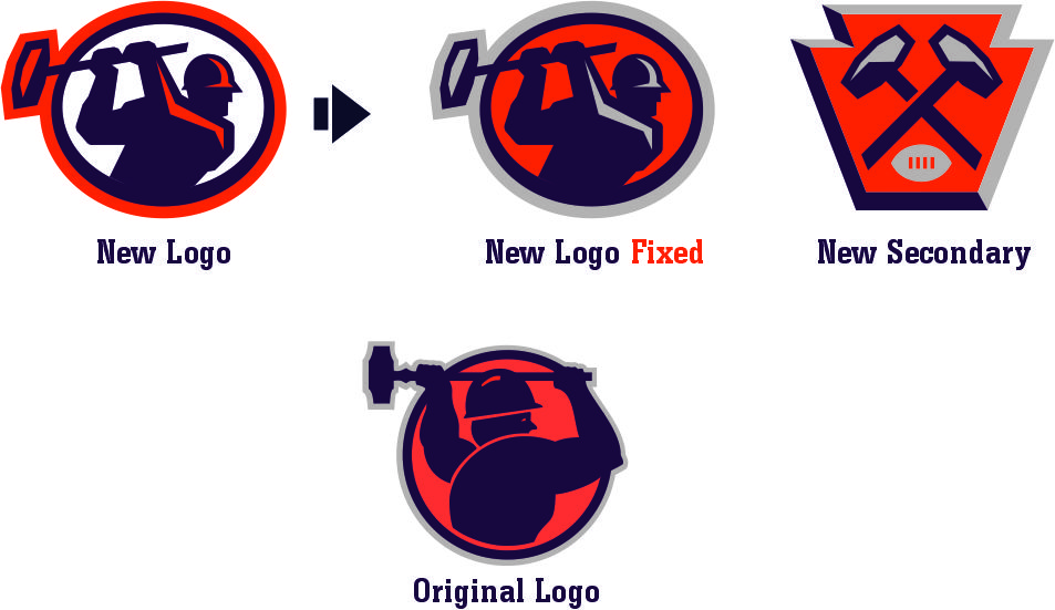
3. Maulers logo: While I think the new version is a reasonable upgrade from the old "stick figure" Mauler, I am not sure why they seem to have eliminated grey/metal from the design. Having a white circle and using orange on the hammer's head seem odd choices to me. The figure is a bit awkward, but so was the original. Honestly, I am not sure why they picked Pittsburgh over either Washington or Chicago, but they did. I think this logo can be fine and the older one would have been far too retro even for the USFL.
4. Stallions logo: I think we will eventually see a full-figure stallion on the helmet, so I am withholding judgement until then, though I do wonder if a predominantly white horse with only a red outline will work on a gold helmet.
5. Stars Logo: I have to say the use of orange is growing on me. I still think the design of the logo itself is not great, and actually prefer the more linear/broken up version from the 1980's, but it is correct that the original logo was very hard to see on the gold helmets.
6. Panthers Logo: I agree with those who say it is too linear/blocky and does not capture the dynamism or "flow" of the original. I think a more animalistic and less structured version would be an improvement.
7. Uniforms: We have not seen them yet, obviously, but just the difference in jersey cuts between 1985 and 2021 is going to have to force some changes. The original USFL was very dependent on sleeve striping, complex series of stripes (Birmingham, Philly, Michigan) or wide stripes (New Orleans) that likely will not work well today, so they are going to have to be inventive to retain some feel from the originals while adjusting to the lack of sleeves in current uniform designs.
I would hope that if the USFL is actually successful with their "All Birmingham" format, which seems like a tough sell to me (How desperate for pro football is Alabama that they would fill stadiums for 4 games a week?) I would hope to see the league add some western teams as a 3rd division to come back to 12 franchises. I would love to see the Express, Invaders, Wranglers and Gold added.
-
7
-
-
And now the final 3 teams and their 1995 uniforms. Three uni updates are coming for the 1996 season: Chicago, Jacksonville, and New Jersey.
-
5
-
-
18 hours ago, BengalErnst said:
I was a huge fan of the XFL so obviously I’m partial to all of those teams, but I can’t wait to see what you churn out.
Have you seen any of the new USFL logos that were leaked? They are terrible.. and I’m hoping they’re false
Just saw them. Several are definitely downgrades from the originals but I did not hate most of them.
I will say they have a couple that are not far off from what I was thinking (PIT, TBY, MGN, BHM).
More on Chicago soon, but for now here are the next 2 teams, Chicago (1995 version) and Birmingham.
Only 3 left, Baltimore, Atlanta, and Arizona.
-
3
-
-
2 minutes ago, Ferdinand Cesarano said:
They absolutely nailed the logos. There's not one of them that is less than excellent.
I am going to have to beg to differ on that. I think they did well on some, but some are definite downgrades from the originals.
Best: Breakers, good modern update. Gamblers, basically left it alone from 1984, Stallions, could be good but I need to see what the helmets look like.
Mediocre/Decent but not ideal: Maulers, a decent upgrade of a pretty odd logo to begin with. Generals, adding blue to the logo is a plus, but the placement of the stars entirely with the laurels seems odd to me.
Downgrades: Bandits-- While I get what they are going for, the awkward position of the horses legs make this a downgrade for me. The design made for the A11FL was better.
Stars-- Why add orange? It is like they are trying to recreate the original but could not figure out how to do that with just red and gold.
Panthers-- That panther is not as good as the original, too linear.
Not horrible by any stretch, but some odd choices made. The Philly secondary with the Liberty Bell is also a weird logo. I do like the Breakers logo as part of a NOLA look.
Let's see if the helmets come close to being as cool as the originals, especially keeping an eye out for Michigan and New Orleans.
-
2
-
-
And a bit of news. The Chicago Machine lost a trademark infringement lawsuit from a small machining company in Michigan, so they have to drop the M (originally from the Montreal Machine). I have 2 options here, I can modify the Chicago Enforcers logo or I can create a new logo. I am leaning towards the latter. It will be a new logo, but one with significant inspiration from the Montreal Machine M, so not entirely new, which is something I am trying to avoid, using borrowed, or otherwises sourced logos whenever possible. That new logo will be revealed soon.
-
2
-
-
Getting close to the end, only a few teams left. Here is Houston and Denver, our two teams with black-dominant uniforms.
-
4
-
-
Next up the "New" LA Express, returning to the City of Angels after a 3 year hiatus, and the Jacksonville Bulls.
LA retains a lot of its original 1983-1992 look, but swapped out burgundy for a lighter "speed" blue.
Jacksonville is still sporting the same look they started out with in 1984, though rumors have them getting a new look for 1996.
Next up we will have Houston and Denver, both of the league's Men in Black.
-
4
-
-
Let's keep this parade of uniforms going with the league's two M teams, Michigan and Memphis. For those who did not follow the Alt History of the league, Memphis switched from Silver & Cardinal to a bluish tinted silver similar in some ways to what Dallas does with their home pant color. Michigan switched to a new logo in 1994 (based on the U. of Houston) but retained the same basic helmet design with the cat curving up the entire bottom of the helmet.
Next up are the new look Express and the Bulls.
-
6
-
-
9 minutes ago, gosioux76 said:
Maybe you've addressed this already (and maybe I've asked and forgotten), but the NFL by this time in its history and joined the NBA and MLB in stitching the league logo onto the uniforms. Do you expect your USFL to do the same?
I have worked up an alternate USFL logo because I think the full acronym does not work as a league logo on a jersey. Expect to see that incorporated into the uniforms either in 1996 or 1997.
-
1
-
-
2 hours ago, Karnage84 said:
Those Breakers jerseys are outstanding.
I like the Generals as a whole but it feels like it's missing that pop of gold from the logo. I don't if a wordmark or a number outline would help but i just feels a bit light.
New Jersey is one of the teams getting new uniforms for 1996, along with Jacksonville, so you may get your wish.
-
1
-
-
Our trip from Z to A in USFL clubs continues with our two N clubs: New Orleans and New Jersey. This is the 1995 Mike Ditka Breakers who switched from Navy, Royal and Silver to two shades of teal and silver. We also have the Generals looking very much like they did in 1983.
-
4
-
-
One more just to wrap up the "O"s. Oakland, of course. Only the yellow pants version. They also have a white set.
Next up is New Orleans, which will take a while. The helmet and all the waves I built into the Uni are great but a challenge to add to a 3/4 position image.
-
7
-
-
And two more, the Orlando Renegades and Ohio Glory.
-
4
-
-
1 hour ago, Skycast said:
I may be in the minority, but I prefer the old uniform template.
The "flat" version is more helpful for desiging the uniforms, but I like having a "model" as well. I am going to use both going forward, one to reveal new looks and then a "see how it looks on players" option as well.
-
4
-
-
11 hours ago, neo_prankster said:
I like how you've given the Philadelphia Stars a sense of tradition. They still dominated the Eighties in your scenario, right?
Yes and no, Philly did win 2 titles in the 80's and just won their 3rd in 1994, but they were not totally dominant.
USFL ALT HISTORY LEAGUE CHAMPIONSHIPS
1983--Tampa Bay Bandits d. Denver Gold
1984--Michigan Panthers d. Birmingham Stallions
1985--Philadelphia Stars d. Chicago Blitz
1986--Michigan Panthers d. Philadelphia Stars
1987--Philadelphia Stars d. Houston Gamblers
1988--Houston Gamblers d. Memphis Showboats
1989--New Jersey Generals d. Denver Gold
1990--Washington Federals d. Arizona Wranglers
1991--Oakland Invaders d. Orlando Renegades
1992--Houston Gamblers d. Pittsburgh Maulers
1993--Birmingham Stallions d. Houston Gamblers
1994--Philadelphia Stars d. Chicago Machine
-
Two more to finish off the day. Keystone State in the house with Pittsburgh and Philadelphia.
-
3
-
-
And here are the St. Louis Knights. I am not loving this look, so expect them to get a new identity/look for either 1996 or 1997. Sure, it is basically the WLAF NY/NJ Knights in purple, but the more I look at it the more I think they need to go in a slightly different direction.
-
5
-


USFL (Alt History)
in Concepts
Posted
Just an FYI that I have 3 designs primed and ready go go as part of Nike's 1997 season updates. I am away from my home computer (where I keep Corel) so nothing for a few more days, but once I am home and get the 1996 USFL season simulation started I will then begin to introduce the 3 teams that will have new looks in 1997.
It's Denver, Orlando, and Texas. Two of them will be getting a new primary logo as well as new uniforms. Which will get tweaked and which will undergo a major change? News on this soon.