

.gif.f20f8ca4c4a7b2174a37b93e4494fc64.gif)
MilSox
-
Posts
2,067 -
Joined
-
Last visited
-
Days Won
4
Posts posted by MilSox
-
-
On 7/30/2022 at 1:21 PM, Burmy said:
Ladies and gentlemen, welcome to Wisconsin's great brand confusion-a-rama...Blain's Farm & Fleet and Mills Fleet Farm!

(As of lately, Fleet Farm, has changed their logo and dropped the "Mills" though:)
The eternal debate of where "Up North" starts in Wisconsin should be settled by where does Farm & Fleet give way to Fleet Farm.
-
Oh man... Milwaukee looks great! Had the Brewers name not had so much cache in Milwaukee to necessitate changing the Pilots name I could totally see this existing. For those who might be confused why @coco1997 went with OD green instead of blue. It's because Billy Mitchell was in the Army Air Corps... one of the precursors to the modern USAF.
Seattle looks good, but for them I'd much rather see kelly green as the primary color and brown as a trim color. Seattle is known as the Emerald City after all. I love your coffee pot though. Very Seattle.
-
 1
1
-
-
2 hours ago, Digby said:
Definitely an improvement over the various black-jersey-with-robocop-deer-head designs they've been using since the rebrand. (Assuming this replaces that? Hard to keep up.) The blue is an unfortunate detail as it renders the green, which is the real Bucks color, nearly invisible. Why are they still trying to make blue happen?
They did have the green one last year which I liked even better... their brand works well as just dark green, black and cream. No white needed. Definitely no blue needed, but.
I didn't see this comment before. But these are pretty much my exact thoughts. The blue is 100% unnecessary and I hate that they're still trying to make it a thing. At least some form of green/gold/cream/black has been there since the beginning (even if the OG uniforms were green and red, the actual logo was a variation on those colors).
Put it on the floor if you must pay tribute to the Robert Indiana MECCA floor. At least then everyone knows why it's there. Otherwise, I've never seen an application of blue on a Bucks uniform that didn't look awkward. Even the "Cream City" jerseys which I found to be their least offensive use of blue would have looked much better without it.
-
1
-
-
1 hour ago, 8BW14 said:
Make that sucker green and it’s a real winner
I know the point has already been made, but I had to post this image from a night I'll never forget because it's the first time I ever saw my Bucks win a finals game. Which was especially significant, because I watched it from the local Wisconsin "embassy" in what is now my current neighborhood in Chicago when I was in town to set things up for my eventual move.
(Sidenote: I... uhhh... may or may not have made threats of violence towards the douchebags who... of all the bars they could have gone to in Chicago... showed up in Suns jerseys to a spot with "CAMP RANDALL SOUTH" literally painted on the side. I don't remember doing it though. Which totally has nothing to do with how much I was drinking that night...........)
Anyway. I know more people here probably associate me with the Brewers, and rightfully so. Because I find baseball uniforms the most interesting. But I've always been a Bucks fan first and foremost, and I 100% approve of these. Do I wish they would just bring back the green ones? Absolutely. But I understand what they're going for here, and these will probably replace their ugly old black alts that resemble those stupid "blue line" t-shirts a little too much for my tastes.
The color balance isn't what I would have chosen. I would have gone with a green wordmark and numbers with a cream outline instead of what they did here, which makes the green pretty much disappear. They also forced the blue in, like on their regular home & road (icon & association... whatever) which I wish they would stop trying to make a thing. But overall, I like these and more than likely will own one soon.
I give these a solid B in a vacuum. But graded on what I know they were going for, I give it a A-.
-
6
-
-
5 hours ago, johne9109 said:
As a New Englander I love the "Cheers" wordmarks, but I can understand why a Brewers fan may not like it. I hope these are the wordmarks you're referring to. As far as the throwback I really liked the powder blue uniform with the yellow wordmark and I like to keep the throwbacks as historically accurate as possible.
Yes! This is the one!
-
1
-
-
6 hours ago, johne9109 said:
Milwaukee Brewers
For the most part the Brewers have a solid set of uniforms. The only change to the home and away is I put the baseball logo on the right sleeve and added Barrell Man to the left sleeve. The Alternates base are the same as well. The home alternate keeps the wheat color as the regular home and then for both the home and away alternates I brought back the previous wordmarks. The home throwback goes back to 1901 and the original Brewers. The away throwback is the baby blue uniform form the 70's
Pretty solid set. Though I would have gone with the early 90s wordmarks for the alts. The "cheers" wordmarks remind most of us of losing baseball and the Ryan Braun scandal. I'd also go with the 1982 powder blues. I know the block M is historically accurate, but the last time I owned one everyone thought it was a Michigan hat.
-
I miss the IHL. Hopefully my Milwaukee Admirals make an appearance in this thread. They had awesome sweaters in those days.
-
10 hours ago, packerfan21396 said:
First off, congratulations on the completion of a top tier project; truly some fantastic work. Recreating all the renewal stickers is also a top tier detail that adds a lot to the authenticity.
While the Wisconsin highway shape is unique, the current shape is a compromise so that numbers can fit well; originally, the Wisconsin highway marker was just a downward pointing triangle:
Could be a bit cleaner to make the divider the downward pointing triangle, plus then it could look like some minimalist cheese and who doesn't love a bit more cheese?
The dots in the i's of the Wisconsin wordmark are already wheels of cheese. I like the use of the current shields. Especially for something traffic related.
-
16 hours ago, TheAnt755 said:
Popeyes New Orleans Bowl
Bowl Name: Popeyes New Orleans Bowl
Stadium: Caesars Superdome
Location: New Orleans, LA
Conference Match-Ups: Sun Belt vs. C-USA
Notes:
R+L Carriers has been sponsoring the New Orleans Bowl since 2006, that's honestly impressive for a sponsor. But I think it's name time for R+L to hang up it's boots and hand over the New Orleans Bowl to Popeyes. Popeyes is know as "Louisiana's Kitchen", it only makes sense to sponsor this bowl game. Oh and the long has change colors, reference to Popeyes' old logo and the Ragin' Cajuns. I thought the logo needs a change too.
If Popeye's became the sponsor, I wouldn't mind if it became the Louisiana Kitchen Bowl. That works for me the way other corporate sponsorships like Great Western Forum, Great American Ballpark, or Miller Park did where they didn't necessarily sound corporate.
-
1
-
-
16 hours ago, TheGiantsFan said:
WISCONSIN
At the request of @NicDB, I eliminated the state’s longtime “America’s Dairyland” slogan to reflect Wisconsin’s urbanizing population. Inspired by the 1998 Sesquicentennial license plates, my redesign combines several Wisconsin landscapes: dairy farms, the Apostle Islands, and the Milwaukee skyline. The wordmark is inspired by an optional plate design and contains two truckles of cheese above each “I”. The serial divider is inspired by Wisconsin’s unique state highway shields and the state’s motto is found at the bottom.
Oh man... you nailed it on Wisconsin. If you told me that had been the plates for the past 30 years I wouldn't even question it. Also, not sure if that's what inspired it, but your wordmark looks remarkably like the Something Special From Wisconsin logo.
I especially love the buck staring at the skyline. #FearTheDeer
-
On 7/9/2022 at 5:43 PM, DTConcepts said:
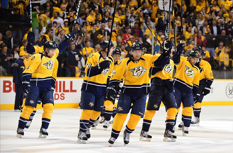
I think the Predators' switch from a navy/silver to yellow counts here.
Is this really a 180 though? Sure they decided to brand around gold and cleaned up their crest a bit, but otherwise this looks like the same team.
-
3
-
-
Loving this for obvious reasons. My only nitpick is that I wish you used images of Braun and Yelich in the old "retro" uniforms from that era. It would look more consistent with the other players and fits your theme better IMO.
I'd love to see this become a series with teams associated with a particular beer. Like Old Style for the Cubs, Budwieser for the Cardinals, Hamm's for the Twins, Rainier for the Mariners, etc.
-
1
-
-
12 hours ago, Chawls said:
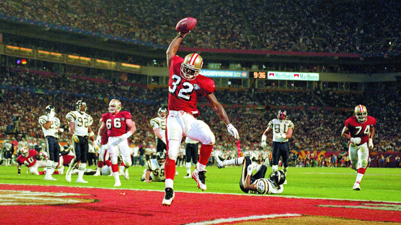
I’m surprised there’s no mention of the 49ers uniforms in Super Bowl XXIX against the Chargers.
I think this is the right uniform for THAT Niners team. No Joe Montana, Ronnie Lott, Roger Craig, or Charles Haley. This was a completely different squad than the ones that won all the Super Bowls in the 80s. Which is kind of amazing considering they were only 5 years removed from the last one.
-
7
-
-
I like the bricks on the numbers. But other than that, I still like your first tweak the best.
-
2
-
-
I would have kept the pinstripes and dropped the navy. But otherwise I love pretty much everything about what you've done here. The cream uni looks so much better with matching piping.
-
1
-
-
Hate to put this up here, but it belongs. Maybe not as egregious as some of the others already here, but they had their regular home and away as well as those gorgeous earned editions with the antlers. They didn't need to do this.
-
8
-
-
7 hours ago, Big Yellow Flag said:
I have no issue with MKE, as I simply have no dog in the fight (though interestingly, my own local airport is TLV despite being technically located in Lod). My issue is the logo itself, which you say you like but I just can't.
I'm actually agreeing with you. MIL also plays into some nicknames for the city ("The Mil," "Mil Town," etc.) and feels like the more "local" abbreviation to me.... if that makes any sense. There's just no denying that MKE has become the preferred abbreviation over the past couple decades. Even the Milwaukee Wave and The Hop (streetcar) use MKE.
-
On 5/30/2022 at 9:32 AM, Sec19Row53 said:
Mighty broad brush you're painting with there, Tex.
On 5/30/2022 at 5:56 PM, BigZuDaddy said:Stop making stuff up Nic, I been living in SE Wisconsin my whole life and the vast majority of people don't wish failure upon Milwaukee.
C'mon now... obviously I'm not pointing fingers at ayone here personally. But are you really gonna deny that there's an entire sociolpolitical culture propped up in the WOW Counties based on resentment of the big city and the people who live there?
I say if anything, the Milkmen and Dockhounds should take advantage of it and draw some people to the ballparks. There hasn't been a Milwauee-Waukesha "rivalry" in sports since Marquette was playing Carroll College, and that was before WWII.
Granted, this also ties into what I've said before about the Milkmen's identity, which looks even more egregious now since they're the "city" team in this scenario.
-
My only nitpick is go all in with the gold and make that the front number.
Otherwise, this is 100 percent what I wish they would have done.
-
1
-
-
On 6/17/2022 at 9:56 AM, Big Yellow Flag said:
The cap logo well and truly sucks. I can't help reading it as Mike, and also it's ugly and bad.
The rest of it is... Fine, I guess I know they say they've been working on these for two years, but I would have expected something better for that kind of time. Even the storytelling copy is lackluster, much thinner than usual, as is the tenuous Connection to the City. The People's Flag colors are also just standard Brewers colors, and is there a franchise out there whose fans don't tailgate?
I do love the grill logo, as minor league as it is. Would have made a much better hat logo than Mike.
I'll be honest .. as a local, I fought "MKE" for the longest time. The traditional abbreviation for Milwaukee was MILW (watch any old Bucks game from the 1970s ABC era). MIL was closer to that and felt more intuitive to me. MKE seemed to be preferred by transplants who wanted to be cool and trendy.
But.... there's no denying that MKE has taken over as the preferred abbreviation over the past 20 years. I've also admitted that it means more to me that they were able to work the hidden 414 in. That resonates more with me as a local.... even if I live in that "other" city down the lakeshore now.
-
5 hours ago, fortunat1 said:
Maybe another look at the Milwaukee's city connect? The hat looks much more powder instead of the "Milwaukee People's Flag" blue from the past leak. The stitching isn't as great in front but it has the New Era stickers and logo.
from Hatstore
Guessing its the difference in quality between a professional render and a pic someone took woth their camera phone.
-
1
-
-
9 hours ago, Carolingian Steamroller said:
I'm going to disagree with that sentiment.
It is mostly changing the name on the front to Southside but for a section of town that takes a lot of garbage, not just locally from North Side and suburban residents but on a national level, to openly proclaim yourself the Southside meant a lot.
It wasn't mentioned in the reveal but the reverse pins also drew a lot of comps locally to the Chicago American Giants who represented Black Chicago and played only a few yards away from 35th and Shields.
To blend in with that the association with the Sox brand and its connection to hip hop with the Polo G song in the reveal struck a nerve in terms of pride of place. It's messy because there's a lot of chicken/egg stuff going on since the gothic font has been used by the Sox for ages and that found its way into hip hop and then back into the uniform but its there.
I live on the northside, but my grandpa was a southsider from Bridgeport. Obviously his time was way before hip hop, but no one can accuse the Sox of missing the plot here. They doubled down on everything about their identity that made them connect with the southside in the first place.
-
2
-
-
NOW you've got something that makes me think of the MAM!
-
1
-
-
Weird to think of Detroit being a two team city in any sport. Of course back then, St. Louis actually was.
Apparently the Cardinals also considered moving to Milwaukee in the 1940s. Which would have been very ironic considering the St. Louis Browns were the OG Brewers.
-
1
-
 1
1
-


/cdn.vox-cdn.com/uploads/chorus_image/image/69569035/usa_today_16396306.0.jpg)


MLB 2023 Uniform/Logo Changes
in Sports Logo News
Posted
To your point... baseball is the sport that has always emphasized the city's name over the nickname. I also like the point of the Twins using TC. Unpopular opinion maybe, but the Rangers should be using a DFW hat. Still call yourselves the Texas Rangers since that fits the theme of your identity, but you don't represent all of Texas.
Heck, even the California Angels used a A. Which ostensibly referred to their nickname, but just as easily stood for Anaheim. Remember, they originally used a CA.