


Wade Heidt
-
Posts
390 -
Joined
-
Last visited
Posts posted by Wade Heidt
-
-
11 hours ago, mkg74 said:
All of these Teams look so incredible. they are all upgrades full stop on anything current In the CFL. Especially the Lions Bombers and Argos.
The concepts are good. I would not want to replace any of the current logos for these logos though some of the concept logos are good.
What is an upgrade over current CFL are the helmet/jersey/pants colour combinations. Would be pleased if all teams wore these combos. No monochrome. White/orange/white for the Lions was one of their best looks. Like the Als with the white/royal blue/white combo. Stamps with white pants at home better than black. Riders, Argos, Redblacks wearing white pants with their dark jerseys better than their current monochrome looks.
-
Georgia Bulldogs grad Ben Zambiasi.
Was a LB in the CFL. 1978 to 1987 with the Hamilton Tiger-Cats. A Ticat through and through. For his last season in 1988, he played with the arch-rival Toronto Argonauts.

-
 2
2
-
-
BC Lions LB Carl Kidd.
His entire CFL career with the Lions. 7 seasons. The last 2 in the white/orange/white combination:
Does not look right compared to the Lions uniform he wore during the first 5 seasons:
-
Ottawa Rough Riders C/OL Irv Daymond. This one is a two-fer.
Whole CFL career with the Eastern Riders (1986-1995).
Most of those seasons wearing the longstanding and classic Rough Riders look. Black and red with the single "R" as the helmet logo. Then the Riders went through those ownership changes during those later hard financial years. Each owner making head-scratching decisions about new uniforms.
So we saw the long-time Rough Rider Daymond wear the "double flaming Rs" in 1992 and 1993:
Then the radically different uniform in 1994 and 1995. A uniform which was really the "wrong uniform" for whole Rough Riders organization:
-
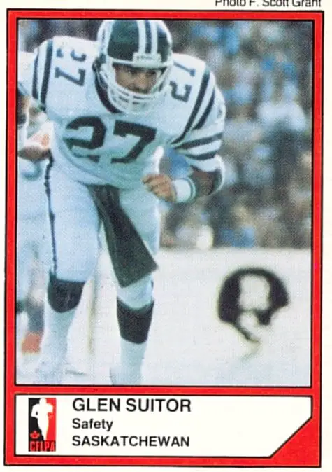
Saskatchewan Roughriders S Glen Suitor.
Entire CFL career with the Riders (1984-1994). Only his rookie season spent wearing this uniform before the Roughriders made the uniform redesign happen in 1985.
-
Anthony Calvillo quarterbacked for the Montreal Alouettes from 1998 to 2013.
Don't see many photos or footage of him in the Montreal Alouettes uniforms they wore during the start of his stay in Montreal.
-
OL Chris Walby.
Played 1981 to 1994 with the Winnipeg Blue Bombers in royal blue and gold. Gold helmet, royal blue jersey, gold pants.
His last seasons (1995 and 1996) with the Blue Bombers just did not look right with navy helmets and jerseys.
-
One for those die hard Canadian football fans out there.
Joe Paopao spent the first 6 seasons of his CFL career (1978-83) wearing the orange and brown of the BC Lions.
Came back in 1989 as an assistant coach. The Lions' last year in the orange and brown uniforms.
Came out of retirement for one season to quarterback the Lions in 1990. Wearing the new predominantly black Lions uniform with silver pants and helmet. Playing a lot that season, sharing quarterbacking duties with Doug Flutie in Flutie's rookie CFL season.
-
1
-
-
6 minutes ago, Davidellias said:
Raines is the only one where Expos are the first team I think with them. Dawson I think of as a Cub and Carter as a Met.
Here is definitely player in wrong uniform for Gary Carter:
-
3
-
-
On 3/29/2020 at 11:37 AM, Davidellias said:
At least two of the three here deserve to be on this thread.Really? Dawson was an Expo 1976-86. Raines 1979-90 and 2001. Carter 1974-84 and 1992.
This one might be more appropriate for Dawson:
-
We can't forget SCTV
-
1
-
-
We seem to be missing some Canadian TV content. Happened many times on Corner Gas with the Saskatchewan Roughriders. Including an episode in 2009 when the Riders were a focal point of the episode.
-
7
-
-
2 hours ago, monkeypower said:
Outside of a massive population boost, I think Saskatchewan is at about the highest level it can go in terms of major sports franchises. I guess you could conceivably do AHL, but I don't think the support is there for that.
You are absolutely right. If there was support for the AHL to be there we would be hearing about teams considering it. Saskatchewan is Dub country. That is what the province knows and loves. You can see the highest level there is for players in their junior hockey years, rather than minor league pros. The Pats and the Blades fans can enjoy the longstanding, tense rivalries they have with each other and the other long tenured teams in the WHL (damn you Moose Jaw Warriors!) . Not sure many fans would be clamouring to go see the Rockford IceHogs when they come into town for a game.
-
Will the OHL's future include the Burlington Bulldogs?
https://globalnews.ca/news/6513811/burlington-mayor-hamilton-bulldogs/
-
10 hours ago, CaliforniaGlowin said:
I'd love to see a team with anthracite/dark grey as a primary color. I know I'm all about bright colors, but I'm really starting to like that too.
We do have the Vegas Golden Knights.
-
6
-
-
2 hours ago, monkeypower said:
In turns out the Calgary Canucks also went retro for the game, and the rematch tonight, but for the Canucks retro means last season’s jerseys.
Calgary Canucks should just admit they made a mistake with the uniform change this year and go back to this. I am really not a fan of the new Calgary Canucks primary logo or look after decades of have the blue and green and this classic logo as the primary logo.
-
On 11/30/2019 at 7:13 PM, nash61 said:
Better have lime green helmets to match.
Vancouver Giants went with red helmets.
-
2
-
-
I love WHL hockey but don't see it much live anymore since the Vancouver Giants moved from Pacific Coliseum out to Langley. Too much of a nightmare commute to get out there.
The Dec 8 game is at Rogers Arena. Really easy trip for me, but if the Giants are going to be wearing that uniform, I am passing on going to that game.
-
Wow - I guess it will be the Vancouver Grinches on Dec 6 and 8. This is a bit too much.
-
1
-
-
Since it is CFL playoff time, one for some of the vintage CFL fans out there.
Vince Goldsmith is up there in the list of all-time CFL sack leaders. Started and ended his career with the Saskatchewan Roughriders. Spent some quality season in between with the Calgary Stampeders.
However, Goldsmith in a Toronto Argonauts uniform just does not look right. Spent only 1 season there in 1984.
-
9 hours ago, kiwi_canadian said:
A slight change on the Victoria Royals sweaters. They have replaced their shoulder logo with the word mark logo.
Good eye on that.
Another really small thing since the change to CCM Quicklite that has fallen under the radar. Just noticed this today. Sudbury Wolves no longer have trim colour around the edges of their shoulder yokes.
Present:
Old jerseys. A bit of white trim around the shoulder yokes:
-
1
-
-
On 10/18/2019 at 12:55 PM, monkeypower said:
The Hitmen are having Bret Hart Night on November 2 in conjuction with Prostate Cancer awareness.
Love the tie-in with it being the 25th anniversary. Back in original colours,
Not a Hitmen fan myself, but curious about how their fans would feel about a return to the original colours full-time. I like the pink and silver trim better than the red and copper trim they have going on. An uncommon colour scheme that works. Always liked this past uniform they wore as an alternate. This idea with tweaks such as making the stripes on the jersey like they are on the socks would be a good primary look.
-
4
-
-
Somehow this one went under the radar for me and maybe most of us.
Baie-Comeau Drakkar have dropped the black trim this year. Going just red and yellow.
-
3
-
-
1 hour ago, Discrimihater said:
They were orange and brown? I thought they've always been orange and black.
BC Lions are orange and black now and were from their 1954 birth to 1977. Here are the 1977 uniforms:
In 1978, the team underwent a colour change that just seems really 1970s. There was a brand new logo (really same one as today with different colouring) and new uniform. The black trim was switched out in favour of chocolate brown trim. They switched from the black helmet to white helmets.
Would agree sometimes hard to tell as it was used as a trim colour and BC Lions known for being orange and black. Here is QB Joe Paopao in the new uniforms. In the background, you can see BC Lions coaches rocking the brown jackets:
May be a little bit easier to notice in this photo while playing the Ottawa Rough Riders, when comparing the Lions' socks to the black in the Riders' uniforms.
The BC Lions got rid of the brown after the 1989 season. It was into predominantly black, with orange and silver trim in 1990:
-
1
-


CFL Project (Expansion in Canada & USA starts 5/4)
in Concepts
Posted
Would not really be an issue for London that the colours are the same as the local university football team. It is kind of a thing that happens in real life. Calgary, Edmonton, Saskatchewan and Ottawa all have similar colour schemes to the university football programs in their city/province. Though Riders and U. of S. Huskies looked a bit more similar in the 1990s than today. In fact, the Eskimos started wearing green and gold because they received a second hand set of uniforms from the U. of Alberta Golden Bears way back in the day.