

Eastport76
-
Posts
333 -
Joined
-
Last visited
Posts posted by Eastport76
-
-
-
-
NHL teams moving their farm teams in a nutshell:

-
 1
1
-
-
idk but the mallard look like more a Richard Scarry Character. Remember his Busytown series?
-
1
-
-
Even I'm a Jets fan, I don't like their RR. The grey looks way off..
Missed opportunity to having a Atlanta Thrashers(Pre-Rebook) jersey in Winnpieg Jets colors, Like @colinturner95's Jets RR concept from his NHL by Nike series.
-
4
-
-
Another ridiculous name in minors?
-
1
-
-
On 3/17/2021 at 3:58 PM, kimball said:
Good question. Let's pray it's the earned so we don't have to see something like this ...
-
2
-
-
6 hours ago, Germanshepherd said:
Missed opportunity not to have a Phineas and Ferb themed identity
Danville Platypuses?
I think this would a much better identity than a whatever animal robot from the 80s.
-
6
-
-
I wanna see the Red Sox in Bruins' colours.
-
1
-
-
Nickelodeon's "SilverBall" logo(1981-84)
Rede Globo(a Brazilian television network)
Both of these logos were chrome-themed and ever they share a rainbow theme.
-
For the Blue Jackets:
The cannon jersey is near perfect and it's very popular with the fans. The logo is dope. Why they don't make them primaries? I wanna see a white version of that jersey. However, the colour scheme is very similar to Jets. I agree with many people wanting the Heritage jerseys should've the primaries, but I think a retro-modern look is the best idea for Jets. like Blue jays,Bills,Sabres.
Maybe for Avalanche?
Not only the logo is a tribute to Rockies, it's sleek and clean, along the whole jersey. I love this scheme. Comparing that and the primaries, that logo makes the primary looks outdated. Yes, the Rockies logo feels timeless and the jersey is so clean.
-
6
-
-
Meh. I still prefer @mcrosby’s St Louis concept.
-
2
-
-
Target Canada-
Euro Disney(now called Disneyland Paris)
Disney Quest-
-
23 hours ago, chcarlson23 said:
I saw these posted to facebook the other day on a jersey selling group. I thought this was really interesting direction that the Oilers were looking to go. Clearly the Orange base was the plan for a while, even before navy came into the mix. These do look legit, but I'm not 100% sure...
(The other images are in a spoiler, because they're huge...)
Much better than they had now. But the Oilers’ home should always be royal blue. The orange should’ve the alternate. Home jersey? No.
-
2
-
-
I think San Jose Sharks should’ve wearing their original jerseys (1991-97) in 2016 Stanley Cup Final. Like the Pens wear their throwback/former alternate as home uniform before they returned to their retro uniforms full time.
why not Sharks use their beautiful retro jerseys and going with that as full time? Honestly it’ll much better than current set. Fix the stealth “pyjamas” with more white and add hem stripes to match the 1991-97 original set. -
I think Detroit Tigers should've add orange to their home uniform and fix their road uniform. Relive the tiger logo and put the tiger head on the left sleeve. Add sublimated tiger stripes on the logo and even the sleeve piping.
I'm so sorry but Tigers' uniforms are one of world's boringest uniforms. Ever.
-
1
-
-
I'm feeling that Rangers jersey is a city jersey..
-
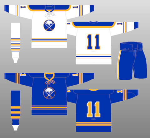
Talking about the Sabres..
Their inaugural road jersey's originally striping were all blue. I glad they changed it because that road had too much blue and addtion of gold helped to balance the colours better on the road.
-
3
-
-
3 hours ago, Brian in Boston said:
Eight caps is absolutely ridiculous.
I'm sorry, But, did you say eight? there are seven caps. also, I agreed with you. these are too many caps. The all blue "W" in Red Sox font is the best of them in my opinion.
-
1
-
-
Loved Texas Rangers' first logo.
-
2
-
-
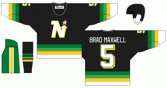
Loved the gradient, Hated the black and green pants.
Also, the Nordiques nearly changed logo shortly before they moved to Denver. I think the husky is definitely a great idea for the Nordiques, but this logo need a massive update.
Definitely a great idea for a shoulder patch if the classic "N" igloo becomes the crest. In case if they're back.
-
2
-
-
Tokyo Yakult Swallows had neon green.
-
1
-
-
the collar of Blackhawks' Adidas jerseys bugs me. it's looks like they're wearing collared shirts underneath.
-
3
-


2021-2022 International Club Soccer Kits
in Sports Logo News
Posted · Edited by Eastport76
my first thought of this uniform is Titanic's sister ship Olympic's dazzle camouflage in WWI.