


HopewellJones
-
Posts
158 -
Joined
-
Last visited
-
Days Won
1
Posts posted by HopewellJones
-
-
The “mountains” on the shoulders are driving me up the wall. They only look like mountains on the blue jersey. Otherwise my first impression is lightning bolts. So close but so far. So frustrating.
-
 4
4
-
-
Bolts on the shoulders.
Just blows my mind that nobody in the entire process thought “umm maybe we shouldn’t take a design element from our biggest rival.” Like how?
I know it’s supposed to be a mountain. But it only comes across as a mountain on the blue jersey, with the white snow on top. Should’ve kept the white on top on the orange jersey too.
-
2
-
-
"H-Town and tough" lololololol
Like oh, this is H-town AND tough?? thanks for letting me know!"
-
 1
1
-
-
When is the official reveal? Surprised we haven't seen the full set yet.
-
Absolutely cannot believe we're seeing new, non-throwback NFL Nike jerseys with block numbers. Gotta love it.
-
12
-
 1
1
-
 1
1
-
-
HUGE upgrade for the Lions. The gray numbers were so dingy. All I wanted was white numbers, nix the WCF patch, and don't do anything too crazy. Success! Not a fan of the black jersey - but it's so awesome that they kept black out of the main jerseys.
-
5
-
 1
1
-
-
I actually kinda like the monolulu blue.
Monochrome can be okay but there NEEDS to be pants stripes. The Lions all-white is so awful, but would at least be palatable with pants stripes.
I will never understand the appeal of teams dressed in yoga pants. I mean never.
-
5
-
-
1 hour ago, tBBP said:
Two things:
There was a much different approach to design in the 60s when the original Falcons logo debuted. I'm not sure if it was originally meant to imply an F or not, but the now-current logo certainly was intended to, well, "strongly imply" the F. Speaking of, I don't see a problem in "implying" certain elements, but there are instances where it becomes obvious and thus kinda ruins the whole thing. Like this:

It's the difference between connotative and denotative design. When it's connotative, it's nicely built in (and in the grand visual hierarchy, it may be one of the last things the eye picks up). When it denotative, it's done on purpose, often starting from that point and working backwards (which is what I believe happened with the above Wolves example; that tree in the fur is way too obvious. Matthew Wolff did a great job in fixing that with the current Wolves logo.)
Now, for the second thing. That Grizzlies logo was originally designed while the club was still in Vancouver, so of course Memphis wouldn't have any kind connection to it. That said, their now-current and to me vastly inferior alternate logo does imply an M:
You'd have to look very hard to see it if you didn't already know it was there, but the top three claws are what imply the M. (Thus, it's connotative; it connotes, or projects the idea of, an M.) For reference, here's the preceding version(s) of that claw-ball mark:
This raises a whole other line of questioning, whether "sanitizing" that logo (my words, but pretty much the same thing Tampa did with the current Jolly Roger logo as compared to the pre-2013 version) just to be clever and imply the M was really worth sacrificing the superior dynamism of the previous version(s). But that's what they did, and that's what we got.
Design. Decisions, decisions....
Very insightful and interesting, thank you!
-
18 hours ago, seasaltvanilla said:
Imagine if a historical franchise like Montreal or something used the letter of the team name on their jersey.
"Club de Hockey Canadien." The official/original team name is French, and there is no 'M' in that name. That makes it a little different for me, especially with how long they've been around.But yeah those other examples irk me. Especially the Falcons. The logo is literally a Falcon...does it really need to be shaped like an F? It'd be one thing if they were the Frankfurt Falcons or something, and the F was representing the locale name. In that case, the logo would represent the full team name - F for Frankfurt, and a depiction of a falcon for..Falcons. The way it is now just seems redundant and doesn't strike me as clever at all.
For the record I actually like the Falcons logo. Just the whole "the falcon is shaped like an F because falcon starts with F" seems dumb.
Same thing with that Grizzlies logo. I mean...the identifier is with the animal mascot. Do Memphis fans really brand themselves around the first letter of the word "grizzlies?" Do they ever refer to the team as the "Gs?" Make that an M to include the locale name, and I'd be into it.
-
3
-
-
The Orca logo sucks solely because it uses the initial of the team name and not the locale. That's one of my biggest pet peeves, just drives me crazy. Imagine if Michigan used a 'W' as their primary logo.
-
 1
1
-
 2
2
-
-
-
2
-
1
-
1
-
-
Monolulu Blue
-
3
-
1
-
1
-
10
-
1
-
-
4 hours ago, henburg said:
Michigan in any of these combos against Washington in Gold-Purple-Gold would've been a fantastic visual matchup, one of the best in recent years. Funny how both teams ended up fumbling their combos and taking all of the vibrant colors out of the matchup.
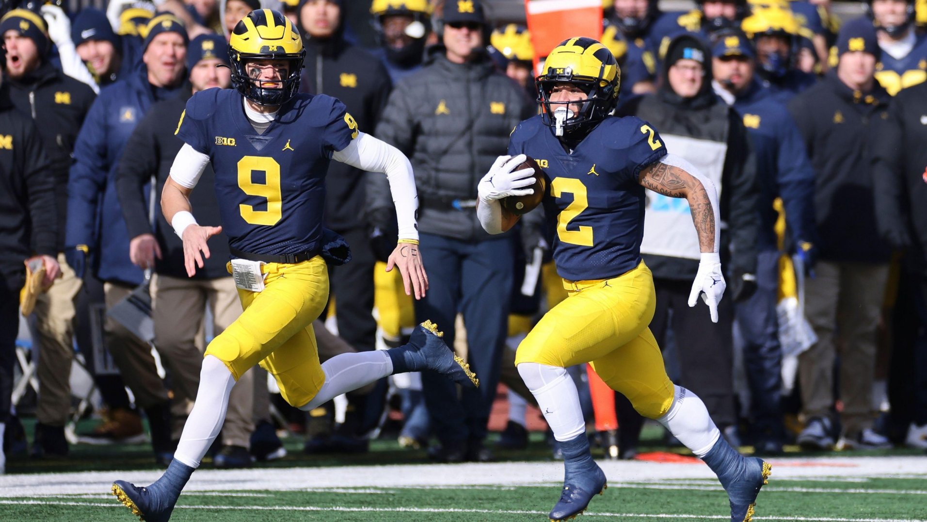
Agreed. I love the all-blue, but wish they didn't wear it as much. Now they've become the "Big Game Blues." I absolutely loved the Rose Bowl uniforms with the white socks and sleeves (not to mention the shoulder patches). That's classic Michigan right there.
-
The away looks:
White-Blue-Blue
White-Maize-White
White-Maize-Maize
White-White-White
White-White-Blue
-
3
-
-
7 hours ago, Ted Cunningham said:
I'm sorry, I'm not following what these colors mean or what order they're in. I am guessing the helmet is not included (as that would be blue all the time). Is it like sock color or shoes or something? If it's socks, I didn't know they were consistent enough to track or definitively say they were one color per game.
Yeah, Jersey-Pants-Socks/Sleeves.
I know the average fan doesn't really notice socks and accessories, but most people here do. And they make a big difference in aesthetic. The blue jersey/pants combo definitely has a different feel when they wear maize socks and sleeves with it. Wearing the maize pants with maize socks just looks bad. But anyway yeah it seems as though they very deliberately tried not to repeat any uniform combos until the very end.
Blue-Blue-Blue
Blue-Blue-White
Blue-Blue-Maize
Blue-Maize-Maize
Blue-Maize-White
Blue-Maize-Blue
-
5
-
-
Looking back, I didn't realize how many different combinations Michigan wore.
11 different combinations to start the season. Wasn't until Ohio State that they repeated a combination (all blue).
Week 1: Blue-Maize-BlueWeek 2: Blue-Maize-White
Week 3: Blue-Blue-Blue
Week 4: Blue-Maize-Maize
Week 5: White-Maize-White
Week 6: White-White-White
Week 7: Blue-Blue-Maize
Week 8: White-Blue-Blue
Week 9: Blue-Blue-White
Week 10: White-Maize-Maize
Week 11: White-White-Blue
-
1
-
-
13 minutes ago, ruttep said:
Delete the Arizona Cardinals franchise from existence. They have just gone AN ENTIRE SEASON wearing exclusively monochrome combos. I am absolutely disgusted by this mockery of uniform aesthetics. Anyone who said "don't worry, they'll mix and match eventually" was unfortunately proven wrong.
They straight up look like bottles of ketchup.
I know this is the least unique opinion on here, but it needs to be said again...JFC I cannot wrap my head around people thinking monochrome jersey-pants-socks looks good. How do you see anything other than pajamas, leggings, or unitards? I mean it just looks SO dumb.
And I actually don't mind mono jersey+pants. But contrasting socks make all the difference. I'd actually like the Cardinals uniforms if they had white socks.
-
7
-
2
-
-
I just noticed the "Mich1Gan" helmet bumper...I think that's new...and real dumb.
-
2
-
1
-
-
Never thought they'd bring back the shoulder patches! That pumps me up.
I'm definitely biased here, but man Michigan has the best uniforms in all of football. The classic home speaks for itself. I was born in the 90s but I remember seeing pictures of the white, striped pants from the 70s and thinking they looked great. So happy Harbaugh brought those back. That seems to be an unpopular opinion, but the reason I like it is because of color balance. Maize/Blue are pretty equally represented in the home uniform. With maize pants and a white jersey, the classic away uniform is too maize-heavy. The striping on the 70s all-white keeps the balance between maize and blue pretty equal. Also I love how the stripes mimic the back of the helmet. The switch to Jordan was a perfect update; a custom font that isn't obnoxious, helmet bumpers changing from white to blue (keeps the home uniforms strictly maize and blue), but most importantly - fixing the shade of maize! The highlighter yellow was awful - the new one is perfect. And this is probably another unpopular opinion but I like the all-blue home alternate a lot. With two different jerseys and three different pants, I think they do an excellent job of mixing up combos while still looking like Michigan. Definitely some combinations I don't love, like white jersey/blue pants, but if it's enough to scratch their itch for alternates, I'm cool with it.
-
5
-
1
-
-
Notre Dame wearing white pants...weird.
-
5
-
-
Lions and Cardinals just prove to me how badly a wordmark within/as a stripe can ruin a uniform.
-
5
-
-
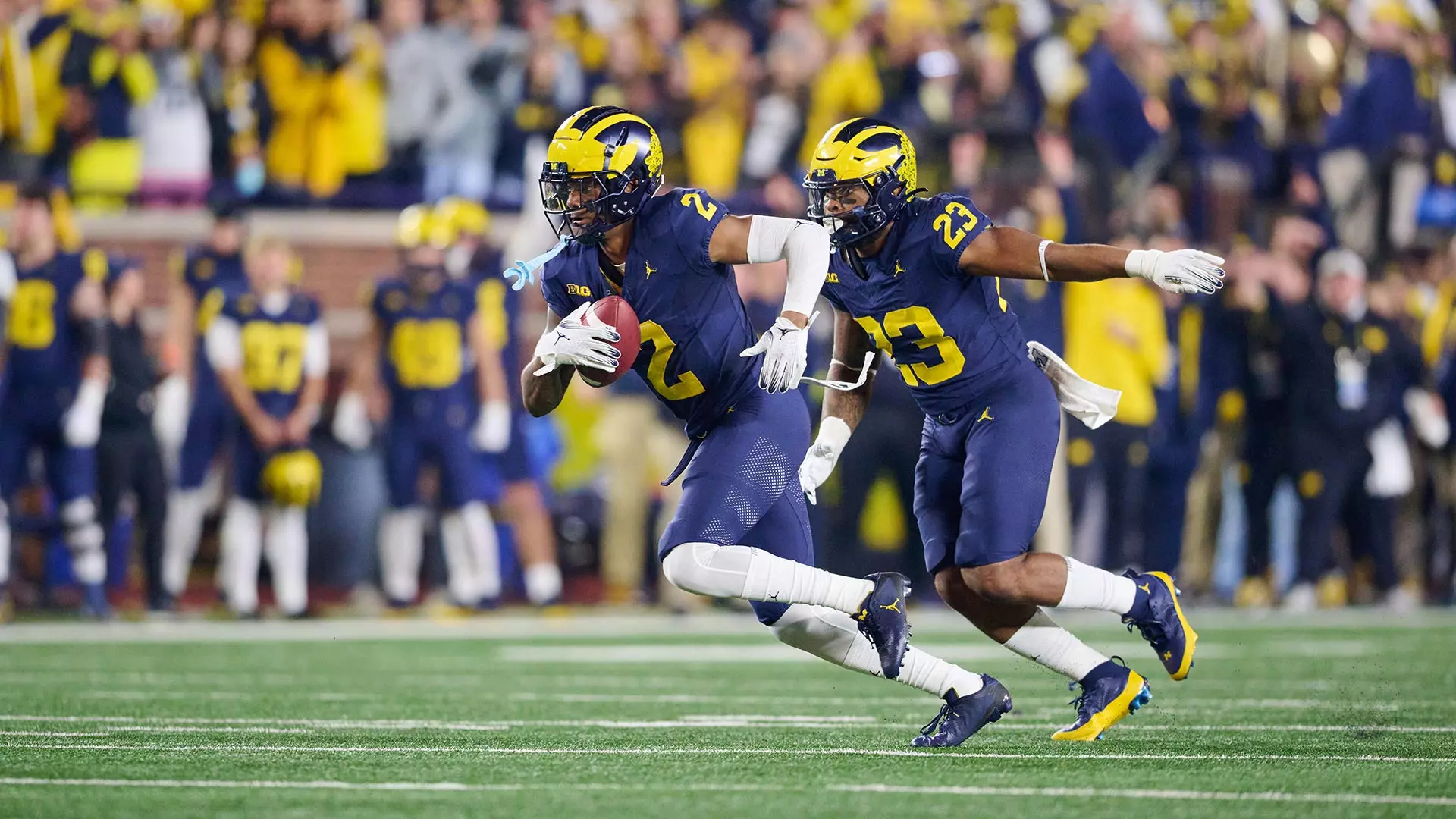
Michigan in all blue, with maize socks and sleeves. Kinda whacky. Don't love it, don't hate it.
Also, black trim works for Indiana.
-
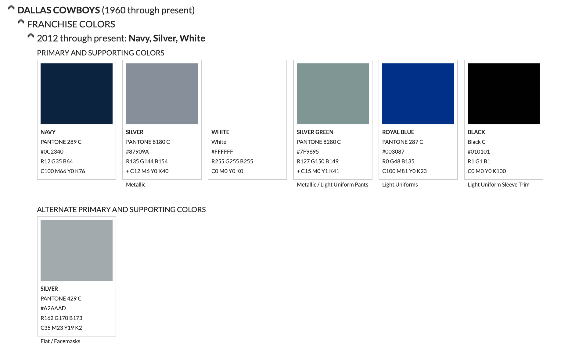
15 hours ago, TruColor said:
OK - I'm confused. You're posting a 13-year old image of mine? Here's the current palette (They modified it again in 2012; 2 years after that old crappy image):
NiCe TrY bRo /s
-
4 hours ago, Cujo said:
The 394652 shades of blue and silver immediately disqualify the Cowboys from ever being in the best uniform conversation.
2 shades of blue and 2 shades of silver...1 shade of each on the dark uniform.
-
 2
2
-


:format(webp)/cdn.vox-cdn.com/uploads/chorus_image/image/72868123/1788082630.0.jpg)
:format(webp)/cdn.vox-cdn.com/uploads/chorus_image/image/72733512/1723400658.0.jpg)


2024 NFL Changes
in Sports Logo News
Posted
The red helmet and horns on the red jersey lacking white...while the numbers and pants stripes do...that's one of those inconsistencies that just drives me absolutely crazy. Really dig the home uniform. I've always had an inexplicable soft spot for TV numbers being slightly different from main numbers. Kinda ironic, given my gripes on consistency lol.