HopewellJones
-
Posts
158 -
Joined
-
Last visited
-
Days Won
1
Posts posted by HopewellJones
-
-
47 minutes ago, Lumbergh said:
Such a great matchup. If Washington changed the sleeve stripes to white and added a gold trim to the numbers, these would be my #1 in college football.
I absolutely loved those Cal uniforms when the debuted. But for whatever reason, they haven't aged well in my eyes. Can't really put my finger on why, but I definitely do not love them anymore.
-
 2
2
-
-
16 hours ago, pluggerplugger1 said:
P.J. Fleck had a rant on Minnesota's uniforms that I think you all will find interesting:
What a friggin goon. Good lord. You wanna add BFBS uniforms? Go for it. Yours look terrible when you're using dark maroon as the accent color, with none of your gold for contrast, but go for it. But adding oars and "row the boat" to the uniforms is so selfish and annoying.
-
 11
11
-
-
Michigan will be in all-blue tonight vs. Bowling Green.
I'm a fan.
-
I don't mind a little mismatch of the Cowboys' shades. It's kinda their thing.
But the black outlines on the stripes are just aggravating.
If you're going to use black on your uniform, even if just for outlines, it has to be consistent, especially if blue is your primary color.
-
1 hour ago, oldschoolvikings said:
The Seahawks' color distribution is all out of whack, anyway. The helmet is navy, with gray and white details, and a tiny drop of green. The home jersey is navy, with a fair amount of gray, green trim and no white. The white jersey has navy numbers, a small amount of green, and no gray. The navy pants have greren trim, but no white, or gray. The gray and white pants have no green.
WTH?
The white on the helmet really bothers me when they're clearly going for a gray-not-white color scheme otherwise. Similar to the white on the Lions helmet logo, but the Lions bother me way more.
-
2 minutes ago, HOOVER said:
These were stale at the time, but I'm coming back around on them. Change to a classic, bold 1-color number font like the Bengals CR jerse;, match the helmet stripe to the White pant stripe or just a single 1-inch Navy stripe; tinker with the yoke (or pay homage to the Oilers and get rid of it completely); then use something other than the Sword logo on the cap sleeve and these could make a great next set that could stick around forever.
I would argue that White pants could also be worn with the White jersey, but there should never be a Navy jersey or pant ever again.Both their current and former uniforms are marred by the use of bad combinations.

- Change the helmet stripe to match the pants stripe
- Border the yoke with navy to match the helmet/pants stripes
- Remove the outline from the numbers (and get a better font)
Would make a classic uniform that never needs to change.
-
 1
1
-
-
Forever annoyed with the Giants ruining their away uniforms.
I'm cool with the blue-heavy home uniform and red-heavy away uniform. I actually really like those types of quirks. But they went overboard with the away uniform being solely red and white below the helmet.
-
 6
6
-
-
1 hour ago, SFGiants58 said:
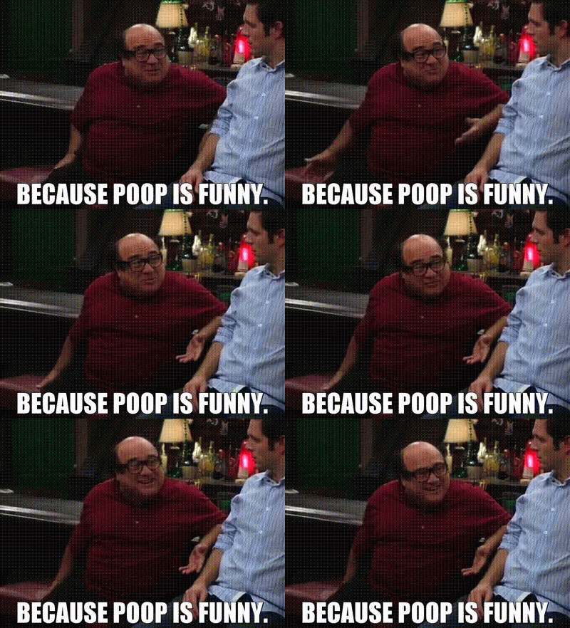
It's why "Who Pooped the Bed?" is among my favorite episodes of It's Always Sunny in Philadelphia.
It's also the best episode of Sex in the City, if you look at it a certain way.But back to the Browns - their 50-yd/primary logo really should be a stylized representation of the helmet, two-bar mask and everything.
A turd merger!
-
 2
2
-
-
Just popping in to say the Golden Knights really messed up a great original look.
That mustard gold looks awful with that shade of gray equipment. Bring back the original home jersey and equipment. Sprinkle in the gold helmets and/or gold jerseys as a quirky alternate look. Or, if they want to keep the gold jersey as the primary, switch the equipment to black.
-
31 minutes ago, Indigo said:
How come every time I see you on the boards, you're saying something controversial?
It was just a silly joke lol. I don’t know the guy, but I appreciate his contributions to the site. It’s been fun following this unveiling. Was making a joke, not meant to be taken seriously.
-
 2
2
-
-
More like FalseColor amirite??
-
 5
5
-
 10
10
-
-
I just CANNOT wrap my head around the appeal of socks that are the same color as the pants. God, these uniforms are actually great with the red pants only used with the white jersey. I mean it literally looks like pajamas with red jersey/pants/socks…there are uniforms I don’t like but I can at least understand the appeal. But a huge block of all red looks awful.
-
 5
5
-
-
A lot of unknown potential for this new set to be a disaster, but can we all at least just take a second to appreciate that the current set is finally dying
-
 9
9
-
 2
2
-
-
32 minutes ago, 8BW14 said:
The Texans are going to eff up their uniforms soooo hard.what they wear now is a very solid uniform with a great logo. I’ll never understand the powder blue/red circle jerk. THEY ARE NOT THE OILERS!!! The works thing is that once they change, they will probably never go back.
Literally the only thing I would change about their uniforms would be the pants stripe:
white w/red tapered stripe(for the blue jerseys)
white w/blue tapered stripe (for red and white jerseys)
blue w/red tapered stripe (all three jerseys really)
*and they always need to wear red socks with blue pants.
Powder/Red is simply a better color scheme than Navy/Red. Don't care about history.
-
 1
1
-
-
4 hours ago, Cujo said:
**DO NOT GIVE YOUR GAME JERSEY AWAY OR SWAP IT BECAUSE THIS ISN'T SOCCER!!!
Yeah! And soccer isn't footba - ...ah wait.
-
 2
2
-
 3
3
-
-
On 1/17/2023 at 12:46 PM, Brave-Bird 08 said:
49ers-Cowboys is the best uniform matchup in sports.
Red against Blue
Gold against Silver
Similar uniform elements that emphasize the contrast
Actually I'd say Michigan (home) vs. Ohio State (away) is the best matchup in sports, but for the same reason.
-
 2
2
-
-
Add me to the list of people who want the Capitals to return to black/blue/bronze. It looks so much better.
-
 1
1
-
-
I know this is an old gripe, but the "TBD" pants on the matchup displays really ruins it. It just takes up a bunch of space on the page and it's not nearly as exciting anymore.
But for the pants that ARE shown...my god, the Cowboys...if they're truly gonna wear those pants with a silver stripe down the middle. That's the kind of thing that just drives me up a wall. You go with this Navy/White scheme and then completely ruin it with the inconsistent pants.
-
 13
13
-
 2
2
-
-
9 hours ago, Indigo said:
Seriously how did this get green-lit? It looks SO bad.
-
 2
2
-
-
1 hour ago, YelichGraphics said:
That might be the worst looking 5 I've ever seen.
-
 10
10
-
-
On 12/18/2022 at 4:38 PM, Pigskin12 said:
And stop wearing the damn white socks with the gray pants
I’m the type who hardly notices socks, unless it’s the dreaded leggings look when they’re the same color as the pants. If they’re contrasting, I’m good. Blue would look better with the Lions’ gray pants, but it doesn’t bother me at all when they go white.
-
 2
2
-
 1
1
-
 1
1
-
-
The Lions would have a top ten, maybe top five look if they...
- Eliminate the dark gray from the pallet.
- Change the home numbers to white with gray outline.
- Remove, or at least modify, the sleeve patches. I don't even hate the WCF, but the LIONS in the sleeve stripe is super lame. The WCF patch having the only white on the home jersey annoys me to no end.
- Replace the color rush with a Barry Sanders era throwback.
So close but so far.
-
 15
15
-
 1
1
-
-
I've revised my stance on Browns facemasks. The new shade of orange changes things. With the current helmets, white is better than gray. And I love gray facemasks.
-
Browns' facemasks:
Gray > White > Brown
-
 1
1
-


NFL 2023 Changes
in Sports Logo News
Posted
I really like the Ravens and Jaguars uniforms, for very similar reasons.
- Purple and teal both go well with black.
- Unique fonts that aren't obnoxious.
- I love logo-only colors when applied right, especially gold. The gold on the Jaguar head and the Ravens' logos create a nice "badge" look that's used tastefully. I wouldn't be opposed to the Jags using gold on the numbers like Baltimore does, but they're fine without it.
- Their all-black uniforms actually look good (as an alternate) and vibe with their mascot/identity.
- They have simple designs, but can mix things up with different color blocking. Ravens look good in black over purple, as well as purple over black. Just as the Jags look good in black over teal, or teal over black. Both teams' away uniforms should be white jersey over team-color (not black) pants.
Kind of amazing that the Ravens have had this set for so long. They should keep them forever. I fear the day that they feel the need to change and we lose this classic look.