-
Posts
120 -
Joined
-
Last visited
Posts posted by udubfan19
-
-
20 hours ago, MCM0313 said:
Appoint a successor to Merton Hanks to enforce them.
appoint rex ryan
-
 1
1
-
-
3 hours ago, VDizzle12 said:
That Missouri set was so popular other teams went with the same template. I remember Houston specifically going with it during the Case Keenum years.
Illinois was probably the worst offender of the "piping" look. With Oregon State and even Clemson not being far behind.
can't forget even more traditional schools such as Washington & Michigan had piping on their jerseys in the last NCAA game.
-
 2
2
-
-
11 hours ago, burgundy said:
"32s" is a reference to 1932, not being the 32nd team.
32nd in standings
-
 1
1
-
 2
2
-
-
46 minutes ago, Sec19Row53 said:
I saw a Phillies cap in the same color/style this past week.
at least they actually have blue in their color scheme. a giant hat in dodger blue is forbidden.
-

what in the
-
 1
1
-
 1
1
-
-
11 hours ago, Ark said:
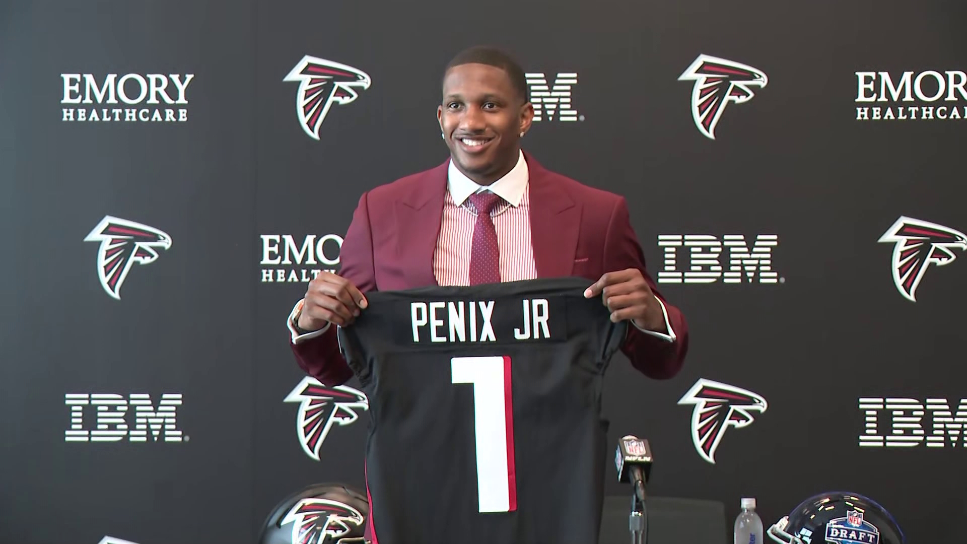
2001: falcons changed jerseys 4 calendar years prior, draft a lefty QB named Michael who lost a national championship game and had an amazing deep ball.
2024: falcons changed jerseys 4 calendar years prior, draft a lefty QB named Michael who lost a national championship game and had an amazing deep ball.
-
 1
1
-
-
y'all aren't gonna believe this:

-


 how denver should have honored those colors:

-
 8
8
-
 1
1
-
-
10 hours ago, rfraser85 said:
I don't know about sales for U-H, but if the NFL did nothing, how many other college teams may try to do something like this? One imitator may not be a problem, but the potential for cumulative damage may be worth taking action.
That said, I agree that shutting everything down may be excessive. The Iowa Hawkeyes have been using Steelers look-alike uniforms for decades, so there may be a middle ground somewhere.
hell, Washington even did that designing theirs after the 49ers.
-
9 hours ago, schlim said:
I thought Seattle was 12.
could be, but I thought the stadiums were at 16
-
9 hours ago, Chromatic said:
Why does it have 5280? Does that number have any significance to the city of Denver?
On a completely unrelated note, does anyone know Denver's official altitude? I know its probably never been discussed before, but I sure wish cities would spam their official distance from sea level at every possible opportunity so we never forget how thin the air is there.
Seattle with a 16

-
I prefer the 2013-2018 font for WV, but the rest is a move in the right direction.
-
 2
2
-
-
On 4/27/2024 at 7:36 PM, BBTV said:
Search feature. It's never been good, and it never will be. You do a search, and it returns x pages of results. If you don't get what you want on the fist page, and click another page, you get "you must wait # seconds before running another search." FFS - why do the search results show you that there's multiple pages, if you can't actually view them in less than a week? I'm not b-tching at the mods - I know it's just the forum software - but it's gear grinding, and dissuades anyone from using the search "feature".
also shows the same thread 74 times...
-
On 4/9/2024 at 12:53 PM, dont care said:
Is your “A” button broke?
i just saw this, and also just saw the a in marks isn't emoji.
-
10 hours ago, mcrosby said:
I'm struggling to come up with a good logo for Cincinatti. Would love to hear some suggestions!

-
 3
3
-
 1
1
-
-
11 hours ago, TrueYankee26 said:
As for my Yankees I am glad the Astros aren't there lol
second that from seattle.
-
 3
3
-
-
numbers on concepts randomly chosen. 4 jersey limit (as MLB rules). also every jersey has NOB and only in block font. to prevent this. most alternates can be worn home or away
AL west:
SEA: the font from the wordmark in used on the jersey numbers, gray jersey is added over the cream jersey. and silver brim hat replaces all blue, and blue jersey has piping

TEX: i preferred the 2014-2019 jerseys over the 2020- ones, I don't like the rangers script, although having 'texas' on the home jersey is worse. red jersey added back for red-blue balance

ANA: they play in Anaheim. also added a blue jersey & hat

OAK/SAC/LV: the Oakland athletics of Sacramento & Las Vegas have good jerseys. but the yellow A on the all green hat looks much better than white.

HOU: orange hat added back & blue jersey matches others.

NL west:
SF: all jerseys match the home jersey better. alt bridge logo added to sleeves

COL: more purple is added to home jerseys.

AZ: gold/sand added back over teal, 'diamondbacks' added to white & black jerseys. also, the dark gray jersey was unique, so I brought it back.

LAD: on Jackie Robinson day, they wear jerseys without front numbers, and i think it looks better than front numbers that mismatch the back numbers. (also, a throwback to 1951)

SD: the blue-gold color scheme is vastly superior to brown-yellow, why celebrate 22 years of .436 ball with 1 90 win season? and they wore blue for longer as well.

AL central:
CWS: red or navy has been in use for the white sox for a vast amount of time more than black & silver. also throwback hats!

MIN: i prefer the current striping, but the previous gen of everything else for the twins. also, cream alt is back.

CLE: I hate almost everything about the guardians rebrand. so, these are close the 1994 jerseys.

KC: i prefer seeing the script on the away jerseys over block.

DET: I added a modified version of spring training jerseys from years back as an alternate, and the B-W-O striping on the road. (I remember seeing it somewhere on their old jerseys.)

NL central:
CIN: black brim replaced with white brim.

MIL: the ball in glove logo could work for any other ball club with MB initials. i prefer the previous set with gold & a logo with wheat in it.

CHC: old road script is back, also R-W-B striping. and your beloved red bills.

STL: st. louis added to road jerseys. red alt added over cream & powder blue.

PIT: only 1 black jersey is needed. also 'pittsburgh' is in the same font as the home jersey

AL east:
NYY: blue alt added with white brim hat. (also, one NY logo apparently.)

BOS: blue centric road from the 2013 team is added back with red outlines. blue & white on red jerseys flipped, and 2 alt hats are added

TB: modified 2007 set with font on back numbers. a devil ray is more intimidating than a ray of light.

TOR: navy added back to be more accurate to the WS jerseys

BAL: black is the primary over orange. old bird is back.

NL east:
PHI: more blue added and red alt jersey is back

NYM: pinstripes moved to cream alt, old blue jersey is back.

MIA: white M on hat.

ATL: i made a 2019-2023 blue jersey here, but i think blue on blue is more unique and less like CLE

WAS: nationals script in red on home, white on red jersey, 2023 road jersey added back.

requests now open
-
Houston looks like the 2017 Arizona jerseys.


-
 1
1
-
 1
1
-
 1
1
-
-
2 blues will end up looking like these, especially paired with white pants:

-
13 hours ago, burgundy said:
What the
 are you talking about? What does Cleveland have to do with this?
because its Cleveland, duh.
-
5 hours ago, BBTV said:
given the Eagles silver pants and helmets
what silver helmets?
-
 1
1
-
-
23 hours ago, coco1997 said:
Thanks! I'm not convinced this version would have been that much better received, as I feel the biggest issues most people have with the Phils' new set is the wordmark and wonky numbers style, neither of which I really mind.
SEATTLE MARINERSHOME:
ROAD:
HOME ALT:
ROAD ALT:Notes:
- It was an odd choice by Seattle to drop their gray road jerseys while keeping their Sunday home fauxbacks, because 1) the team now has gray pants without a matching jersey, and 2) their City Connect set is also blue and gold, which makes the fauxback, in my opinion, redundant.
- After ditching the team’s Sunday home fauxbacks, I asked myself, “Why can’t Seattle’s primary home uniforms be off-white?” I'm not entirely convinced it works, but you be the judge.
- The whole set uses a more vibrant shade of teal/seafoam green, similar to the one from the team’s Spring Training caps. The new home cap is also a recolored version of the ST hat, which swaps out the "S" logo for the compass.
- I decided to work up a new road alt design that replaces the “Seattle” wordmark with the “S” logo. I also streamlined the home jersey wordmark by dropping the second stroke around the letters.
- As I tend to prefer custom style numbers, I restored the M’s’ rounded numbers across the board.- I previously shared my Seattle City Connect tweak here, where you can read a breakdown of the changes I made. In short: The black pants are now white, newly added t-bars are inspired by the Steelheads, a touch of red comes from the Rainiers, and the crossed tridents on the cap bill were suggested by @Frylock.
C&C appreciated and have a great weekend!they just don't look right in cream, but the CC is definitely better than the current mess.
-
 1
1
-
-
4 minutes ago, Brave-Bird 08 said:
We have gone from the NFL basically treating their team's helmets like primary logos to inevitably rotating through uniforms like college teams do.
Ick. This scares me, especially because I fear teams will use this opportunity to complete the "icy whites" look.
(Also, does this maybe clear up what's going on with Denver? Could be that white helmet is for an all-white alternate look, while the primary will be blue. We will see.)
man, I hope this is right and Denver keeps the blue helmet primary.
-
 1
1
-
-
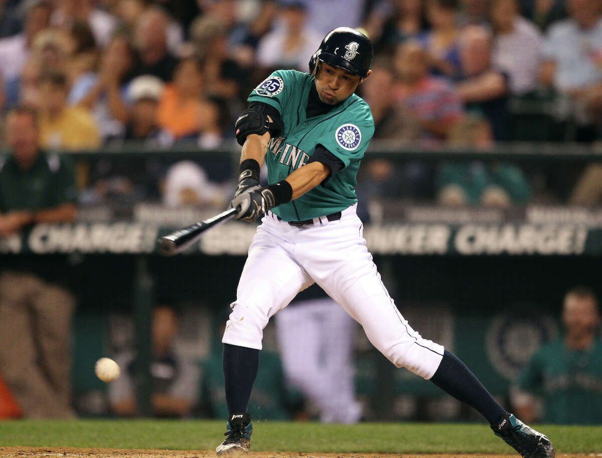
 Ichiro in teal jerseys, which they only introduced in his 3rd to last year in Seattle.


/cdn.vox-cdn.com/uploads/chorus_image/image/61943063/usa_today_11539779.0.jpg)


 Ichiro in teal jerseys, which they only introduced in his 3rd to last year in Seattle.
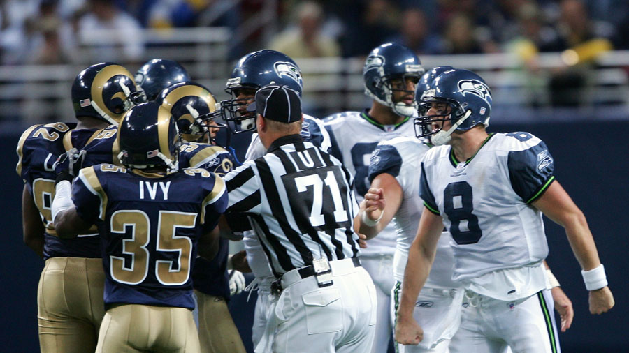
Players on the "RIGHT" Team, but "WRONG" Uniform
in Sports Logo General Discussion
Posted
not the right team but most definitely the wrong uniform