


tBBP
-
Posts
10,523 -
Joined
-
Last visited
-
Days Won
21
Posts posted by tBBP
-
-
1 minute ago, DNAsports said:

I want everyone to remember these images the next time somebody around here starts going "BUT DEY WUN UH CHAMPEEYUNZHIP IN DOZE!!!" to justify keeping a uniform look around...
-
 11
11
-
-
2 hours ago, Discrim said:
Eh, why not. During his stint with the Pats, Bryan Cox wore 0 during the preseason, then was sporting his usual #51 once the regular season began. Whether whoever was wearing 51 got released or agreed to give Cox the number, I have no idea.
Ah, yes...Bryan "The Headboard" Cox.
Do they even make those headboard things for players anymore?
-
Word of caution about these new Mitchell & Ness throwback jerseys, for those who haven't seen or touched them up close: they're NOT full-twill. The scripts and numbers are one-layer faux-twill, and on some, sizes, proportions, and some colors are off. I've also noticed this with the "throwback" NFL jerseys they've been producing lately, which really are no better than the one-layer faux-twill jerseys Nike produces now, or the one-layer faux-twill. For all that, the NFL ones retail at $150; don't know about these.
It's a dang disappointment, too, as Mitchell & Ness used to be the gold standard for authentic throwback quality jerseys; now it seems they're going the cheaper-yet-pricier route.
-
3
-
-
Since there's many hockey heads in here far more knowledgeable than I about this: didn't hockey used to have some type of numbering system along this same line, which pretty much was the reason defencemen and goalies wore single digits for so long (despite, in the case of the defencemen, being the biggest players on the ice, strange-looking as that is)? At what point, if someone knows, did the ol' rules get busted and more and decencemen started wearing whatever numbers they wanted (particularly in the 70s, if my memory serves right--which admittedly it probably doesn't)?
-
I mean, I ain't gonna front, but I'd love to see some more of this, just for the novelty of it...
(R.I.P.)
(^ that, btw, is my personal favorite Chargers look of all time, with the blue jersey to match...)
Of course, all it'll take is one person to beak the mold and start the trend going before it loses its "cool factor". That said, I don't know about this one (blame this on UVa's number draft thingamajig they got going on down there...)
And of course, history also gave us this, but I don't know that I'd want to see it again...
(Dude apparently also wore #48 as a QB in college, as well.)
-
1
-
-
This seems silly to me...but I also ain't NFL brass, so ain't a thing I can do about it.
I don't know why so many lobby for WRs to be able to wear single digits in the NFL--but if we're gonna bust the ol' rules, then go all the way--open up everything within the range of 0-49 for WRs, and for that matter, QBs, too--yeah, let's see some QBs wearing 20, 21 and 22 again, like Doug Flutie, Don Hadl and Bobby Layne used to (Flutie in the CFL, of course).
You know what, how about this? Designate 0-60 for the offense; 60-99 for the defense. Flip the whole dang script over. Oh and allow interior linemen to wear 00 again, too, doggone it. Since the floodgates done been opened, why not???
-
1
-
-
Not that my opinion of it matters one ioda, but I've long thought the Footballs' yellow gold masks as garish. It may just be because yellow is so bright on its own, but I never understood why they went that route rather than color-keying the masks to the helmets.
-
3
-
-
14 minutes ago, _DietDrPepper_ said:
Didn't you just post this right before this and get proven wrong? The Cardinals are over 100 years old. If there's a teams that's going to have a grey facemask its them. That helmet hasn't changed in decades, changing it now would be disastrous.
Well, except for the logo on the sides of it...

...And if the Cardinals really valued their oldest-in-the-league traditional legacy, they wouldn't have allowed Reebok to pipe-n-panel it all to h-e-double in the first place, so there's that, too.
Anyway, to your point, for anyone curious as to a visual, here you go:
(Shoot, this might look better with a black facemask...)
-
16
-
-
2 hours ago, EddieJ1984 said:
The Bills should've went with red facemasks.
I'm glad someone else agrees. It'd really help bring out the [little bit of] red throughout their uniform. (Of course, it'd also help if they axed out all traces of navy trim as well--let that red breathe a lot more than it does now.) And for those curious how the Bills' helmet might look with a red mask, well, here's a good comparison point, from a team that [used to have] a dang-near similar colorway and uniform layout:
53 minutes ago, _DietDrPepper_ said:The hate for gray facemasks is stupid. It's like the grey away uniforms in baseball, it's a neutral color that works for every possible helmet in the NFL. There's only like a handful of teams I don't think would benefit from wearing a grey face mask permanently.
Ermm...
I know, I know, it's "chrome", but still... yeah, gray don't work with that helmet. So glad Tampa came to their good senses and got rid of that mess...
-
2
-
-
1 hour ago, phutmasterflex said:
Then when they had the uniform change, the NFL Equipment logo was placed lower onto the mesh of the uniform body which actually wasn't on the collar. (SF, SD were a couple teams who did this too)
I'm still trying to forget this uniform ever existed...
-
8
-
-
Let me get us back on topic.
Y'all really wanna know what greatness is?
Here...
That's greatness...uniform greatness, that is.
(It still ain't too late, Jacksonville...)
-
19
-
-
On 3/18/2021 at 11:13 AM, throwuascenario said:
Clearly that's not true. The Patriots are the only team in history to win 18 games in a season. The goal of football is to win. That makes them indisputably the best team to ever play.
That's only because the NFL played a 14-game regular season in 1972...
On 3/18/2021 at 11:21 AM, ManillaToad said:I hate being an "um ackshully" guy but the 1984 49ers and 1985 Bears both did
Sho' nuff. But yet...
3 hours ago, throwuascenario said:Okay, you got me. So those are the only two teams that have been better.
Mercury Morris & rest of that 1972 Miami Dolphins squad might have something to say about that...
3 hours ago, throwuascenario said:Who cares about a trophy? The goal of anything you do competitively is to be the best. Winning the most games makes you the best. Losing all year just to get hot in January and February has no logical path to an argument that you're the best.
Try telling that to the 1984-2001 Florida State Seminoles, 1995-2005 Atlanta Braves, 2001 Seattle Mariners--and oh yes, those 2007 New England Patriots. On the other hand, getting hot at the right time is exactly what propelled the 1999 Tennessee Titans, 2006 Pittsburgh Steelers, 2008 Arizona Cardinals--and oh yes, the 2020 Tampa Bay Buccaneers into the Super Bowl, with all but one of those teams winning it all.
Actually, those '08 Cardinals pretty much got Jean-Claude Van Damme helicopter-kicked backwards into the playoffs, but then got up, got hot, had the fortune of feasting on The Bakery 1.0 aka Jake Delhomme, and then made it into the Super Bowl--and if not for Ken Whisenhunt's boneheaded attempt at spiting his former team by abandoning the very formula that got his Cardinals to the Super Bowl in favor of "out-Steelering the Steelers", up until he saw that wasn't going to work, only too little too late, there'd be a Lombardi sitting in Glendale, too. But who's keeping track?
-
7
-
-
5 hours ago, Chromatic said:
The Broncos current look is great. Perfect colour balance, and the design is one of the few examples of something that isn't a "traditional" design while not being an over designed mess. The number font is fine, its unique, and aesthetically ties into the Broncos identity while simultaneously not being illegible nonsense or generic block numbers.
If there's one thing they need to do its reduce the amount of times they wear navy and focus on being the orange team.
Heh...left to me, Tampa would've reclaimed their status as the orange team--but we all know that ain't happening, especially now, so...plus, Cleveland and Cincinnati now kinda have that covered.
Anyway, re: Denver, I'd argue the opposite...considering the fact those uniforms were very obviously designed to highlight the orange side panels, I'd say they need to [get back to] wearing them as originally intended, meaning navy over white at home. (Actually, they were originally intended to be navy over navy, but IIRC John Elway wasn't having that, so they went to navy over white. ) The orange tops just look washed out in comparison (may just be the shade of orange they're using). Of course, all of this could be helped if they were to shift towards a bit brighter blue-- not quite royal, but close.
Saint
The thing that always boggled me about their aways is why they chose not to carry the orange side panels over to the away sets, and simply pair the navy pants they originally intended for the navy tops with the white jerseys...
These are not the best images, but back in the early part of the 2000s Morgan State football did this...if you can ignore the navy outlines (& orange facemasks), this is a visual idea of what I'm talking about.
-
3
-
-
1 hour ago, Bathysphere said:
That's what the crawler has looked like this whole time.
It definitely has aged about as well as, well, its head. Id love to see a fresh crawler on the sleeves.
I don't know where this notion that the Jaguars' full-body logo was bad is coming from, but I wholeheartedly and vehemently disagree. That logo was rendered about as well as one could've rendered a full-body animal, in the mid-'90s, with that many markings on it--and in such a short turnaround time, too. (Might I remind everyone that basically the entire identity package had to be redone from the debuting of the first prototype uniforms to the first preseason game once Jaguar the automotive company kicked up static about their original logo too closely resembling their auto marque.)
Anyway, none of that is why I quoted the above post...I quoted it to declare, definitely, that that jersey in particular and that uniform in general was definitely one of the absolute best in NFL history--and then they blew it. Which segues nicely into this...
43 minutes ago, Brian in Boston said:The sartorial history of the Jacksonville Jaguars has been a progressively worsening s***show since 2002. It's been one dubious design decision after another from that season on.
There was no need for black jerseys or black pants... and certainly no need for black unitard combos. There was no need for logos on the hips. No need for black numbers and black names. There was no need for teal flake helmets. No need for wispy, barely-there piping. There was no need to drop the unique alphanumeric font introduced in 1998. There was absolutely no need for gold-to-black fade helmets. No need for a complete overhaul of the primary logo into something more akin to an illustration, when a slight tweak to the original logo's lower jaw would have sufficed. There was no need for team logo "shields" over the heart. No need for truncated insert stripes on the pants. There was no need for mustard - pardon, gold - jerseys or pants... and sure as s*** no need for mustard - pardon, gold - unitard combos. There was no need for teal pants... and no need for the inevitable teal unitard combos.
Bottom line? The best the Jacksonville Jaguars franchise ever looked was during the 1998 through 2001 NFL seasons when they sported a certified modern classic. Full stop.Straight...up. No lies detected anywhere in this.
(Now, side note, and I may have asked this before a long time ago--we've been on these boards a long time: how did a Bostonian transplanted to L.A. become a Jaguars fan in the first place? I was always curious about that.)
-
13
-
-
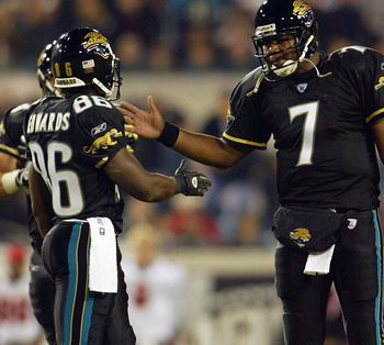
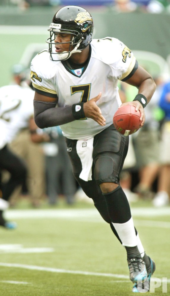
1 hour ago, DG_ThenNowForever said:
I could see why people don't love it, but I think Jacksonville peaked with Super Bowl champion coordinator Byron Leftwich:
We can cut that last image off, as they had officially* become the "Blaguars" by that point--but otherwise yeah, this (& with the white pants) was their peak. If they were to revive this, whether they opt for teal or black numbers on the away jerseys, they absolutely must have teal away pants...really all they'd need to do is color-flip the black and teal from those black pants and leave the gold trim exactly as is. Bam, bingo--done.
*as designated by the guy who grew up rooting for his central and north Florida teams.
-
5
-
-
12 hours ago, -Akronite- said:
They do use aqua and I agree the Eagles are closer, though depending on the lighting and application it's not that far off. The background "aqua" here looks nearly as teal at the Jaguar tongue, and the Jags uniforms often look brighter than most teals.
I don't think I really noticed until now how unnecessarily HUGE those collars are.
Also, those Jaguars jerseys still look like unfinished practice jerseys, with patch to boot.
-
10
-
-
5 hours ago, DG_ThenNowForever said:
Absolutely. Has any team had as many completely new uniform identities as the Jaguars have since 1996?
Maybe the White Sox back in the 80s-- but that was a different time. But yeah, the Jags at this point have far surpassed the Padres in the uni-schiz category.
As for this "teal-is-primary" thing, this only works if teal pants are primary on the road under the white tops... if not, the whole thing is a wash. (Pretty much like the organization will be if they don't figure out fast who they are or what they even want to look like.)
-
5
-
-
20 hours ago, Dilbert said:
Valpo Kernels! Valparaiso is where Orville Redenbacher created his popcorn and the city has a statue of him and a popcorn festival every year
You might be onto something here. Flip it to "Colonels" as a double entendre and you're working with something...
-
3
-
-
10 hours ago, Yac12 said:
Proposal made to look at designing a new flag for the city of Nashville, TN.
https://www.newschannel5.com/news/metro-councilman-calls-for-revision-of-nashville-flag
Information from Wikipedia on the current flag.
It's about doggone time.
If it turns out looking like anything other than a Gibson ad, I'll be very impressed.
-
5 hours ago, Lights Out said:
Denver's uniforms were designed by Nike, and Baltimore's were designed by Starter.
2 hours ago, BBTV said:How do you know Starter designed them? Many teams used either in-house or 3rd-party designers and just fed the designs to the manufacturers back then. Not saying Starter didn't design them, but it's possible that all they did was make someone else's design.
That.
Those original Ravens uniforms were actually manufactured--but not designed--by Russell Athletic. Those uniforms, along with those of the Jaguars, Panthers, Buccaneers and Eagles of that era, IIRC were done collaboratively between the league and (I believe) SME Branding. I know SME created the Jaguars' brand identity; Kurt Osaki created the Ravens' and Buccaneers' logo sets and also had a hand in those specific teams' uniforms, to what degree I'm not sure, though.
Off to the side...but I miss the days when teams were free to choose their own design crews and uniform suppliers. I'm almost certain the Texans' current identity and Falcons' now-former brand identity were the last to be designed by an independent agency--Mark Verlander, to be specific (who also created the Bengals "B" mark, the refreshed Arizona Cardinals and Seahawks logos, and all of those teams' wordmarks). I doubt we'll ever see a return to those days, but a brotha can wish...haha.
-
1
-
-
The Texans are kind of a weird case to me. Their uniforms aren't bad by any means from a technical perspective, and their logo is one of the best in all of sports (that is an objective fact and as such is beyond contestation
 )...but at the same time, nothing about their look really "stands out" as distinctive, and so for even as solid a look as they have, lined up with the other 31 teams they're also pretty forgettable in that if you're not looking right at them, you'll probably forget they even exist (unless you're a Texans fan). It may have to do with their color scheme, overused and predictable as it is and was when they first picked it. At this point, though, I don't know what, or if, they do with it.
I do know this, though: they absolutely, positively, unequivocally and without any further delay, NEED to get those red socks back up under those navy pants, like, STAT.
Given what they got now, though? I suppose they could pull a Broncos and Titans (at one point) and promote their red jerseys to primary status...red over navy with red socks at home, white over navy with red socks for the away? If nothing else, at least that potential home combo would be a unique way to present red and navy...I don't know.
(While I'm on this... have the Texans ever at any point in their history worn white over white on the road?)
-
7
-
-
12 minutes ago, WSU151 said:
I'm happy with the black jerseys with the tiger accents and the tiger helmets. Going full tiger really isn't needed.
I agree with you--except that's pretty much exactly what happened in '04, isn't it?
-
3
-
-
Someone remind MiLB that one-word nicknames are not, in fact, illegal...
-
4
-
-
I give them credit for updating that tiger the way they did; that HAD to happen. But the new font they added (which looks like a hackjob of Demonized, itself a hackjob of Berthold City) just looks SO out of place. (If they chose to use that on its own, it probably could come across cleaner.)
Having lived in Nashville for almost five years, and having spent enough time at that campus and amongst its students and alumni, some of whom I still know, I believe I understand the attachment to the legacy TSU mark (and for the record, no one in town calls it "Tennessee State", its "TSU"). That said, the "Athletics" font, or something based on Handel, would've fit far better. Either way, pick one or the other, I say.
-
1
-


/cdn.vox-cdn.com/uploads/chorus_asset/file/18279863/1462806.jpg.jpg)


Minor/Independent/Collegiate League Baseball Logo/Uniform Changes
in Sports Logo News
Posted
Not even when they're pulled straight from the city's flag??
And as for their use on a baseball uniform, well...Boston just put it that on blast with those City joints (which would work really well for, say, Tampa Bay). One can draw one's own conclusions.
But yeah...yeesh on all those extra details. That feathered "M" mark looks extremely well done enough to stand on its own in one-color; but the outlines and dropshadow kill it. I'm not even going to comment on the cheesecap, except to ask if Wisconsinites feel by this point the whole "cheese" thing is played out already...? (I mean at some point people should definitely know there's more to Wisconsin than just cheese...or dairy...)