-
Posts
10,466 -
Joined
-
Last visited
-
Days Won
21
Posts posted by tBBP
-
-
7 minutes ago, GhostOfNormMacdonald said:
I can see IU Indianapolis being shortened as IU Indy in casual settings. Shouldn't be an issue, and I think it's probably a good move in the long run
They may just end up going with IUI. Rolls off the tongue much easier.
(Or at least they should go with IUI...)
-
I find it quite funny that now people are talking about how good those former Snatit uniforms were. (And they were good, in a World League kind of way.) Back before the cosplay, I remember so many people here and in other places railing on how "dated" or or played out those sets were, with several wishing for an update. WELP...
...That's just another example of "be careful what you wish for."
(Let this be a memo to those who keep railing about the Ravens or Eagles changing uniforms, too...I'll even throw the Broncos in here considering the response their new uniforms have been met with...)
-
 6
6
-
-
Boyyy some people need to take about 8 or 9 chill pills...or maybe 89 chill pills. It really ain't that serious.
-
 2
2
-
 1
1
-
 1
1
-
 1
1
-
-
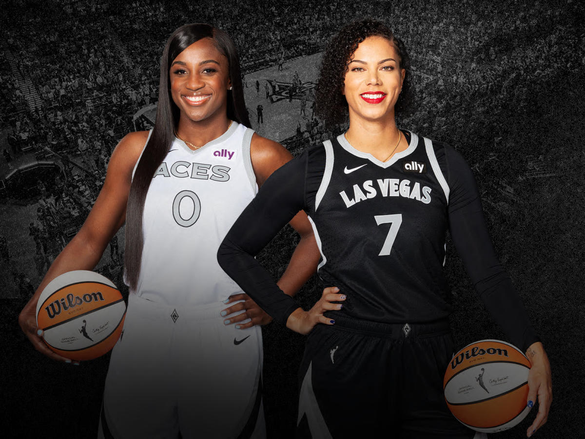
I don't know if this was already brought up, but I saw A'ja Wilson with platimum hair and what looked like a color-stripped jersey on, got me curious as to what that was, and...I guess at some point in the offseason, Mark Davis decided to do Mark Davis things with his other team and "unify the branding"...


On one hand, its an instant downgrade for me, since the red and gold "popped" so well against the black and I much preferred the vertical wordmark—that was their "thing". On the other hand, given that the Aces have pretty much played their way into being the W's "villain" now, I suppose taking on the identity of the Raiders makes some level of sense. And in a weird way, it's a full-circle thing for Becky Hammon, who played in those colors when the team was still the San Antonio Silver Stars, so there's that. They may grow on me as the season progresses.
That said...if they're gonna stack silver on top of white like that, they've defintiely got to thicken those black strokes. Make it more legible.
-
Somebody better hurry up and trademark "Harriers" before another squatter does...
-
Just so everyone is clear on this:
It isn't the use of the color itself that led the NFL to send that cease-and-desist letter to the University of Houston. They could have used light blue as a trim and been completely okay. It was the use of uniforms [in that color] that looked dang near exactly like the Houston Oilers...intellectual property that is owned by the Tennessee Titans franchise. THAT'S what got the cease-and-desist sent.
Please don't conflate the two. Let's get those two details ironed out here.
And I don't know how many people saw it, but the Texans actually got permission from both the Titans and the NFL to use that light blue color for their alts, so there's that, too.
I think there's a lot of little details a lot of people are mixing up and making errant posts about here.
-
 10
10
-
-
5 hours ago, Old School Fool said:
2032/33 - Ransom note to the city of Miami
2033/34 - Heat move to North Dakota, Dakota Culture uniform debuts
Well, their G-League team has been in South Dakota for the past 35 years, so...

-
I believe I-State (ha!) could still add an alternate
yellowgold helmet to that uniform set...they'd either have to change theyellowgold letters to red or put Cy on the sides, but either could work. I too would like to see them lean more into ayellowgold-helmeted look.By the way, fun little fact: all three of Iowa's state-named programs—the Iowa Hawkeyes, the Iowa State Cyclones, and Northen Iowa Panthers—share the color
yellowgold in common. How appropriate for a state known for, well...this??? (And I say this as a former short-term resident):-
 1
1
-
 1
1
-
 1
1
-
-
Can someone remind these teams that games are played in the light??? For once I'd like to see a reveal video in the same conditions as the game will be played in...and it sure as heck won't be in no coal mine down Beckley nowhere...
-
 4
4
-
 1
1
-
-
3 hours ago, Silent Wind of Doom said:
This Tampa Bay City Connect has taught us all about parts of the local culture none of us were aware of. It's what the program should be.
Those of us who were born and raised in Florida knew about it, and it's not unique to Tampa (Bay). However, Tampa does have certain things dedicated to the culture. All that said, and I may write up a full critique on all this later, this Tampa Bay CC may be the biggest hit in terms of total impact since since very first CC, that being the Red Sox's Boston Marathon-inspired alts. I may add in the White Sox's CCs as a second total hit. I still think the Rangers' CCs might be my favorite of these alternate uniforms; however, in terms of alternate identity, however (I'm talking in terms of art direction, mostly, not really the uniforms themselves), yeah, nothing's touching Tampa right now.
3 hours ago, Silent Wind of Doom said:And it points out how much of a complete failure Philadelphia's is.
Tou-dang-ché there, pal. Touuuuuché.
-
 3
3
-
-
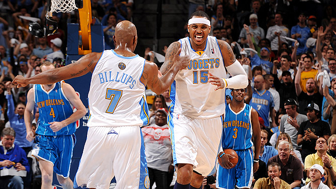
I'm curious how many of these what-unifoms-to-wear decisions are made in-house versus whatever "push" the NBA/Nike may be nudging onto teams externally...and I know this may be different for every team, but I've long wondered about that. I mean, TV exposure is promotion regardless, but still...
....Now that to the side, not one home white uniform, Denver? (And good Lord, I just realized the counters of many of those letterforms are rounded rather than squared off in certain instances...they may need to revisit that at some point.)
-
 3
3
-
-
2 hours ago, JayMac said:
The Eagles look has been dated for about 10-15 years. They really need an update.
How so, do you think? And what's your idea of an update?
-


It'll never get better than that.
-
 16
16
-
-
4 hours ago, bushy said:
I’m in the minority, but the rainbow jerseys are super overrated to me. Better than what they have now, but I don’t get the appeal. I can’t even say it’s because I didn’t grow up with them, because there’s plenty of other 80’s-90’s jerseys I prefer. Tbh, I prefer mostly the classics than the current sets. The rainbows just do nothing for me.
Everything from 2003-2018 Nuggets was my favorite.
Are you talking about these?


Yeah, trash-bagginess aside, I remember liking those when they first came out, simply because (for Denver) it was so new. That navy alternate was especially sharp. And of all the major-pro sports teams that chose to rebrand to some form of navy-and-light blue in the 2000s, Denver might have pulled it off the best. Sidenote: I think they were also the first to do the two-blue plus yellow...only to be followed the very next season by the dang Memphis Grizzlies (who actually used three different shades of blue back then, plus yellow, and now plus gray) and then the Tampa Bay Rays in '08. Of course the Jazz also rebranded to double-blue somewhere in the '00s, too. But I think the Nuggets really jumped thay trend off, even though the Tennessee Titans Snatit were the first pro team to do navy and light blue in the recent era. (I say that because the Pittsburgh Penguins also did the two-blue thing in like the '70s or something like that, I think briefly.)
Anyway, my point to all of that is that it was a good distinctive look for the time, but looking at it now, it didn't hold too well. What they have now is a cleaner set...even though it could use some tweaks to look a little less jumbled. I will say of the current brand that I greatly appreciate how their current team font is a faithful (and far better) update on the Aachen Bold they'd been using since like 1993 or something up through somewhere around like 2016 or something like that.
Maybe one day I'll write up a full synopsis on all this...but for now let's all appreciate the current nuggetjacking now taking place.

-
 4
4
-
 2
2
-
-
28 minutes ago, FiddySicks said:
Oh great. These are all terrible. And you know that the very worst one of them all, Yetis, is ABSOLUTELY going to win in a landslide.
Is going to? My brother, it done already won...it just ain't "official" yet. (They ain't fooling nobody with this naming contest...Smith n' em done already picked the name.)
 5 hours ago, Foxxtrot44 said:
I will accept the Yeti name on the condition that the aesthetics lean into the ski/winter sports styles of the late 80's and early 90's.
That means the Yeti will need to be in a cool pair of polarized sunglassesand that the color scheme will be

Ryan Smith gets his highlighter color. Fans get a local culture connection. Kids get a silly name. Hockey purists get to choke on their tongues at the utter steeziness of it all. Win-Win-Win-Win.
I am not a crackpot.
I'm getting some serious 1998 Jacksonville Lizard Kings vibes from this colorway...


(Yes, these were real, and yes, they were really worn on the ice. But good luck finding any on-ice photos of that '98 black alternate, my favorite JLK sweater and one of my favorite hockey sweaters of all time, period.)
-
 4
4
-
-
I read @Chromatic's post as a tongue-in-cheek sarcastic response regarding Denver's (or pehaps Nike's) need to continuously push this 5280 thing as a sub-brand or something, as if its like this big huge deal. The City of Denver doesn't even do that! My point in responding is that at least one other semi-large US city has a higher altitude--but it doesn't brand itself by it! (At least not yet; we'll see what the Lobos do in the coming years.)
@Chromatic if I read your post wrong, feel free to correct my interpretation.
-
 1
1
-
-
6 minutes ago, Chromatic said:
Why does it have 5280? Does that number have any significance to the city of Denver?
On a completely unrelated note, does anyone know Denver's official altitude? I know its probably never been discussed before, but I sure wish cities would spam their official distance from sea level at every possible opportunity so we never forget how thin the air is there.
Well Denver better hope that neither Albuquerque nor especially Santa Fe ever get a top-pro basketball or football team then, because both of them have Denver beat in the altitude game...
SpoilerAlbuquerque: 5,312 ft.
Santa Fe: 6,998 ft.
-
This may well be the first time in recorded human history that TAMPA BAY has broken the internet...
-
2 hours ago, bowld said:
Wiggins will wear #2 for Baltimore
Time out...where's Tyler Huntley, then?
-
1 hour ago, The_Admiral said:
I have never once heard that the Tampa Bay Devil Rays were inspired by '60s drive-thrus.
Let me clarify: I don't mean that it was that...that's just what it always looked like to me. (And that's only because it's the closest thing I can think of to what I actually think but have never really been able to put into words to...)
-
3 hours ago, JohnnyCowboy5 said:
All jokes to the side, this may form the basis of a pretty nice full-on rebrand...to include the Skyrays nickname...
-
 5
5
-
-
And back to the Mountaineers right quick...


... That was peak WV for me. I always liked how the jersey stripes/panels ever so slightly connoted the idea of a W and a V without actually "screaming" it.
And no, I'll hear no arguments on this...don't @ me, bro.

-
 5
5
-
 2
2
-
-
1 hour ago, coco1997 said:
Rays City Connect sock leak:
Looks like they’re going all-in on the gradient.
While I will always have a soft spot for the 60s drive-thru-inspired original branding, I will--TIME OUT...are they trying some type of "flame" pseudo-Heat Vice type of stuff here??? And is that a mashup of the Sunshine Skyway bridge mixed with a front-facing manta ray I see in that lower right-hand pic??
Okay, Imma have to keep my eyeballs on this one here...
-
 1
1
-
 1
1
-
-
7 hours ago, DCarp1231 said:
New uniforms for West Virginia
GoMart? Really though?? They actually have enough cash flow to sponsor something like this???*
Spoiler*That's a joke, btw...anyone who's been to/through WV knows what's up with that. You ain't neer been to a single GoMart that looks like it's had a remodel in about 20 years...especially not the one on McCorkle in east Charleston...
6 hours ago, DCarp1231 said:Okay...I'm feeling those, Wyo. And @FiddySicks I too feel like that's what the Broncos tried to do--and ended up falling flat on.
-
 2
2
-


:format(jpeg)/cdn.vox-cdn.com/uploads/chorus_image/image/19383673/20130831_pjc_ax4_098.0.jpg)


.jpg)
.jpg)


2024 NFL Changes
in Sports Logo News
Posted
The uniform design, while rather basic, was really never the problem with the Texans. Their main problem was (and still is) their colors...yeah yeah Texas flag all that, fine, but if that ain't just about the most overused colorway in spo—anyway, even that colorway could be salvaged if they were to use it in a unique way.
The Memphis Express had the right idea...