


tBBP
-
Posts
10,507 -
Joined
-
Last visited
-
Days Won
21
Posts posted by tBBP
-
-
Can anyone tell me what font is used for "JACKALOPES" in the logo here?
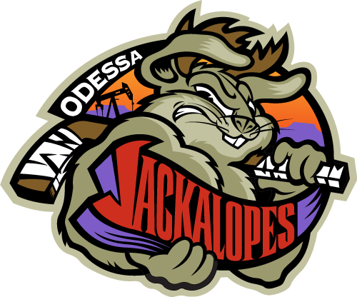

Bugs Bunny on steroids???
-
Is that the original logo? If not, post the original version.
If it is, about the only thing you gon' be able to do with that is actually redraw the letters, if you don't have whatever font that is. And even if you do, you'll have to convert the text to outliines in order to achieve the pointed edges going on with the letters there.
-
There's several ways you can do it. I can't remember how to do this (I got a tutorial somewhere on one of my computers, but I'm sure you can find one online), but I actually created a brush composed of a bunch of oval shapes. I then drew a brush pattern large enough to fill , say, a box or so, and saved it. I then took the shape of the mesh (take, for example, the front panel of a football jersey), put it over the brush pattern I created and made a clip mask out of it, and then moved that mask back over the part of the jersey I wanted to make look like mesh.
Hope that helps a little bit.
The other way, I suppose, would be to, like you said, do a step-and-repeat process. (There's actually a shortcut way to do that in Illy, but I haven't done it in so long I can't even remember where to tell you to start looking.)
-
No it isn't. A pencil and some paper is.

No--seriously, it depends on what you can do with it. Some posters in this community can achieve high-quality work using the free vector program Inkscape. Others have even done so with basic Microsoft Paint. There are other programs out there, though, such as CorelDraw (I think that's Corel's vector program), and if Macromedia Freehand is still floating around out there, it's another vector program (though personally, I'd stay away from that one). No matter what it is you're using, though, attention to detail is probably the single biggest selling point.
Ultimately, the thing to remember is that all these different software programs are but tools used to help "refine" logos or whatever other designs you may come up with and bring them to "digital" life. Now granted, some people have the advanced skill to create sketches on these software programs and go from there to the finished product (how I don't know, but some do). But, the best place to start is right there on your drawing pad.
-
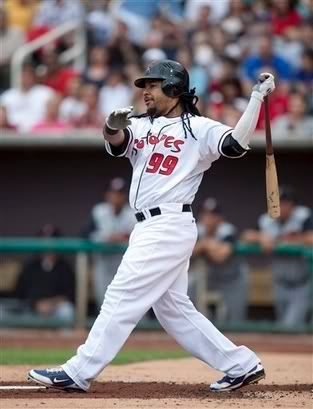
For anyone wondering, the jersey lettering says Isotopes. It's Albuquerque's minor league team.

I'm pretty sure anyone who was watching the College World Series yesterday knew that...with as much as they was talking about him and his every move, breath, hop, skip, and jump yesterday prior to, during, and after the game...

(Seriously...ESPN really needs to cut that mess out.)
-
art monk......
yuck......
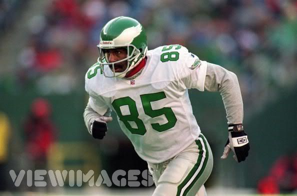
Don't forget his other green-and-white stop...

You know, pretty much an entire thread can be devoted to "legends who done somehow ended up in a New York Jets uniform".
See: John Riggins, Ronnie Lott, Brat Farve...
-
I apologize for not filtering through 35 pages to see if Danny Ainge the Blue Jay was in there...

Now THAT...really came out of the blue.
(pun totally indended.)
-
It's the Colorado Avalanche proprietary font that Eriqjaffe has in his signature.
Not exactly. But unless you got a magnifying glass and a protractor, you probably couldn't really spot the "custom" differences with the Avalanche's numbers.

About those numbers in the picture (which I see entirely too much in the HBCU world, BTW), Bodega Sans is what you're looking for. (And I don't doubt there's a freeware version out there somewhere, though I have no clue if it is.)
-

See how the edges are crinkly?
How do I create that in Illustrator?
Is it a brush? Or style?
I don't see why you couldn't use a brush to replicate that.
-
A friend's daughter is named Victoria, and wants to create something in her room with this (not the "Gift Bag" part):

Any idea? Thanks.
that looks like Times New Roman to me.
Look like Trajan. If it ain't Trajan, then it's mighty close.
-
Hi!
Can somebody name this?


Look like some jacked-up inkblot version of Aachen. I betcha dafont.com probably has something similar to this somewhere.
-
Could someone tell me the font used for MLB The Show 08

Appears to be Compacta to me.
"MLB 08" looks like Compacta to me as well, but I think "The Show" looks more like Eurostile Bold Condensed.
Upon closer inspection...you may be right.
Aiight JP22...where you at mayn???
-
Could someone tell me the font used for MLB The Show 08
Appears to be Compacta to me.
-
Klavika, from Process Type Foundry, is the typeface that Chevrolet uses for all of its advertising and collateral materials.
That's the one. Big ups to gordie_delini. I will most definitely be throwin' down some change for that font family there.
-
Need some assistance...
...Somewhere, out there in the font world, is a font that's very similar in style and feel to the one that Chevrolet uses. Someone posted a picture and a link to it somewhere in this forum but I cannot for the life of me remember where I saw it. I know it exists because as I'm typing this request, my fingers are striking the letters of that font (it's on my keyboard). FWIW, I'm on a Toshiba Satellite L305-S5907 laptop.
I wanna say it was like Utica or something like that...can anyone out there help a brotha out??? Many thanks in advance.
-
Stupid question, but on Illustrator CS1, for some reason I'm not able to resize/rotate an object. It just comes up with all the solid blue points, with no surrounding box to edit the size, etc. I realize I can use the free transform tool, but that'd be a pain. It showed the resize box always before, but just recently stopped. How can I fix it?
That mess happened to you too? Good to see I ain't the only one who that done happened to.

(Look up a couple posts above yours and you'll my my similar episode.)
-
HELP!!!
I got a issue going on here...that's bugging the crap out of me!
Okay...first, what you need to know: this issue exists with my Ully CS2 for my Mac. For whatever reason, my selection tool (regulat black arrow) is acting up. You know how whenever you go to click on and select an object with the selection tool, that "transform" box usually comes up around it (that allows you to resize, shrink, scale, or warp an object)? Well...I don't know what I did, but mine ain't doing it no more! I looked through the Preferences trying to find out what's up...no dice. When I go to click on an object, it selects only the object, but won't let me transform it at all (almost like the direct selection tool, only without being able to click directly on a path or a point.)
Hopefully someone out there can help a brotha out with this here...cuz this is bugging the living hell out of me!!!
Thanks in advance...
~Buc
go to view > show bounding box. you must've hit Cmd-Shift-B by accident.
That musta been what i did--I knew I hit something wrong. That did the trick. Good look big homie!
-
HELP!!!
I got a issue going on here...that's bugging the crap out of me!
Okay...first, what you need to know: this issue exists with my Ully CS2 for my Mac. For whatever reason, my selection tool (regulat black arrow) is acting up. You know how whenever you go to click on and select an object with the selection tool, that "transform" box usually comes up around it (that allows you to resize, shrink, scale, or warp an object)? Well...I don't know what I did, but mine ain't doing it no more! I looked through the Preferences trying to find out what's up...no dice. When I go to click on an object, it selects only the object, but won't let me transform it at all (almost like the direct selection tool, only without being able to click directly on a path or a point.)
Hopefully someone out there can help a brotha out with this here...cuz this is bugging the living hell out of me!!!
Thanks in advance...
~Buc
-
And now they're up. Have fun with them!
-
The funny thing is that I used 'Drew's uniform temp as a basis for mine. My latest version is actually a mash-up of a previous one I've had for a while and Drew's temp.
BTW...for all those of you who've been asking about my action temps...in a few days, those should be made readily available. I ain't forgot about y'all out there...just ain't had the time to fine-tune them the way I've wanted.
-
Anyone know the font used for the "Ports" script? I used to have it a few years ago on my old computer, but can't remember what it's called. I know it was free, and I remember there being 2 that were pretty much the same thing, only slight differences. Any help would be appreciated. Thanks.

This actually looks like two different fonts in the same word--which actually is a very poor choice in direction for whoever did this.
The "P" looks to be a font called Marker or something like that (run a search on "Marker" and see what comes up--I can't remember it off the top of my head). The rest looks to be some type of script--and a very jacked-up one at that.
Hope that helps.
-
I'm looking for help to identify the font used for these numbers and letters. I appreciate the help anyone can provide. Thank you!!


Agency FB Bold
Fiasco...JP (slapshot) done anointed you as his heir apparent or something, mayn??
-
I'm working on an anniversary graphic for my student newspaper, and I've been stumped by what I'm sure is a simple question: how do you make vertically arched text in Illustrator?
Yeah, I'm daft.
Simple solution? Type out the word. Then in the Menu go Effect > Warp > Arch...
...from there, select the "Horizontal" radio button, and then start playing with the slider to get the arch that you want. (Move the "Warp Options" window out of the way of the word so you can see what you're doing.) Check the "Preview" box to see what it'll look like. Once it gets to where you want it, hit "OK". BAM!
*NOTE: All "warp" options can be done without having to convert text to outlines first--very helpful tip for those who wish to create templates and such without having to type/redraw numbers every time--unless, like me, you keep coming up with unique fonts and such.
-
Anyone recognise this font. The V is very unique

Anyone any clue??
I wanna say that's Baskerville. I don't remember all the different weights, but that might be semi-bold italic.


Name That Font!
in General Design
Posted
I just now realized how retarded that looks.
I mean...it might look better if there weren't so many layers involved...even WITH the crazy spurs and serifs...but two outlines AND a dropshadow??
Can you say visual overload??