


tBBP
-
Posts
10,507 -
Joined
-
Last visited
-
Days Won
21
Posts posted by tBBP
-
-
Well considering my Seminoles ganked their now-iconic spear helmet design from the Washington DC football team in the first place...

-
I'm looking for that font (Script and numbers):

"Tuscan" will get you close on the chest script.
The numbers look custom...like the characteristics of Tuscan were edited into another stock font.
-
Not quite...
Didn't seem so unique when the Warriors, Wizards, Hawks, Diamondbacks, and Mariners were wearing variations of it.I actually love the [Ravens'] font. It is unique and very cool.

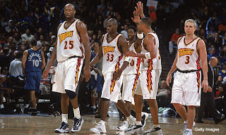


The Ravens, Dbacks and Mariners all use custom variations of Matrix; the Warriors and Wizards were variations on (what Im pretty positive is) Friz Quadrata a.k.a. the "Cincinnati Bearcats" font; the Hawks used (what looks like) Benguiat Bold.
And you know what--let's go ahead and throw the Atlanta Thrashers into this (with group A)...
-
Indy already has the Indians minor league team (AAA affiliate of the MLB Pirates, for what that's worth), and they're usually one of the better teams in their league. They play in a very nice stadium too, with a view open to downtown.What about Indianapolis? I'm not too familiar with the stadium landscape. They obviously can't use Lucas Oil, but is there a demand for ball there?
So in that vein, I don't see MLB ever coming up in here. That, added to Cincinnati being 100 miles east/southeast, Chicago about 160 miles north/northwest, St Louis 250 miles straight west--and transplants from all those places, and more, living up in here who I don't think would give up their preexisting allegiances to their hometown teams.
Then there'd be the issue of building a park for an MLB team, which is a discussion that ain't even worth having around here (if you live here, you know why).
-
Also, there's the whole nowhere for them to really go thing.
Sure there is...its called Victory Field.
Sike.
If any kind of move gets tossed around, I think most of us would prefer to see some new incarnation of the Montreal Expos. Failing that, sheeit--I don't know. Tokyo, maybe?
-
Is that with, or without traffic? And/or with, or without, all that daggone construction that's going on around there? (Or was, last time I went through there a few months ago.)'Sconnies do take their tailgating quite seriously. Plus there's a great bar within an easy walk of there. (...and, I'm sure, about twenty more I don't know.)
I'm not sure that a 5-10 minute drive from downtown is really all that far, though.
Either way, I kinda get what people are saying about Miller's location. Having passed by it a few times myself via I-43/894/whatevertheyrecallingitnow, it does kinda seem detached from the rest of the city by being out there all on it's lonesome...almost like the Palace at Auburn Hills that way (though not nearly the same distance.)
But then...also having been in and around downtown Mikwaukee (the first time by accident--and don't even ask me how that happened, I don't wanna talk about it), short of cannonballing some of the existing buildings/infrastructure, I also don't see where else they'd have been able to build a park downtown.
-
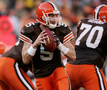
There you go right there, Browns...what's so hard about this? With proper matching road socks, even!!! (Needs the gray masks, though.)
They could designate this as their primary look tomorrow, and automatically infuse new life into their identity without even adding or subtracting anything (except those white pants).
Make this happen, Mr. Haslam. I'll even keep buying fuel from y'all.
-
*this space reserved for Ed Reed in Houston Texans uniform*
-
I think the fine folk of Atlanta GA might have something to say about that assessment...
-
Most are missing the point if you're looking for refreshes that then failed. I didn't miss the point, I just don't think there are that many that fit the definition. I thought ValuJet did a version of this without the so-called "critter" (cartoon plane) after the Everglades crash but I couldn't find an example.
For those unfamiliar with what happened to them, ValuJet was acquired by AirTran which has since been bought by Southwest.

Ehhhh....I remember it being just a tad bit more complicated than that, from what I understood at the time (my ramp-rat days). Back in '92, a couple folks from the then-newly-defunct Southern and Eastern Airways banded together to form ValuJet (with just two planes, mind you). A couple years later, another group of former Eastern Airlines associates banded together to form the first iteration of AirTran Airways, which was previously known as Conquest Sun--AirTran Corporation bought it up and renamed it (I wanna say around '94, but I don't feel like digging up my Airline Football League Concept Series notes to vet any of this stuff right now--plus I can't find them right now anyways
), and moved its HQ down to Orlando. Here's where the complicated part comes in: ValuJet's holding company, ValuJet Inc, actually ended up acquiring AirTran's holding company, then known as Airways Corporation, then renamed its own airline, shortly after all that Everglades mess, to AirTran Airlines, so for a short while two airlines, AirTran Airlines and AirTran Airways, were flying around with dang-near the same name. Eventually ValuJet Inc. and Airways Corporation merged under the same certificate, I think this was '97, and the new entity rebranded itself as one singular AirTran Airways. (And after that 592 disaster, I can see why they wanted to distance themselves from that as far as humanly possible.) Airline history...gotta love it sometimes, eh?Looking at rebrands that failed, I would nominate Oldsmobile:

Oldsmobile had very strong brand identity and brand loyalty in the 80s, with the streamlined straight-line rocket logo, having a market place of being more luxurious than Pontiac or Chevy and more performance-oriented than Buick or Cadillac. In the mid-90s, GM sought to refresh the brand against foreign imports by dumping the Cutlass and the 98, moving to the logo on the right, and muddying the identity by downplaying the rocket/V-8 performance history (did you know that logo on the right is supposed to conjure images of rocket-fast speed?) as they emphasized Pontiac as a performance model and downplayed the luxury elements in comparison to how they kept marketing Buick.
They were gone for good in 2004. They even made good cars and still had lingering brand loyalty, but rebranding to make yourself more generic seems like a recipe for failure. It's kind-of what happened to Pontiac later on when they decided to make Pontiac the producer of the Aztec and the Vibe.
Oh dear...dastard GM, in failing to market it right (like you said) chose to kill it off, for shame. I remember, like you said, good ol' Olds DID have a super-strong following and brand loyalty (including me), so why GM chose to axe Olds and not Buick belies my comprehension--but I think that's more sympomatic of GM not knowing what the hell it was doing back in those days, with any of its brands, let alone Olds. As for that updated logo up above, if I remember right it was actually inspired from the logo they created for their then-intended-to-be-all-new-flagship Aurora, one of two cars GM built on its then-new G-platform, which I believe was originally supposed to underpin a new Cadillac supercar, only to end up underpinning the Aurora and it's frame-rail twin, the 2-door eigth-generation Buick Riviera. (I used to own one of those Auroras--this was mine--and loved every cubic centimeter of it--in fact if not for the fact that 4.0L Northstar-derived twin-turbo 250HP motor required 93 octance, I'd have probably traded my 4Runner back in for another one a while ago...you'd be surprised how many of those I've seen for sale all around Indiana.) At the time Olds desperately needed the Aurora, because I remember at that point in the '90s about the only Olds people cared about was the Cutlass (this thing, which in and itself was seventy different kinds of awesome--they're also hard as hell to find these days)--but again, that was really GM's fault both for getting away from what made Olds, well, Olds, and for the rampid "badge-engineering" they became notoriously famous for about the time that Aurora came out (you can only build the same car so many different ways...no amount of differing name tags is going to help that--mid-late '90s Buick Century and LeSabre, anyone?), not to mention blurring the lines between its own brands, particularly Buick and Oldsmobile. I think Olds/GM fell so in love with that car that every other Olds that came after it took cues from that car, and for that matter, so did the badge-twins of those cars, (in particular the Pontiac Grand Am, from the Alero, and Grand Prix/Intrigue twins). But yeah, to your point, GM/Olds effed up badly during the '90s...again, for shame.
-
 1
1
-
-
I need some fontologist assistance, please....specifically, the word "SCOTS":

This appears to be the same font the Philadelphia Union use (which is really what I'm looking for)...and three different times in the past two weeks I've seen "PLEASE PLACE ORDER HERE" signs hanging above the counter at Subway typed out in the same font.
Anyone in the world know what this is? I've been searching for a while now.
Many thanks in advance to whoever knows!
So...any takers on this one here??
-
Anyone know the font used for the scripts on this fantasy set?
Looks to me like Home Run, by Doyald Young.
-
I need some fontologist assistance, please....specifically, the word "SCOTS":
This appears to be the same font the Philadelphia Union use (which is really what I'm looking for)...and three different times in the past two weeks I've seen "PLEASE PLACE ORDER HERE" signs hanging above the counter at Subway typed out in the same font.
Anyone in the world know what this is? I've been searching for a while now.
Many thanks in advance to whoever knows!
-
The Tmberwolves will always be Garnett's "right" team in my mind. He played his best years in Minnesota.
The young man with the long-ass username is 100% correct here. Smart guy.
It'd be something different if he split his years between Minnesota and Boston, but that ain't thethe case. Mr. 20-10-and-5 made his name in Minnesota. And plus, he's only been a Celtic since what, 2008? Someone else tried to argue this same thing about Ray Allen somewhere back in this thread?that his Celtics uniform is right, and his previous two wrong, simply because he got his 'shipin ring in Boston. In the eyes of most, Ray's a Buck before either of the other two.
I really wish people would stop using championship as the absolute criteriin for "right" or "wrong".
-
Shoot, I wouldn't mind, either.
(Email sent via PM)
-
Wanna see something all the way wrong? How about this blast from the past...
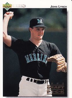
That there would be RHP John Lynch. As in former longtime Tampa Bay Buccaneers SS John Lynch, who was actually one of the then-expansion Florida Marlins' first draftees.
(Fun trivia fact: Lynch actually threw the very first ever pitch in the Marlins' organization. Funny how some things turn out, ain't it?)
-
To me, Ray Ray looks strangest as a Buck.
i guess it depends on how old you were when he played for the Bucks. He made his name with that team with teammates Sam Cassell and Glenn Robinson. Looks right to me. Personally I don't think he looks strange in any of the 3. He spent a good chunk of his career and made an impact in all 3 cities.
I compare it to Johnny Damon when it comes to KC, BOS, and NY. Could make an argument for all 3.
THANK YOU.
It's about time someone set perspective straight on this. (And I seriously thought I was the only one who remembered John Damon was originally a Kansas City Royal. Almost like people forget Jermaine Dye and Carlos Beltran came from up outta there as well.)
Also...so what is it?just because a player won a championship in one uniform makes that the "right" one? I don't buy that?I don't buy that for Ray Allen, I damn sho' don't buy it for Kevin Garnett (there's a debate for you). And after all, remember, Trent Dilfer won a SB as a Baltimore Raven...does that make the Ravens the right uniform for him, too?
Although...in the interest of fairness, I suppose Drew Brees presents a compelling counter-argument. But then, I bet most folk have all but forgotten by now that Brees started as a Charger for four years (?)...but almost singlehandedly lifted the Saints from obscurity to national relevancy. (That SB win might've helped with that just happened a lil bit...
) -
Do He Still Hate Him?Rod Smart
-
I'll play. And I'll caveat the whole thing by mentioning I'm a born-and-raised Florida boy, as most of y'all know.
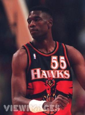
Tampa Bay Buccaneers (obviously) - I was initially a Cowboys fan--but that was only because of local boy Emmitt Smith (who was born and raised in Pensacola, though no one back home really a/ cares for nor b/ claims him). My then-stepdad was a Packers fan, and I remember watching a Packers vs Buccaneers game and being attracted to all that bright orange...been hooked ever since. Of course, I also happen to have okay, I had a blood-tie to that team via a certain longtime linebacker who just happens to be my first cousin--some of y'all might've heard of him, wore #55?
Florida State Seminoles - If you grew up in the Florida Panhandle, your options were Florida or Florida State. Long story short, I liked FSU's colors better, started following them as a young'n as well, and when they won that 'ship in '93, I was all-in...especially since that same linebacker/cousin of mine I mentioned above was also a stalwart of the Seminole defense during that time. (Not for nothing, but I'm also kind of a failed alumnus of the school.)
Argentina National Team (AFA) - this one happened during my first overseas deployment. I used to play the game in middle school, and seeing so much of it on what TV stations we could get over there rekindled my interest. Anyway, I just remembered seeing the same team a lot, remembered the blue-and-white striped jerseys, to where I'd pay attention to them (eventually I figured out it was Argentina) anytime they were on, and really enjoyed their style of play. Watching the international game also rekindled my interest in American soccer too, which leads me to...
Philadelphia Union - I was stationed out in Maryland when the Union were born. Previous to that, I paid a lot of attention to DC United (because, you know, they were kinda like right there), but then the Union were introduced in '09, and I instantly fell in love with the entire identity-colors, logos, uniforms, everything. Been a fan from the beginning, still a fan today.
I've never really had a favorite NBA team, but that's because I've never been a big NBA fan. But, the two teams I always paid attention to growing up were the Chicago Bulls (Jordan, Pippen, *insert supporting cast here*), and the Milwaukee Bucks, chiefly due to Ray Allen, who I remembered watching when he was at UConn lighting it up, but also because of Glenn "Big Dog" Robinson, who I remembered watching from Purdue. Seeing them on the same team was great (I'll also admit to liking their purple-and-green uniforms and LOVING that green alternate)...and Ray Allen was then and still is my favorite NBA baller of all-time.
As with the NBA, I've never been a big baseball guy, either--but that's because I was force-fed Braves baseball growing up, through both the hometown newspaper and the local news station, as if baseball in general and the Braves in particular were the only sport and team that existed in the world--until Friday night football rolled around. Either way it goes, the two teams I've always found myself never rooting against were the Pittsburgh Pirates (and that was before I moved up there) and, for some strange reason, the New York Mets, probably due to being so sick & tired of being force-fed Braves all day long and night. (As a caveat. I don't hate the team at all...still followed them in the '90s, just never became an actual fan. I did, however, LOVE that Mets alternate black jersey and hat back when it came out in '99...now, not so much.)
I have no favorite hockey team, I just watch the game. I do have a favorite sweater, though...that third jersey of the Columbus Blue Jackets. Love that thing.
-
I also hate white football helmets, for the most part. There are some rare exceptions where white helmets do look fine (Texas Longhorns, for example). But helmets should display a team's color, other than white. I mean, imagine if baseball helmets were white.
Imagine if football uniforms had grey shirts and grey pants. Every sport has its own conventions.
Have you not been paying attention to college football lately?
-
Been looking for this one here...but can someone help a brotha out with the serif typeface used by the Philadelphia Union?
Many many thanks in advance...
-
Does anyone know which two fonts are used in the Memphis Grizzlies Logo??

There may be a closer true match out there that I just don't know about, but other than that, both of those scripts as wella s the Grizz's jersey numbers look like a doctored-up version of DIN. (For what it's worth, it also looks like both the Cincinnati Bengals and now the Detroit Lions use their own respective doctored-up version or other of that same font for their nameplates and jersey numbers. )
-
I vastly prefer the Cowboys' silver-green-blue to the regular silver....I just wish their helmets matched.
I too prefer the greenish silver. I, too, wish the helmets matched.
Dark royal + greenish silver = win in my book. (Not the super-duper-greenish silver of current, but something a little closer of that of the Carolina Panthers.)
-
Unpopular opinion or not, I actually thought the 49ers through the mid-late 90s up through the season before last were the perfect example of how tasteful addition of black trim enhanced their uniforms' appearance. The drop shadows added a "western" feel, to me anyway. The only thing I really found wrong with the previous set was the incongruity of the pants and helmet stripe (that is, the red offset by thin gold on the pants, which wasn't present on the helmet stripe). I didn't even so much mind the darker cardinal. Actually felt they were among the sharpest uniforms in the league. In retrospect, I still do.

Minor/Independent/Collegiate League Baseball Logo/Uniform Changes
in Sports Logo News
Posted
I can see that. For one, check the highlighting...on the other two scripts there's also an extra thin white outline, and those highlights are thicker. (In addition to being set in what looks like Berthold City...PDW do these, anybody know?) On that script, the highlights are much thinner and flow better within the letterforms--which themselves are more refined.
So yeah, I wouldn't be surprised at all if two different people/groups/elements did different parts of this.
(Speaking of...that actual Neptune character could use a LOT of refinement...that's way too much detail for such a tiny space.)