


tBBP
-
Posts
10,507 -
Joined
-
Last visited
-
Days Won
21
Posts posted by tBBP
-
-
1 hour ago, reb_fan_23 said:
Ole Miss fan here, and I have to agree with what others have said. The powder blue jerseys with the white pants did not work. Should have worn the gray pants. Yes, the navy stripe on the gray pants would not have “matched” but that’s sort of the point.
IMO what makes the Ole Miss powder blue helmets so great is that powder blue is not necessarily a throwback color for us in the same sense that other schools have throwback colors (think Pitt with the royal blue or Oregon with the Kelly green). Powder blue was never a school color for Ole Miss. The football team just happened to order the wrong color helmet when they first switched from leather to plastic. The team then intentionally wore a mismatched helmet for the next 20+ years, which included probably the program’s most steady success. It’s a neat quirk that I think deserves to be honored by wearing the powder blue helmets a couple times per season. Personally, I would leave it there, but the players have been clamoring for a powder blue jersey and they seemed to enjoy them.
The original powder blues in action:

So Ole Miss' uniforms have been jacked up for that long???
Whatever...they're still weirdly one of my more favorite looks in CFB, for reasons unknown to mankind.

-
 6
6
-
-
2 hours ago, aawagner011 said:
Not a fan of the Ole Miss alt. It’s overkill and too much of a color that’s not typical for them. The powder blue helmet worked when worn with the red and white jerseys because it was a small part of the overall uniform and it highlighted the red on the jersey and pants. It worked because the total package was traditional and cohesive. This powder blue jersey is totally disconnected from everything else. The helmet has a lot of red but there’s not a lick of it on the top or the pants. Also, the helmet has always looked like it has a hint of steel blue in it but the jersey is straight up sky blue. Wouldn’t miss them if we never saw them again. Don’t get me wrong, though, Ole Miss should make the powder blue lid the primary. It’s one of the best in all of college football.
I definitely wasn't expecting those jerseys to be THAT light a shade--then again, sunshine is what it is. But I also believe we're looking at something that could well serve as a base for a completely reversioned Ole Miss identity overhaul--across the entire spectrum. With so much change abounding in the state now, this would be a perfect opportunity to adopt the egg blue (or whatever they call it) as their official blue in place of the navy.
I think Lane Kiffin's jersey is also probably closer to their ideal shade of egg blue (it also shows how different the two shades are):
-
1
-
-
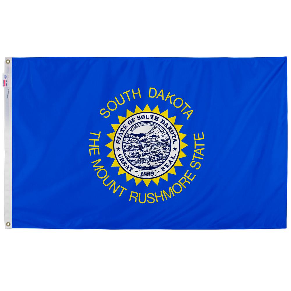
2 hours ago, DTConcepts said:
I know it's South Dakota, but having "The Mount Rushmore State" on your flag isn't doing your state any favors.
Boy what you said!
(And plus, once one learns the history behind Mount Rushmore in the first place--not to mention the Black Hills in general--one maaaayyyy not be so quick to tout that about so freely.)
-
2
-
-
Late like Kanye here, but I really feel like they missed a golden opportunity to really stand out and forever press forward a fresh new image of Mississippi. (And trust me, I know the history well, haing grown up barely two hours from there.) Of the original nine finalists, the middle-bottom one really showed the most potential to be super-distinctive--but then, why should we designer types expect bureaucrats in suits to know what unique and distinctive flag design looks like? That said, given that it looks as if they were benchmarking the great seal of the US, the winner was definitely the best of what was left.
Now, since we're still having fun with flags up in here, can we (re)do South Dakota's next? Because um uh....
...yyyeah.
-
1 hour ago, hormone said:
Are these city editions? Cause I see no reason a blue/yellow team called the panthers need a “steel” uniform with a patch of someone forging metal.
Nike gonna Nike.
And here I thought they were done unnecessarily graying out CFB...silly me.
-
11 hours ago, SSmith48 said:
Looks like new powder blue jerseys for Ole Miss. Should look nice with the powder blue helmets!
I've long thought that Ole Miss should look at adopting that egg blue as their primary blue in place of navy. Now I'll get to see how that looks on the field.
-
On 9/12/2020 at 2:34 PM, SSmith48 said:
I know huge numbers are a trend, but Charlotte, on top of the pale gold, have numbers that are obnoxiously colossal... double digits take up the whole back!
7 hours ago, SSmith48 said:I can see where you're coming from, but even still I think they need to be downsized. They look very amateur with their size. Or they should switch to green, which would vastly improve the look.
I also think that the shade that UAB/Under Armour uses is a bit darker than what Charlotte/Nike uses (not sure though, can someone confirm?). My old high school team wore new Nike uniforms for my last year, and the shade of gold is much more of a dark off-white than a gold color. If it's worth anything, I would prefer UAB in green numbers as well.
-
I've been by and through Beloit more times than I can remember; right off hand about the only thing I can tell anyone about Beloit is that it's the resident of Diane Hendricks, one of my former head bosses and longtime CEO of everyone's favorite national building supply company, ABC Supply. Woman's house looks like Bowser's castle in Super Mario.
So I did a cursory read on Beloit and...
QuoteTwelve men in Colebrook, New Hampshire created the "New England Emigrating Company" in October 1836 and sent Dr. Horace White to find a suitable region of Wisconsin in which to settle. The level fields and the water power of Turtle Creek and the "unlimited gravel" in the area around what is now Beloit fixed the site of the intended village and farms. White purchased the land. At the same time as the Colebrook settlers, six families from Bedford, New Hampshire arrived and settled in the region. They said that the Rock River Valley had a "New England look", which made them feel at home. The village was platted in 1838 and was planned with wide streets which built on the New England model.
Beloit was originally named New Albany (after Albany, Vermont) in 1837 by its founder, Caleb Blodgett. The name was changed to Beloit in 1838.[6][7] The name Beloit was coined to be reminiscent of Detroit.[6]
Beloit lays claim to such inventions as the speedometer,[8] Korn Kurls,[9] and John Francis Appleby's twine binder.[10] Korn Kurls, which resemble Cheetos, was the original puffed cheese snack.[11]They better not even...
-
3
-
-
6 hours ago, PaleVermilion81 said:3 hours ago, Maroon said:
The whole shebang right here, including full colors:
I knew it...I straight called it on the colors. Being that this is also my hometown Wahoos' colorway (minus the yellow), I'm already predisposed to liking the color scheme--and it is at least some kind of unique to MLS.
That crest, though? In the voice of Randy Jackson, "that's gonna be a hard pass from me, dawg." I want to see the design brief on this so I can see what they were aiming at. This thing looks almost too much like the advertising flags you see outside fairs and hew home developments, not to mention the banners that sometimes hang on the sides of stadia:
Points for at least trying their hand at abstraction, but that execution fell way short of the mark. The arch is what is is, but its tough to make out whether the lines are supposed to be I-44/64/55/70/Stan Musial Bridge, the rivers, or something else.
-
2
-
-
22 hours ago, BC985 said:
If posts like these continue, could we be looking at Saint Louis City?
Meanwhile, I'm looking at the colors used in that promo (which I'm legit amazed no one's mentioned yet) and wondering if that may be the new team's colorway...?
-
42 minutes ago, gosioux76 said:
Since I moved here a year or so ago, I've noticed a fair amount of "Saint" references. Some are more recent, like Saint Louis FC and Hotel Saint Louis, but others are long-standing and, in some cases, historic organizations: Saint Louis Zoo, Saint Louis Art Museum, Saint Louis University.
Unlike, say, St. Paul, where you rarely see the use of the word "Saint" in identifying the city, St. Louis seems to embrace both spellings equally.
That makes sense. Granted, I don't get to see all the things you all get to see on the ground since I'm more concerned with not getting stuck trying to maneuver a 13-foot tall 74-foot-long vehicle through there.

Off to the side, out of curiosity...how prominent (and this is for anyone) does the color orange figure into the St. Louis landscape? I mean, all the bridge overpasses are gray, red and black, but in the grander scheme of things, does orange have a visibility? I know the Spirits of St Louis had orange as their primary color...guess I'm just trying to think outside the box a lil' bit.
-
1
-
-
8 hours ago, Brian in Boston said:
Further, the 8.13.20 tease that MLS4THELOU released...
... features thin yellow and red lines at the bottom. Yellow, red, and blue have been associated with the Carolyn Kindle Betz-led MLS bid since its launch, so the presence of two of said colors in the teaser image doesn't come as a surprise. The placement of the bits of yellow in the image are interesting, as they're spaced in such a way that they could be a portion of a depiction of the Gateway Arch - specifically, the point where the Arch's legs make contact with the base of the logo.
Time will tell.That all sounds like something of a callback to these...
(Side note: I miss the 90s, when team identities, especially in hockey, took risks...)
...As for the club name, it seems they are dead set on spelling out the "Saint" in "St. Louis"--funny since not even the post office does that there. Any particular reason for that?
-
I haven't been following this whole thing, but could the nickname "Archers" conceivably be used (as an obvious double entendre)?
-
"Lou-ventus". Cute.
-
1 hour ago, slapshot said:
Maybe they'll change is to the War on the Willamette? Can't think of anything significantly geographic separating the two. Both are in between the 44th and 45th parallels, and only Route 99W seems to travel between both cities.
Didn't realize they were only about 50 miles apart, and both in the extreme western part of the state.
Unrelated, but it amuses me how often that's the case. Just right off the top of my head...
- Kansas University and K-State are about 80 miles from each other, up in the northeast portion of Kansas, both within 120 miles of KC proper (which is saying something because once you pass Topeka going west or south, you finna hit a whole lotta nada--except for Wichita way down south).
- North Dakota State and NDSU, same thing--both are about 80 miles apart, both right on the eastern border of the state, in Fargo and Grand Forks, respectively (leaving practically the entire rest of the state to the west wide open).
- Even here in South Dakota...South Dakota State is 50 miles north up the road in Brookings; USD is about 50 miles the other way down in Vermillion, both again pretty much on the eastern border (and in the case of USD, pretty much in what I call the "toenail" of the state, not unlike Evansville in Indiana).
I'm sure there are other examples--but let's get back to the Ducks and the Beavs
-
1
-
-
so what are they gonna be, "Spaceknights" now?
Shoot, just reclaim the "Citronauts" moniker and be done with it. That's a more fun nickname, anyway.
-
7
-
-
I had to look at their new primary logo to make sure my eyes weren't playing tricks on me...
...There's a way to incorporate subtle design features to enhance a brand, but that 9° download thing ain't working here. The whole identity looks more at home in an airport. That said, i understand what they were going for, and despite the fact that I definitely ain't the biggest fan of the visuals, I do believe they hit their mark in terms of simplicity, scalability, and ease of reproduction. That said...have they all but axed out the gold? Just about everything I've seen favors just green and white. Not that that's an issue, but I am curious.
And since I'm curious...just why the heck is this program nicknamed the "49ers", anyway?
-
1
-
-
How were they able to secure rights to the name?
And yes, those uniforms are
 . Nice double entendre play on the eagle imagery, too.
-
Since we're on this tangent of patterns, let me take you back in time a lil' bit...
... First off, circa '94, when the first pattern trim showed up.
A better look...
Apart from the impeded "f", the current pattern really is sort of a callback to this, at least with the fire symbols-- they're just turned and stretched in places to make the pattern. I often get nostalgic for this one. (And yes, for reasons unknown to mankind FSU still had the mismatched "gold" on their jerseys that late into the decade--up until 1997. Made for a nice little quirk, though.)
Glades Bold (and proper gold trim on the jerseys) showed up in 1998, along with the pattern many of us knew well, this time based on feathers rather than symbols...
(I had the toughest time trying to recreate that in Illustrator back in my greenhorn days...)
-
3
-
-
9 hours ago, colinturner95 said:
Okay. Step 1 achieved. Step 2: get the pattern off the collar.
Pattern stays...even going back to the early 90s (maybe even late 80s, I'd have to double-check), Florida State has always had some kind of pattern on their collars and cuffs. This one is a nice update...but after so many years I think now I see what it is that’s been missing: the little touches of black in that trim. That said, this one is cool...but they do need to get it off the sleeves. Or...
9 hours ago, TenaciousG said:This is still the only acceptable FSU look:
Nike, ya blew it.
I really won't disagree on the face. That there is classic FSU, to include the respective shades of garnet and gold. If anything, they should've just simply updated the pattern, maybe add the Unconquered font (in white, as will be whenever/if CFB takes the field again), and left it at that.
7 hours ago, colinturner95 said:I think it was a case of "ooh we created this new pattern to go with everything, let's use it as much as possible". I think that they did a better job than a D, but they definitely over used the pattern. I'd have stuck it on the sleeves and called it good there.
Agreed. This is why fanciful things are best left to moderation. (Take note of that for all those who keep clamoring for the Arizona Cardinals to adopt more Southwest native pattern/imagery on their next uniform update...)
-
3
-
-
I don't know about y'all, but I don't miss the great Yankees dynasty of the mid-late '90s...
OR that annoying-behind victory call (y'all know the one)....-
1
-
-
2 hours ago, Red Comet said:
Why find people with charisma when there are so many ex-stars needing work? I emphasize ex-stars as Rex Hudler did play in the big leagues but was mostly a utility player. Seems like guys like that make better coaches and broadcasters.
I know some didn't care for him, but I really enjoyed Jon Gruden when he was in the booth. He didn't talk too loudly or fast, and of course had that same fire (albeit subdued because TV). And, until ESPN turned him into Sean Salisbury 2.0, I really liked Trent Dilfer as an analyst, as well. Neither would be mistaken for Madden or Summerall, but they weren't wooden like a Troy Aikman or *gasp* Joe Buck, either.
-
Shoot...why not use 'em both??
Only because this is a college we're talking about, and many colleges like to promote their name/initials, it'd make sense to me to go with option 1 as the primary and option 2 as the secondary. Pair that with font 2--but close up those horizontal bars. As rendered, that looks like something more for Star Trek than for Slugs.
Speaking of slugs...kudos on whoever came up with these for finding a way to render a doggone slug in a distinctive, attractive and half-formidable way. This might become one of my new favorites.
-
1
-
-
On 2/27/2020 at 2:26 PM, GriffinM6 said:
This team has my favorite logo of all time and I may just end up spending whatever ungodly amount of money I need to in order to obtain one of these.
Several of us (and by "us" I mean Pensacola natives and residents) have been trying to find out if they'll actually release these bad boys for sale in the team shop. We've yet to hear an answer, so here's hoping they actually just do it. (Of course I already have my bright-rose-brimmed cap--along with the other two primary caps--so I'm just waiting for them to greenlight production.)
If nothing else, hopefully they'll at least release a t-shirt...I remember when the Indianapolis Indians released their Circle City alternate jerseys, and after talking with some team reps there, they said they decided not to have them produced for sale because they didn't think they'd sell enough. They did, however, release T-shirts with the Circle City alternate script...and they couldn't keep them on the shelves. (And one of them made it into my closet.
) Silly reps.
-
1
-


/cdn.vox-cdn.com/uploads/chorus_image/image/56382793/72353633.0.jpg)
/cdn.vox-cdn.com/uploads/chorus_asset/file/11916207/280159.jpg.jpg)


:no_upscale()/cdn.vox-cdn.com/uploads/chorus_image/image/63952105/83129202.jpg.0.jpg)


College Football 2020
in Sports Logo News
Posted
Is it the programs themselves...or is it their suppliers??