


tBBP
-
Posts
10,468 -
Joined
-
Last visited
-
Days Won
21
Posts posted by tBBP
-
-
23 minutes ago, heavybass said:
..... Pittsburgh is burning in tire fires covered in heinz sauce tonight.
And yet still somehow some way they'll still find a way to go 9-8 while getting curbstomped on their home turf by two or three of the league's worst teams only to trip backwards into the playoff picture because of course they will...
-
 1
1
-
-
From the "From Out of Nowhere" Files: The Snatit jumped in to sign Calvin Ridley away from Jacksonville...four years, 92 Ms total value.
I like this move for the Snatit. Ran's starting to build this team his way...and it further exposes Trent "Gul Dukat's Doppelganger" Baalke's shortcomings as a GM. Ridley may have his own issues, but it at least gives Will Levis a potential bona-fide top target (because Westbrook-Ikine sho' ain't it and the jury is still out on Treylon Burks). And oh yeah, DeAndre Hopkins is will most likely be on the other side. (And old or not, having Ridley and Hopkins gives the Snatit something that franshise has not had since, depending on how you view it, Randy Moss or Billy White Shoes Johnson: an actual big-name receiver.) Now with King Henry signed to Baltimore and Tony Pollard on board, the Snatit's whole identity is about to change...and probably for the better. From what I saw of Pollard last season, he's more of a Marshall Faulk-type of back which can only help Levis out...provided he doesn't get hurt this upcoming season.
Oh, and speaking of Levis: the Snatit also plucked Mason Rudolph out of Pittsburgh to back him up.
-
2
-
-
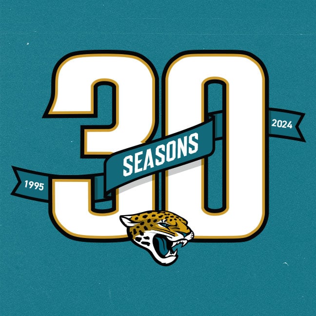
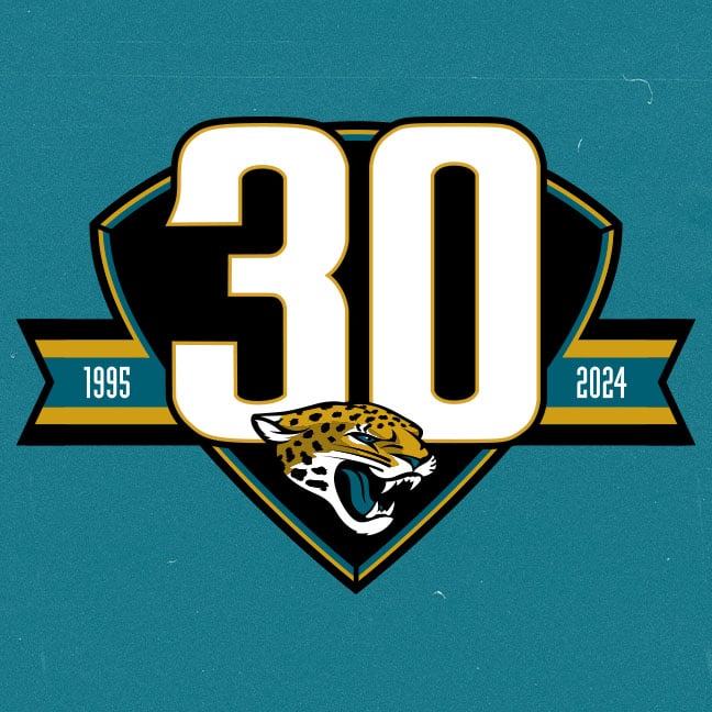
5 hours ago, Old School Fool said:
Jaguars are having fans vote for the 30th season logo and two of the choices use gold and the number font from the 90's jersey so one can only wonder....
https://web.witcontests.com/jaguars/sweepstakes/vote/vote-for-the-30th-season-logo-240309

Both of those are booty, and both the height/width proportions and thickness of the numbers are way off, but the top is less fussy.
1 hour ago, MCM0313 said:I maybe vaguely recall that?
It was somewhat adapted from this circa '99:
57 minutes ago, rfraser85 said:Did these fans say which uniform(s) the Jaguars will use? I'm guessing the originals because they're celebrating 30 years.
On a side note, this is a great focus group trick for new uniforms. Using throwbacks instead of the back-room research is a great idea for testing. The only problem is you only have past uniforms for testing. Although, you could test throwbacks in current colors.
I'm willing to bet it'll the first version if they do it at all. I personally would prefer the '98 refresh, but I don't trust the organization to actually pull the trigger on those (or for Nike/Fanatics to get the numbers/NOB font right if they do)...
-
I've since either gotten rid of or given most away, but...
- Joe Sakic burgundy Avalanche jersey (literally my first pro sports jersey purchase...afer my hometown Ice Pilots jersey which was nowhere near as nice
- Black Blasty Calgary Flames jersey (back then I thought it was cool as heck)
- Marshall Faulk St Louis Rams navy/gold jersey...with the gold side panels
- Personalized Pittsburgh Pirates white vest jersey (back when those still came with the separate undershirts)...because I always loved that look
- White Troy Polamalu Steelers jersey (that was one of my favorite ones there)
- Tamba Hali Chiefs jersey (boy if I still had that one...maaannnn....
- Inaugural Philadelphia Union navy shirt (and accompanying jacket and hatscarf)
- John Lynch Buccaneers creamsicle throwback jersey (one of three Bucs jerseys I've had; I still have two)
- Peyton Manning Colts jersey (although that was more because I lived in Indy at the time)
- Marcus Mariota navy Snatit jersey (the first one, not the sword-shoulder version)... those jerseys really grew on me while living in Nashville
- Fauxback Kirby Puckett Twins powder blue jersey
- Drew Bledsoe blue Patriots flying Elvis jersey (with the NASCAR numbers)...second-favorite sports uniforms EVER.
-Teal Andre Dawson Florida Marlins throwback batting practice jersey
- Personalized Memphis Grizzlies 2023 City black jersey (still in love with that thing...and the matching cap that came with it)
- Gray Mark Stone VGK jersey (absolutely HAD to grab that while I could; debated getting a gold Keegan Kolesar, but I don't like reversed-out sleeve colors)
- White Adley Rutschman Orioles jersey (and white-front-panel cartoon bird cap...and black cartoon bird t-shirt)
- Cal Ripken Jr. orange Cooperstown Classic Orioles jersey.
-
22 minutes ago, TrueYankee26 said:
Ravens are a retirement home for legendary Titans players
I may be the only person in the world who saw that coming the second the last 0 ticked off the clock after the Snatit beat the Jags last game of the season...
...Now watch him go up there and beast out. (And remind everyone in Tennessee what an actual competent OC can do with a back of his caliber...)
-
3
-
-
2 hours ago, BottomlessPitt said:
Where's Jeff Van Gundy when you need him?
Probably being dragged across somebody's floor somewhere...
-
And in other offseason moves I'm sure people care about
 , Mac Jones is now T-Law's new backup in Duval.
-
 1
1
-
-
7 hours ago, DCarp1231 said:
I’ll be honest… I’d welcome the idea of Michigan exploring blue socks to be worn with the “plum” pants
Time out...just time all the way out.
What is going on with this pants stripe here?? That's NOT how you do that there, Michigan/Under Armour. What was wrong with the simple brasher? That's how you start ruining the best uniform set the
USFLUFL had/has.-
4
-
 1
1
-
-
9 minutes ago, monkeypower said:
A lighter blue would definitely work as brought up by @tBBP.
Here's Tufts University.
Colorado's burgundy isn't the same as Tuft's brown, it's much more like the Phillies throwbacks which also just happen to use a lighter blue
As do Colorado's own Rapids...
That may not be the worst idea in the world for the Avs to try...but for some reason I feel like the Avs would look better by darkening the blue and slightly brightening the burgundy. However, that's just one man's opinion ...my two rusted Lincolns™, of course.
-
2
-
-
Do not ever underestimate the power of a wealthy man's money. If dude has enough money to found a team, and if the amount of money is enough to entice Bettman to let him in to the good ol' NHL owners club, Atlanta will have another team, whether any of us like it, think it makes sense, or not. Now whether it actually succeeds or not depends on how the owner invests in the club and how the front office manages the franchise.
(Personally, I think the NHL would better succeed in a place like Omaha or Salt Lake City, but whatever...)
-
6
-
-
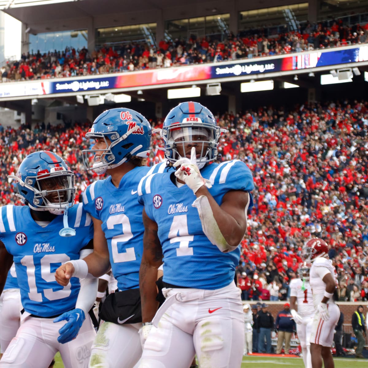
1 hour ago, aawagner011 said:
The only uniforms Ole Miss needs.
I think they should promote powder blue lids to primary status. I’ve also long preferred the red jerseys, especially when they are paired with those helmets. I don’t mind the navy stripe on the pants. It’s just one of those quirks but it doesn’t detract from the set. They’ve had that double stripe for so long that I think it would be wrong to change it to powder blue. The navy jersey and helmet could be alternates.
I think that’s enough and just about perfect, but if they have to have alternates, I’d take these, too.
You know what's funny about all this? Ole Miss ain't had matching stripes since 1957:
That there be Charlie Flowers, who played there from '57-'59. Yes these are black and white photographs, but we can see the mismatched stripe details—and what looks like it may have been the robin egg blue helmet. My point is that while I doubt Ole Miss set out to brand themselves with mismatched stripes, their current supposed-to-be primaries are about as on-brand historically as could be. (It should also be noted that the Rebs claimed three national championships from back then—1959, 1960, and 1962, with the last being their only undefeated and untied season...you know, for those who wanna keep bringing up the whole "BUT DEY WHUN A CHAMPEYUNSHIP!!!4321" line.) So there's that.
(Sidebar: the navy jersey/navy helmet primaries are among my favorite football uniforms ever...for reasons Indiana Jones can't even find.
 )
1 hour ago, aawagner011 said:
)
1 hour ago, aawagner011 said:I didn’t love the powder jersey, but I’ve come around to it because it’s definitely their color. It’s also unique in the SEC. And I think white pants probably look best with that jersey. Light blue and gray doesn’t sound like an appealing combination. Speaking of white pants, I found they looked fine with the powder helmet and white jersey. That combo still had a strong classic look thanks to the helmet and jersey. And the all white combo was fine, too. I’d say the all white is the only one truly deviating much from the classic look.
2 hours ago, PrimalCookie said:Ole Miss has been inching closer and closer toward making powder the main blue over the last few years. Definitely worried about the rest of the design considering how Kiffin likes the whole "different combo for every game" thing, but I hope they make the switch official.
I happen to know—or at least knew-—that Lane Kiffin LOVES the lighter blue. A while ago I was able to sleuth a couple concept sketches from Oxford, and just about all of them had the lighter blue. Now I don't know how popular the lighter blue is amongst the rest of the athletic department, but it wouldn't shock me in the slightest if Ole Miss were to pull a Ucla move and set a unique set of colors as primary for their football squad. (Back before Ucla standardized their colors across all sports, the football team was in powder and metallic gold—and navy and gold on the road—while the rest of the teams were in a somewhat deeper pacific blue and athletic gold combo. I don't know if a full-on rebrand of Ole Miss sports is actually happening, but I remember hearing a lot of heavy rumblings about it back when I used to run in and out of Oxford for work a few years back, so we'll see. Personally, I think it'd be a nice switch-up for Ole Miss, and at any rate a Mississippi school period. (Plus it'd give us all a program that trots out the tried-and-true Houston Oilers colorway that, at least as of yet, no big-name D1 program lays claim to yet.)
1 hour ago, HOOVER said:
My wife’s family are all diehard Hoosiers. I can’t even watch the teams because of how bad the adidas looks are.
Praying they flip to Nike.
And yea…Crimson & Cream.
If recent experience has taught us anything, it's this: be VERRRRY careful what you wish for...
-
1
-
-
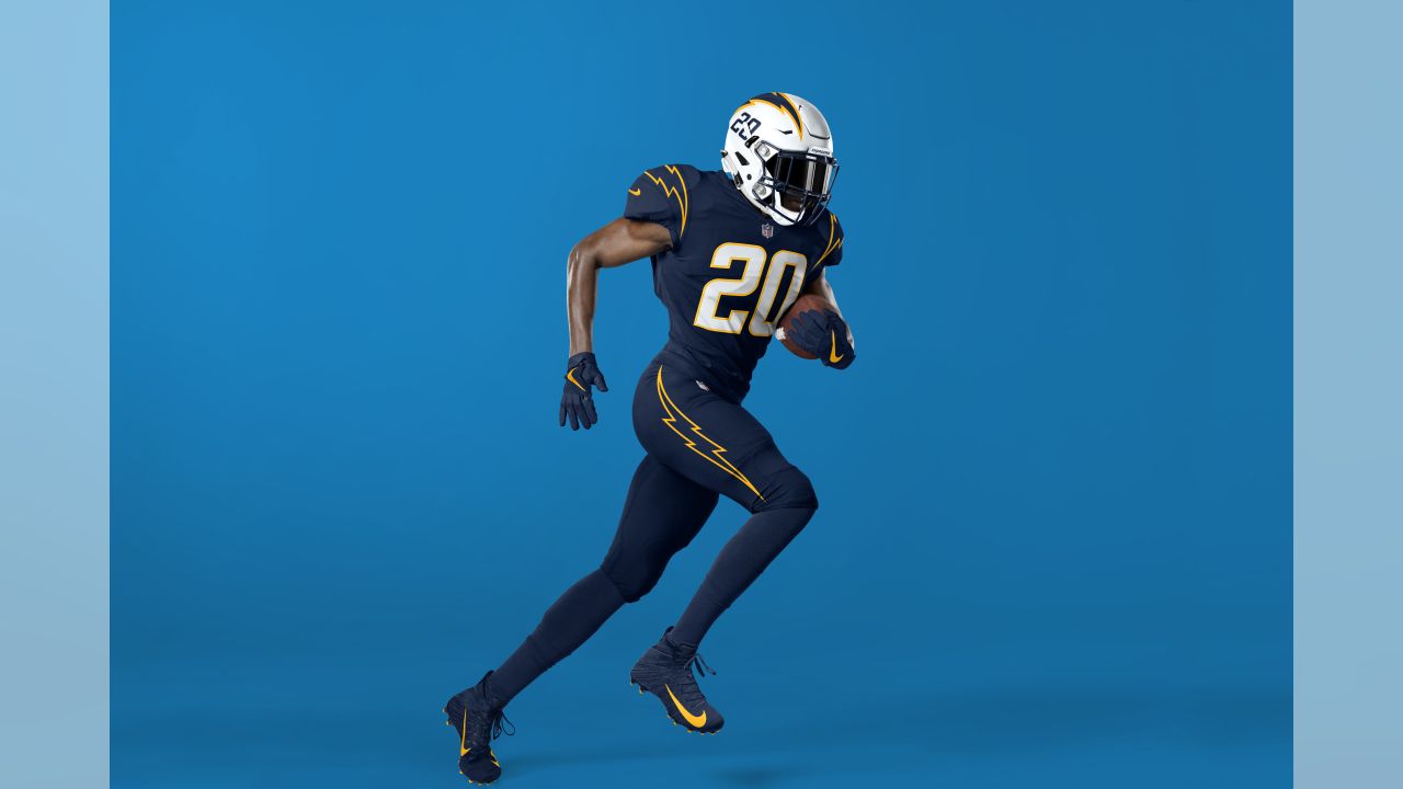
1 hour ago, PrimalCookie said:
So I was going to make my usual "I don't like the Chargers gold pants, in fact I don't like any uniform where all 3 elements are different and the helmet's the lightest of them" post that I always make whenever the Chargers come up, and then I came across this picture.
The reason I was never a fan was because it made the uniform imbalanced and the helmet sticks out like it doesn't belong. The white numbers help somewhat (Wyoming is much worse than the Chargers because they have gold numbers), but yeah. I'm now realizing I think white socks fixes the problem. It makes it white at the top and bottom, and then blue/gold in between. The color blocking works now. Light-dark-medium-light instead of light-dark-medium-dark.
I will never say this again: thank you players for wearing the incorrect socks, because it actually improved the look this time.
Thank you for backing up my point I made a few posts up.

-
6 hours ago, HailGoldPants said:
I mean, all else considered...that wouldn't be terrible. Of course, they'd also just as soon wear all white socks/leggings with those powder pants, so even that wouldn't be as much of an issue.
4 hours ago, Carolingian Steamroller said:
That is among if not my top favorite away uniform set in the league...yes, even with the white socks/leggings. In fact, this may the one instance of an all-white sock adding to a look rather than detracting from it.
-
2
-
 1
1
-
-
14 hours ago, BBTV said:
Due didn't even get a college scholarship, and had to walk on a Cincinnati as a linebacker before moving to OL. He's now going down as arguably the greatest center of all time, and the HOF is basically announcing he'll be a first ballot.
Actually, he walked onto the Bearcats as a running back; the program converted him to linebacker shortly thereafter. Which only adds even more to his story.
-
25 minutes ago, DCarp1231 said:
There's always one. ..I referenced their home and away sets, playboy. (Specifically because I knew someone was gonna try that...and whaddya know.)
-
18
-
-
I for one am glad the Chargers 86'd all the navy out of their main set. Sure, it provides a nice little bit of contrast when present, but the whole set looks cleaner without it.
And for my $, the current primary home and away sets are among if not the best uniforms in the league.
-
25
-
 2
2
-
4
-
-
9 hours ago, Lights Out said:
Those colors absolutely do contrast. Maybe they're not the absolute best colors to have touching each other, but it's not the end of the world like you're making it out to be either.
Nah...they really don't.
And to repeat my earlier point (which by now is buried two pages deep into this current avblackjacking), it's the chroma of those colors that's the problem. One or the other needs to be adjusted up and the other the opposite way to create better separati—umm, contrast between both.
Not the end of the world, of course, but if the Avs are gonna continue to use those specific tones of red and blue, they definitely could use something of sharper contrast to break them up.
-
11
-
2
-
-
I don't know whether to call this thread Avjacked or blackjacked at this point...

-
1
-
 2
2
-
-
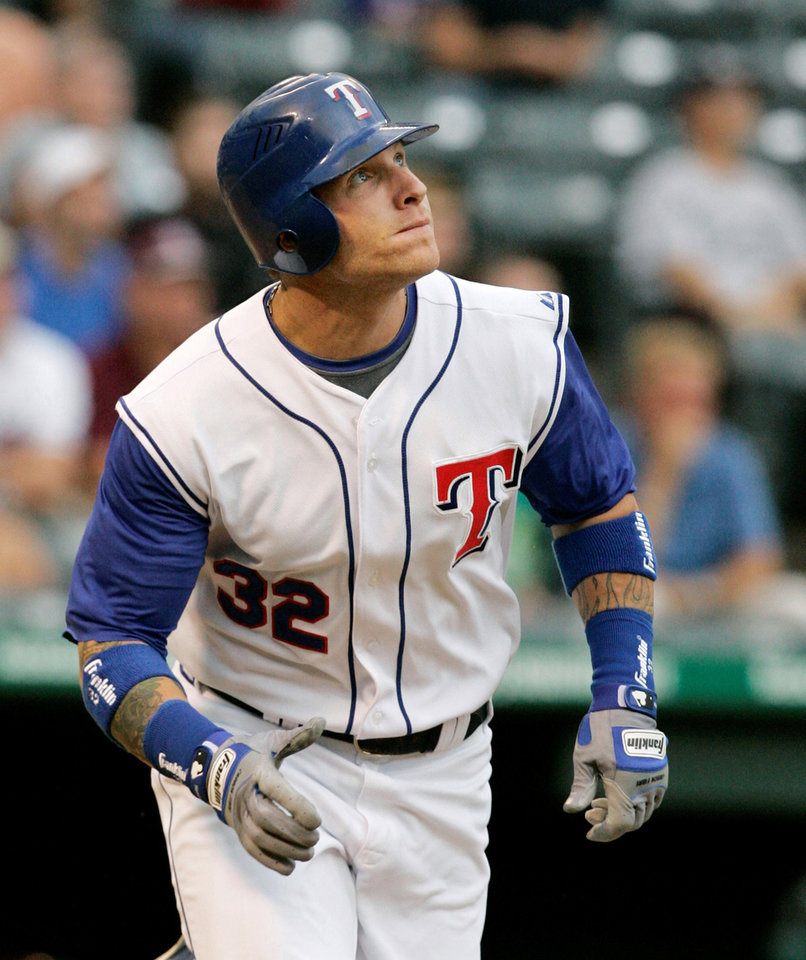
21 minutes ago, BBTV said:
Pittsburgh did.
As did Texas, for a spell anyways:
Personally, I don't have a problem with the lower front number; it's one of those quirks I kinda like. (Though I could live with either placement: lowered or even with the chest logo/mark.)
Speaking of quirks, and sorta off-topic: I miss vests. Vests were fun. Vests also added a much-needed dose of color to baseball uniforms. But given the absolute crap-jack that fan replithentics have become these days, I doubt vested jerseys even be made right—or it'd just be the vest minus the undershirts—so it's probably better they we don't have them.
-
2
-
-
The big issue with the Avalanche involves the chroma of their colors. If you grayscale them, you'll barely notice a difference. That's why they seem to fight against one another.
I've seen many concept this idea out, but essentially, the best move for the Avs is to darken the shade of one of those colors and brighten the tone or tint or the other, to create a little more separation.
Take a look at this:
Right now the Avs colors are closer to the blue and burgundy swatches second and third from the right. I think either a darker red (okay, burgundy) and light blue or a dark blue (like that navy, though I know some wouldn't care for yet another navy team) and even the burgundy next to that navy, or even better, the burgundy all the way to the left, would help improve the appearance of their colorway (especially if they choose to continue to incorporate the silver/gray).
-
2
-
-
17 minutes ago, GFB said:
What kills this kit for me is that they inverted the colors on their badge for some insane reason... Instead of having a red crest on a white shirt, it's a white crest on a white shirt.
Dumb.
Not too much of an inversion...they just made the navy background of the badge white for this kit (and added a CITYRED border). I'm going to presume it was to keep emphasis on the CITY banner. Not really a justification, but more a clarification.
That said, that would have been a great kit to apply CITY's alternate mark to:
THAT badge, truly inverted (white for CITYRED and CITYRED for navy), would have been a big winner.
-
3
-
-
One of the things I saw regarding the creative brief for this rebrand was that the Clippers wanted to emphasize "upward, forward motion". That may in part explain why the clipper ship may be rendered as if you're looking at it head-on from a perspective point somewhat below the bow.
For whatever that may be worth...
-
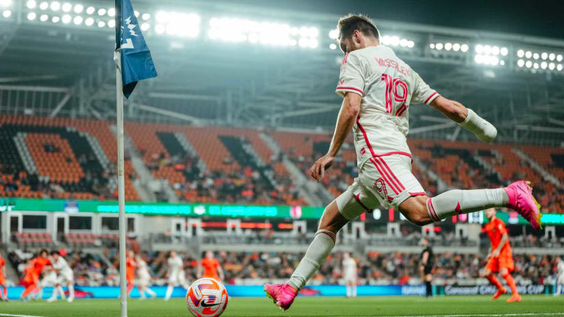
CITY change kits in action on the pitch last night:
That dose of color is really needed. That said, it not illegal to wear contrasting shorts, MLS sides. This one could really use the CITYRED shorts (and the primary kits could use navy shorts).
All in all, I still really like these.
-
1
-
-
21 hours ago, GFB said:
On the negative side, I don't care for the heavy reliance on navy/nautical blue. It's a design choice that makes sense in the context of the direction, but the Clippers have been tied to light blue and royal blue for so long and the darker blue isn't clicking for me. Even the almost entirely navy blue court and logos are giving me flashbacks of Nautica or a knock-off Tommy Hilfiger:
Called it...
23 hours ago, tBBP said:I don't love the darkening of the blue, but if they were insistent on including the Pacific Blue, I can see why they did it. (Truth be told, they probably also did it for apparel merchandising, too...it's much easier to pair navy-ish sports gear with everyday casual clothing than it is royal blue or other brighter colors.) I'm also not totally on board with the navy-and-white side panels on the red alternate jerseys...but I do love the idea of putting nautical flags down the sides of those panels. Got a little 2023 Memphis Grizzlies City edition vibe going on there. Oh, and since we're talking about City Edition, I'm willing to bet my next two paychecks that the first City Edition we see under the new brand will be on a pacific blue base--or at least include heavy dosages of it.
Oh and...
17 hours ago, GFB said:THAT is NICE!
From having read about the focus groups and whatnot, it seems like Ballmer and their respondents really wanted to keep the red, which I understand. Visually, though, orange contrasts much better (I mean of course it does...blue and orange are complementary colors!). And that usage of Pacific Blue is way better! (I also believe @Conrad.'s mockup may predict the first City Edition we see under this new rebrand.
-
1
-


/cdn.vox-cdn.com/uploads/chorus_asset/file/23285306/powder_blue.jpg)

/cdn.vox-cdn.com/uploads/chorus_asset/file/22889157/image.png)


/cdn.vox-cdn.com/uploads/chorus_asset/file/25204670/1760048385.jpg)


2023-24 NHL Jersey Changes
in Sports Logo News
Posted
EDIT: found another version...
The first Carolina script probably has the best idea of incorporating the shape of North Carolina into the tail...except isn't the team supposed to appeal to both Carolinas? (Or is that the Panthers that appeal to both?) The top right looks like just about every sanitized corporate refresh we've seen over the past decade. And are they considering completely 86'ing the silver/gray? I mean, gray kinda is in Raleigh's city flag (one side of it, anyway...fun fact, the thing is double-sided), so at least they'd have justification to do so...but whatevs.