


tBBP
-
Posts
10,466 -
Joined
-
Last visited
-
Days Won
21
Posts posted by tBBP
-
-
14 hours ago, mmejia said:
The most common elements of Colorado are quartzite, sandstone, agate, and gabbro. So make of that what you will.
And weed. And fentanyl. And too many soccer moms rolling around in Chevrolet Tahoes.
****************
...Anyway, as for the Ravens, I'm GLAD they're keeping their primary looks as they are (though I'm not too keen on the black pants, at least not without similar braisher stripes to their other three pants sets). I see people remark often about how they should change their number font and such...for what? Beyond maybe the drop shadow, they just just as good now as they did 24 years ago. They're not unnecessary custom hackjobs; they—and the team wordmarks—are slightly modified from an actual real typeface (Matrix, for those not in the know) Nothing wrong with them at all.
Now I WILL say they could use an updated birdhead logo (I dunno, maybe something like...THIS?), but beyond all that, kudos to Baltimore for actually maintaining consistency in their set for as long as they have—and being one of just two teams to have done so since the wave of mid-90s rebrands (the other being the Eagles; the Buccaneers eventually figured out their error and went back to their '97 refresh.)
-
 6
6
-
-
Total and complete speculation on my part, but I'm also willing to bet on white *ahem* snowcapped helmets (which last year was a trial run for)—I'm not yet ready to bet on them being primary helmets, but I've been wrong before. The mountain stripes on the sleeve caps seems like a no-brainer...and in the grand scheme of things really isn't the worst thing in the world.
The thing I'm most concerned about is that this BRONCOS uniforms set turns into a COLORADO/CITY CONNECT uniform moreso than a Broncos uniform update...especially if the rumored "ice blue" is actually a thing (which i hope it won't be). But I guess we'll wait and see....
-
1
-
-
1 hour ago, Jezus_Ghoti said:
Imma need ppl to breathe a lil' bit on this and take a few steps back. All this tells us is THAT new "threads" are coming. (Hence the "motion thread" effect". If anything, about the only tangible clue one could garner from this is that they intend to designate orange as their "primary" (*fingerquotes*) dark jersey color.
Nothing beyond that...yet.
-
4 minutes ago, DCarp1231 said:
All blue logo? Bluecifer uniform incoming

There's absolutely 0% chance of that.
-
Chef Carthon still cookin' in Nashville...
Snatit completing trade for Chiefs CB L'Jarius Sneed.
Dude's somewhat quietly become one of the better DBs in the league and is still very young, so this is quite the time to go ahead and lock him up for a lil' while.
-
10 hours ago, burgundy said:
The main reason for CNFCNS(Custom Numbers For Custom Numbers Sake TM) is that it's just another way for the designer/manufacturer to experiment and put their stamp on teams. The Texans didn't need a new number font. Their outgoing numbers were already a clean, modern font with tasteful design elements that evoked the bull horns of the logo. It would have worked well with the new horn stripes. But they were a Reebok design, and Nike didn't want them on their jersey. So they designed a new font that looks like the old font is glitching out. It's still using the same ideas as the old font, but they shuffled elements around just to make it different.
Minor point of correction: those Texans numbers—along with the rest of the Texans brand identity, as well as the refreshed brand identities of the Atlanta Falcons, Cincinnati Bengals, and Seattle Seahawks circa '02—were actually the work of Mark Verlander. Those were the last independently-designed brand identities prior to the league-wide contract model, in this case by Reebok, for that 2002 season.
8 hours ago, Discrim said:You forgot the Patriots
Ah, yes...good ol' Apex One. (That is still my second-favorite major pro sports uniform of all-time.) And to @Ted Cunningham's point...I hadn't thought about it, but I believe that was indeed the first instance of italicized jersey numbers in the NFL. Shoot—it may have been one of the first instances of italicized jersey numbers period...the only other ones I can think of right off the top of my head prior to those were the Tampa Bay Lightning circa '95 or '96, which is when those Patriots uniforms hit the field. (I half-remember an NBA All-Star uniform using italicized numbers, too...I think it was the Phoenix one.)
2 hours ago, DCarp1231 said:Imagine looking for tiny numbers on a jersey when you can simply look at the giant numbers provided on the front and back of said jersey
Except when you can't see the giant numbers provided on the front and back of said jersey...
...Or when they're partially obscured.
Not as big an issue when watching live because one can see the players before they get tackled or tied up, but the point remains...TV numbers would have helped in each of these instances. But they're also no longer a requirement, so it is what it is...
-
9
-
-
I mean...the Texans put themselves behind the 8-ball by employing such a drab (and by that point overused in pro sport) colorway in the firs place. I mean shoot, even making their Battle Red brighter than what it is currently would help a little bit.
Actually, you know what? Moving towards something more like neon red might help a LOT:
That'd be one way to spice things up a little bit...but whatevs.
-
7
-
-
3 minutes ago, chriscj1983 said:
Why do I get the feeling the blue shoulder horns extend to the nameplate on the back of the jersey?
-
1
-
 4
4
-
-
37 minutes ago, mmejia said:
The Texans are owning the leak and just posted this pic. Thick red stripe with white outline visible in the reflection on the right
And now that I see this, my suspicion is confirmed.
It looks like the [glyph forms of the] new Texans number font is based off a rectangle leaf shape:
I have absolutely no idea why or for what reason—or what this shape has to do with anything Houston or Texans-related—but I don't doubt the team/Nike will [over]explain it away at the full reveal.
And also, not that this next part really means anything in the grand scheme of things, considering past uniform designs, but the total lack of a single semblance of anything "H-Town Blue" in these leaks now really has me wondering a/ if it will show up on the home sets and/or b/ exactly how it will show up period.
(Oh and it looks like the HOUSTON script is a little different from the soon-to-be-former one, which tells me a new TEXANS script is coming, as well...)
-
2
-
-
32 minutes ago, coborjobs2010 said:
Wellp, we're certainly sure to have some traction in this thread now...!
Those numbers are...a choice. But I need to see the full details if this is indeed real. I'm still seeing the trademark Nike-style opposing-corner thing if that 2 serves as evidence, but I still see enough of the Texans' soon-to-be-former number font that it's not offensive. Looking at those shoulder horns (because I'm 100% positive that's what those are), I'm curious of its just a forward-facing horn or if it's two horns and the back half is red a la the Texas state flag (not to mention the Texans' own logo).
This could be interesting if the rest of the set is as relatively tame as this...
-
1
-
-
Whatever the case, seeing any edge rusher, DL, LB, or hybrid, wearing #24 is wild as heck.
-
4
-
-
I wouldn't put too much stock into it, especially when it comes to web colors...those are beast unto themselves. I don't know whether this is the case for Illinois, but it's possible they're using web safe navy and orange values, for versatility's sake. (Browser-testing can be a PITA, especially when it comes to web colors.) Sometimes, those web safe colors can be off by a good bit from the true intention.
As for fabrics: too many factors for that. For one, the lighting outside--daytime, sunlight, overcast, nighttime, the type of lights used in the stadium, whether the fabric gets wet (rain), etc. I'll tell you what all this does, though: give me an appreciation for all those who executing the color-testing processes.
Now, as for the thread title, when I saw it, I immediately thought of IU (Indiana University), as I was thinking it'd be more along the lines of teams whose schools call their colors one thing but then team teams wear another, like Indiana's crimson and "cream"...except they (like Oklahoma) wear white. (And if I really wanted to be pedantic, I could extend this to every school that wears yellow and calls it "gold"...but I won't go there today.
 )
)
-
2
-
-
On 3/15/2024 at 3:05 PM, Leviathan said:
Interesting that the 2024 Rays media guide cover photo has players in the old Nike/Majestic template. And it's not even last year's uniforms because last year they replaced the devil ray sleeve patch with the 25th anniversary patch.
Sunshine and water...yep, that's good ol' Florida for you, so says the native.
That said, I know they're not gonna do it but...can the Rays rebrand already?? If they absolutely must keep the sun and the stingray rather than one or the other, there's got to be a better way to blend the two than...this.
(And if they must keep this same colorway, this cover may show a far more interesting way to deploy it...)
-
10
-
-
3 hours ago, rfraser85 said:
Finally, I would replace the teens with the 20's for WR. RB and WR have become similar to the EDGE position and having both groups use the 20's makes sense to me because of that.
Ooh...
And depending on how you count him, the last guy to full-time get away with it (unless you count Devin Hester)...
I'd be with that, too!!!
-
5
-
-
3 minutes ago, Red Comet said:
So the quarterback situation in Pittsburgh is a scheisseshow, they just got rid of one of their best receivers and I’m supposed to be surprised when they manage to go 10-7 next year?
Mike Tomlin can turn sewage into whiskey and a lot more people need to appreciate that.
Ehh...the Steelers are basically the Snatit in black and yellow. (Sreleets??
 ) Actually, they may have been the Snatit before the Snatit were the Snatit. Credit due to Tomlin for somehow keeping his guys motivated enough to compete and win games they otherwise have no business winning. But I've also watched a lot of that team over the past...well, since he's been there and more importantly the past six or seven years, and I think there's another factor at play:
The
HeinzAceisure Field Mystique is real.I don't know what it is, but teams go in there, get their feet squarely on the Steele—urm, Sreleets' necks...and for some reason can never seem to close the deal, thus *cue Dennis Green slapping the mic* letting them off the hook. Pittsburgh doesn't even seem to benefit from gift flags as much as they used to, so that's gotta be the only other plausible explanation. That said, this season is gonna be an interesting one for them up there no matter who's quarterbacking (or OC'ing, which has long been another of their longstanding issues).
All of which is to say: yeah, they'll skirt the borderline of the last wild-card spot...then either watch a team pull its foot off their neck or some other team trip over their own feet elsewhere, either or both of which will keep Pittsburgh right there in the hunt if not drop-kick them into the postseason.
-
1
-
-
I dunno, I feel like one of the two of them. Fields and Wilson, may be flipped again before the season starts. Unless the Steelers really think Russell Wilson can serve as a good mentor to Justin Fields (which they'd have to be about as dumb as the five-way interchange at PA-51 @ Library Rd/88 to think that), don't see how this could possibly help them at all. But hey, let's ride and see what happens...
-
1 hour ago, who do you think said:
Cool story. I associate Wince Carter with being a selfish disappointment and a net negative on the game.
Yeah you just told on yourself there, bruh.
-
6
-
1
-
-
6 hours ago, The_Admiral said:
It's going to be the top-left one as a spiritual continuation of the Whalers' logo, right down to claiming there's an H in the negative space.
Good observation. That execution of it ain't hitting (the top-left), but the idea of that could work well as a secondary/shoulder patch if rendered the right way.
-
2
-
-
1 hour ago, DCarp1231 said:
Yeah, I wish QBs got to go into the 20s.
Just like I’m of the opinion that defensive linemen should get access to 80-89 again.
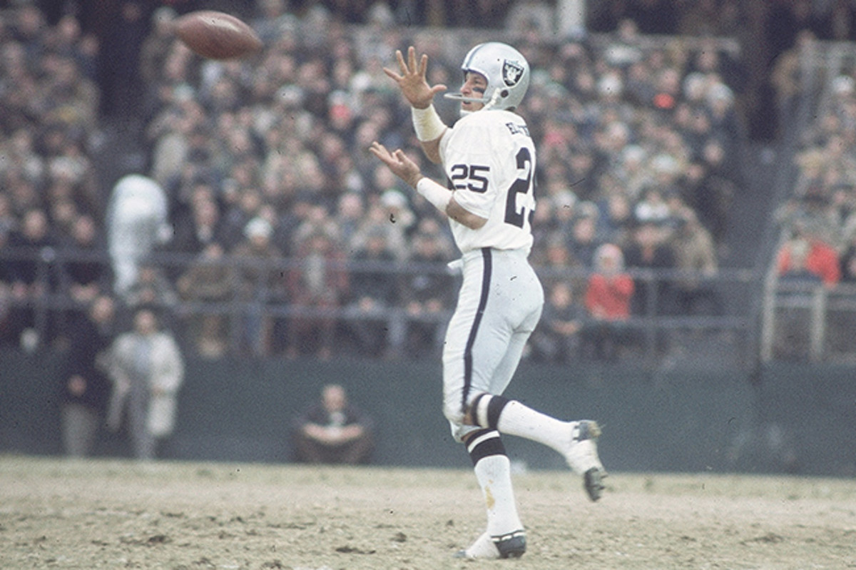
YES.
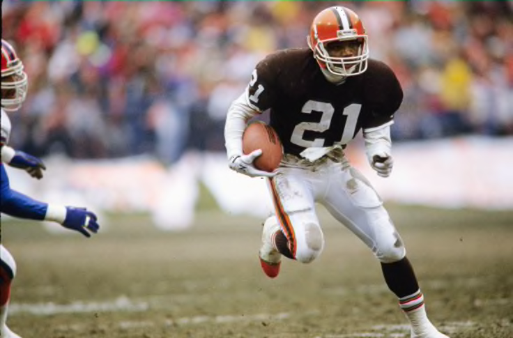
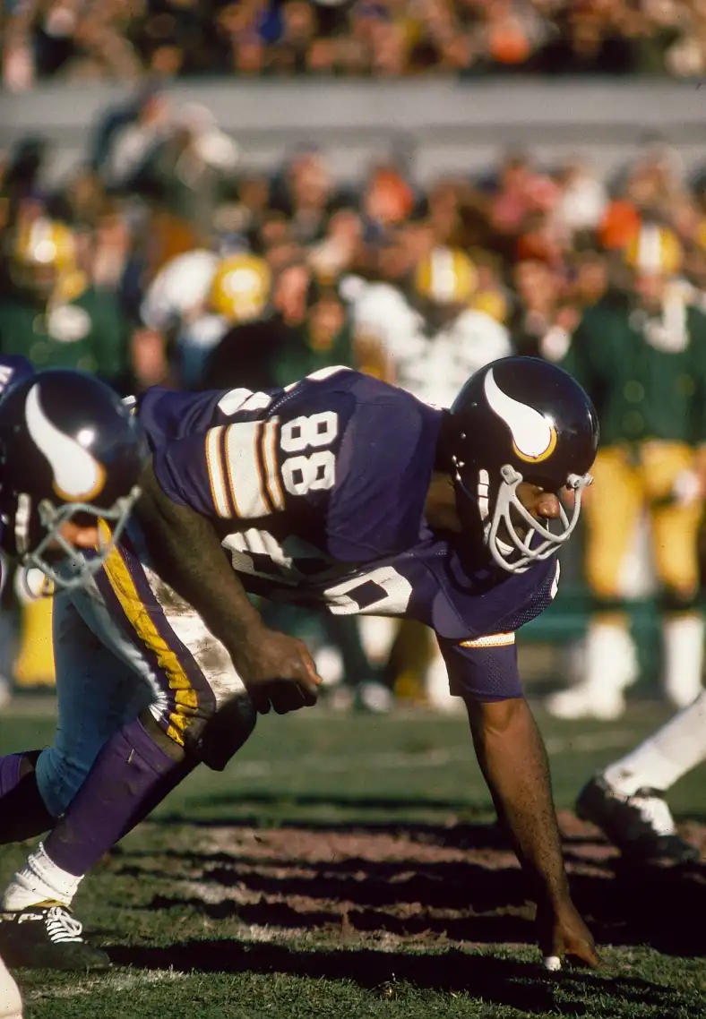
There's several I can list right off the bat, but the first one I think of, THE preeminent DL with an 80-89 jersey number, is this guy:
(His fellow HoFer linemate Carl Eller wore a number in the 80s, too...81 to be specific.)
-
2
-
 1
1
-
-
Let me see if I can help make it make sense...
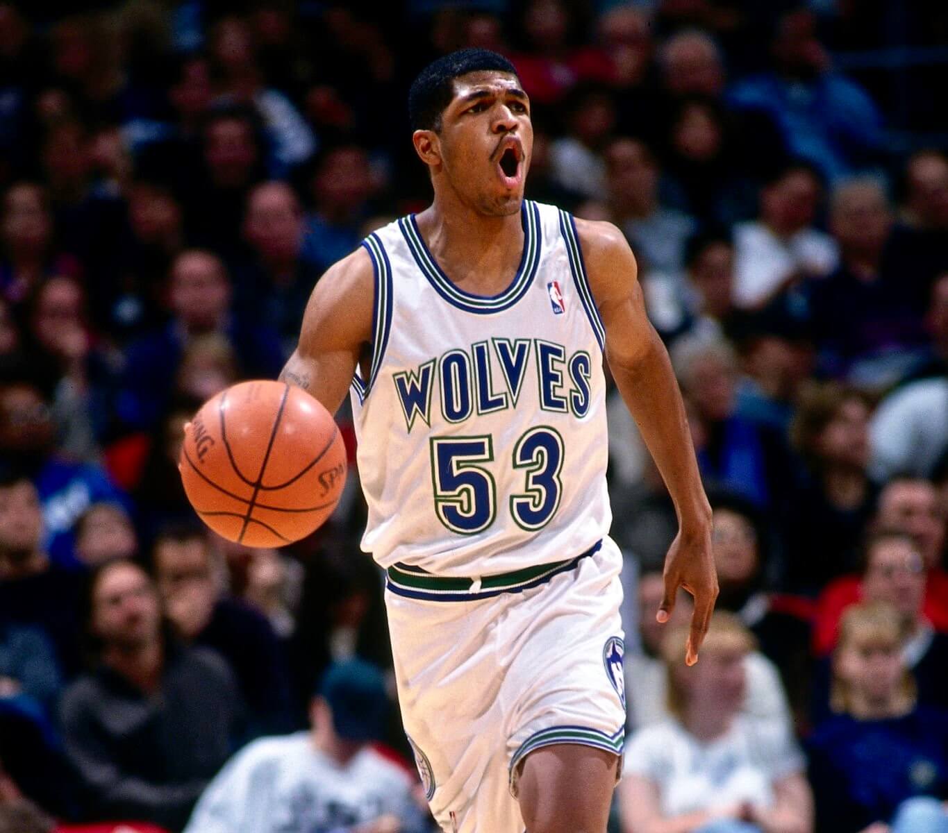
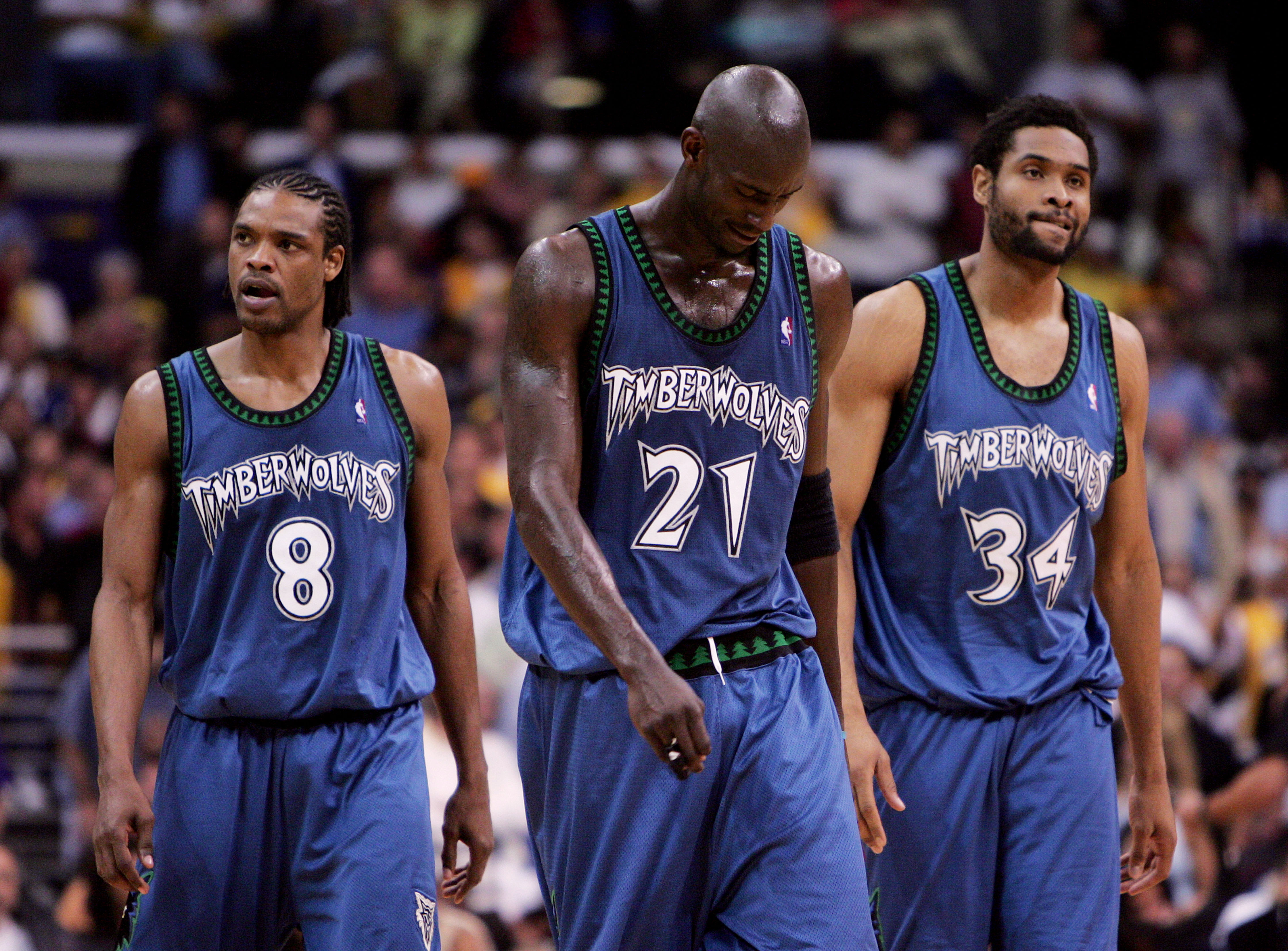
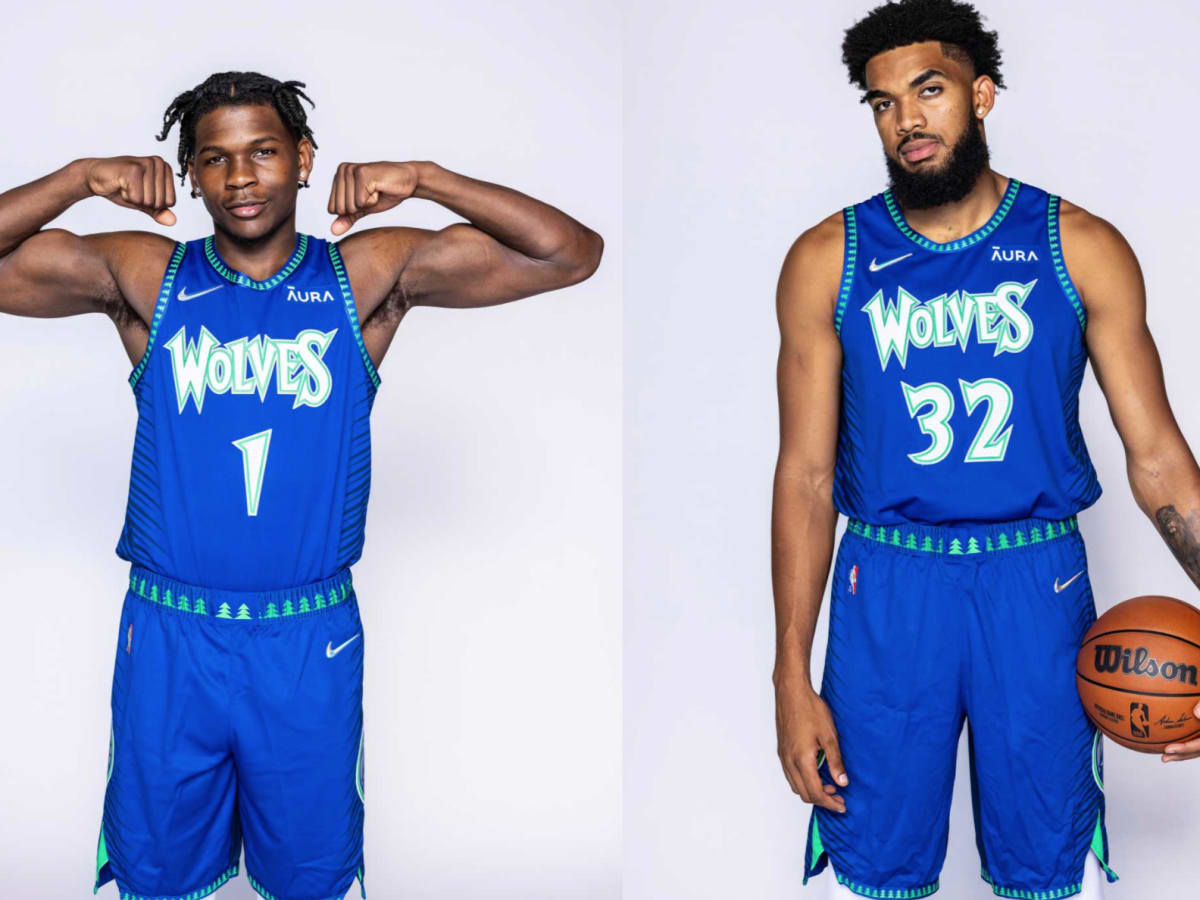
I'm sure we all know this is where it all started. Back in '89, had anyone confused this with the Dallas Mavericks (as young me often did), they could easily be forgiven. That said, those Wolves teams were just not all that memorable until Stephon Marbury and Kevin Garnett showed up. Sure, they had some notable players--like JR Rider and Sam Mitchell--but the teams themselves were rather forgettable. Then came the '97 refresh, which brought us a muted tone of blue, the introduction of black, a wacky new font even by today's standards (which I personally loved and still do), and their most signature element: that tree trim, which was just too perfect for a team named the Timberwolves:
Call it wacky, call it tacky, call it what you want; I call it fun and memorable. It also coincided with the Wolves' rise to relevance on the back of KG, Starbury--and oh yeah, that other guy pictured above, one Latrell Sprewell. Dang shame those guys could never break through in the postseason during KG's time there. These uniforms gained much distinction, but at the same time lost a lot of green, except in that tree trim (and of course added in black). Every uniform design since then has slid further and further down the scale. Their current primaries--if they can even be considered that--aren't even liked all that by much of the fanbase, from what I could tell during my four years living up there in close proximity to the Twin Cities, especially compared to the throwback versions of the above, the 2022 City edition stuff, and the 2021 City Edition stuff, which I'll come back to.
Anyway, all that said, the Wolves' inaugural uniforms hadn't been seen at all until the team decided to *dennisbergan voice* throw 'em back to those sets for present day. And I can see why fans love them. For one, never underestimate the element of nostalgia. Secondly, we're a full generation plus some away from the last time that uniform set was even seen, meaning we got a lot of people walking around who weren't even born while the Wolves still wore those, so I understand why many of them find the throwbacks alluring. Then there's this part: we are also fully and squarely in the days of brighter colors being in vogue, and if you look around the landscape of sports right now, the only other team that sports royal blue and kelly green as a primary colorway is the Vancouver Canucks, so the Wolves throwbacks also provide at least a somewhat unique colorway. (And before anyone tries it, yes I know the Seattle Seahawks rolled out their pre-'02 throwbacks last season.)
All of that being said (*opinion piece incoming*), I believe, if the Wolves really wanted to, they can marry up the most distinctive elements of their looks over the years and devise a signature look that can last. I look at the Miami Heat as a benchmark...for the most part they've kept the same look since the late '90s. It may not be the fanciest primary look, but at least they've stuck to it. If I were to throw out a vote for the Wolves, I could go with either their current throwbacks, or something based more on their 2021 Mixtape sets:
Now with this, I think there are things they could definitely do to "tone it down" just a tad--namely removing the extra outline on the blues--but this uniform brings out that beautiful royal blue and bright kelly green. I can take or leave the navy backs of those, but I personally love that quirk of those uniforms...very reminiscent of the split backs of the Vince Carter Raptors uniforms. (They'd defintiely have to tone down the blend effects between the two colors, though, because with the tree trim and I guess "tree" font, it definitely becomes distracting.)
Anyway, if I had a vote in the matter, I'd streamline the mixtape sets, devise a white set to match, and let it be what it be forevermore. But that's just one man's opinion...my two rusted Lincolns.
-
15
-
 2
2
-
-
10 hours ago, who do you think said:
After the garbage he pulled, Toronto retiring Vince Carter's number would be one of the most spineless moves an NBA franchise has ever made. Might as well suggest the Celtics retire Kyrie's number.
Say what now???
And um, yeah, most of Toronto got over all of that nearly a decade ago:
Aside from him singlehandedly putting the Raptors on the basketball map, think of all the Canadian hoopers that followed VC's time in Toronto. If that ain't enough of a reason to retire the man's number, I don't know what else is.
-
5
-
-
11 hours ago, Dynasty said:
Sooner or later, they might let QB's wear whatever number they want, even if it's something like 99.
Not that I'm advocating for it, but it's a worrying reality.
I'll say it again and scream it to the hills: QBs should be allowed any number from 1-50. I'm trying to see that again.... let's get some latter-day Bobby Laynes, Don Hadls, Sammy Baughs out there!
Or more of what Teddy Bridgewater was forced into...
Come on.... it'll be fun!!!
-
4
-
1
-
 1
1
-
 2
2
-
-
5 hours ago, M4One said:
Carolina Hurricanes are polling season ticket members about possible new logos. I know some people don't like their current primary, but none of these would be an upgrade.
EDIT: found another version...
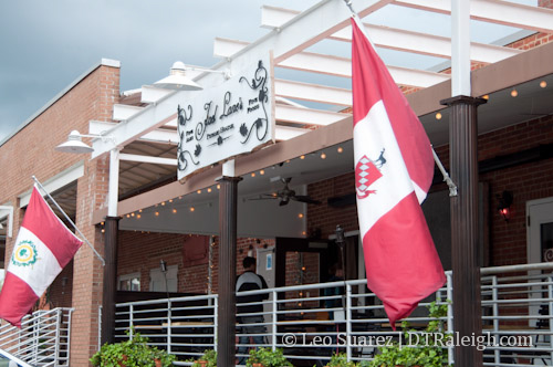
The first Carolina script probably has the best idea of incorporating the shape of North Carolina into the tail...except isn't the team supposed to appeal to both Carolinas? (Or is that the Panthers that appeal to both?) The top right looks like just about every sanitized corporate refresh we've seen over the past decade. And are they considering completely 86'ing the silver/gray? I mean, gray kinda is in Raleigh's city flag (one side of it, anyway...fun fact, the thing is double-sided), so at least they'd have justification to do so...but whatevs.
-
23 minutes ago, heavybass said:
..... Pittsburgh is burning in tire fires covered in heinz sauce tonight.
And yet still somehow some way they'll still find a way to go 9-8 while getting curbstomped on their home turf by two or three of the league's worst teams only to trip backwards into the playoff picture because of course they will...
-
1
-


2024 NFL Changes
in Sports Logo News
Posted
Well last year the Cardinals managed to keep everything under lock and key until the day of their reveal (only to underwhelm just about everyone on the planet—but given the alternative, that may have been the smart play). So it is possible, and maybe the Texans and other teams learned *some* lessons from the Cardinals.