


tBBP
-
Posts
10,507 -
Joined
-
Last visited
-
Days Won
21
Posts posted by tBBP
-
-
14 hours ago, BBTV said:
Due didn't even get a college scholarship, and had to walk on a Cincinnati as a linebacker before moving to OL. He's now going down as arguably the greatest center of all time, and the HOF is basically announcing he'll be a first ballot.
Actually, he walked onto the Bearcats as a running back; the program converted him to linebacker shortly thereafter. Which only adds even more to his story.
-
25 minutes ago, DCarp1231 said:

There's always one. ..I referenced their home and away sets, playboy. (Specifically because I knew someone was gonna try that...and whaddya know.)
-
 18
18
-
-
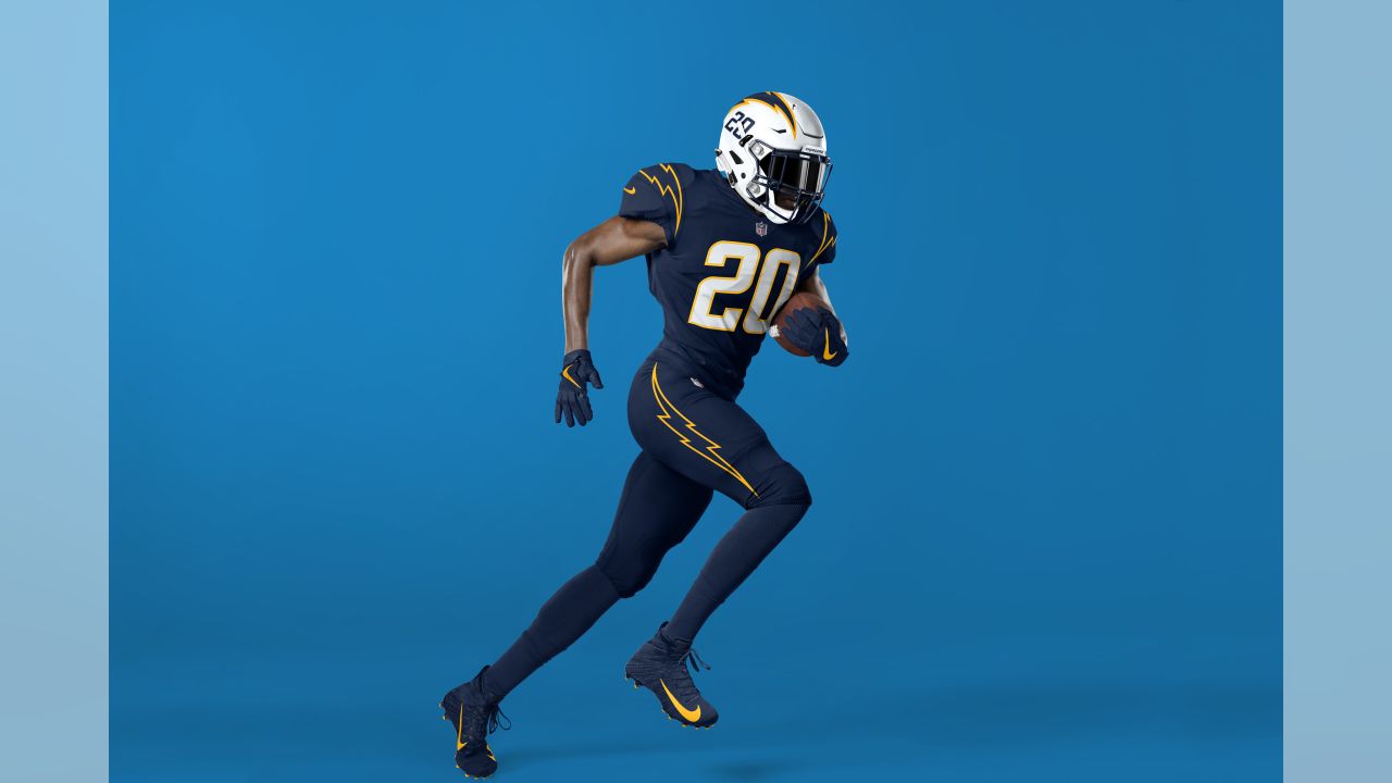
I for one am glad the Chargers 86'd all the navy out of their main set. Sure, it provides a nice little bit of contrast when present, but the whole set looks cleaner without it.
And for my $, the current primary home and away sets are among if not the best uniforms in the league.
-
25
-
 2
2
-
 4
4
-
-
9 hours ago, Lights Out said:
Those colors absolutely do contrast. Maybe they're not the absolute best colors to have touching each other, but it's not the end of the world like you're making it out to be either.
Nah...they really don't.
And to repeat my earlier point (which by now is buried two pages deep into this current avblackjacking), it's the chroma of those colors that's the problem. One or the other needs to be adjusted up and the other the opposite way to create better separati—umm, contrast between both.
Not the end of the world, of course, but if the Avs are gonna continue to use those specific tones of red and blue, they definitely could use something of sharper contrast to break them up.
-
11
-
2
-
-
I don't know whether to call this thread Avjacked or blackjacked at this point...

-
1
-
 2
2
-
-
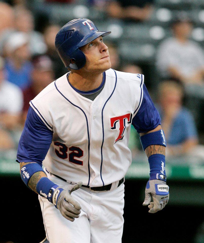
21 minutes ago, BBTV said:
Pittsburgh did.
As did Texas, for a spell anyways:
Personally, I don't have a problem with the lower front number; it's one of those quirks I kinda like. (Though I could live with either placement: lowered or even with the chest logo/mark.)
Speaking of quirks, and sorta off-topic: I miss vests. Vests were fun. Vests also added a much-needed dose of color to baseball uniforms. But given the absolute crap-jack that fan replithentics have become these days, I doubt vested jerseys even be made right—or it'd just be the vest minus the undershirts—so it's probably better they we don't have them.
-
2
-
-
The big issue with the Avalanche involves the chroma of their colors. If you grayscale them, you'll barely notice a difference. That's why they seem to fight against one another.
I've seen many concept this idea out, but essentially, the best move for the Avs is to darken the shade of one of those colors and brighten the tone or tint or the other, to create a little more separation.
Take a look at this:
Right now the Avs colors are closer to the blue and burgundy swatches second and third from the right. I think either a darker red (okay, burgundy) and light blue or a dark blue (like that navy, though I know some wouldn't care for yet another navy team) and even the burgundy next to that navy, or even better, the burgundy all the way to the left, would help improve the appearance of their colorway (especially if they choose to continue to incorporate the silver/gray).
-
2
-
-
17 minutes ago, GFB said:
What kills this kit for me is that they inverted the colors on their badge for some insane reason... Instead of having a red crest on a white shirt, it's a white crest on a white shirt.
Dumb.
Not too much of an inversion...they just made the navy background of the badge white for this kit (and added a CITYRED border). I'm going to presume it was to keep emphasis on the CITY banner. Not really a justification, but more a clarification.
That said, that would have been a great kit to apply CITY's alternate mark to:
THAT badge, truly inverted (white for CITYRED and CITYRED for navy), would have been a big winner.
-
3
-
-
One of the things I saw regarding the creative brief for this rebrand was that the Clippers wanted to emphasize "upward, forward motion". That may in part explain why the clipper ship may be rendered as if you're looking at it head-on from a perspective point somewhat below the bow.
For whatever that may be worth...
-
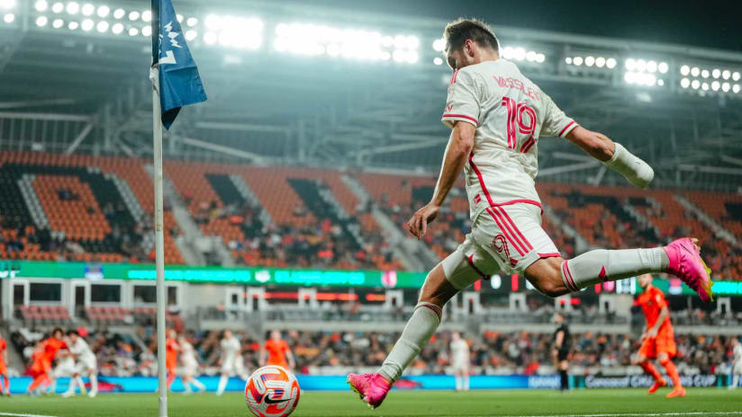
CITY change kits in action on the pitch last night:
That dose of color is really needed. That said, it not illegal to wear contrasting shorts, MLS sides. This one could really use the CITYRED shorts (and the primary kits could use navy shorts).
All in all, I still really like these.
-
1
-
-
21 hours ago, GFB said:
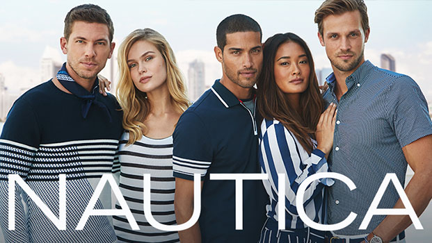
On the negative side, I don't care for the heavy reliance on navy/nautical blue. It's a design choice that makes sense in the context of the direction, but the Clippers have been tied to light blue and royal blue for so long and the darker blue isn't clicking for me. Even the almost entirely navy blue court and logos are giving me flashbacks of Nautica or a knock-off Tommy Hilfiger:
Called it...
23 hours ago, tBBP said:I don't love the darkening of the blue, but if they were insistent on including the Pacific Blue, I can see why they did it. (Truth be told, they probably also did it for apparel merchandising, too...it's much easier to pair navy-ish sports gear with everyday casual clothing than it is royal blue or other brighter colors.) I'm also not totally on board with the navy-and-white side panels on the red alternate jerseys...but I do love the idea of putting nautical flags down the sides of those panels. Got a little 2023 Memphis Grizzlies City edition vibe going on there. Oh, and since we're talking about City Edition, I'm willing to bet my next two paychecks that the first City Edition we see under the new brand will be on a pacific blue base--or at least include heavy dosages of it.
Oh and...
17 hours ago, GFB said:THAT is NICE!
From having read about the focus groups and whatnot, it seems like Ballmer and their respondents really wanted to keep the red, which I understand. Visually, though, orange contrasts much better (I mean of course it does...blue and orange are complementary colors!). And that usage of Pacific Blue is way better! (I also believe @Conrad.'s mockup may predict the first City Edition we see under this new rebrand.
-
1
-
-
Overall, I'm going to give this thing 9.275/10. What this visual identity does is give the Clippers an actual tangible brand identity for the first time since, well, since they were the Buffalo Braves. A ship? a nautical compass?? And a dang loop hook??? Come on here, now!
I don't love the darkening of the blue, but if they were insistent on including the Pacific Blue, I can see why they did it. (Truth be told, they probably also did it for apparel merchandising, too...it's much easier to pair navy-ish sports gear with everyday casual clothing than it is royal blue or other brighter colors.) I'm also not totally on board with the navy-and-white side panels on the red alternate jerseys...but I do love the idea of putting nautical flags down the sides of those panels. Got a little 2023 Memphis Grizzlies City edition vibe going on there. Oh, and since we're talking about City Edition, I'm willing to bet my next two paychecks that the first City Edition we see under the new brand will be on a pacific blue base--or at least include heavy dosages of it.
To all who also see the Twins in this: I agree. I see the resemblance, too. I also see the continuing trend of minimalism and sans-keystroke scripts/numbering continuing on. That said, I love that they prioritized their longstanding Clippers script and cleaned it up, pretty much like how the Sacramento Kings cleaned up their old script and put it on their new uniforms. (That coincidence is also not lost on me...might we begin seeing more chest scripts pop up in the NBA?) I can't peg the new supporting font, looks like Rotis (but it isn't), but it does give off a nautical feel, which seems to be the main overall theme of all this.
Some of the supporting elements of this brand identity are also quite nice. I'm sure it was completely accidental, but the way the N in "LOS ANGELES" is positioned at true north as on a compass dial on the full logo is some slick genius, as is putting the lat/long of their arena on the court baseline. It's distinctive without being overdone (like the 5280 thing is starting to become in Denver). I didn't see the ship by itself, and I can see why some aren't a big fan of it, but I do think adding implied basketball lines in there was a pretty clever way to pull off the "must have basketball in global logo" requirement.
Finally, I am extra glad an actual sports design branding agency handled this. Doubleday and Cartwright have done some pretty good work over the years. I'm also glad to see Matthew Wolff was involved--dude has been making the rounds in recent years in the sports design game. Part of me views him as the modern-day Joe Bosack in that his style is beginning to permeate throughout multiple levels of pro sport.
All in all, 9.275/10 as I said earlier. This is really one of the freshest new brands I've seen come out in a good couple years--and one of the best in the NBA, period.
-
7
-
-
it's taken me this long to see the hidden X right in plain sight right in the middle of those lightning bolts.
If that was intentional, it's genius. (Oh and that's the #1 secondary...bump all them other rankings.
 )
)
-
1
-
-
Are they nicknaming kits at the lower levels too, now, or has that also been a thing for a while?
-
16 hours ago, dont care said:
Yea rather than just regular tackle twill it does appear thinner almost just like what the rest of the jersey material is made out of.
Just to save everyone some scrolling...
And yeah, that looks like some Walmart beer-league twill if ever there were some...
11 hours ago, MJD7 said:The Twins Minnesota state outline sleeve patch was always on the left sleeve last year, it being on Buxton's right sleeve means an ad is likely coming for them too, unfortunately.
Well, the alternate hypothesis would state that no relationship exists between the placement of the state patch on one sleeve and the probability of an impending ad patch to be placed on the opposite sleeve.
But this ain't quantitative analysis, so we won't need chi-square, the t-test, or any critical values to test this hypothesis. Nope, just good ol' fashioned eyeballs...
So yes, a relationship definitely exists between the placement of the state patch on one sleeve and the probability of an impending ad to be placed on the opposite sleeve. Therefore, we can successfully reject the alternate hypothesis that no relationship exists between the two variables at a 1.00 significance level.
(In other words, an ad patch is definitely coming...)
-
4
-
 1
1
-
-
53 minutes ago, WideRight said:
Got to say that having a UT-Southern just seems odd to me. Tennessee is an East-West state, not a North-South state. Is there really that much distance between the southern edge of the state and its northern edge? It's like that old song about "Kids in America" where Kim Wylde sings about Eastern California. No, Cali is a North-South state, and TN is an East-West state. No need for the U. of Southern Tennessee just like there is no need for the U. of Eastern Vermont.
Depending on where you are in the state, maybe 110 miles or so. So no, not really.
(Of course it can take forever to get from south edge to north edge if you catch Nashville at the wrong time of day...)
-
1
-
-
4 hours ago, Sodboy13 said:
The "Elite" jerseys are now for sale.
Blank: $355
Pre-customized: $395
Pick your own name and number: $430
At least they are listed as being made in the USA. I thought for sure they'd pull an NHL and start selling non-authentic Authentics.
-
4
-
-
23 hours ago, aawagner011 said:
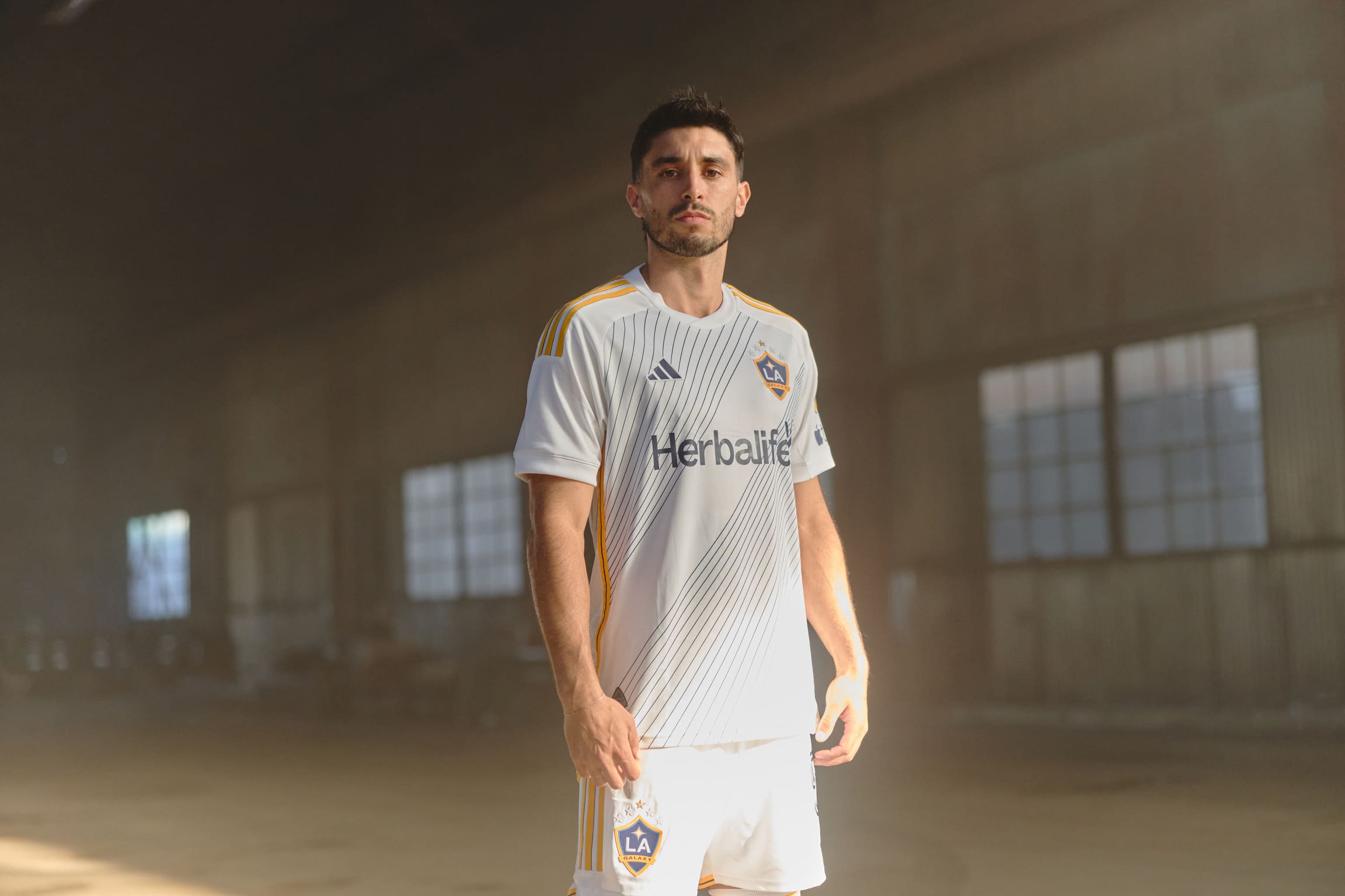
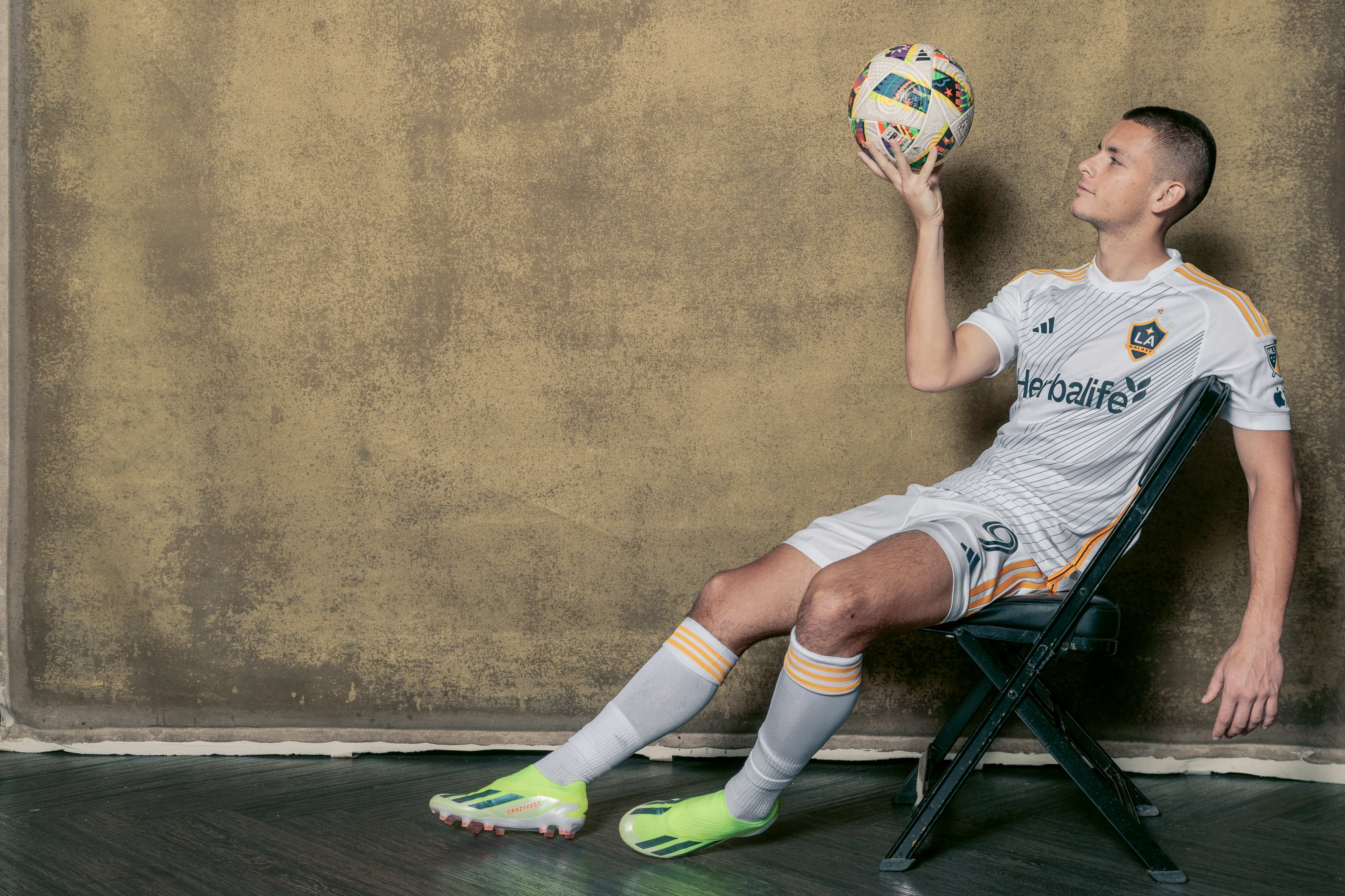
Wanna stop by for a second to say to all those who swear up and down that yellow should never touch white: take a good look at this. 1) it ain't illegal, not even in the "rule" of tincture; and 2) when done right it can be mighty effective. (Also works for a team with a nickname inspired by space...)
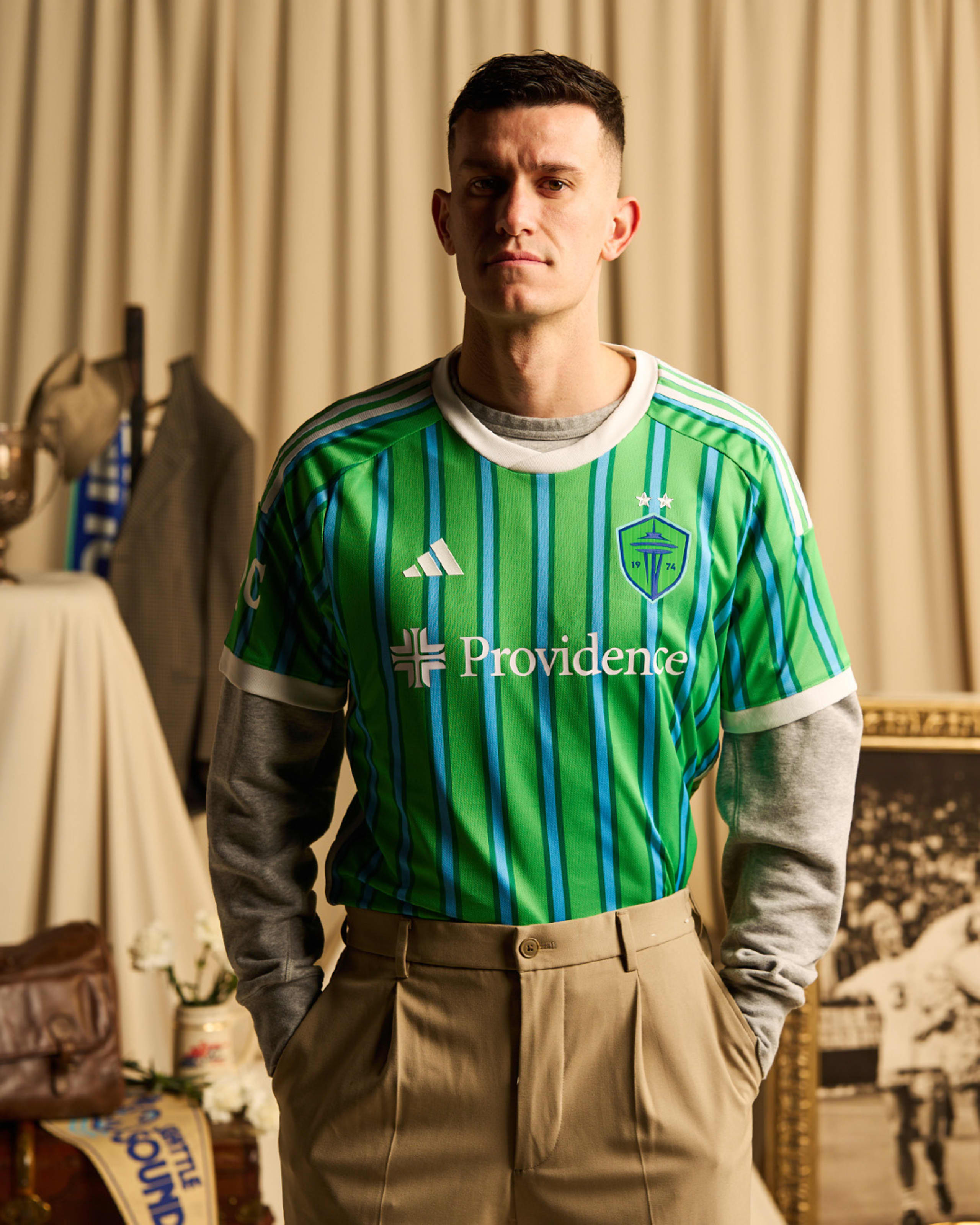
16 hours ago, upperV03 said:They made no mention of it in the kit unveiling, but within Adidas Seattle’s new kit is apparently dubbed “The Macklemore Kit”. It helps to explain the nauseating stripes and the ridiculous hipster shoot. This is straight from the head of club football apparel at Adidas:
Now why didn’t the club make mention of it during the unveiling? Probably because they’re saving it for a future tie-in or someone within the club realized how embarrassing it was.
All the public figures in Seattle's cultural history to name a kit after—if they even had to name a kit after a certain someone—and that's the one they chose???
-
2
-
-
3 hours ago, Digby said:
Sorta off-topic but these unveil photoshoots have become so strange. Who is wearing a jersey tucked in to pleated khakis???
If this ain't about the most stereotypically Seattle photoshoot ever...
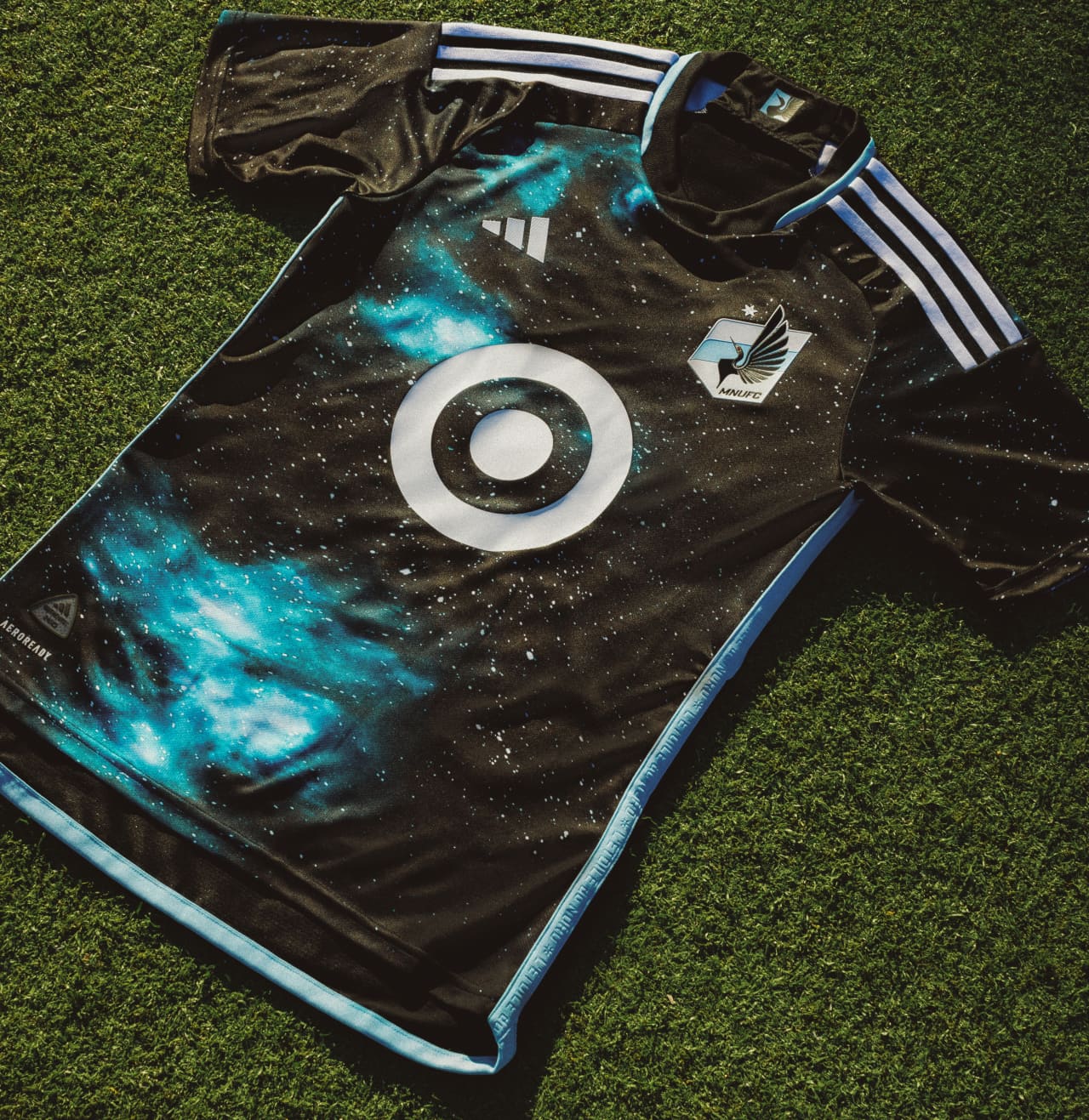
2 hours ago, officeglenn said:Minnesota United "Starry Night" primary kit:
I get the point--and what is that written into the side piping?--but it still kinda looks like bleach blots...
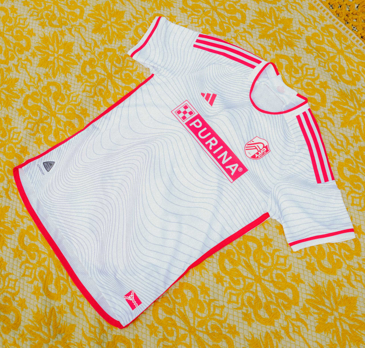
2 hours ago, officeglenn said:St. Louis CITY SC "Confluence" secondary kit:
COPPED. I don't even care that I don't have the money for it right now; I'm naming and claiming it right now. This is also what I wish they would have done for their first secondary kit.
1 hour ago, hereandthere said:Oh, come on, this has to be one of the most incredible and visually coherent home/away sets ever made.
(I understand if MNUFC fans don't love it becuase they want the wing back, but as a neutral non-US kit fan, I absolutely adore both of them)
One thing's for sure: Minnesota's got the most decorative kits in MLS. They got that in the bag.
1 hour ago, aawagner011 said:
So is St Louis settling in with a standard away look? It’s not much different than their previous design. Both gray with pink accents. Only main difference is the old design had the full color crest and navy touches. But it seems like they aren’t planning to introduce radically different designs for secondary kits, unlike some clubs.That's CITYRED to you...get it right.

-
2
-
2
-
-
On 2/12/2024 at 1:27 PM, NYCdog said:
Looks like Houston is leaning heavy into local rap scene with the Purple Drank/Lean colored kit and chrome badging, a nod to the slab car culture and spoke elbow wheels down there. Intriguing but I like that they’re at least attempting it going out there…
Hendrix lol …someone’s never heard of DJ Screw or chopped & screwed music. IYKYK.
That's swangers to you, sir...get it right.
 (Speaking of, I find the fact that both the Dynamo and apparently the Texans are about a decade late in catching onto parts of Houston street culture that went mainstream about a decade ago absolutely hilarious.)
On 2/12/2024 at 6:55 PM, BadSeed84 said:
(Speaking of, I find the fact that both the Dynamo and apparently the Texans are about a decade late in catching onto parts of Houston street culture that went mainstream about a decade ago absolutely hilarious.)
On 2/12/2024 at 6:55 PM, BadSeed84 said:To save people from clicking spoiler clicks after spoiler clicks
Tampa Bay Mutiny, is that you???
21 hours ago, MJWalker45 said:I actually like this logo better, but I understand that they needed a logo that can work in digital presentations better.
7 minutes ago, MJWalker45 said:
They are really doubling down on that swallowtail burgee shape, aren't they? Guess it ain't the worst thing in the world, EXCEPT...
4 minutes ago, docbrass said:Charlie Brown ???
...Somebody should have seen this. *wa-wa-wa-wa-wop...wop-wop*
-
2
-
-
Lemme clarify my earlier post: I don't believe the Jets will add new customized numbers to their on-field uniforms; I was just saying that I wouldn't be mad if they fleshed out a full set of numbers to accompany the letters in the font they used on that tweet. That said, I personally wouldn't me mad if the Jets were to one day do that...they'd be the one team other than the Chargers for whom that makes sense.
And to answer an earlier question as to whether italicized fonts ever look good on a uniform: in my opinion, YES, when done right and makes sense for the overall brand. I just cited one example:
THIS, on the other hand, is an example of italic fonts not done right:
Aside from some of the usual Nikeistic stylings—namely the opposing hard corners that Nike seems to love to keep doing for reasons—these numbers can't decide whether they're Roman or Italic and end up being neither and both at the same time. (And that's to say nothing about the unnecessary darker gray...but that's for another discussion.)
I'll give the Steelers a pass, too, since a/ all that is is italicized Futura Condensed (well, a slightly edited version of it) and b/ it didn't completely come out of left field since it's also been on their helmets going back to the early 70s.
I'm not the hater of custom or italic number fonts that some seem to be....BUT they have to be done right to make sense. The thing that does grate my gears is when custom font jobs are so obviously done "just to be custom" without it really making any sense other than just to be cute or "modern".
-
9
-
-
On 2/11/2024 at 10:10 PM, monkeypower said:
I just want to circle back to this tweet, now that I'm getting caught up.
Did everyone just completey gloss over the FONT used in this tweet? Tell me someone else sees what I see in plain sight: an updated version of the old logo font. This also leads me to now believe we will indeed be seeing an updated version of the 80s-90s JETS helmet logo.
(I also wouldn't be totally mad if they fleshed out an accompanying number set with that font, either, just based off the three digits that appear up there...)
-
5
-
1
-
 1
1
-
-
11 hours ago, Rockstar Matt said:
I know Brady has 7 rings and is the GOAT, but it just feels like we’re watching the eventual greatest QB of all time in his prime when watching Mahomes. He’s unbelievable.
Unquestionably solidified himself as one of the two best QB’s ever tonight.
So which of Unitas, Staubach, or Montana has he replaced? (Because Brady is definitely entrenched.)
11 hours ago, infrared41 said:I was going to move to Costa Rica.
Sri Lanka for me...
31 minutes ago, Sport said:The Chiefs have that thing that the Patriots had in the latter Brady years where they're obviously good, but teams also seem to self-immolate against them in playoff games. It's like they think they have to play perfectly to beat KC and in doing so hand them assists all over the place. They could've easily had losses in all of this Super Bowl, last year's Super Bowl, this year's Ravens game, this year's Bills game, the AFC Championship last year against the Bengals, the 13 seconds game against Buffalo, etc. Time after time an opponent short circuits and muffs a punt or donates a defensive TD like Hurts did a year ago. The last time a team didn't give them any wiggle room was the Bengals in 2021 and the Chiefs haven't lost a playoff game since.
You do have to hand it to them.
Slick double entendre. Well played.
 20 minutes ago, BBTV said:
49er players are now saying that they weren't coached up on the new OT rules, and legitimately had no idea that they wouldn't have won if they got a TD.
Chiefs players say that Reid told them on day-1 of SB prep about their OT plan, which was to kick off, and go for 2 if the 49ers scored a TD and practiced the 2-pt play options.
As has been mentioned, you have to be perfect to beat the Chiefs, and even that one detail was enough to cost them.
That's the difference between winning and losing right there.
Not so much a genius after all, are ya, Kyle Shanahan??
-
 1
1
-
-
1 hour ago, BottomlessPitt said:
Don't worry the Patriots & Steelers will remain the only 2 members of the 6 club.
Green Bay says hi.
(Yeah yeah I know, some of those chips were before the merger, but still...thirteen is thirteen.)
Aaaannnnd with that, KC and Taylor Swift win it.
 Dynasty mode engaged.
-
5
-


.jpg)


/cdn.vox-cdn.com/uploads/chorus_asset/file/24611054/1228519648.jpg)


2024 NFL Changes
in Sports Logo News
Posted
I mean, all else considered...that wouldn't be terrible. Of course, they'd also just as soon wear all white socks/leggings with those powder pants, so even that wouldn't be as much of an issue.
That is among if not my top favorite away uniform set in the league...yes, even with the white socks/leggings. In fact, this may the one instance of an all-white sock adding to a look rather than detracting from it.