


NYCdog
-
Posts
674 -
Joined
-
Last visited
-
Days Won
2
Posts posted by NYCdog
-
-
50 minutes ago, DCarp1231 said:

Get the white over orange some blue socks and we got something cookin’
The jerseys are fine & safe. 6/10
The white helmet paired with the navy jerseys and pants is a terrible looking combo.
The helmet strip is looks incomplete not coming full way to the front of the helmet. I’m not sure if that would’ve helped.
It just feels like a missed opportunity to not modernize the retro D-Horse logo with something that matched up a bit better with Cyber Horse.
This also confirms the legitimacy of the AB/CTESPN leaks we’ve been seeing, although I’d say the retail graphics don’t do the uniforms any favors. The uniforms look better thankfully. Can’t wait to see the actual Giants throwbacks AB leaked in reality, as well as that helmet,
-
 3
3
-
-
1 hour ago, Brian E said:
looks like we have a mets city connect cap leak:
https://www.instagram.com/p/C5tDIQzRlFB/?igsh=MWFram96eTMxbmlpbg==
Another possible Mets leak.
-
5
-
 1
1
-
 2
2
-
-
44 minutes ago, Chromatic said:
Addendum to my comment about the Broncos 'Club 1977' that was using an updated 'D' logo that was taken from a fan concept, apparently that's not the case.
https://twitter.com/masedenver/status/1778542035210752116?s=46&t=EsXZXf63qJs621q-gvh_Pw
https://twitter.com/mikeklis9news/status/1778541613729415265?s=46&t=EsXZXf63qJs621q-gvh_Pw
Also that portal no longer displays that logo either. I wonder if this is a case of some web-design intern going rogue.
Modernizing the throwback D Horse primary mark feels like an obvious move though. I thought we would see this as part of the package. It could’ve looked great IMOWith the Texans confirmed to debut a 3 helmet on 4/23 with the rest of their new uniforms (see my prior post), might we see the Broncos unveil a 3rd helmet too? White primary, Throwback secondary, Navy 3rd helmet?
Might we see the Jets and Lions all unveil 3rd helmets?
-
1
-
-
Texans owner confirms they will unveil a 3rd helmet. FFWD to 9:55 mark
https://www.fox26houston.com/video/1440060
Edit: Another mention of the Texans 3rd helmet from the owner’s wife at 2: 40 mark.
-
1
-
-
7 hours ago, CaliforniaGlowin said:
The Texans were my first thought after reading the tweet

 they already on it
5 hours ago, Cujo said:
they already on it
5 hours ago, Cujo said:And Broncos twitter confirms
Note the teams soon to trot out new uniforms in 2 weeks are the ones making noise about the 3 helmet shell rule.
They probably already knew this rule change was coming down the pipeline in andvance and had something planned. They could in theory announce their 3rd alternate helmet for 2025 when they unveil new uniforms in 2 weeks.
-
2
-
-
Not sure if it was already posted. No new uniforms for the Seahawks.
-
7
-
 1
1
-
 1
1
-
-
DCU
-
 1
1
-
-
On 2/5/2024 at 10:39 PM, aawagner011 said:
Real photo of NYCFC replica.
On 2/6/2024 at 12:43 PM, Brave-Bird 08 said:I am loving the partial logos popping up with a lot of these, more of that please!
Charlotte especially would do itself favors by putting their monogram logo on a kit instead of the crown roundel.
(not that it definitely looks and sounds like something else)
The only team that is a disappointment based on leaks so far is Seattle. That kit isn't bad in any sense, but it's very traditional/classic looking for a team running out its first kit after a rebrand -- a team that already has a very contemporary image.
They have this brand new tri-color colorway to work with and they give us a kit that appears to be rave green and white with pinstripes?
This. There’s a few teams in MLS that would do their kits a favor by using their monogram logos instead of their badges. It looks fabulous on NYCFC kits and CLTFC is a perfect example of this as well. It’s miles better than the roundel crown logo. -
2 hours ago, fouhy12 said:
Nothing about this says New Orleans to me. It screams acid trip. Super Bowl LIX the rainbow.
Of the 11 Super Bowl’s New Orleans has hosted, this might be the worst logo. I can envision conspiracy theorists predicting a Chiefs vs Packers (green & yellow both in there) rematch of Super Bowl 1
-
6 hours ago, HOOVER said:
Nice mockup of possible Black set via Twitter:
Likely what we get and while I don't think any of us want a Black alt, we're getting one, so if this is close to what it will be, I can accept these terms since the move to the Sack Exchange home & away is a mega-win for the Jets.
Will remind many of the Black 49ers alts of years ago; I was in the minority of people who didn't hate those as a standalone uniform (they just didn't suit the 49ers).6 hours ago, HOOVER said:And another from Jake Buff:
Either of these will work for me. A simple, clean, timeless look. Happy the Jets listened to the fans just don’t overthink it with any unnecessary gimmicks added in.
I did like the Nike uniforms just hated the “New York” text on the chest that Nike has tried to shoehorn in on so many redesigned uniforms (Browns, Falcons ATL, Cardinals, etc). It’s totally unnecessary and I wish Nike would ditch that design ethos. It has never looked good no matter how they’ve tried to apply that gimmick to any team’s uniforms
-
2
-
-
19 hours ago, WBeltz said:
Houstons Away got leaked and it’s purple?
https://www.footyheadlines.com/2024/02/houston-dynamo-2024-away-kit.html
Looks like Houston is leaning heavy into local rap scene with the Purple Drank/Lean colored kit and chrome badging, a nod to the slab car culture and spoke elbow wheels down there. Intriguing but I like that they’re at least attempting it going out there…9 hours ago, NYWEL said:Houston creativity - going for a replica of the Hendrix Kit
Hendrix lol …someone’s never heard of DJ Screw or chopped & screwed music. IYKYK.
-
1
-
-
3 hours ago, Pigskin12 said:
Was it this?
I also saw the same five teams mentioned in the top comment of this article. It's possible the above account got the info from that guy.
https://news.sportslogos.net/2024/01/16/could-seattle-seahawks-get-new-uniforms-in-2024/football/
It takes years for this process to be completed. We’ve known for years about the Texans, Broncos, and Lions new uniforms coming in 2024
I’m more skeptical on the Seahawks and Titans rumors this late in the process coming from out of nowhere recently. I’m thinking we see new alternate uniforms and helmets for the Seahawks and Titans, not wholesale changes.
Seahawks Prediction: A silver alternate helmet with the current logo (via logo swap with throwback helmet) as a nod to the past that could be paired with Wolf Gray pants and jerseys. Mono-Wolf Gray anyone?
Titans Prediction: Id guess a white alternate helmet with the T-Sword Ball & Stars alternate logo that can be paired with the Columbia blue alternate jersey for an Oilers-esqe look (as the Texans adopt H-Town blue lol)
-
1
-
-
Washington Post is reporting 5 XFL teams and 3 USFL teams will make up the league.
Teams to be revealed tomorrow on College Game Day
QuoteThe eight-team UFL will include five teams from the XFL: the D.C. Defenders (who will play home games at Audi Field), Arlington (Tex.) Renegades (Choctaw Stadium), Houston Roughnecks (home venue to be determined), San Antonio Brahmas (Alamodome) and the St. Louis Battlehawks (The Dome at America's Center). Three teams will come from the USFL: the Birmingham (Ala.) Stallions (Protective Stadium), Memphis Showboats (Liberty Stadium) and Michigan Panthers (Ford Field), a person with knowledge of the situation confirmed.
-
1
-
-
1 hour ago, Pigskin12 said:
I would call it more than just a hint! I am curious to see how this looks.
Needs red socks but this is FYAH
Also note admin got the Color Rush pants mixed up with the Road Blue pants (see striping) lol
This makes me wonder if this a preview of their rebranded look next season to test the waters on a red helmet, blue jersey home look.
-
3
-
1
-
 1
1
-
-
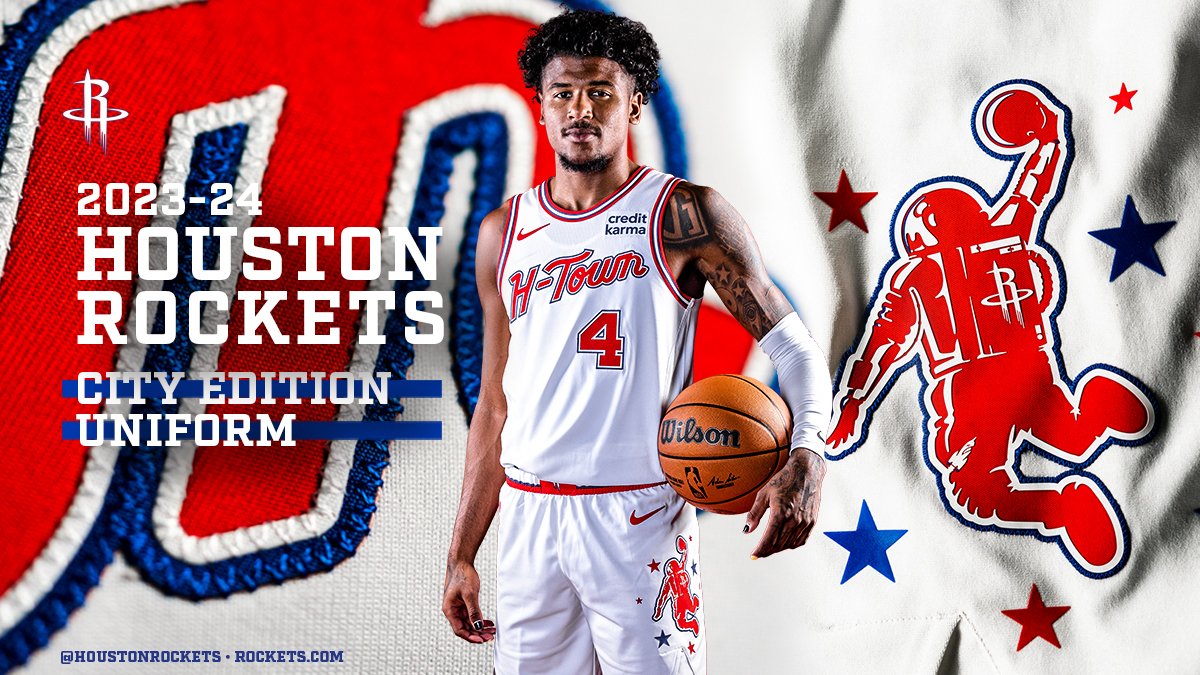
21 hours ago, tscuzzy said:
Rockets are calling this logo the "dunkstronaut". Lot of potential here for an official secondary logo one day. They need to drop the R ... there is just so much potential behind a space/earth/rocket logo.
I was a little offended by the shade of blue (very Clippers like), but they are staying true to the old UH uniforms:
Dunkstronaut at center court. I love how this logo incorporates both the Type R logo as well as the former shark toothed rocket logo on the leg. Great base for a rebrand.-
6
-
5
-
-
5 hours ago, Carolingian Steamroller said:
IMO, the best colorway ND has ever trotted out. The gold & white color scheme with the art deco inspired touches mesh well together. Would’ve been perfect for the Chicago game.-
3
-
-
How is Cleveland able to select multiple players at the waiver wire deadline? I thought after a team is awarded a player, that team goes to the end of the waiting line.
What if Cleveland overtakes Minnesota because of their new waiver wire Guardian Angels?
https://x.com/jeffpassan/status/1697301686593704050?s=46&t=zrFvaO6tbFH7POh1WfkjuA
-
On 8/23/2023 at 12:08 PM, pelicanfan said:
New court coming soon for the Pelicans, about time the creative department of this team stepped up (i've been criticizing them for years already if you dont know.) Also note it says this October. November is when the city editions supposedly unveil so this might mean this is a new full-time home floor. which might be a bit much for a normal home floor but at least the blandness of team's uniforms balance it out. i'm pretty satisfied
October is also media day season, which is probably the reason why you’ll see the new court then.-
1
-
-
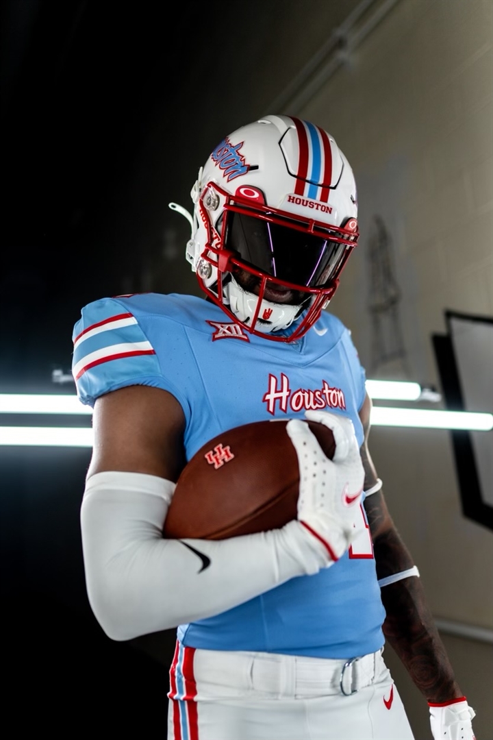
2 hours ago, HOOVER said:
I thought the Texans were going to be the Houston football team to do this. Who would’ve thought the University of Houston would’ve jumped them to it haha.
I don’t mind it. That history belongs to the city it occurred in and is likely to be more appreciated, not some damn billionaire owner that repeatedly fleeces cities for money to get even richer (looking at you Amy Adams Strunk and the $1.2 billion you just got in public funding). It’s funny people ignore the Adams family history of this as an example yet vilify John Fisher for the same exact behavior. Y’all better show up with pitchforks for the Brewers & Orioles owners too when Milwaukee & Baltimore get threatened
-
4
-
1
-
-
3 hours ago, Sykotyk said:
I thought the Texans were going to be the Houston football team to do this. Who would’ve thought the University of Houston would’ve jumped them to it haha.
I don’t mind it. That history belongs to the city it occurred in and is likely to be more appreciated, not some damn billionaire owner that repeatedly fleeces cities for money to get even richer (looking at you Amy Adams Strunk and the $1.2 billion you just got in public funding). It’s funny people ignore the Adams family history of this as an example yet vilify John Fisher for the same exact behavior. Y’all better show up with pitchforks for the Brewers & Orioles owners too when Milwaukee & Baltimore get threatened
-
Paul Lukas reporting on leak of next years ASG logo. https://uni-watch.com/2023/07/17/2024-mlb-all-star-game-logo-apparently-leaks/
Predictably, the Rangers (host) went all in on Texas.
-
10
-
-
-
The Y represents the 3 Rivers (a la Chicago) but what does the square shape signify?
Not a fan of the PGH abbreviation. I understand probably not wanting to use Steel City (due to the Steelers) but why not use “Three Rivers?” Would’ve been a good call back to the former home (Three Rivers Stadium), in addition to a moniker for the city.
-
6
-


2024 NFL Changes
in Sports Logo News
Posted
That H Town Blue will be interesting to see how it looks in person. With AB’s leaks, I don’t get mismatching colors/logos so far…
But I’ve noticed a bunch of recent concepts from Pro Line Mockups and others illustrating a red helmet with bull horns. Coupled with an all red uniform set, this could be heat.
An all icy-Vikings set makes sense for a Minnesota franchise if it wasn’t for multiple other teams beating them to the punch already. It’s played out now and they’re just late to the trend. And why silver? It’s not like they have any silverware in their trophy case to attribute that color too. But I do like the icicle touch on the numerals