


NYCdog
-
Posts
674 -
Joined
-
Last visited
-
Days Won
2
Posts posted by NYCdog
-
-
3 minutes ago, Blast_Brothers said:
Oh cool, the prerecorded video has echo from the room mic for some reason
What did you expect? It’s the Arizona Cardinals hosting this. -
19 minutes ago, MJD7 said:
@TruColor later liked a post that stated “white shell with chrome flakes and a chrome face mask, current logo.” That fits the description of being like the alternate helmet (using red flakes)Personally, I’d like a bone or sand helmet with copper flakes and the 3D Cardinal logo
-
 2
2
-
-
3 hours ago, Gary said:
No Washington Magic?
 Washington Wizards like this.
-
 1
1
-
-
18 minutes ago, coco1997 said:
Still looks black to me.
That navy feels similar to the Midnight Blue the Astros used on their late 90’s Shooting Star uniforms, which also looks like black
Black would’ve looked better, just not on the pants. They should’ve been cream.
-
1
-
-
2 hours ago, officeglenn said:

Also worth noting that it's a very dark navy blue, not black.
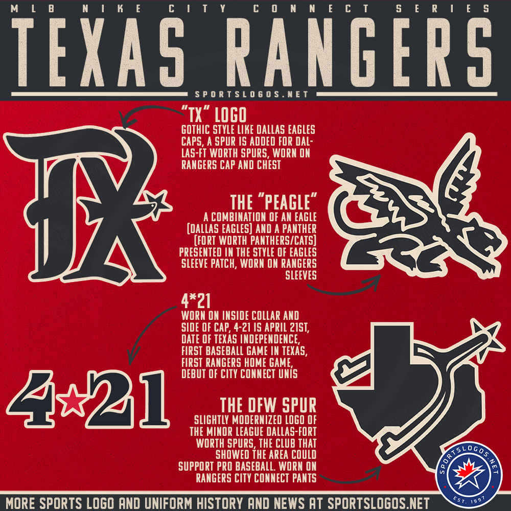
That Dallas Eagles hat is a straight rip off of the Detroit Tigers old English D.
The Peagle would’ve been a better hat logo.
-
The Rangers City Connect is up on MLB.com shop.
Looks like they’re going with no name-on backs. And that numeral font …woof
https://www.mlbshop.com/city-connect/c-2392775252+z-959665-454063718
-
2 minutes ago, coco1997 said:
Was not expecting a cream-colored jersey with black pants.
What is with the old English font? Are they trying to be the Tigers?Cant wait for the Nike speak to explain this mess.
-
1 hour ago, DJT said:
Not good. But first city edition for next season has been released.
Oh I can’t wait for the designer speak that attempts to explain this garbage.“This is an artistic homage honoring the characters and contributions to the world provided by New York’s own, Sesame Street”
-
2
-
1
-
-
On 4/4/2023 at 2:08 PM, CDCLT said:
I would be totally ok with white/blue/white being our look. I'd imagine some kind of blackout color rush would be the alt.
White/Blue/White. Titans fans might have an issue with it since they’re rolling out the Oilers throwbacks this coming season. Chargers fans might have beef with it too. .
7 hours ago, jerrylawless3 said:Titans have officially teased Oilers throwbacks via this oil-barrel teaser video
But aside from the Cardinals (whom are also rebranding), no one is doing White/Black/White. That’s the play the Panthers should make (with blue trim of course)
-
40 minutes ago, HOOVER said:
So yes, Kansas City folks would have the right to be upset if Arizona adds it as a core color in their update.5 hours ago, HOOVER said:If this is an indicator of things to come, I'm not happy about it, as a Kansas City Chiefs fan, and I can't imagine Clark Hunt & Co. would be either.
This would be a foolish move by Arizona, and a confusing one if approved by the NFL.
Does Arizona use the same Red as Kansas City? I always thought it was darker.
Seriously, this is already more annoying than Jackson Mahomes.
Aside from a yellow beak on a red bird, guess what colors are in the AZ state flag? I’m not from AZ nor a Cards fan but I can totally envision why the Cards might add yellow trim to the team color palette. It’s not a reach and it makes sense, unlike some of other things Nike does with rebrands. And if Kansas City is pissed about another team using some variation of red and yellow, tough :censored:, Goldilocks. Get over yourselves. See all of the red, white, and blue teams this league is filled with.
-
9
-
1
-
-
2023 Men’s Final Four Court in Houston.
-
8
-
 1
1
-
-
Uniform sponsorship coming soon to Yankees jerseys
-
 7
7
-
 1
1
-
 2
2
-
 2
2
-
-
On 2/26/2023 at 8:18 PM, tBBP said:
The last one is a bit of a stretch since Houston has also used white so much, but it gets the point across. (And yes I'm aware that just about all those clubs use a third "trim" color, but you get my drift.)
The Dynamo haven’t had a white change kit since 2015. The last 8 seasons, they’ve gone exclusively with orange primary kits and black change kits, which better aligns with their badge. Also orange and black is a very strong brand colorway that’s unique in MLS. They’ve just squandered the opportunity to build upon this with terrible wooden spoon quality squads. -
On 2/25/2023 at 4:54 PM, coco1997 said:
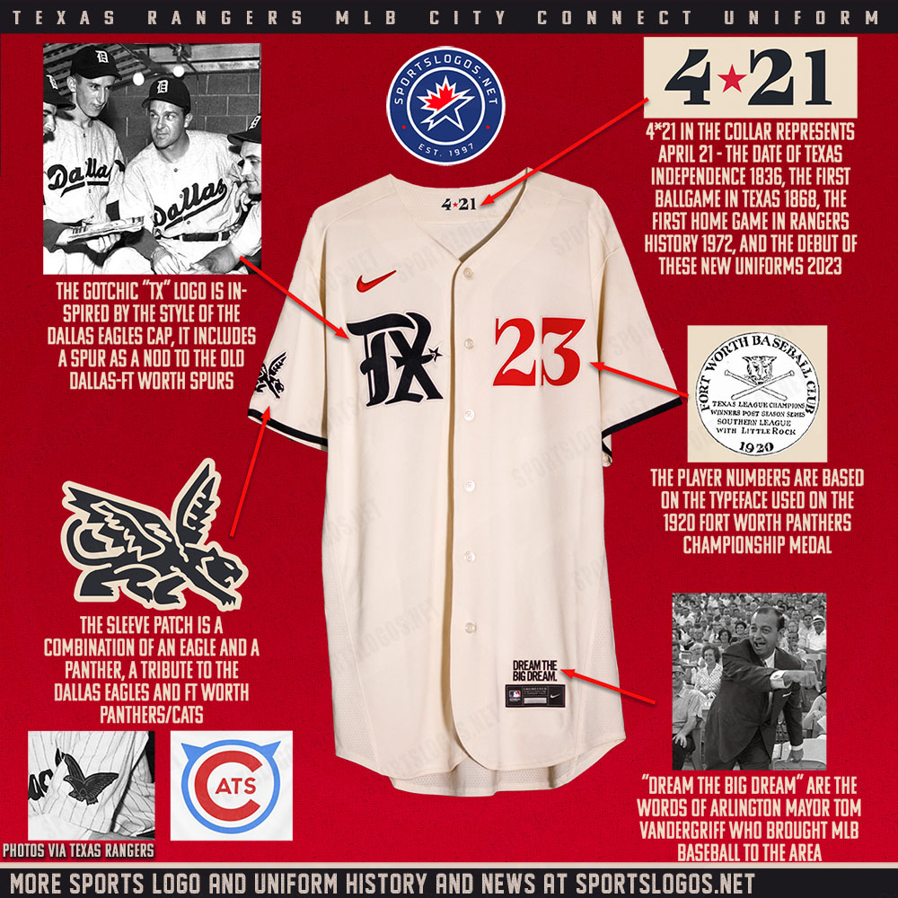
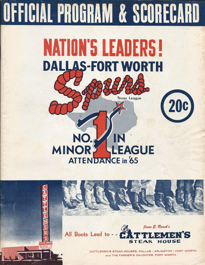
The Rangers City Connect is likely a Dallas Ft Worth Spurs AAA (1965-72) homage because of the spur visible in the Texas logo, which bears a resemblance.The silver Lariat rope trim at the top of the sock was also used as font in programs.
Im not sure why they are using black.
-
5
-
-
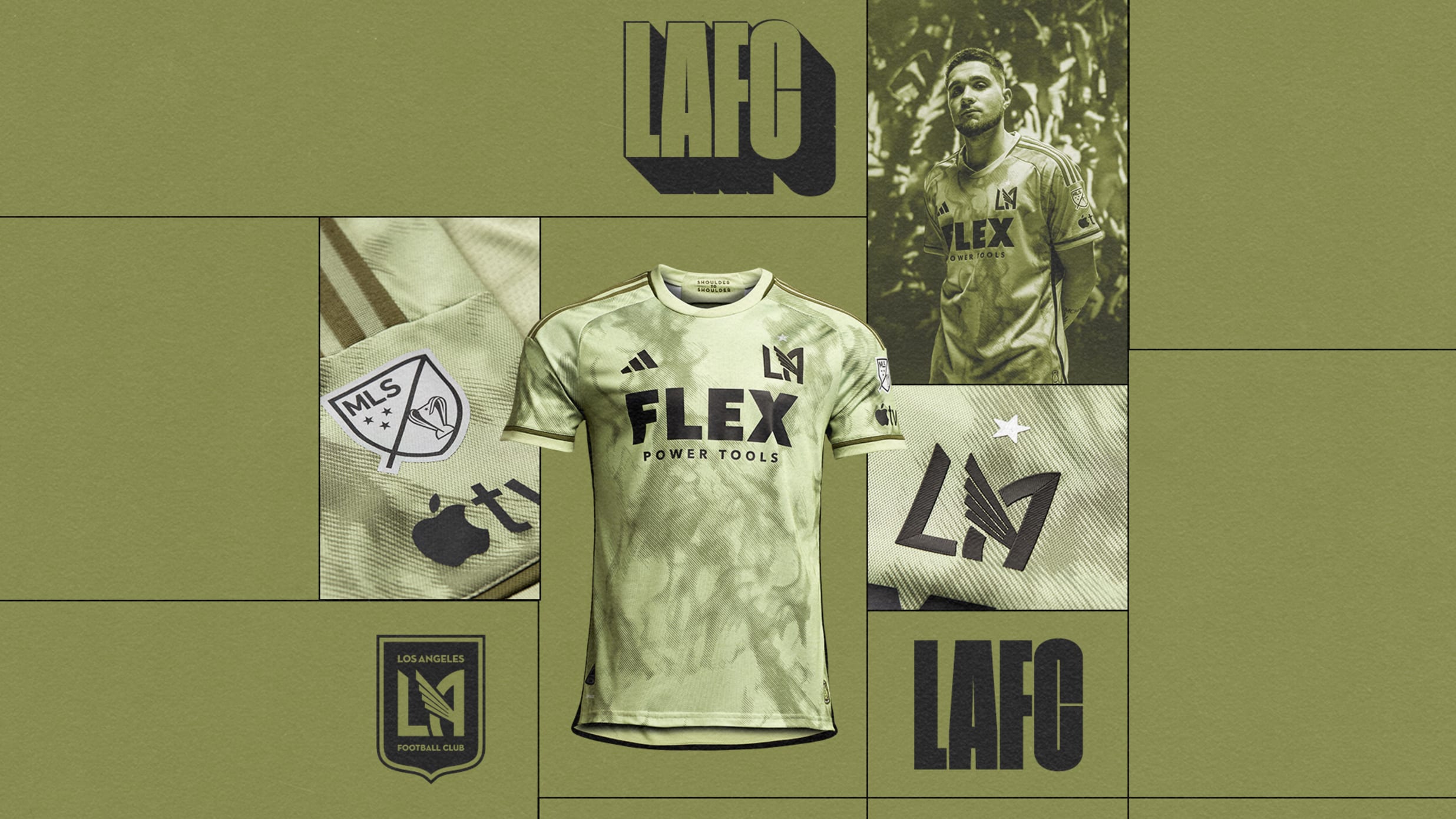
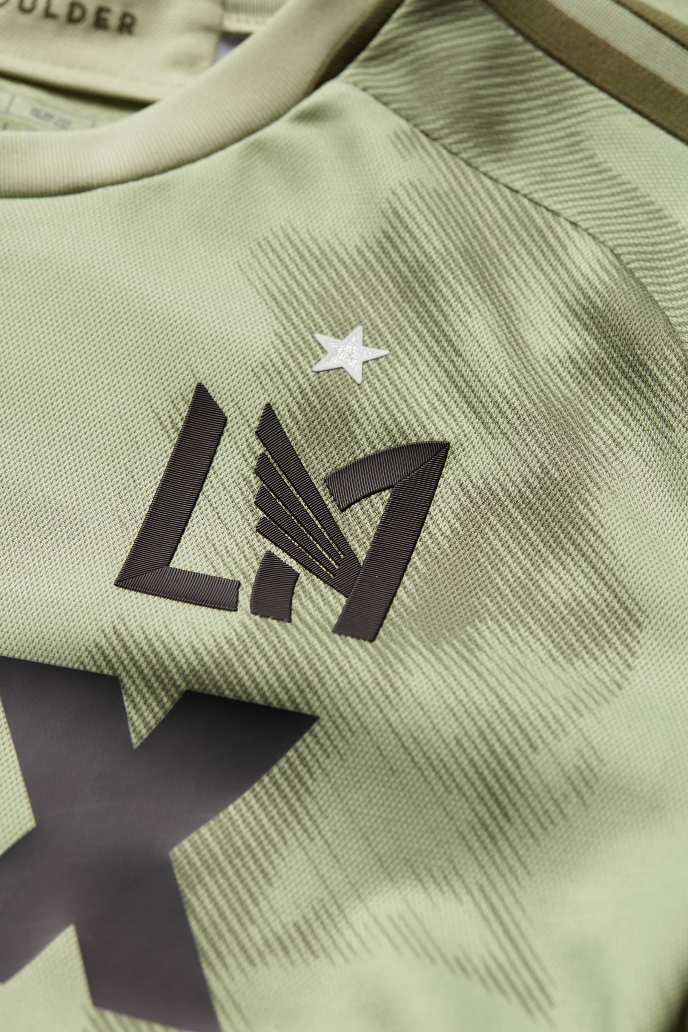
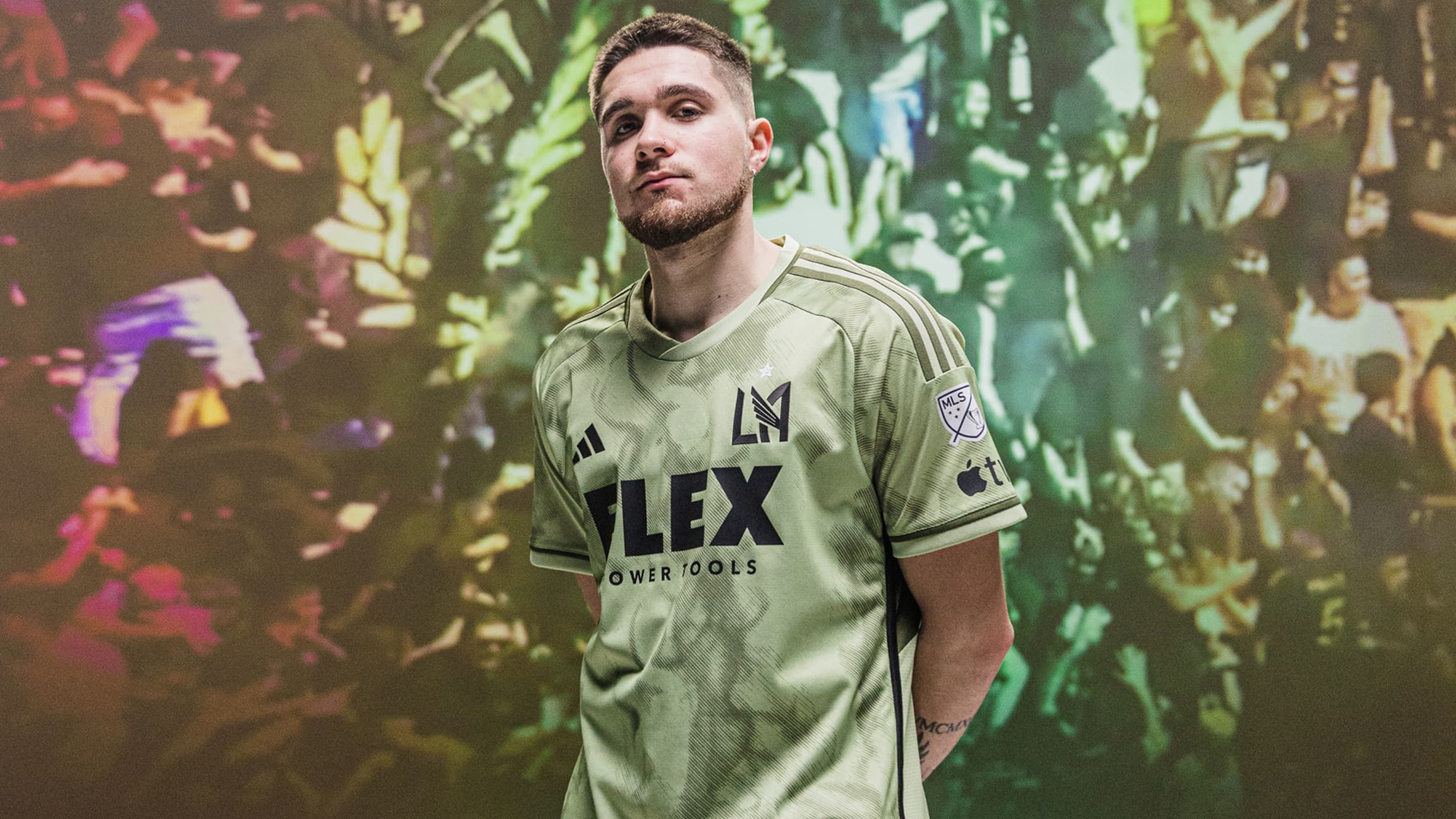
9 minutes ago, aawagner011 said:
LAFC is official according to MLSsoccer.com, though the team have not put out any additional posts themselves. You can see the MLS Cup winners badge, too. I need to see the rest of the kit to better judge this one. My color blind eyes aren’t even sure what color that is.
LAFC is going with a smoke pattern as a nod to The 3252 -
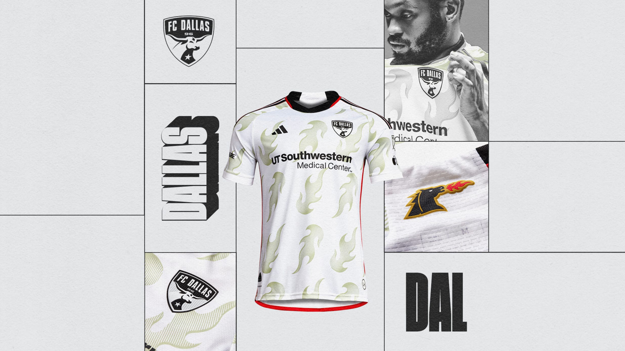
38 minutes ago, aawagner011 said:
FC Dallas: previously unseen to this point. Clearly inspired as a callback to their Dallas Burn days. The last tweet includes a photo of the full kit.
A kit full of flame emoji’s as a nod to the Dallas Burn roots just feels like a terrible uninspired effort by Adidas here.
But Portland gets those sweet plaid jerseys? Talk about hometown discount.
Also Austin feels like a straight rip of the 21/22 Barca kit. FC Cincy’s water print also feels like a lazy attempt to honor the Ohio River. Why not use a map pattern of the river’s flow instead?
Kits I do like: RBNY, NYCFC, Revs, Dynamo, PTFC.
Im really intrigued by Minny’s Northern Lights theme, waiting for that to drop…
-
-
-
-
56 minutes ago, VDizzle12 said:
I don't live in NE Ohio anymore, but my understanding has always been that it's the overarching name for all of the nature preserves/reservations, public parks, beaches, zoo, golf courses, etc in the Cleveland area.
I get the connection since Cleveland has always be called "Forest City" but the light blue and tan don't make me think of any park I've ever been to in the area. Dark green and tan would have made more sense.
So the Cavs City Edition is basically a Parks & Recreation jersey? Haha

-
On 11/10/2022 at 9:17 AM, VDizzle12 said:
They went with a Cleveland Metroparks theme. Honestly don't know why they went with light blue instead of green if that's the case. Can't say I've been impressed by anything this "visual artist" has done since he was put in charge of the Cavs branding.
What exactly is Cleveland MetroPark? I thought MetroPark (the clothing store) died a decade ago? Is this the last MetroPark store still in operation, celebrated like the last Blockbuster Video in Bend, OR?SPEAKING OF: Maybe the Blazers should do a Last Blockbuster Video store themed City Edition?
On 11/10/2022 at 10:21 AM, Magic Dynasty said:Edit: I like the court though. It’s about time they did something with the skyline like other teams have.
Not every city has an instantly recognizable skyline so not every team needs to put a skyline on its court.
But Orlando, FL does have an instantly recognizable landmark who’s silhouette would’ve been perfect for the Magic and their Kingdom theme: The Castle at Disney World. A
On 11/12/2022 at 5:45 AM, M4One said:Washington city court. Don't know if posted yet. There's a whole write up on ESPN that includes mock ups of other courts they considered. https://www.espn.com/nba/insider/insider/story/_/id/34981405/lowe-incredible-new-washington-wizards-alternate-court-cherry-blossoms
So the Wizards chose the safe conservative route over much better designs in their think tank? Lame9 hours ago, pepis21 said:I don't know how it looks in 2k but in real life Knicks City court a little bit different this year than in previous.
That Knicks court… the skyline should’ve been on the court here, not crowding up the baselines where it’s likely to be covered up by cameraman
-
1
-
-
16 hours ago, DCarp1231 said:
Detroit- all they gotta do is take this and run with it. It’s literally a blank template.
The Wayne Fontes - era Lions of the early 90’s were the best uniforms this franchise has ever had.
Slap the current logo on the helmet and it’s perfection.
On 11/5/2022 at 12:04 PM, Volt said:
Embedding both here, they display a little larger. This is great Photoshop work. These needed to be added some way, some how to their uniform set as an alternate.
Would be curious to see these in today's Honolulu Blue with the current logo.
-
5
-
-
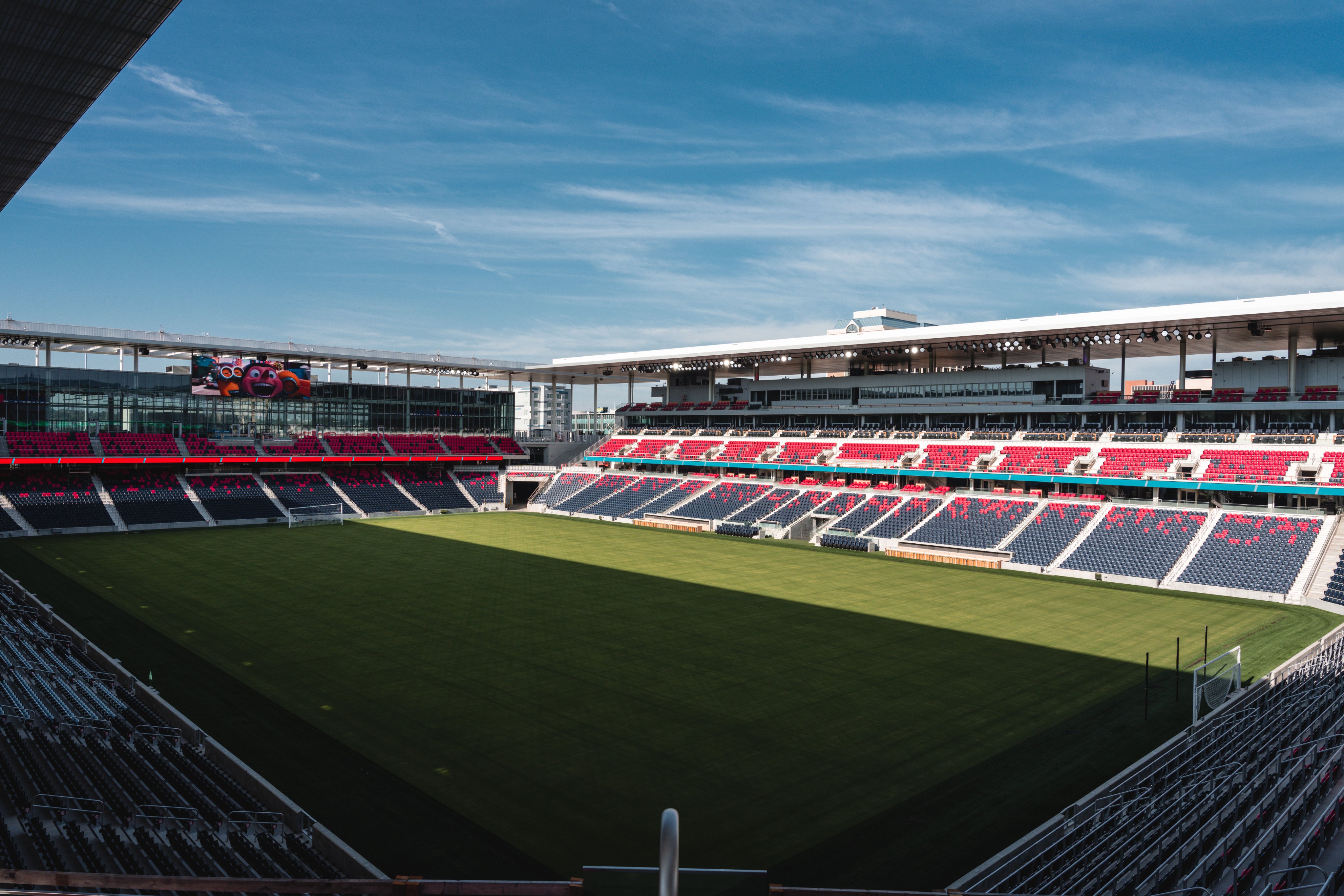
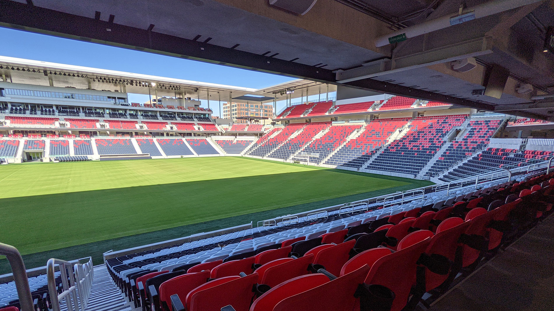
On 11/4/2022 at 1:13 PM, WestCoastBias said:
Best of the new MLS 3.0 venues. Simple clean design. And together with Children’s Mercy Park in KC, the Show Me State is showing off.And even better, the training ground is located next to the stadium as well. All in an Urban area close to the majority of the population. MLS has come a long way from the days of building in suburbs like Commerce City, CO, Harrison, NJ, Chester, PA & Frisco, TX.
-
7
-
-
1 hour ago, BBTV said:
It's either illegal or it's not. And it is. So I don't get your point.
Did it matter? Of course not - but it's just another indication that there's no oversight in that dugout.
Just like there’s no oversight in the Dodgers dugout allowing Max Muncey to use Albert Pujols bat (and homer with it). And like you said …that’s illegal.Call a spade, a spade. Thats how you address League wide issues. That’s my point but you don’t want to see it because it doesn’t fit your narrative.
-
1
-
1
-


Arizona Cardinals new uniform extravaganza
in Sports Logo News
Posted
It would be totally hilarious if we made it this far and then for some reason, they weren’t able to open the briefcase. They lost the key.