


O.C.D
-
Posts
656 -
Joined
-
Last visited
Posts posted by O.C.D
-
-
22 hours ago, upperV03 said:
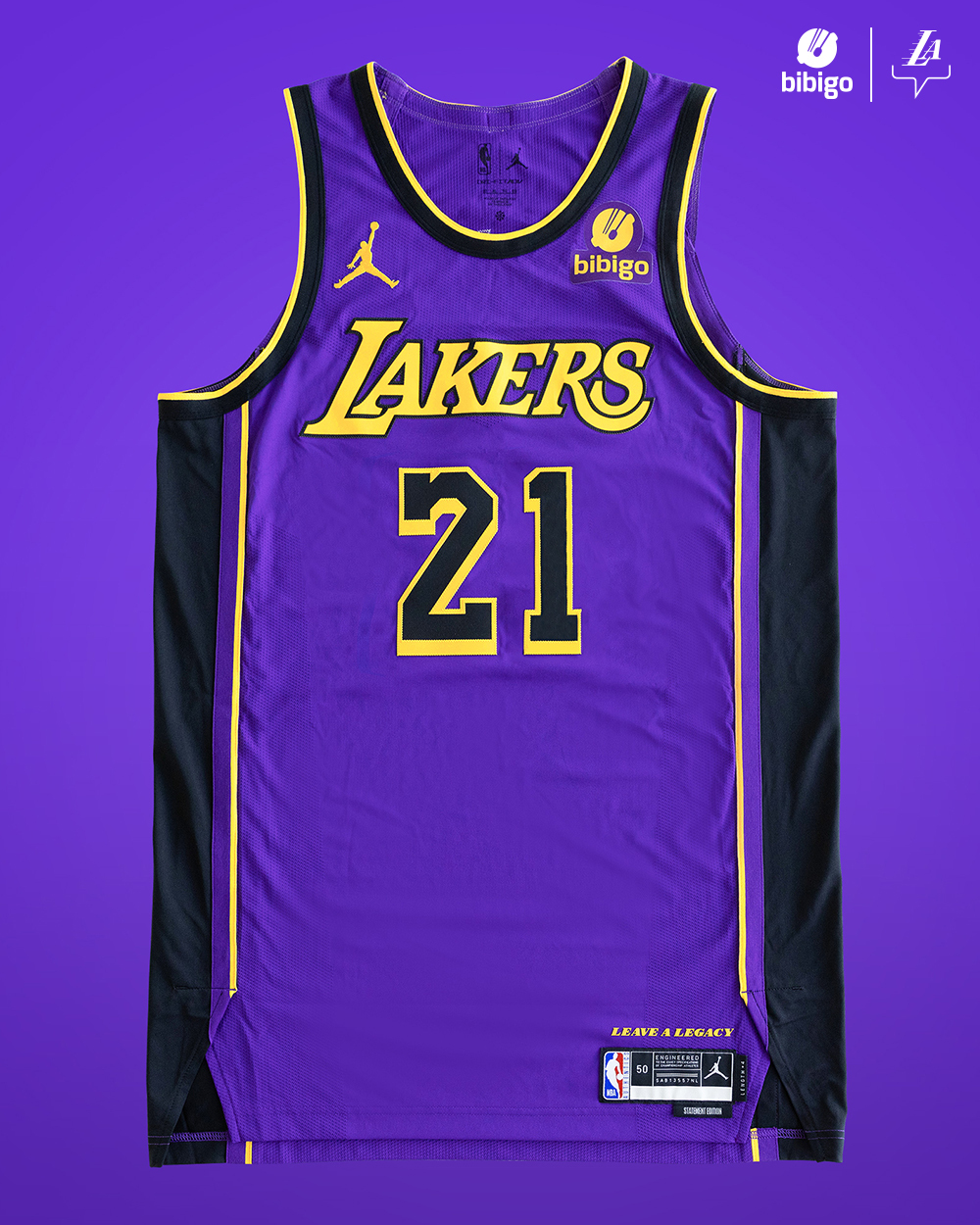
The purples are now alternates, that’s not really an arguable statement (see what I did there?). Also, it sure seems like you didn’t read this part of my post:
”I don’t think it’s a stretch at all to say that those (Hollywood Nights uni) very likely influenced the decision to add black into the purple threads when unveiling their new uniform set in 2018. You can bet those Hollywood Nights jerseys and the associated merch did pretty good sales numbers because 1) they’re the Lakers and 2) black sells, so the Lakers probably saw an opportunity to further integrate black into their identity by way of the new purple unis in that 2018 update.”
With Nike’s Association/Icon/Statement/City designations pushing the purple unis into alternate status, I absolutely think the Lakers saw an opportunity to shoehorn black into the purples since they weren’t going to be the conventional “road” uniform anymore. Again, if the Lakers wanted more of a normal & traditional purple uni, they’d get it. They clearly like the look, they’re now on the 2nd version of the black-accented purple unis (plus they had the Magic Johnson city set, too).
I see what you did there. I did read your post, (without double checking your figures) I didn't disagree with your framing.
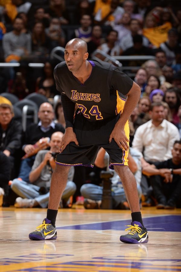
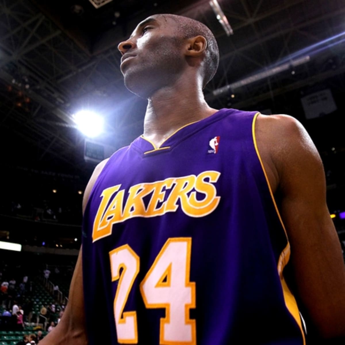
We can now argue if the Lakers purples are *really* alternates (considering they've worn purple on the road since 1966)
We can now argue who's idea it was to add black to the road purple uniforms
We can now argue who's idea it was to change the Lakers and Celtics road uniforms from PURPLE and GREEN
We can now argue if the change in uniform system has been a benefit to the league or not
If it wasn't already clear, I think adding black to the road purple uniforms was a bad idea. I think it was an even worse idea to change the uniform system league wide (I don't think anyone would claim the Lakers invented the new system)
-
16 hours ago, upperV03 said:
We just gonna ignore these???

Blame Nike all you want, but the Lakers signed off on these original BFBS threads (back in ‘13 for the original sleeveless version). Who knows whether that idea originated at Adidas or within the Lakers organization, but it doesn’t come to fruition without the Lakers ultimately signing off. I don’t think it’s a stretch at all to say that those very likely influenced the decision to add black into the purple threads when unveiling their new uniform set in 2018. You can bet those Hollywood Nights jerseys and the associated merch did pretty good sales numbers because 1) they’re the Lakers and 2) black sells, so the Lakers probably saw an opportunity to further integrate black into their identity by way of the new purple unis in that 2018 update. If there’s something to blame Nike for (even then the league had to approve it), it’s forcing the Association/Icon/Statement/City designations and getting rid of the white at home/color on road. That pushed the Lakers’ purple unis into alternate status, which likely made the traditional purples seem more dispensable in the Lakers’ eyes. If they wanted more of a traditional purple uni, or at least one without black, they’d get it. It’s clearly something they like, especially seeing as this new one is the 2nd iteration of the purple/black Statement unis.
These were an alternate. If your position is the purples are now alternates than two different conversations are going on rn
This seems like "THESE SHOULDN'T EXIST vs DON'T BLAME NIKE" but from my perspective they seem like an unpopular uniform. SOMEONE pushed for adding black to the road uniforms and I'd LOVE to know who.
-
9 hours ago, Froob said:
My god what did the do to the lakers purple jerseys? Nike deserves jail time for this
to
I don't know if LeBron gets any blame for adding the black or if it was just a coincidence but it's apart of his Lakers legacy and it's a bad look. Imagine someone going to the Yankees and they pushed for the team to add Khaki or something
-
 4
4
-
-
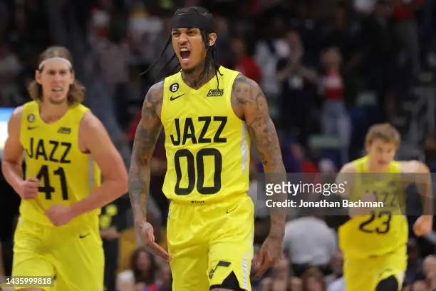
5 hours ago, pelicanfan said:
infamous jerseys debuted last night.
they look ridiculous but i’d be lying if i said i didnt want to see them wear these more. they’re just so funny to look at.
It's a bizarre color combo for a team called the Jazz and I'll be ecstatic when minimalism goes out of style. I can't believe someone got payed to design those
-
5
-
-
7 hours ago, pepis21 said:
It's already WIP.
The implications are pretty crazy. Glowing outlines and piping. Animated gradients. Color changing
numbers and word marks.
-
I'd like to imagine this was approved by several people who were cool with it. Excited about it hopefully
-
3 hours ago, Kg54mvp said:
They need to change up the team identity. Everything is basic and kinda boring. They have good colors, fonts, numbers but the final presentation has been lacking since day one.
On a side note they lost something when they darkened the blue. I don't hate the green but it doesn't make me think of trees in a forest either.
-
6
-
-
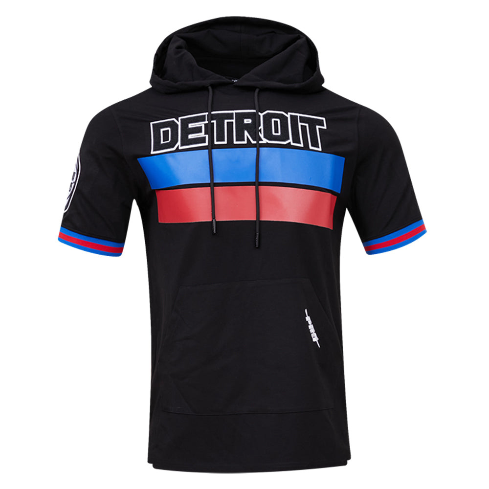
13 hours ago, pepis21 said:
Their offcourt gear are black so big mess with that. BTW they have full Detroit wordmark which look better:
it looks like blue and red duct tape
-
3
-
 1
1
-
-
Just now, the admiral said:
This is a really lame joke you just made, so if you take it over to r/canes, the actual team will probably steal it and do it.
My path to glory
-
10 minutes ago, RollWolfpack said:
Hurricanes Stadium Series inspiration?
Someone on the Canes subreddit just posted this picture of a new Stormy logo that appears to be Tuffy-inspired. Given the game is played at State’s football stadium, could this be the direction for the Stadium Series game uniform?
what if instead of a hog the mascot was an anthropomorphic cane who was in a big rush.....pressed for time......a.....hurry.......................Cane?
Thoughts? Ideas?
-
1
-
-
On 8/26/2022 at 9:45 AM, gosioux76 said:
I'll never understand the love for the satiny dazzle fabric of the early 2000s, but it's also likely it was never meant for me to like. I presume this was a thing because a fashion trend from the era. I seem to recall a lot of brands, Fubu comes to mind, that made streetwear jerseys with this look.
It could be nostalgia but I feel like dazzle fabric has extra depth because the way the light hits it. It really exaggerates the contrast between highlights and shadows. With certain colors it looks great
1 hour ago, the admiral said:No, this is what I was talking about when I said the Nuggets had something interesting going and threw it away to be another navy/gold team.
They were really nice alts but without the powder blues as primaries they aren't as cool
-
2
-
-
21 minutes ago, CreamSoda said:
May as well jump on the bandwagon, eh?
I don't have a dog in this fight but I'm a fan of a city/area owning a color scheme across multiple sports. It makes me feel a sense of community
-
5
-
-
3 hours ago, ramsjetsthunder said:
Stuns me that the Rams have won the same amount of Super Bowls in these helmets
All they had to do was make the top helmet the color of the bottom helmet.
-
9
-
 1
1
-
-
3 hours ago, Ridleylash said:
That's not the Buffaslug, that's the Goathead. This is the Buffaslug;
I hope I get to see this logo get retconned as retro fire emoji tweets on it's triumphant return
-
3 hours ago, fortunat1 said:
I get the dislike for 2000's NBA jerseys, as some jerseys just aren't meant to see the light of day again, but there are some significant (and less appalling) jerseys that will get the throwback nod in the coming years/decades.
Throw in the NJ Nets and the AI-era Sixers if you want to bridge the 90's-00's gap as well.
As 2000's nostalgia develops I'm sure that some other jerseys will gain popularity and make their return. These jerseys aren't perfect, but throwbacks aren't going to disappear in the coming years, so you'd better get ready to see some of these return to the court.
Those Nuggets uniforms are a great example of how much better some designs were in dazzle material. Some current uniforms would benefit from having a shine to them. I also miss satin baseball jackets. Those were sweet
-
5
-
-
58 minutes ago, BJ Sands said:
I'd love to see
black helmet
red jersey's
black pants
red socks
-
2
-
-
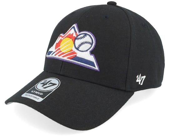
11 hours ago, NH4 said:
Bucks released their purple throwbacks
This is my favorite Bucks identity ( I wish the Rockies would adopt this color scheme) but I think they shrunk the wordmark and numbers too much. Not against making them smaller just not a fan of the ratio.
-
1
-
-
4 hours ago, DEAD! said:
so... is it real?

Red helmet alternate for Bills is awesome but they done goofed on the stripe
-
1
-
-
14 hours ago, TheRealPepman said:
Warriors' new Statements are now official.
are these meant to be a blending of the 2000's uniforms with the championship uniforms or is it navy for navy sake?
-
10 hours ago, bowld said:
Saw this when browsing Fanatics this morning. Anyone ever seen this logo used?
At hat within a hat
-
1
-
-
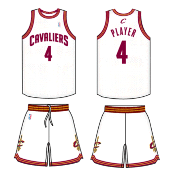
7 hours ago, Cujo said:
Can someone tell me what was so wrong with these?
They were clean. Won a title in these in '16. Could've been modern classics.
The trim is a busy but these were solid. Adding the in-line to the numbers and script would be an upgrade imo
-
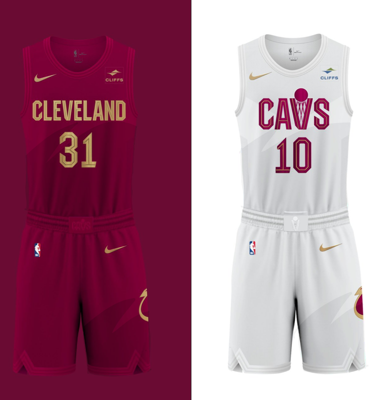
55 minutes ago, pelicanfan said:
my idea was that if the cavaliers had to go for an overly clean look then maybe they could at least add a little subtle shading based off their 90s jerseys. (also do not be fooled by the visible trimming on these generated jerseys, they’re practically invisible irl)
This is as awesome idea. Clean and merges past and present beautifully
-
1
-
-
2 hours ago, Old School Fool said:
The Jazz uniforms in Summer League are terrible, it looks almost exactly like the regular uniforms and that's hilarious. The yellow they're using is just ridiculous, I'm amazed they actually this would be good. They are really gonna wear this crap during the season.
You can see it a little in the pictures but the court/graphics are done in the same style as last years alt. Picture's worth a thousand words.
-
"We're the team that changes a lot. Don't believe us? Just check out the team store!" is a very modern approach to branding


2022-23 NBA Logo & Jersey Changes
in Sports Logo News
Posted
We agree on a lot. I'm not obfuscating blame from the Lakers for the design either. Someone in their organization is pushing it and without looking at the sales numbers I can't know the full story. The Hollywood night/New purple uniforms don't seem popular but the numbers could tell a different story