


O.C.D
-
Posts
656 -
Joined
-
Last visited
Posts posted by O.C.D
-
-
3 hours ago, fouhy12 said:
I can't believe I've been on this forum for a decade and we're still having the grey facemask debate. It's what really makes this place feel like home.
Like the inevitable rising and setting of the sun there are a handful of topics you can always expect to see here. It's like the movie groundhogs day
-
 13
13
-
-
11 hours ago, BBTV said:
I still contend that 2 is the worst-looking number for a quarterback to wear, and it looks really bad on a guy that looks/plays like Wentz.
6 is the worst number on a jersey. It's asymmetrical in a way that makes it look too bottom heavy and goofy. I never thought that about 9 though. Maybe it's the direction it faces
-
5
-
-
10 hours ago, WSU151 said:
Which uniforms look cheap in design and execution? It's hard for me to agree with, or to be convinced by, your argument without talking about specifics.
Are you talking about authentic jerseys or replicas?
Generally the fabric used now is thinner and lacks the shine that past authentic jersey's used to use. The jersey's numbers and names used to feature layered thick fabric embroidered to the jersey. The teams ability to design uniforms and identity seems to be limited by the outfitters templates and the fabrics they use (color accuracy, stripping, design element sizing consistency)
I can understand why form fitting templates have become popular because it provides a functional element during game play. Aesthetics have taken a back seat. Uniform real estate has diminished and elements on the uniforms become distorted.
My idea about these changes being cost cutting measures have more to do with my general distrust of big business. Ultimately I'm not privy to their financial records but the product seems inferior to what I used to buy in the late 90's and early to mid 2000's.
-
7 hours ago, dont care said:
What are you going off about? How are using seamless, form fitting, moisture wicking, lighter, stronger fabrics cheap and cost cutting?
I think these outfitters are using adjective word salads in order to sell fans a bill of goods while they're saving money on mass produced jersey's. In comparison to what they used to sell fans, these new uniforms look cheap in design and in execution. This isn't even exclusive to the NFL. MLB and NBA have done the same thing (much less experience with NHL). I've got a closet full of what those leagues used to offer. There used to exist a quality of craftsmanship that you don't find today.
-
2
-
-
3 hours ago, phutmasterflex said:
The issue with that aquafresh piping was that it went through so many changes under Reebok depending on what kind of template was used. And for players like MJD, he wore all three. A design function that can't translate well through different players on the same team is not good.

Your point is right on. The striping was very inconsistent. Over the past decade NFL uniforms look cheap. From quality of design to fabric and uniform cuts. I think the league has tried to sell cost cutting measures as progressive uniform design.
-
 1
1
-
-
I think the biggest mistake NFL teams consistently make in redesigns is number font choice.
The Jags Brunell era uniforms were the best they've ever looked. Once they started to tweak them during the Leftwich era they've gotten progressively worse each version.
They need to go back to the Brunell era numbers and use teal numbers on the white jersies
They need to reintroduce the original shade of gold they used during the Brunell era and use it within the same ratio they originally did.
Helmet should go back to glossy black, although the teal fleck version could work too, black would be better.
-
14
-
 1
1
-
-
1 hour ago, QCS said:
Yeah, that's the point. The silver is superfluous in the identity and axing it in favor of a blue helmet is the right way to go. Not to self-promote, but I did explore this concept about a year ago:
I removed silver, burned the black socks, and replaced the sleeve logo with TV numbers. As long as there are no blue pants, this set would be pretty much perfect. The only thing it requires is a new logo with a preferably black stroke, to avoid the awful blending that happens too often with the current logo.
The logo gets a little muddy on a blue helmet. I'm sure there is a way to redo the outline to make it sit better. I like the blue helmet, but I also like the sense of depth the silver brings.
A change for the Panthers in this direction would be similar to what the Jets did (light helmet to team color helmet). It would probably be well received.
-
2
-
-
5 hours ago, Megildur said:
I admit, I was a bit skeptical of this idea at first. I liked the simple monochrome green look, but I played around with your idea and it's growing on me. Before I revamp the rest of the set though, I wanted to see if this is what you're suggesting:
I decided to switch the colors of the front number too, to add more contrast against the word mark. With the addition of the bright green to the word mark and number, I may also add it to the sleeve striping too if it looks good. Otherwise, I included an updated Seattle primary logo and a cap with the bright green drop shadow as well. With the inclusion of the bright green into the primary home jersey (and potentially the away and away alt too), I figured I'd add it to the logo. I struggled with figuring out how to fix the mountains and the stretched-out feeling of them in my Seattle concept, so I went with another direction for this one. I ended up looking up other mountain-related logos to get ideas and ended up basing the primary off the shape/set-up of this logo here. The mountain is based off the view of Mt. Rainier from Seattle. What do y'all think? Should I update the rest of the Cascades accordingly?
I absolutely LOVE THIS! I think the addition of a light green stripe next to the dark green stripe would look beautiful (to give a sense of balance with the striping pattern of the uniform overall). I think what you've done with the logo and hat is phenomenal as well.
I really liked the mono look too (it reminded me of a green Yankees). What I LOVE about this version is that it fully utilizes a color scheme that is so unique and beautiful. I've always loved 3D drop shadow as a uniform design element because it gives the design a sense of depth that makes it stand out and looks beautiful when embroidered.
I think if an MLB team based it's identity on what you've done here it would be one of the top 5 best looking in the entire league
-
1
-
-
On 7/17/2020 at 11:14 PM, Megildur said:
It appears as if the Denver update has been well-received, so we'll move on to the Seattle Cascades. Here, set the mood with this song by The Cascades, who were actually from San Diego, according to Spotify. The song is about rain, which Seattle gets a lot of...
Since the expansions and realignments of the late 1990’s, California has been the major player out of the Continental League’s West Division. With the past two division titles though, Seattle has emerged as a force to be reckoned with in the division, and the team continues to lead the division with a 19-15 record so far this season. The lone title in Seattle’s history, and their first postseason appearance, came in 2004, as the Cascades beat Atlanta in five games to hoist the Maynard Trophy. Yet, the rest of the Cascades’ history has been bleak, as the club has only managed 11 seasons at .500 or above in their 47 seasons of play.
Despite the lackluster history of the Seattle ballclub, the Cascades are poised to contend for years to come with the #1 pitching staff in the Continental League, which features dominant hurlers throughout the pitching staff, and two top-60 pitching prospects waiting in Triple-A. Lefty SP Trevor Cabrera is the ace, and rightfully so, since he finished last season 2nd in CL Pitcher of the Year voting with his 2.30 ERA and 206 K’s. The 22-year-old signed a team-friendly deal with Seattle this past offseason, buying out his arbitration years and keeping the fan-favorite in a Cascades uniform affordably for years to come. Homegrown SP's 26-year-old Cody Hester and 22-year-old Jay Johnson are slated to anchor the rotation alongside Cabrera for much of that duration, while 31-year-old SP Jonathan Flores represents the lone veteran in the rotation and boasts the only All-Star nod of the staff (for now). 3B Ryan Merritt, at just age 24, is another young star and currently ranks as the UBA’s #4 position player league-wide. Acquired from Cleveland in the 2017-18 offseason for young SP prospect Willie Lovera and others, Merritt established himself as a star last season with 29 HR, 99 RBI, and a .319 average in his first full season as a regular. RF Octavio Molina was signed that same offseason to a 6-year, $102 million deal after establishing himself as an 2x All-Star in Toronto, and he anchors the lineup in the cleanup spot, right behind Merritt at #3.
The Cascades were named for Seattle’s proximity to the Cascade Range, which lie east of the city and boast the beautiful Mt. Rainier, which is visible on sunny days from Puget Sound. The cursive Cascades script has long been part of Seattle’s identity, as well as their rich shade of green and the mountaintop details on their logos. Urban legend claims that the Seattle-based Starbucks chain loved the Cascades color scheme so much that they copied it for themselves. As for the caps, the Cascades boast three different caps, though their bright green alternate cap is rarely worn, even with the popular bright alternate jersey. The bright green alternate, worn in about 30% of Seattle’s home games, was introduced in the early 2010s, after the club scrapped their black alt in the mid-2000’s. The second alternate, a fan favorite, is actually worn more often than the away grays, if just slightly, though it is only worn when the club is on the road.
Home:
Away (v2):
Alternate 1:
Alternate 2 (v2):
So there ya go! Team #4 is posted, so by my measure, just seven more groups of four to go. Welp. If it takes a month for me to post four teams, then that pace would have me done sometime in early 2021. Hmm, hopefully I can speed up before then.
As for the actual design, the bright green was not-too-bright on my computer, but somewhat an eyesore on my phone. I'm thinking of making it a mintier, less bright shade of green if y'all think it's too bright. As for the alternate caps, I'm not sure if I like them, but I wanted to do some sort of mountain-y cap design like the Rockies in recent years. I'm a little unsure about the little tail I added to the 'e' in Seattle too.
Like always, let me know what you think and I hope y'all like Seattle!
SPOILER: Includes v1 of the away uniform and alternate 2. I removed the white outlines from the away set, including the white from its place alongside the green striping. I changed the alternate's pants to match. Also, the removal of white from the away uniform included making the socks stripe-less.
I really REALLY like this concept.
I think an interesting idea could be to use the lighter shade of green to create a 3D drop shadow effect (Like the LA Angels home uniform. But where they used gray, in this set it'd be light green, with the base uniform color being used as negative space). I think you could use that effect on the numbers as well. As a style it could easily transfer to all of the jersey's and it would look spectacular imo. A fully two-toned green uniform identity. Similar in spirit to the Milwaukee Bucks uniforms 86-93, except you'd be using the light green to create a sense of depth rather than using it solely as an outline.
-
1
-
-
In my critique of critique I forgot to say what I thought about the logo change. I think the black W looks better because I like the contrast more
-
1
-
-
4 hours ago, Krz said:
This is the equivalent of the kids who comment “we did it guys we solved racism” when ESPN posts something about civil rights. It’s not funny.
Social media's success is largely due to; 1. People wanting attention 2. People having an ego. Big business takes advantage of those desires by granting the illusion of power. People are addicted to the hyper-reality social media creates and are tribal.
Critique is now entrepreneurial. Spirit is secondary to winning. The troubling part? The mainstreaming of mob justice and mob rule. Being conditioned to think that patience and nuance are part of an evil system. Being encouraged to be more reactionary. Dismissive of the negative effects their actions have. Self appointed soldiers in a culture war. De-humanizing their fellow man and encouraging others to do the same. Why? Because they've granted themselves the authority.
In the age of commercial critique the most jaded wins. No act of contrition is ever truly enough. "Yeah, they did X, but did they do it for the right reasons?" "They did X, but they didn't do X enough" "They should have done X 10 years ago". As long as those type of people drive the cultural discourse, the industry of grievance will thrive and wounds will never heal, and sadly, that's their goal.
-
8
-
-
At best I think it's a shallow PR move and at worst it's a heavy handed attempt to erase a time in history because it makes people uncomfortable.
-
4
-
-
On 6/12/2020 at 10:41 PM, Matthew24 said:
As a SFA Lumberjack Basketball fan. I'm glad they did this. I did look at the last time they tried updating the logo and I still feel it look generic and half***.
Here some creativity was shown atleast. I like the secondary logo though but it looks they they really wanted to hammer the lone star imagery.
As someone who grew up in East Texas, im still puzzled why they're not called the LumberJills. I think it sounds better anyways.
Right? It just seems to make sense from an English perspective like a "John Doe" "Jane Doe" thing
-
1
-
-
Looks good. This is more of just random question but wouldn't LumberJills make more sense than LadyJacks?
-
2
-
-
NFL is hard to watch for various reasons. Having a 2nd option is good. I hope the league does well and grows. Can't wait to see the team designs
-
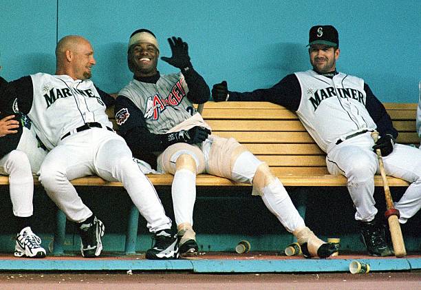
On 6/27/2018 at 6:42 AM, DC in Da House w/o a Doubt said:
Ken Griffey Jr in an Angels jersey
That would have made Angel games a lot more fun back then!
-
2
-
-
2 hours ago, Gothamite said:
Of course, Brandiose being Brandiose, there was a "swingin' mascot" logo. They just left this one on the drawing board.

And look @DC in Da House w/o a Doubt - toppings! Pepperoni!
Seriously, though, how do you look at everything on these pages and say "Yeah, we want that kangaroo-over-the-slice. That's our best choice."
That script is so pleasing to look at. IMO, I feel like it they had stacked the words off center from each other it might look even better. Maybe play with the size of the words in comparison to each other, but I wouldn't really change anything about how the letters are constructed. Really really nice to look at.
-
3
-
-
1 hour ago, bwburke94 said:
Another player to be named later: David Ortiz, formerly David Arias.
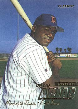
I got to see him when he was on the Twins vs the Angels. He was David Ortiz by that time though. I wonder how many guys in the MLB aren't really named what they're called.
-
1
-
-
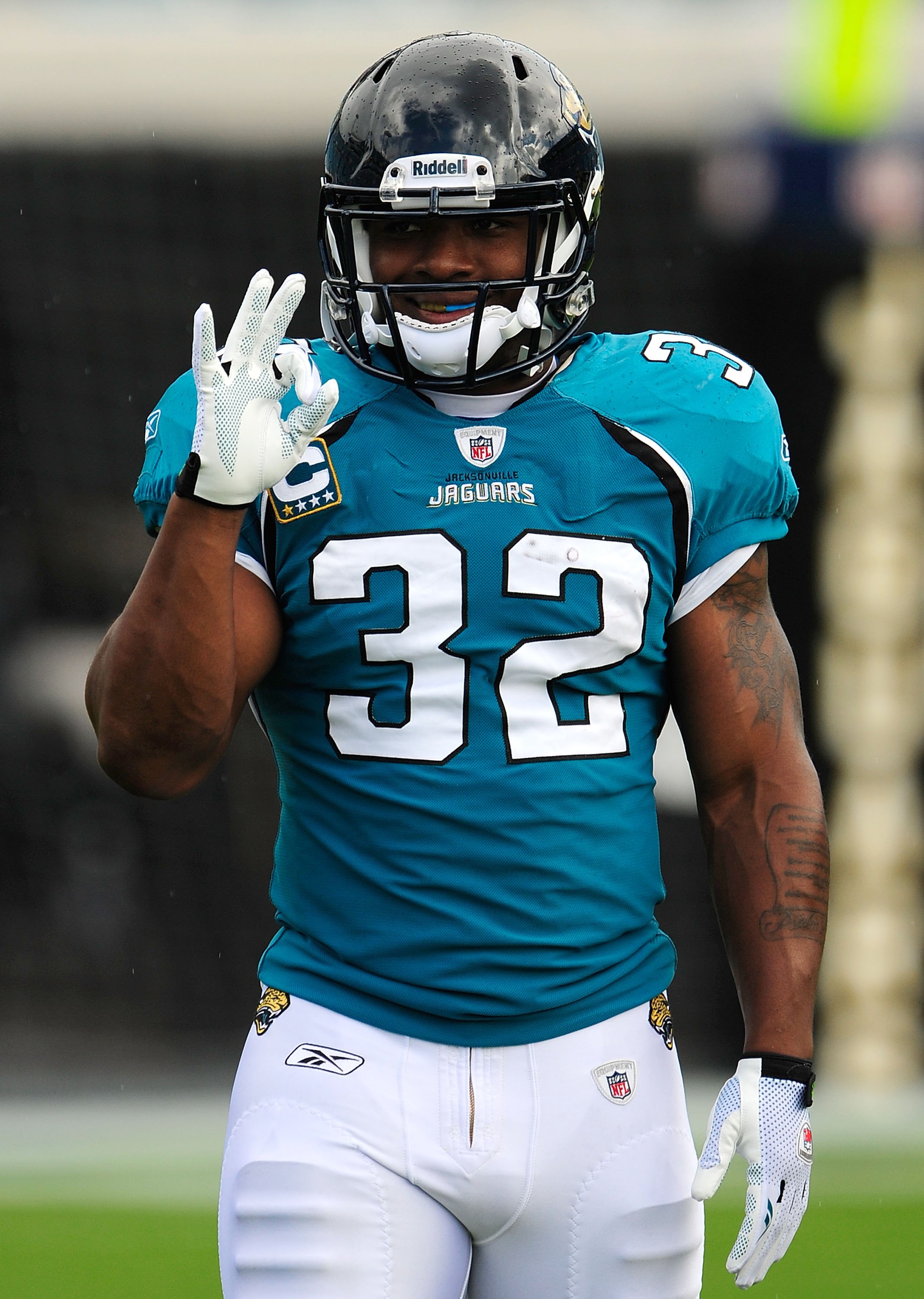
On 5/7/2017 at 10:38 PM, sportsfan0518 said:
Wrong uniform and number! DeAndre Jordan was briefly number 9 and had on the Elton Brand era uniforms during his rookie year.

Such a better uniform than what they have now
-
7
-

/cdn.vox-cdn.com/photo_images/5119969/136319809.jpg)


NFL Changes 2021
in Sports Logo News
Posted
Red>Blue>White>Grey