


O.C.D
-
Posts
656 -
Joined
-
Last visited
Posts posted by O.C.D
-
-
I vehemently dislike the modern approach to designing numbers. They've tried way to hard to reinvent the wheel at the cost of a well balanced uniform. I still have a hard time believing they're classically educated designers
-
 1
1
-
-
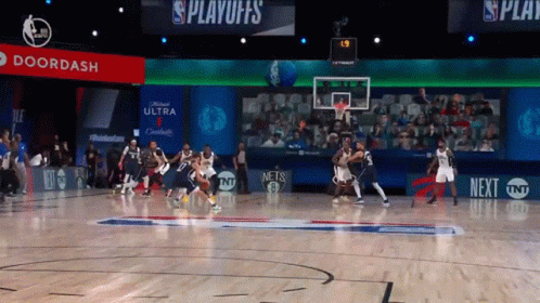
1 hour ago, Primzahl said:
I've seen multiple Mavs uni tracker accounts on twitter confirm these will be back for a third season.

If they want to wear navy they should bring back the old navy primaries. It uses the same template as their current royal blue primaries
-
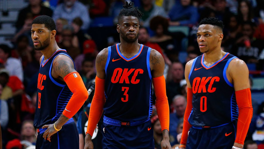
1 hour ago, kimball said:
I can't give you OKC. The logo is soooo ... clip arty. I like the colors, but that's the only thing they go going for them. Basing something off their Statement Jerseys over the past couple of years would be a good direction.
They're a victim of their success in this regard. They got locked into that logo and these colors. I never thought these bright colors were great for a team called the Thunder (something you associate with dark skies and dark clouds). They need a new logo
-
3
-
-
3 hours ago, _DietDrPepper_ said:
I mean, the obvious logos and wordmark differences show otherwise. Maybe with the Lightning and Maple Leafs I could see it, but again the giant chest logos are pretty dead give aways.
Most people would think all those teams uniforms look very similar. What is obvious to the trained eye can easily be missed by average people. Isn't this the reason soccer teams have a clash set? If two teams have similar colors one of the teams can wear something totally different?
-
8 minutes ago, 63Bulldogs63 said:
Not sure where or when the f this boomer thing became a thing, but I'll gladly identify with that generation over my own.
It's been around for a few years. It's partially based on resentment because of the generational wealth gap and partially based on millennials and zoomers wanting to make fun of old people for not being hip.
It's funny being called a boomer for an E-40 reference because E-40 is older than me. I only know who E-40 is because I have friends my age who grew up in Northern California who were shocked I hadn't heard of him.
-
2
-
-
52 minutes ago, MCM0313 said:
Okay, boomer.
Proud Millennial boomer checking in
-
6
-
 1
1
-
-
17 hours ago, ManillaToad said:
Wtf does sprinkle me mane diamond mean?
1 hour ago, Ben in LA said:
It makes me happy when I don't recognize the meme reference.
-
7
-
-
5 hours ago, oldschoolvikings said:
We have been seemingly talking about the one helmet rule, and when it might be repealed for years. What a lot of people who were hoping to see it go away said was that it would be awesome to have alternate helmets again, as long as it was exclusive to throwbacks. I don't know how many times I saw that particular phrase typed... "I'd like to see alternate helmets again, as long as the NFL has a rule that it has to be just for throwbacks." And what I said was, when the rule finally went away, I didn't believe there was any way it was going to be just throwbacks. Too many teams who don't want to wear throwbacks, too much money to be made, too much Nike. When it happened, alternate helmets would mean alternate helmets.
So... you know... just for the record, I was right.
The NFL played their cards right by waiting. They got fans invested by making them beg rather than give it up right away for nothing. They managed to keep it special.
1 hour ago, JayMac said:So how many helmets will each NFL team have by 2025? We all know they will not stop at 2.
The NFL is the conservative pro league. I don't see them over saturating like the NBA does
-
2
-
-
28 minutes ago, LA Fakers+ LA Snippers said:
Doesn’t this:
Look better than this?:
White socks are much better looking with the red pants. Red socks makes it look like the football uniform is a giant unitard
-
8
-
-
52 minutes ago, AndrewG70 said:
The point I’m making is if the NHL promises to keep ads off the jerseys, I can live with them being on the helmets.
They brought in helmet ads under false pretenses and permanent. Jersey ads are coming even if the NHL promises they aren't
-
2
-
-
I think it would take an obscene amount of ads on uniforms to make NHL fans boycott in large numbers. Helmet logos are staying, jersey's are next and fans will not leave.
-
2
-
-
On 6/8/2021 at 11:38 PM, nash61 said:
This really is a lovely shade of blue. I wonder what it would look like if you put the main Avs logo on this jersey instead of the diagonal word mark
-
2
-
-
5 hours ago, flyersfan said:
(PHI) Red @ (ATL) Red (Game 1)
2 hours ago, sayahh said:That can't be right, can it?
This reminds me of something I noticed in 2K21; When you see two teams that use red in a match-up and you notice the variations of red used in the NBA. From afar a lot of the reds look the same, but when compared they're slightly different. In the game the Pistons red looks almost rose compared to the Hawks.
-
1
-
-
1 hour ago, flyersfan said:
Sixers-Hawks is an excellent example of how simple, yet unique uniforms can look gorgeous, as well as giving us 3 distinctly different uniform games with no loss of "Who am I watching?"
2 of the best dressed teams in the league.
Hawks vs Sixers is one of my favorite match ups in NBA 2K21. Both teams use drop shadow numbers but at different angles. Such a great design element. The Hawks should have used a drop shadow on their wordmark too
-
5
-
-
5 hours ago, flyersfan said:
To further the NY branding argument, Think New York Knicks. I couldn't tell you what a Knickerbocker is, but they're a legendary team because of history and New York.
The Jets current uniforms are okay, I think the black alts are unneeded with the dark green, but I can live with them. I like the stripe being unique, not a gimmick, and fits the modern look.
I wish there was some sort of jet (or branding hint) in the logo, since their logo hasn't reached identifiable icon status (which allows skipping the actual team name) like the Bears and Cowboys. We have to read the word Jets to know its them, unless you're plugged in to the uniform design community like us all.
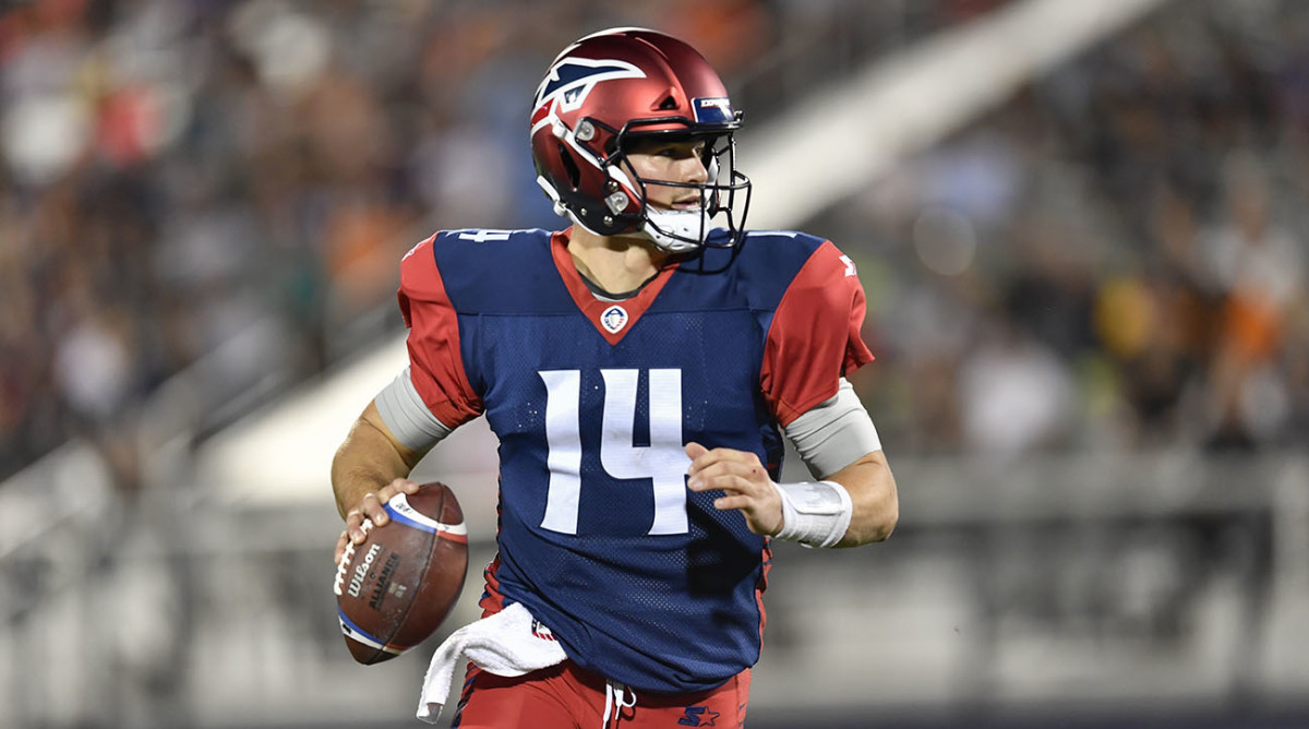
A bit gaudy with the gradient, but I liked the Memphis Express helmet logo (worn by Jets legend Christian Hackenberg)
This is a prime example of how much potential exists in using actual jet imagery as a design element. The Jets could make a truly iconic helmet logo. The design possibilities are so vast.
-
1
-
-
21 hours ago, TaylorMade said:
I'm sure it doesn't, but man does it look like that says "Mallas"
The league is rolling out an "Alt-persona" promotion. The cantankerous Mallas Davericks. Trouble makers if you ask me.
-
20 hours ago, colortv said:
What the Showtime jerseys look like with gold numbers:
https://lakersstore.com/collections/jerseys-2/products/lakers-bryant-clot-x-mn-sweater-knit-jersey
The current Lakers uniforms would look better if they had drop shadows as big as these. Getting rid of the black on the purple uniforms will be an instant upgrade. Current Lakers set is close to being one of the best in the league, but as of right now they're off the mark.
Gold numbers aren't a deal breaker either. It's different, but it's not bad.
-
4
-
-
On 5/13/2021 at 4:01 PM, coco1997 said:
That's a cool idea!
Thanks!
Thanks for the feedback! I'm not sure re-coloring MiLB teams is a rabbit hole I'm willing to go down, but it's an interesting suggestion nonetheless.
As requested by @BayBaseballFan, here are the '90s Brewers in Packers colors!
BREWERS HOME:
BREWERS ROAD:
BREWERS HOME ALT:
BREWERS ROAD ALT:
This concept looks great. Green and Yellow work so well together that I bet you could do a green and yellow concept for every MLB teams and all of them would probably look great. The Wisconsin tie in is a no brainier that I'd be surprised if the Brewers never thought about making the switch
-
1
-
-
On 5/16/2021 at 6:37 AM, DNAsports said:
No one really likes the mono look. Like you said though, Seattle made that the team’s shtick and unfortunately it does work.
For the road grey, it makes a lot of sense. Of all teams, the Rams proved a team doesn’t actually need a white away jersey. Grey is a good one for Seattle to adopt and drop the white uniform completely. I hope some more teams follow suit.
I used to like mono when I was younger. Mostly because it was different. Then someone pointed out how bad mono looks when the socks are the same color as the pants. I can't unsee it. It's like a giant leotard.
When the socks are the same color as the pants it just looks like oddly long pants. No matter what
-
2
-
-
1 hour ago, spartacat_12 said:
I don't get it, it's just a basic wordmark & football. A name like Jets has so much potential when it comes to branding, so the last rebrand was a missed opportunity to inject some life into the logos.
It isn't even the nicest green helmet in the league.
56 minutes ago, FiddySicks said:
I’m with you in the color of the helmet and think the base is fantastic. The new logos are absolute garbage, though. Had they used the original green helmet as an inspiration, I’d be way more sold. As it stands now, they look like placeholders for something better.They could have come up with a really cool jet logo. It could have set them apart from the rest of the league in a big way. What they have now is very Madden create-a-team. Not bad just generic
-
7
-
-
1 hour ago, WSU151 said:
My guess is those are practice jerseys...
dropping the yellow outline from the name and number would be downgrade for sure
-
5
-
-
4 hours ago, bbush24 said:
The fact that real human beings with brains said "What's the difference?" when the new uniforms came out will never not amaze me.
It's the exact same picture
On a side note, the pants on the bottom picture are straight up see through. It really irks me that Nike and other companies make their fabric as thin as possible (to the point of being see through) and charge the same amount of money to produce them on field and commercially. I know they have their word salad explanations about space age polymers and moister wicking technology, but the end product feels insubstantial in your hands compared to the uniforms of 10 years ago
-
9
-
-
Your jersey concept is cleaner than what they use now. I like the subtle changes to the helmet logo. There isn't a consistent stripe pattern overall.
Keep up the good work!

-
1
-
-
The Miami Marlins in Dolphins colors is fantastic. Great color scheme and it looks great with the old template
The Rockies/Av's crossover look really good too. The avs color scheme would stand out and look better than the black and purple.
The Nationals in the old Wizards/Caps colors looks really good. I always really liked that scheme but I have a hard time arguing for it's use over red white and blue
-
2
-


/cdn.vox-cdn.com/uploads/chorus_image/image/69412774/usa_today_15993443.0.jpg)

/cdn.vox-cdn.com/uploads/chorus_asset/file/22641048/usa_today_16216549.jpg)
/cdn.vox-cdn.com/uploads/chorus_image/image/63212978/9124b35f75023d15472f34105cada8eab7f6dbb9_express_team_edited.0.jpg)


NFL Changes 2021
in Sports Logo News
Posted
This was such a slam dunk of a rebrand and they just couldn't stop themselves from ruining it.