


BBTV
-
Posts
39,477 -
Joined
-
Last visited
-
Days Won
328
Posts posted by BBTV
-
-
Kelly green sucks. There's something that feels washed out and unsubstantial about it.
YOU SHUT YOUR WHORE MOUTH!!!!
(Ahem... I think kelly green is the most underrated color in sports and isn't used nearly enough.)
I like kelly green and I don't think it's a bad color. I agree that it isn't used enough in sports (green in general isn't really used enough). However, it depends what other colors it goes with because there are some colors kelly green does not look good with.
Black is one of those colors, IMO, which is why I hate most of the Eagles "concepts" on here that are simply fill-tool replacements of midnight green with kelly.
Silver? Cool. Gold? Cool. Yellow? Cool. White? Cool. Blue? Eh... cool I guess.
Black? Makes it look dreary, which is fine if that's the look you're going for, but that's generally not what you want with Kelly. I think the mid-late 80s Eagles actually did want to make their look darker or "less bright", so their use of black worked for what I think they wanted to accomplish (Buddy Ryan was one of the first to wear black eagles caps and other merch, they wore black shoes, and I think they genearally wanted a more modern / intimidating look but were still bound by the conventions of NFL uniforms at the time. I think they could do much better with the color if they ever went back to it, which they have no plans to now or in the future.
-
That is weird...I'd think it would be "all or none". For me, I am getting used to it but I still prefer WR in the 80s.Not an unpopular opinion so much as an unusual one, but wide recievers wearing numbers 10, 12, and 16 look weird to me. None of the other numbers in the 10s do at this point, just those.
I know 12 and 16 are probably because I still think of them as quarterback numbers. 12 is the go-to number for "glamour" QBs (Namath, Brady, etc.); and 16 is what the Packers QB (Randy Wright) and the best QB in the NFL (Joe Montana wore) when I started watching football. But that still doesn't explain why 10 still looks odd to me on receivers.
Even weirder, receivers who wear single digits in preseason still look more "right" to me than those who wear 10, 12, or 16.
I also don't like receivers in 12,14,16. I guess pretty much all the even numbers except 18, because that's a relatively obscure number for a QB (manning aside). Those other numbers are just QB numbers to me. I'd also like to see receivers with single digits rather than 10s. Actually I'd rather keep them in the 80s, but if that's not possible then single digits works.
-
More Irbe, courtesy Matt Hackett:

I saw this bus in Riga and joked to my friend that maybe Irbe was driving it.

-
If they aren't National Champions, can't they say "regional champion" with the Final Four logo? I agree that "runner up" is pretty dumb - is there another word for it similar to regional champion? Like "left side of braket Champion"?
-
Another actor with Minor League experience; The Macho Man.

I thought he was a catcher, but it wouldn't make sense to be a lefty catcher.
Didn't realize there was a card for him - kind of odd since he wasn't in the major leagues, no?
-
Now that's a new one. Flying Elvis is a way better helmet logo than melting bullseye.
-
 1
1
-
-
What's with that belt? Looks like the buckle is bigger than normal.
-
adding that the team will honor the 14 years remaining on its lease with Broward County.
Wow. 14 more years? How godsdamned long was the lease at inception? Why on earth would you commit to that if you're the Panthers - was there really a risk taht they'd be denied tenancy?
-
Is anyone else constantly being taken to the app store when viewing on iPad? I assume it's part of the advertising deal, but it's happening more frequently and making it difficult to use the site on the tablet. Unless it's just something wrong with my device.
-
Counterfeit ring busted. Article details how they communicated with makers in china and got jet he fakes to market fast. Also dealings with eBay. Really shows how disgusting this "profession" is.
http://www.philly.com/philly/news/Feds_Father_son_ran_counterfeit_sports_jersey_ring.html
-
I'm pretty sure they did that. I think it may have been only for the 2000 season but I'm not sure.Interesting, I have never seen those Rams uniforms before. Didn't the early designs feature block numbers, though?
It was weird. The on field jerseys had a block font (kind of a cross between std block and champion - similar to new Stl Blues font) but the replicas had the custom numerals that wouldn't appear on field for another season.
-
it should be up for renovation or just turn it into a parking lot.It'll always be the Jobberdome.

Regardless of the name, it'll always be known as the place where the Coyotes skate on the frozen blood of the non believers.
-
It'll always be the Jobberdome.
-
Looks like the Saints strongly considered switching to serif numbers (and white numbers at home) in 2000:


But this could be an eBay hoax, but glad they didn't. They look way too much like the Ravens, sans purple.
That would've been a huge upgrade, except for the white pants.
-
Well for 10+ years an honest comment like that wasn't over the line, but now it is. Times change. That's cool.
I don't feel sorry for him, and I don't think you have to feel sorry for him. If the new standard is that we have to weep for everyone's death and "hug the ones close to us" and all be Cardinals, then that's a dramatic shift from the open dialog we used to have. Calling him out for being an idiot isn't baiting, it isn't trolling, nor is it causing trouble.
-
I have had dinner with John de Lancie. John de Lancie is a friend of mine.
You sir, are no John de Lancie.
The biggest thing with moderation is consistency. It's like one can't give you the outside corner, then they rotate in the third inning, and the next one takes it away then ejects you when you argue balls and strikes.
-
I don't think I had any idea Eric Lindros played for the Stars.
The Flyers are putting him in their HOF, which shocks me, considering his (and his parents') rift with the team, specifically Bobby Clarke. They're also putting in John LeClair, so maybe it makes sense that Lindros is going in, because LeClair was absolutely nothing without Lindros.
-
We disagree.
-
By definition, none of those redneck cars belongs in a "uniform" thread.
From m-w.com
Uniform (noun)
-a special kind of clothing that is worn by all members of a group or organization.
-Dress of a distinctive design or fashion worn by members of a particular group and serving as a means of identification;
The car fits this definition.
What group is the car a member of? Looks like just a single car to me.
"UNI-form". I don't know the literal etymology (sp) of the word, but it sounds like "one form". It would apply when multiple people wear the same "one form" outfit to distinguish themselves from others, or like if you're talking about pinstripes and how they're uniformly spaced (in this case it's an adjective). Either way, it implies more than one object is needed for the word to apply. Otherwise, it's just a guy wearing something. Or a stripe.
-
By definition, none of those redneck cars belongs in a "uniform" thread.
From m-w.com
Uniform (noun)
-a special kind of clothing that is worn by all members of a group or organization.
-Dress of a distinctive design or fashion worn by members of a particular group and serving as a means of identification;
-
Cardinals should bring back that red piping on their pants.
-
1990 (and here's your bonus player in a wrong uniform):
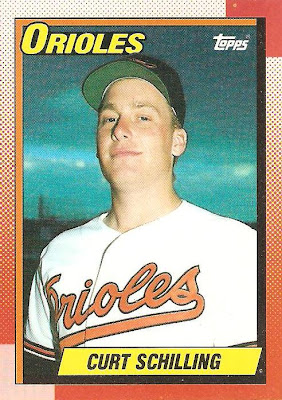
and a player in the wrong body. I love Curt Schilling, but man that dude didn't give one thought to keeping himself in shape or doing any exercising.
-
1
-
-
-
Any app that uploads to imgur. I use Imgupr for iPhone.
Interesting. Never heard of imgur. I'll give that a shot.
Holy crap that's awesome! Thanks.


NHL Anti-Thread: Bad Business Decision Aggregator
in Sports In General
Posted
There was an article today about how the flyers are too good to be the worst, so Hextall should trade anyone decent for prospects and essentially tank like their tenants the Sixers are doing.