


Morgan33
-
Posts
7,664 -
Joined
-
Last visited
-
Days Won
14
Posts posted by Morgan33
-
-
Love the logo, hate the colours
-
Where would you rank it, as far as national mass-market fast food goes? I mean, Burger King is just the worst, McDonald's is pretty decent, Wendy's is fairly good, and White Castle is kind of a special case unto itself.
Side note: I got Subway for lunch today, because my mom gave us a couple of $5 gift cards as stocking stuffers. I had a bite of roast beef that tasted vaguely of fish, which differed from all the others that just tasted of unspecified animal protein. God, that place is a sandwich atrocity.
With the exception of my time at IU, I've never lived in a town with a White Castle (and then it was on the other side of town from me), so I've never really had it and can't weigh in.
For the others that might class as major, my personal hierarchy of taste/value would line up as...
Wendy's
Arby's
Hardee's
McDonalds
Long John Silver's
KFC
Subway
*gap*
Super Bong Burger Taco Bell
Burger King
They're all garbage, google GMO...
-
This logo looks really bad, due to all the silver lining around the buffalo and the swords...

The shrunken version for some reason looks fine, as it gives the logo some depth. However, as soon as you take a closer look, it just looks bad.
It was a bad logo to begin with and the silver highlights do absolutely nothing to address it's many flaws
-
How is the Astro's new logo not the epitome of Lazy? It's the Padres logo with orange and a generic star in place of generic interlocking letters. I'm sure many long days and sleepless nights were put into that peice of artistic genious. If they wanted to look like every other team in the MLB, why not go all the way and replace orange with red? Personally I think every MLB team should be required to use those colours with a roundel as a primary logo.
-

thank god they didn't use this.

Yeah, cuz their current jerseys are so much more creative

Current jerseys may not be as creative, but I'd rather use those than the ones we're lookin' at here.
These just have a fake look to them....
At least it has a proper logo
-

Fantastic! I want one
-
-
While its not my favorite Blues set, I don't get the hate for it:
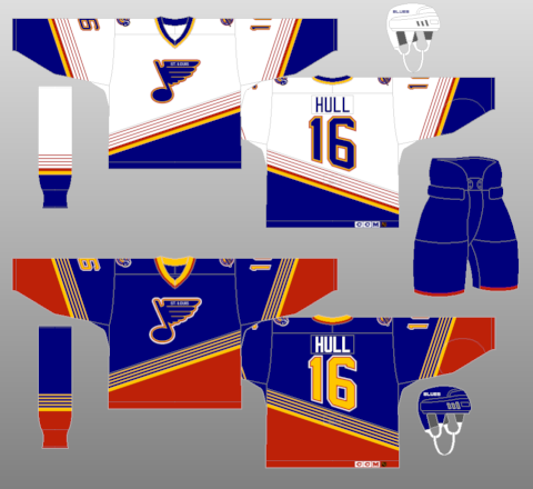
***Credit to NHLUNIFORMS.COM
Likely because the blue jersey has waaay too much red. Red was fine on the previous set because it was used so sparingly.
-

Best set in Pens history.
I like the black sweater. As a potential alternate. With the skating penguin on the shoulders.
Not sure how popular vs unpopular this opinion is, but it's kind of on topic now. I don't think the robo penguin was all that great a logo.
Most people prefer the skating penguin to the Robo Penguin. I personally prefer the latter. It looks more like penguin than the cartoon-like skating iteration and I like the streamlined simplicity of the design. As a jersey crest, it looks fantastic which is why the black jersey not having it featured on the front was a huge mistake.
-
Kelly Green almost always looks awful. Forest green is miles ahead of kelly in terms of how they look on field/court/ice
Wrong! Kelly green looks great on the Celtics, the Canucks and looked way better on the Dallas Stars when they used to use it. Not too mention the North Stars... some of the greatest jerseys ever to see the ice
It really annoys me when people post to this thread saying that they like/dislike something and someone else gives the opposite opinion. It's called the unpopular opinions thread for a reason.
I think the complete lack of notable NHL jersey news made me momentarily forget which thread I was posting in, my bad. Heres one though...
Best set in Pens history.
-
Kelly Green almost always looks awful. Forest green is miles ahead of kelly in terms of how they look on field/court/ice
Wrong! Kelly green looks great on the Celtics, the Canucks and looked way better on the Dallas Stars when they used to use it. Not too mention the North Stars... some of the greatest jerseys ever to see the ice
-
The Cavaliers new set looks awful. A perfect example of a team ditching a vastly superior look to cash in on the retro fad. The Lebron era Home and Away jerseys were the best in Cavaliers history.
-
People need to stop with the "red and gold equals McDonalds" comparisons.
Yep, same goes for the "Red + Green = Christmas" arguement
-
I especially love the patches:


I want one
-
I dislike the Los Angeles Kings' purple and gold colour scheme. Lakers comparisons aside (which, lets be honest, is hard to do), I just never really liked the way it looked on a hockey team. Maybe if they used a simplified, more iconic looking crown it would have clicked with me, but not as it was. My favourite version of the purple and gold would be the 1980-88 set. Even then I think it falls short to the Gretzky era black and silver, and the current black and silver look (even if the current logo leaves a lot to be desired).
Agreed. The biggest mark against the Kings Purple and Gold look is that awful crown logo. Besides being waaay too detailed, it looks like it belongs on a Queen.
The current NYR alt does absolutely nothing for me.
Seconded. Bring back Lady Liberty
-
I've seen a lot of love for the Devils' retro uniforms they wear around St. Patrick's Day and the desire for them to be alternates. I don't really like them enough for them to be full time alts, and quite frankly I'd rather see the Devils with a black alternate full time. It'll never happen on Lou's watch, but if a team could pull off a black alternate well and without anyone crying BFBS, it's the Devils
The Devils current set is already the very definition of BFBS. They tossed out a unique colour scheme, that perfectly represented the area, and replaced it with something bland and safe. If they hadn't won 3 cups, I'd be a huge proponent for Green coming back full time.
-
Lack of hem stripes, the ridiculous socks, and the black and blue not having anything to break them up...
Three huge strikes against that uniform set.
Without question. Though the superiority of the logo to the bland one they use now can't be disputed.
-
Not sure how unpopular this is but this:
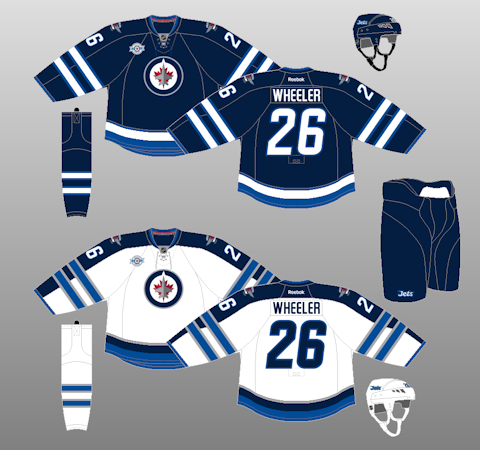
is far and away the best any team called the "Winnipeg Jets" has ever looked.
Without question... THough that's not saying much
-
Oh, I have no problem with teams using brown. When it's used right, it looks good and teams should use it more. The only problem is that options are so limited. I would love it if the Bruins wore their yellow/brown uniforms againand I know there are a lot of Padres fans who wish they'd bring back the brown/yellow uniforms.
Ditto... if were talking about the Winter Classic ones that is. The shade of brown on that is dark enough to work.
-
These were better than the Flyers' current road sweater:
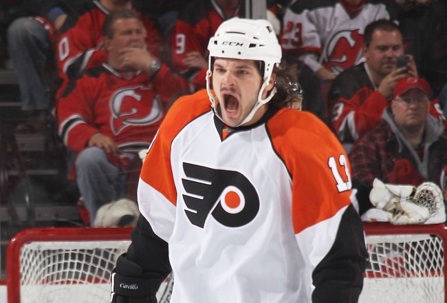
An orange version would have looked great for a full-time home.
Never, this template was horrendous
-
I think the Kings looked better when they had Laker colors, rather than the Raider colors they have now.
Kings best look
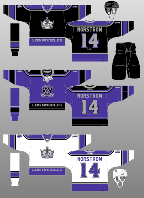
The home and away are definitely the best jerseys in Kings history, though the logo seems like a product of it's time. I could also do without the script on the hemline. The collar on the third however completely ruins that jersey
-
RWB is such a tired, overused scheme. The caps 90's colours were lifted directly from the Presidential Seal and gave them a unique look for the first time in their history. Prior to it and now, they just look like a lesser version of the Canadiens
-
Capitals best look.
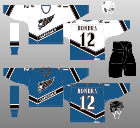
By a country mile
-

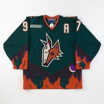
Torn on this one... While the original yotes set looked fantastic (aside from the alternate) the new set has it's own visual merits as well. One thing the current set has going for it is the use of brick as a primary colour instead of the tired cliche of using black. That being said, I can't help but miss the the hunter green and purple accents.


Unpopular Opinions
in Sports Logo General Discussion
Posted