


Morgan33
-
Posts
7,663 -
Joined
-
Last visited
-
Days Won
14
Posts posted by Morgan33
-
-
Look at the proportions of this jersey... Very odd.

-
I'm not going to tell you you're wrong for your opinions, but this....
1.) I hate the Steelers' logo not just because of the team but because it's a blatant lift of another logo. (US Steel for those that want to know)
...is just factually incorrect. The Steelmark wasn't the logo for US Steel, it was the logo for the entire American steel industry. It was a Cleveland-based steel company, Republic Steel, that suggested the Steelers adopt it as their logo. Later they received permission from the American Iron and Steel Institute, an association of the major American steel companies, to alter it by replacing the word "Steel" with "Steelers."
So it's not a rip-off. In fact the steel industry suggested they use it. That same industry gave the team their blessing to alter it.
You are right on all counts. But the logo still isn't very original. I realise its certainly not going anywhere but I think they could have done better.
-
Im curious did the NHL ever have problems with counterfeiters when the CCM 6100 and 550 were the standard? Don't get me wrong I am not for one second trying to justify the criminal actions of counterfeiters or the people who knowingly buy them but this whole debacle does seem like bad karma for Reebok's cheap, parasitic business tactics.
Before they made the Edge uniform the standard, you could buy Replica's of much higher quality, with fully embroidered logos in the price range of 100-110 dollars. Now you pay $130 for a light cheaply made rag with plastic shoulder logos that literally falls apart after only a few washes.
But as I have said before if you don't want to pay $130 for a cheaply made replica. Don't. But paying around $50 or whatever the counterfeiters are charging for an even cheaper product solves nothing. Buy the 6100 or 550 jerseys. I've been a jersey collector for over ten years and I can safely say that the only good thing to come out of the Reebok Edge debacle is the fact that I can get CCM jerseys for much less money. I've gotten many mint condition Authentic jerseys from pre-2007 for the same cost of a Counterfeit Edge. This way you get high quality products for less money without having to resort to supporting criminals. Its win, win.
Like I said before, if your upset with what Reebok is charging for their products, show them by boycotting the Edge Uniform System all together.
-
The other thing that bugs me are people wearing fakes who come over and check the price of legit ones to "see how much they saved". Well, they spent less, but since they didn't buy a real jersey, they didn't "save" anything, they just paid less for something that is worth less. Big difference.
Absolutely, these are ignorent people with no knowledge of jerseys, sports logos, or anything else to do with them. Im sure most people on these boards pity these people. They will never know the joy of purchasing an authentic jersey, knowing its the real thing and being able to know why.
It's hard for me to not make a joke about misspelling "ignorant." You walked right into that one. But I won't say anything else about that.
I disagree with you guys, I consider myself to be very knowledgeable about sports logos, but that wouldn't necessarily stop me from buying a fake. I mean it's not like I actually play for the team. As long as the fake doesn't have blatant errors, I would have no problem buying and wearing it. I think I would get more "joy" out of buying a fake and being able to buy something else with the money I saved, than supposed joy gotten from buying an authentic. And I guess that's what makes people different.
We are all very impressed with your ability to catch grammatical errors. Your opinions and knowledge of Jerseys... not so much. Ignorance is claiming that these counterfeit jerseys do not have blatant errors in a 12 page thread dedicated to pointing them out. If you had bothered to read the thread I am sure you would have seen things like the Flames jersey having the logo backwards, the Team USA World Juniors jersey having a Team Canada tag and every other Counterfeit rag sporting oversized, wrinkled crests that look nothing like the real thing. What takes the cake however is that you have the audacity to brag about the money you saved by purchasing said rags on a message board populated by the designers who are getting ripped off by people like you. That is Ignorance.
-
The other thing that bugs me are people wearing fakes who come over and check the price of legit ones to "see how much they saved". Well, they spent less, but since they didn't buy a real jersey, they didn't "save" anything, they just paid less for something that is worth less. Big difference.
Absolutely, these are ignorant people with no knowledge of jerseys, sports logos, or anything else to do with them. Im sure most people on these boards pity these people. They will never know the joy of purchasing an authentic jersey, knowing its the real thing and being able to know why.
-
We do remember Sammy Sosa as a Cubs player... but watch him with the old Rangers jersey and the old ChiSox jersey...!!!


Legend in the wrong hair?
Legends in the wrong skin?

Perhaps he has Vitiligo

-
i work in law enforcement, yet somehow am disinterested in the moral debate about if either side of this issue is in the right or wrong.
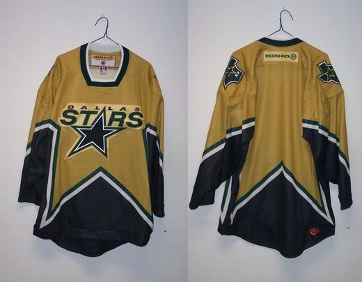
all i know is that a replica dallas stars jersey is both more expensive and poorer quality than a counterfeit authentic from china. most of the counterfeits look terrible and have bright bright yellow instead of gold... that said, the one i've found looks pretty accurate except for one or two discrepancies. it's give and take. the DALLAS wordmark is laughable on replicas. unevenly cut twill that is glued, without even an attempt at making it look like it's stitched anywhere. literally perfect triangles for the holes in the A's outline that don't match up with the font at all. the replicas are the worst peices of
 i've ever seen, and apparently most teams don't have it as bad as dallas in that regard.
I couldn't agree more with you that Edge Replica's are cheaply made rags they have no business charging $130.00 for, especially when consider that the old CCM/Koho replica's were of much higher quality for less. For the Star's awful looking jerseys its even more of a rip off because their crest is on the shoulders and as everyone has discussed, the shoulder patches for Edge Replica's are all cheap plastic.
i'll take an off-center NHL logo on the collar, and a close-but-not-quite font on the name-plate as my flaws any day of the week, over the inaccuracies that the officially licensed replicas have.That being said the counterfeits look even worse with their cheaper materials, oversized wordmarks, incorrect colours and crest materials prone to wrinkling and air bubbles.
Good way to get around both issues and the moral issues of supporting criminal counterfeiters? Dont buy Edge the Edge style! In your case why not look for an old 6100 Authentic Stars jersey on Ebay? You could probably get it for half the Price of an Edge Replica and the design is far superior anyways. This way you get around Reebok's overpricing for shoddy products without having to resort to supporting criminals. Don't like Edge Uniform system? Don't buy it. Thats my two cents.
-

Look at the tag hanging from the sleeve... what's wrong with this picture?
That is just pricless. Almost as much as this...

Heres the link to the site and a quote from the "About Us" section...
http://www.mynhls.com/reebok-calgary-flames-4-jay-bouwmeester-heritage-classic-red-nhl-p-966.html
We have rich experience in sourcing Chinese manufacturers and suppliers, in our handbags outlet store, all the hight [sic] quality Designer nhl Jerseys,nhl Jerseys, has reached [sic] the highest level of perfection. -
I like the "buffaslug" jersey template. Logo ...not so much
I have said it once and I'll say it again: the Canucks have the BEST uniforms in the NHL.
Agree 100% Those colours are simply spectacular.
-
-
Well theres no doubt that these look like low quality trash but one thing I like about the fake Edge jerseys is that the hemlines appear to be straight on the front. This is a significant improvement on the Minnesota Wild's new third.
-
No pic just yet, but Modano is said to have accepted an offer for a one year deal with the Red Wings. I just can't imagine him not wearing Green and yellow/gold
Correct me if I'm wrong, but Modano hasn't worn a green or gold jersey in ages.
He wore a Green one last in the 07 playoffs. He's never worn a gold jersey.
-


Love the Oilers current set (minus the gawdy throwback). For a franchise with an annoying habit of wanting to wallow in their own history, this is, for once, a bold step forward into the future. Would love to see Taylor Hall raise the Stanley Cup one day wearing these.
A future where the NHL's 30 teams all wear practice jerseys?
I'd say we have a new winner
-
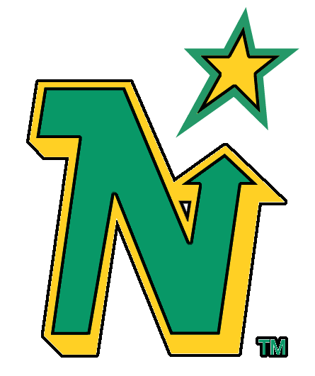
I love this logo/colour scheme...
Better than the original North Stars logo
Also props to whoever mentioned Nashville's Mustard jersey, couldnt agree more. Same with the Islanders Fisherman set.
-
According to a video on the Islanders site, the Islanders showed the unused logos and jerseys that were considered when they debuted the Fisherman jersey.
Anybody with pics of the unused isles jerseys?
-Dan
I was wondering about that as well. The guy on the video said he liked some of the runner up logos better then the fisherman yet according to book "Fishsticks," the Fisherman logo was the unanimous choice during the selection process. Also from the book (Source: Third String Goalie)...
"The Islanders were living in the shadow of the Rangers," designer Ed O'Hara told Newsday's Steve Zipay in 1997. "We all agreed that a strengthened tie to Long Island was important, to keep the heritage of the Island and amplify it. Savvy marketers will tell you to think locally." As New Coke and Pepsi Clear showed, sometimes it's better to leave well enough alone. Walsh, who allowed his children's opinions to influence his decision, had a vision of a maritime theme. SME submitted a proposal to the Islanders with three to five concepts. In April, designs with various colors and logos of a lighthouse, a bearded grimacing mariner and the steering wheel of a fishing boat were offered. "Everyone agreed that the bayman was the one, although the entire process was a huge concern. There was always self-doubt," O'Hara said.I would love to see these prototype logos. Looked all over internet for a Video of the press conference and no luck. If anybody has any scans or info about these designs please post em!
Link: http://thirdstringgoalie.blogspot.com/2009/08/1996-97-new-york-islanders-ziggy-palffy.html
-
Does anybody have a picture of the proposed Washington Capitals Uniforms for the 2001/02 season? The only picture I've seen is a graphic on NHL Uniforms.com but even that has been removed. Weren't Replica's made and sold prior to the re-design being scrapped?
Thanks in advance
-

Anyone know if these were planned alternates or just fashion jerseys?
-
I read something recently about Yellow Flordia Panthers jerseys being sold on Ebay. Were these planned as an alternate jersey before being scrapped? Or were these just fan jerseys?
-
well Morgo...you're gonna laugh man...they axed these at the last minute...and depending on where you stand, hilarity or stupidity ensued. yes, this gold jersey was sacrificed to ensure the birth of Mooterus.
Haha excellent point. Its hard to say which jersey is worse though. The only thing wrong with the Mooterus jersey (In my opinion anyways) is main the crest. I dont even mind the addition of red and the Stars on Sleeves looked sharp and unique. That gold jersey is just putrid however. Is that the best way they could recolour the Stars Logo?
-
I've see one or two floating around ebay, along with the gold Dallas jersey.
There was a company in Minnesota selling remakes of the unused Nordique jersey.
-Dan
Anybody got pictures of said Dallas Jerseys?
Thanks!
That is just brutal. Even has that Square Neckline that was on Nashville's Alt's.
-
I've see one or two floating around ebay, along with the gold Dallas jersey.
There was a company in Minnesota selling remakes of the unused Nordique jersey.
-Dan
Anybody got pictures of said Dallas Jerseys?
-
Hmm. I found two:


I'm guessing that the top one is a souvenir ring and the bottom one is the real deal? Top one doesn't have any personalization.
Yep the bottom one is the real deal. Awesome ring, should have been the Flames though

-
 1
1
-
-
Anybody got a high quality image of The Tampa Bay Lightning's cup ring from 2004? From what I remember it was very sharp!
-
Celtics 2008

Are you freakin? kidding me!
 That has to be the best Championship Ring I?ve ever seen!
Agree 100% That looks spectacular!

 i've ever seen, and apparently most teams don't have it as bad as dallas in that regard.

The Big Ol' Counterfeit Jersey Thread
in Sports Logo General Discussion
Posted
This site is absolutely laughable.
Apparantly Tie Domi played for the St. Pats...
Gretzky wore this design
And the North Stars had specially stylized, Pixelated Front Numbers...