


Morgan33
-
Posts
7,664 -
Joined
-
Last visited
-
Days Won
14
Posts posted by Morgan33
-
-
My opinion on these wavered over the years, I'll admit, but in a "don't know what's there 'till it's gone" epiphany...
I think these were some of the neatest uniforms in the NHL.
I think if Atlanta were to have made a white roadie in that design to match and/or emphasized powder a little more, it'd have been a much more solid identity.
The side panels ruined it for me. The pre-edge version was far superior
-

There is no God.
What is this... this, thing supposed to be?
-
2007 Anaheim Ducks:

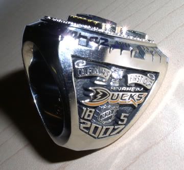
Easily the best Stanley Cup Ring of the last decade. The details are so clever. The green gems on the side representing the Mighty Ducks years, the white gem for the lockout and the orange gems representing the years after the name change. Compare this to the bland monochromatic rings the Hawks and Bruins got
-
The addition of burnt orange to the San Jose Sharks colour scheme is a vast upgrade.
Agreed. The current Home is the best jersey in Sharks history. Just remove the front numbers
-
Calgary and Colorado notwithstanding, this is the worst jersey in the league:

The grey piping dilutes the blue so much. Unlike on the home, where the silver blends with the gold to make a fullsized stripe, the silver blends with the white, which just makes the dark stripe look thin and ugly. Hell, if they didn't have piping or armpit stains they would be the worst.
This jersey is awesome though.

I couldn't disagree more with this statement. The Sabres home jersey looks awful. The pit stains and piping are far more noticeable and a primarily blue logo on a primarily blue jersey is a huge gaffe on the designers part. It looked awful pre-1996 and it looks worse now.
The white jersey on the other hand looks spectacular. The piping and pit stains are practically invisible, the logo really pops and the shoulder yoke is the difference between a good jersey and a great one. The thin blue stripes don't bother me in the slightest because they are offset by the large amount of navy on the yoke and the pants.
-
This was one of the best hockey sweaters ever:

Burn it
-
From your front view picture, yes, it is a beautiful uniform. But the white side paneling ruin it. Why on Earth did Golden State add the white? This uniform would be a Top 3 uniform without those white side panels.

Agreed. The white panels do take away from what could be a beatiful uniform. Worse than that however are the awful & completely unnecessary wordmark's surrounding the logo... in copperplate
-
You won three superbowls in the current uniforms.. which is why they should never change
-
wow, theres a double dose of really unpopular opinions haha
Heres one... I've always thought this jersey was really clever and the that the 'uterus' connection was a bit of a stretch.

-
Can't believe wanting the powder blue Chargers jersey used full time is an unpopular opinion. The navy is as dull as paint.
-
Best Sabres sweaters:


Slug and all. It's grown on me... but only on the CCM template. The Edge template makes every team look like garbage.
The blue one looks sort of nice... if you blur your eyes and forget that the logo in no way resembles a Buffalo. The white one is and will always be the worst in Sabres History, edge or otherwise.
-
The Sabres current set is far superior to the their pre 1996 duds. The road white in particular looks spectacular. They could do without the piping and front numbers but it gets points for having a uniform striping pattern and superior logo.
-
The only thing I hate more than counterfeit jerseys are the idiots who wear them
-
Those Chargers alts suck because they aren't using a true powder blue.
In the same state but a different sport, the current Sharks identity is the best they've ever had. I think the addition of orange really works for them.

If it weren't for the front numbers I would agree wholeheartedly. Can't understand why they used that generic black alter in the playoffs last year.
-
This was the Predators best jersey...

-
I've always thought that these looked horrendous:

Agreed. I was a fan of them during their heyday but looking back, they really are awful. Excellent signature by the way
-
Agreed, though I think they got even better when they swapped the logos:

The player name font could have used work, mind you, but everything else was terrific.
I disagree. I thought the Shield logo was very clever and fitting, a hockey coat of arms if you will. Also looked better on the jerseys.
-
I'll use NFL as an example beacuse that where it seems to be bad:
I think knockoffs are populare because people are pissed off with Reebok. Reebok charges $80 for a jersey where the logos, numbers, and stripes are screen printed. You could also get an authentic jersey for $250. Then, there are the Chinese made jerseys which are meant to be the equivalent to an authentic. They may be knockoff, but for the most part it looks accurate and everything is nicely embroidered and go for $20-60. Which would you buy?
The licensed product if I had the available funds. If not maybe I'd get a t-shirt/sweat shirt or two of my favorite team.
Yes
-
So wannabe-Lakers sweaters are better? The Kings have never had a look that they truly "owned." The purple and gold looked like the Lakers. The black and silver looked like the Raiders. The purple, black, and silver, while a nice attempt to combine both past eras, looked like a hockey version of the Sacramento Kings' look. If any team should "scrap it all and start over" it's the Los Angeles Kings. They have no championships that immortalize any of their past looks, looks which always echoed those of other teams. Truly taking time to devise a scheme that doesn't belong to another team would be to their advantage in the long run. Seeing as they probably won't do that, though, they might as well go with one of their past schemes. Seeing as the team was its most relevant with Gretzky they might as well try to own black and silver in the NHL.
So what would you propose they do? What colour scheme would you advocate and what would you want to be used for a logo? If they start all over, it will be their 4th colour scheme... which by the way is one scheme more than the Canucks had.
-
These were really good looks. I like the unorthodox "Los Angeles" across the bottom, and the use of color is great. It's too bad the Kings and Ducks both currently have the worst looks in their history now.
Yep
The Ducks set is the epitome of bland while L.A's doesn't even match. If the Kings adjusted their Black jersey to match the white home (add hem stripes) it'd be a massive improvement.
-
The first time I saw the Oilers Edge Uni's I thought they were designed by a Flames fan... Seriously, no Oilers fan could consciously make the team look that bad right?
Heres an Unpopular opinion....

This was the best set in Kings History. This team has never won a cup... so why must they throwback to an inferior design?
-
I agree that navy and copper look better than their blue and orange, but the red really threw it off.
I don't know why a lot of teams in the 90s felt the need to add red.
The red was necessary. Without it, the non metallic application of the copper looks brown.
-
I liked the Gold third jersey the Wizards used for a brief time.
-

Proof there is no god
Unpopular Opinions
in Sports Logo General Discussion
Posted
Definitely different strokes. I think the Pre-edge flows much better.
The side panels on the Edge version would often blur into the sleeve creating a jarring blob of navy. The hem stripe on the other hand grounded the design and gave it consistency with the rest of the set.