


SCL
-
Posts
917 -
Joined
-
Last visited
-
Days Won
1
Posts posted by SCL
-
-
12 hours ago, aawagner011 said:
I don’t love either of these designs, but the original bomb pop was better.
Also, sorry to clog the board but I gotta pour one out for adidas and the DFB. Supplier changes like this, the end of a truly iconic relationship, don’t happen very often. Teams change suppliers all the time, but Germany and adidas are about to conclude about 70 years of partnership, nearly unheard of these days. I truly can’t believe it’s happening. Countless masterpieces over the years. A crime for it to end. Hopefully Nike treats the Germans on the same level as France and England. If so, I’m sure they’ll look good. But they’ll always be missing something without the three stripes on their sleeves.
These are not all of their kits, but they represent their best. Either the pinnacle of design or noteworthy moments in the partnership’s history. Adidas hardly ever whiffed on das deutsches trikot.
If adidas and Germany couldn’t figure it out, I think the phrase is something along the lines of “football is dead.”
Just terrible, the Gernman national team in something other than Adidas seems wrong. Puma I could get but Nike is sacrilegious.
-
 1
1
-
-
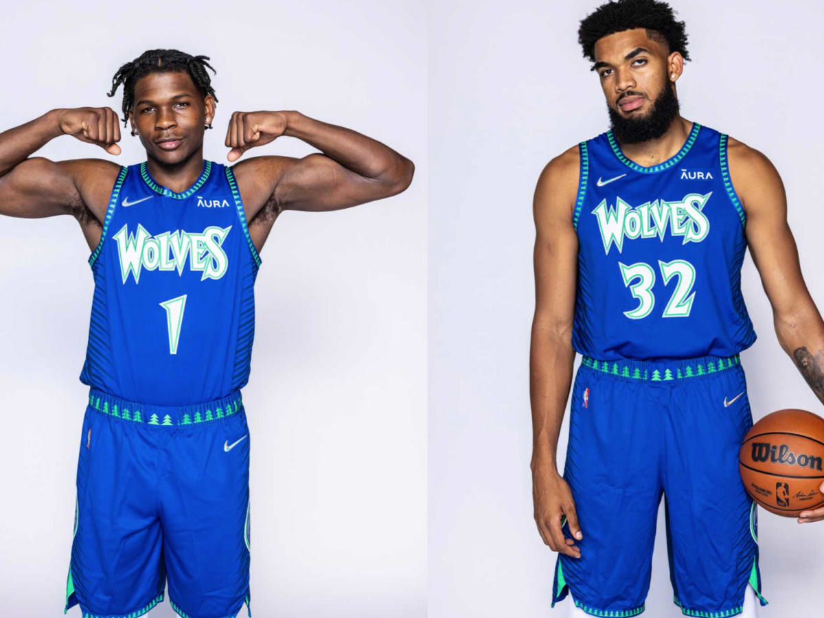
Should have kept the number font, everything else looks solid.
-
19 hours ago, tBBP said:
All of that being said (*opinion piece incoming*), I believe, if the Wolves really wanted to, they can marry up the most distinctive elements of their looks over the years and devise a signature look that can last. I look at the Miami Heat as a benchmark...for the most part they've kept the same look since the late '90s. It may not be the fanciest primary look, but at least they've stuck to it. If I were to throw out a vote for the Wolves, I could go with either their current throwbacks, or something based more on their 2021 Mixtape sets:

Now with this, I think there are things they could definitely do to "tone it down" just a tad--namely removing the extra outline on the blues--but this uniform brings out that beautiful royal blue and bright kelly green. I can take or leave the navy backs of those, but I personally love that quirk of those uniforms...very reminiscent of the split backs of the Vince Carter Raptors uniforms. (They'd defintiely have to tone down the blend effects between the two colors, though, because with the tree trim and I guess "tree" font, it definitely becomes distracting.)
Anyway, if I had a vote in the matter, I'd streamline the mixtape sets, devise a white set to match, and let it be what it be forevermore. But that's just one man's opinion...my two rusted Lincolns.
The mixtape is a top uniform in Wolves history and should be the basis for a new set as you said.
-
5
-
 1
1
-
-
On 3/16/2024 at 11:36 AM, aawagner011 said:
I have to add this photo, because the shorts elevate the entire look. Now that I’ve seen the stripes on the short, I feel more confident in saying the entire collar should have been blue. It’s kinda stripe overload. Still great, though.
The shorts are terrific, bravo to Nike on this set.
-
On 3/13/2024 at 11:29 AM, GoGreenGoWhite said:
The Wolves should roll with the throwbacks full time. So much more fun than their navy look. Just return to these brighter colors in some fashion please.
Such a clean set and fun to see them have success in them.
-
Everything is great except for the primary logo, reminds me of the Winnepeg Jets in that they are both unnecessarily busy.
-
2
-
-
1 hour ago, WBeltz said:
I think this years crop is probably the best we've seen in a while. I have some gripes, but overall, these are all (mostly) phenomenal.
Yeah it feels like Adidas tried with the MLS across the board for once.
-
4
-
-
20 hours ago, PaleVermilion81 said:
For a team called the Loons it makes no sense and doesn't alignment to any of their kit history. That's the stupidity of it. If it was, say, a team called the Galaxy it would be the perfect kit. Or a team based in some state where they had a song that said, "The stars at night...are big and bright...". For a team who is the Loons...just dumb...
Loons are active during the starry night, the tie is fairly seamless to me.
-
1
-
-
What's funny is the Sack Exchange uniforms are among the worst throwback uniforms that will inform a modern set.
-
2
-
 1
1
-
-
1 hour ago, PaleVermilion81 said:
Oh I missed that the new stripes are white on the shorts/socks. Sigh. That's really disappointing. And I fully agree with the dark gray primaries. Their NASL kits are still far and away the best they've ever had.
Everything pales to the gray with wing and red button.
-
1
-
-
21 hours ago, VikWings said:
Most of the BP caps are good-to-great. Ant there's really terrible ones. You have everything from fun with the Phillies and Brewers logos to classic with the Cardinals. I even like the pinstripe Marlins (Twins, not so much. Still hate that logo as well).
Favorites have to be the Diamondbacks, Rays, White Sox and A's.
M* can't go away fast enough, bring back M.
-
6
-
-
27 minutes ago, rwaters1221 said:
Rally House has some interesting alternative logos and designs for the Clubhouse Collection. Too many to post pictures of but if you're a hat collector worth a look. The Guardians Navy hat with red bill looks like it should be an everyday hat. There's even a few minor league versions as well.
The flying G logo is underrated and reminds me of Major League, the Guardians deserve a ton of credit for the seemlessness of their transition.
-
8
-
-
On 1/17/2024 at 11:32 AM, Burmy said:
We have our first name...say hello to the Mankato Habaneros!
Love how the name is unique, but not Brandiose goofy. Especially enjoy how the logo is currently green, but will evolve and ripen throughout the season just as the pepper does.
That's more than Minnesota spicy.
-
8 hours ago, ruttep said:
Captain's patch on the Rangers Stadium Series jersey looks bizarre. Why didn't they make it dropshadow??
Such a great sweater.
-
2
-
 1
1
-
 1
1
-
 1
1
-
-
54 minutes ago, HOOVER said:
To continue the Jag-jacking of this thread, if/when Jacksonville finally does a Throwback uniform to this beloved set, I'd argue they should go all the way back to the beginning, not just 1997:
These block number bad boys made for a very good uniform.
Still, I'm on the side of things that says their current Coughlin-era set are still very, very good (when the right combos are worn):
The Fred Taylor era number font was far superior for the Jags.
-
5
-
4
-
 2
2
-
-
How the Nationals went from the middle to the right is unfathomable. What in the name of fake made for TV movie teams is that?
-
15
-
 1
1
-
-
Similar to the city of Pittsburgh being united with black and yellow, the DC teams are united in their terribleness.
-
2
-
 4
4
-
-
32 minutes ago, Chromatic said:
That’s a great template, but that green is so drab it makes the uniform look lifeless and dreary. I would like to see that striping pattern with the current green.
I'd be cool with that, not using an all-time template and one unique to the Jets seems like such a waste.
-
12 hours ago, TrueYankee26 said:
The logo itself is not that bad. And it is not even the lamest rebrand to a Mexican restaurant chain.
Old Qdoba logo
New, boring Qdoba logo
It's funny because the logo change almost directly aligns with the downfall, the old logo was great.
-
1
-
-
On 12/23/2023 at 10:01 AM, MinnyHockey said:
I love this!
Why did you have to link this? My wallet is now thinner thanks to you!

-
1
-
-
The Kings should find a fourth other California sports team to rip off this next design go around.
-
9 hours ago, burgundy said:
Possibly an unpopular opinion, but I actually prefer the solid light blue field in place of the tricolor. I think it allows the abstracted state shape to stand out better. The tricolor feels like two flags mashed together.
I agree, I think in the end the right call was made on the solid light blue. The new flag when hung vertically also looks like headwaters below the north star. Ultimately the flag is bold, uncluttered and versatile which should help it stand up long term.
-
1
-
-
36 minutes ago, TBGKon said:
Do they retract seats at Allegiant Stadium for UNLV games? That endzone wall looks like a bunch of doors in a practice facility.
That's where the Raiders grass enters and exits, they really don't need these stands given attendance which is why they leave that way.
-
1
-
-
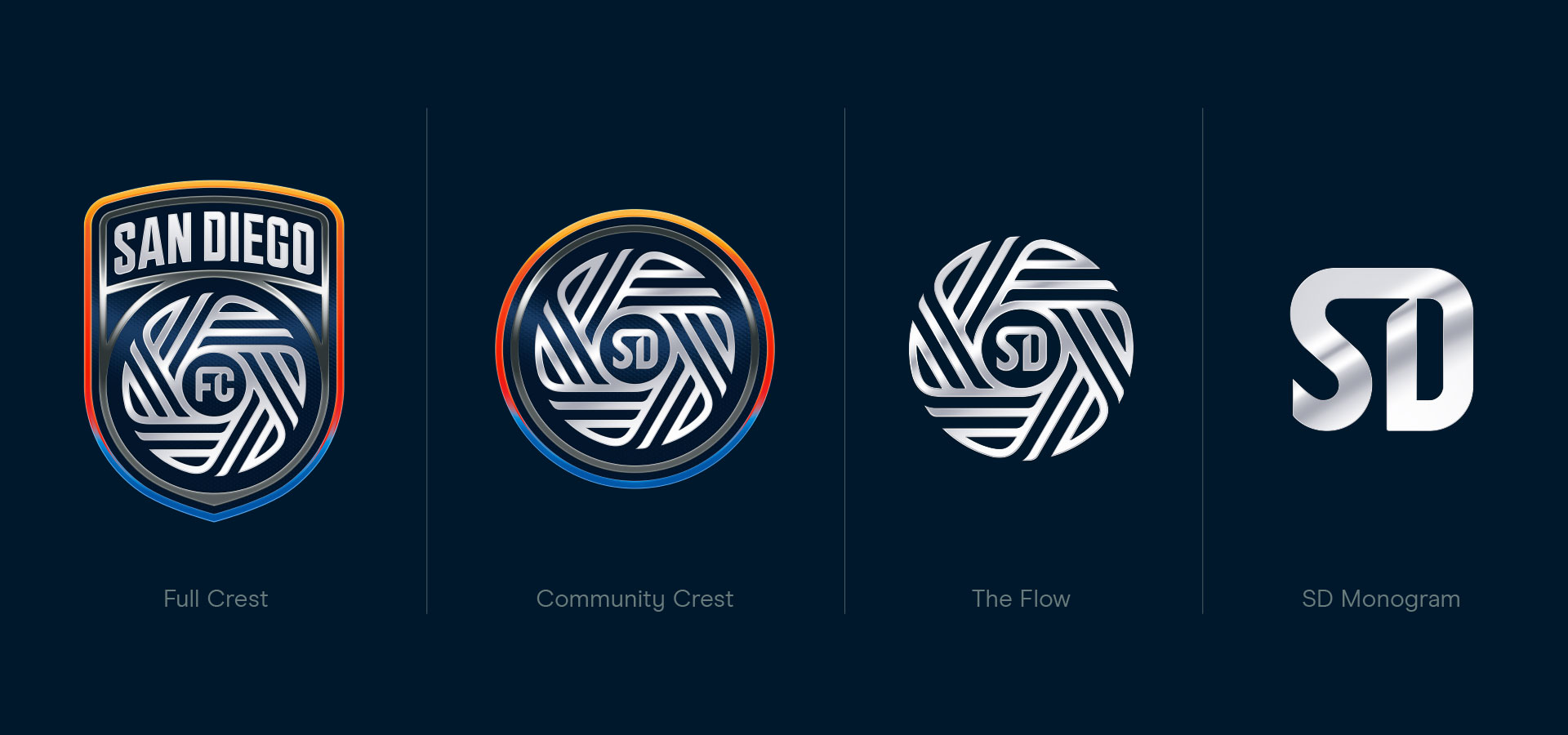
6 hours ago, PK22 said:
I don't hate the logo as much when its just the "flow" (what a dumb name for that thing) or Community Crest with the SD in the middle instead of the FC. I don't like taking a circular item as the main focus and then putting it into a shield. The little triangles of empty space really bother me.
While the flow/community chest portions only are not good logos by any means, its better than the full shield and I hope they lean into using those secondary marks more regularly.
Beyond terrible, looks like an attachment for a food processor. The font is horrendous and all under the sheen of 2007-2018 era auto/iphone skeuomorphism. This logo would be terrible by USL League 2 standards.


.jpg)


2024 NFL Changes
in Sports Logo News
Posted
White mask was always the best glad the Browns are returning.