


SCL
-
Posts
917 -
Joined
-
Last visited
-
Days Won
1
Posts posted by SCL
-
-
5 minutes ago, FinsUp1214 said:
The Jets are a weird case for me. Like many other teams, they wear some bad combos (mono black, white over black), but I really don’t think the base design of the uniform as a whole is bad at all. That being said, I also don’t think there’s anything particularly special about it, either. To me it’s very average, middle of the pack uniform and doesn’t do much to stand out in bad or good ways. All in all, I just feel nothing but indifference towards that whole set, which I suppose can be just as bad as dislike.
Take that with all the losing it’s associated with, and I feel like they probably just need to go either back to the Namath set (but with the updated green and fixed shoulder stripes), or something that more closely resembles the 80’s or early 90’s sets than this current one does. That team is in desperate need of an identity boost, and tapping into some nostalgia and heritage in a more deliberate, clear fashion could do them some wonders.
It's a MAC/CFL uniform that the manufacturer talked them into because they couldn't correctly manufacture the uniforms the Jets belong in.
-
 7
7
-
-
On 1/5/2022 at 1:53 PM, LA Fakers+ LA Snippers said:
The 49ers are doing this exact thing this season.

Can the Niners now return the three stripes back to the home and away uniforms? The two stripes are awful specifically for SF...
-
3
-
-
41 minutes ago, CreamSoda said:
These are great, is it back to East vs. West?
-
"The barcodes represent New Jersey's commitment to retail as the home of American Dream"
-
2
-
-
11 hours ago, chcarlson23 said:
I also think that both Sharks logos really do have their flaws. While the 90’s bizarreness of the shark eating a hockey stick is actually really cool, the logo just needs to be cleaned up a little bit. The current logo looks more inline with a dated ECHL logo, where it’s tough but cartoony. It needs a little more realism, and a few less outlines. I also still can’t believe that the artist didn’t know enough about hockey to figure out the knob of the stick-problem.
The Sharks and the Jaguars are logo siblings in different sports, while both of their original logos are flawed they are far superior to the slicked up attempts to modernize in their current logos.
-
7
-
-
1 hour ago, spartacat_12 said:
This year’s All Star Weekend logo has been released
A huge snoozer.
-
4
-
-
23 minutes ago, MJWalker45 said:
If they kept the old number set and the red/black jerseys was just red they'd be near the top of the league.
Have to remove the IATA code from the jersey as well.
-
3 hours ago, monkeypower said:
After this long, and the success the Ducks have had in the non-Mighty era, I don't think it'll ever fully happen.
This is from the Athletic when Ducks writer Eric Stephens (at least I presume it was Stephens) did a Q&A a couple weeks ago. Includes a shoutout to the mothership.
Per Icethetics Jersey Watch 2021, there was nothing from/for the Ducks for this upcoming season.
They don't need to go back to the Mighty Duck mask but they do need to lose the current exurban high school on the edge of a cornfield identity from circa 2009.
-
1
-
-
9 hours ago, monkeypower said:
Ok Ducks, you're next.
-
14
-
-
20 minutes ago, BBTV said:
How was Guardians "seamless"? If you mean "makes sense", then fine - but I'd hardly refer to the transition as "seamless".
"Seamless" is an unachievable standard in any of these name-change cases. Elks was probably the closest we'll see, but that's apples and oranges compared to an NFL change.
I was pro Spiders but I think Guardians makes complete sense for Cleveland, Washington has no obvious solution to the point where they could go Washington Burgundy and it might be the best option. I still believe Redtails is the best option with the Airmen imagery.
-
1
-
-
14 minutes ago, TBGKon said:
Guardians was seamless, none of these represent that for Washington. Every name in the left column is awful which leaves Presidents, Redwolves and Redhogs as the only viable options.
-
2
-
-
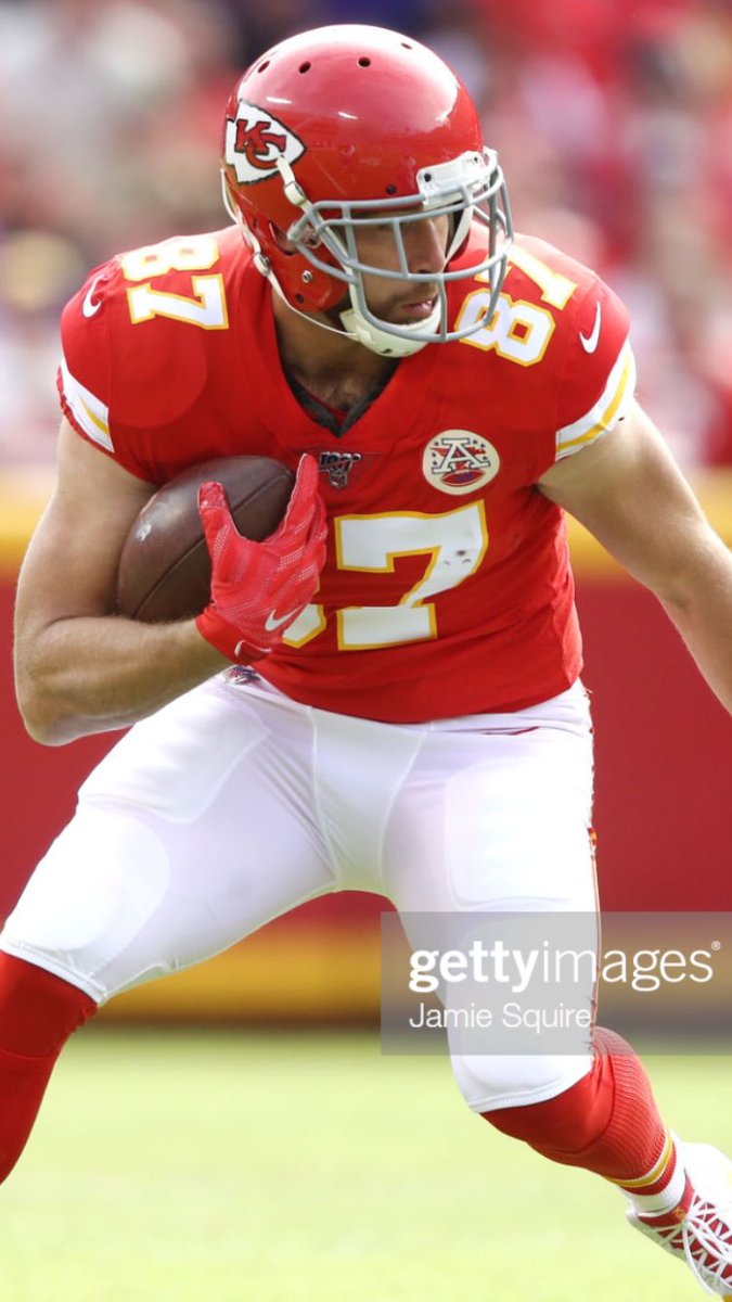
15 hours ago, oldschoolvikings said:
This is such a great look for them...
White>Gray facemasks for Chiefs.
-
18
-
-
The name is fine, the lighthouse makes zero sense. I am guessing this logo, which works for beacons, remains the most prominent.
-
4
-
-
I am glad the Kachina is back even as someone who once wanted it gone. I hope the purple reverse retro becomes a permanent alternate.
-
5
-
-
6 minutes ago, upperV03 said:
Fantastic matchup between Poland and Slovakia, featuring two of the nicest individual kits in the tournament:
Not enough collars these days, Poland looks great.
-
4
-
-
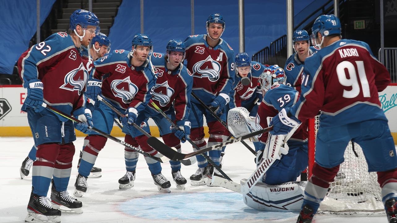
53 minutes ago, habsfan1 said:
The Avs switching the black pants to blue was the right call. The new look has grown on me for a few reasons that I noticed.
The original jerseys had thick dual outlines around the arm stripes. Black pants combined with burgundy jersey base, blue arms, and white numbers balanced out all the colors:
The whites had color balance too:
The new ones have singular outlines:
The blue on the homes might be a bit excessive and not quite perfect, depending on the amount of lighting in the photograph. But with a light enough burgundy and a slightly darker steel blue, it works quite well. The whites look much better cause with the black shells, they looked like a burgundy and black team with almost no blue whatsever.
The white with blue is one of the single worst looks in the NHL, just atrocious.
-
3
-
-
Only in Wisconsin.
-
Just ad insanity, large top and bottom ads, in-line ads, scrolling ads; it's making it unfeasible as a user and inhibits discussion flow.
-
2
-
-
-
Woof is that a terrible logo.
-
3
-
-
1 hour ago, seasaltvanilla said:
Touched up uniforms for the St. Paul Saints now that they're the AAA affiliate of the Twins:
https://www.facebook.com/stpaulsaints/posts/10159408687949374
Like the addition of yellow from the St. Paul flag, and having the period under the T in St. Paul. Wish they'd bring back this script though.
Not a fan of the yellow in the same way I don't like gold with the Twins. The Saints new unis are far to busy now and the number font is atrocious.
-
Good first step, now pull a Bucs and return to this uniform.
-
5
-
-
11 hours ago, rorinator said:
I think the Jets new uniforms have actually really grown on me. Besides the status quo logo change and BFBS (that I can live with), I think it's an upgrade over the butchered Namath-shoulders and ugly shade of green...
As long as they are bad roll with the current set (Kotite lite), after that back to the Namath/Vinny/Sanchez era throwbacks.
-
2
-
-
It will be nice to see UCLA in Nike for once but I thought UA did a great job with their football uniforms.
-
3
-


2022-23 NBA Logo & Jersey Changes
in Sports Logo News
Posted
I think they should've build an entire set around The Valley jerseys and leave the sunburst as the throwback.