


SCL
-
Posts
917 -
Joined
-
Last visited
-
Days Won
1
Posts posted by SCL
-
-
12 hours ago, Friedrich Stuart Macbeth said:
That 10-year deal is going to fall apart quicker than what the NHL thinks. If this keeps up, they're done for.
Still, if Fanatics defied all odds and actually make an effort to improve quality control, within those 10 years that hatedom will be gone. But until then, oh lord......
Due to their monopoly position at this point does quality even matter? They've built their empire on consigned plain tshirt inventory and a screen printer and every league chased the dollar, it's been a pure market share ploy.
-
 3
3
-
 1
1
-
-
11 hours ago, Cujo said:
NOOOOOOOOOOOOOOOOOOOOOOOOOOO

Looks like my kid after he sleep on his hair after a nightime shower.
-
1
-
 6
6
-
-
Why does this race to the bottom company keep getting rewarded?
-
3
-
2
-
-
Minnesota needs to build a full set off of these terrific throwbacks they wore yesterday.
-
10
-
-
1 hour ago, Mingjai said:
Minnesota uses the North Star because of the state motto “L'Étoile du Nord,” meaning the Star of the North. As a result, one of Minnesota’s nicknames is the North Star State.Completely unnecessary for the Twins and is the crown jewel of the flaming turd of the new set.
-
1
-
-
12 minutes ago, MinnyHockey said:
After sleeping on it, the M logo and cap has grown on me a bit. The initial shock of "Oh no it's the Marlins!" has faded away a bit. Still not amazing but it's really not that bad.
Something I noticed is how the M logo is similar to the Minnesota State Colleges & Universities logo used here:
The Timberwolves sold a hat post rebrand that did a far better job:
-
3
-
 1
1
-
-
Day after opinions:
Home: The red Twins remains a bit corny but the rest of the uniform is great
Away Gray: Overall a great look even if unconvinced on the Minnesota font
Navy Alternate: Needs a Minnesota script or Twins script to improve this jersey
Cream Alternate: Terrific, reads like a throwback St. Paul Saints uni. The flags are an early 1900's vibe bringing Millers and Saints together. Would love to see throwback style Millers and Saints hats (Navy and Cream) utilized at some point for Sunday games.
M * Hat: There is no saving this one, needs to be brought back to the drawing board and revised.
-
2
-
-
4 minutes ago, Survival79 said:
The corporate logo atrocious, overall the look is the worst in history save for the Target Field era. The M and Minnesota are terrible.
-
2
-
 4
4
-
-
The M Star quite literally stolen from the Timberwolves.
-
6
-
-
"Why don't the Broncos wear blue pants with the white jersey?" We now finally know why.
-
8
-
-
This is pure genius, someone deserves an award for this.
-
8
-
 1
1
-
-
The moon remains the issue with the Wild Reverse Retro, needs a harvest moon.
-
1
-
-
10 hours ago, TenaciousG said:
I still think the USMNT should go vertical stripes a la Atlético or Chivas. But anything would be an upgrade over the current uninspired trash.
I saw the WC kits in person for the first time, arguably worse in person. Just complete and total garbage.
-
Why does France always get Nike's best work while the US gets rubbish?
-
30 minutes ago, DCarp1231 said:
I don’t know how many times this has to be said, but Snyder wasn’t directly responsible for the new uniforms. It was his wife, Tanya who was “heavily involved with the uniform design”.
A distinction without a difference.
-
5
-
-
16 minutes ago, DCarp1231 said:
Commanders are holding a poll for the new mascot theme and it’s… embarrassing
I think their goal is to constantly remind everyone how crappy their rebrand is. Cleveland Guardians fans should be so thankful.
-
13
-
-
2 hours ago, Krona said:
Lakers dropped their 75th Anniversary logo on twitter this morning
That's kind of terrible.
-
4
-
-
Granted they just released an orange helmet, but the Bears belong on the Soldier Field site and in Chicago proper.
-
6 hours ago, MJWalker45 said:
At least they aren't going with that horrible idea of slapping the team name on the front like last year.
FC United of Manchester written all over this one
-
1
-
1
-
-
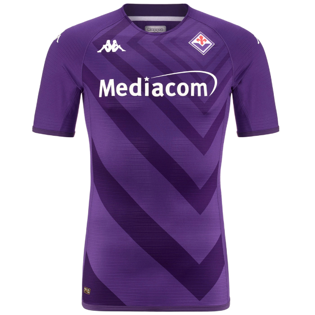
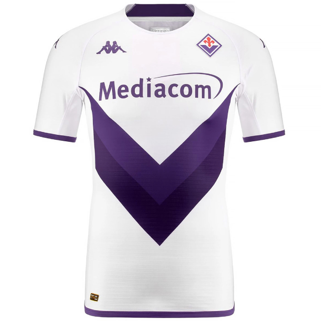
7 hours ago, officeglenn said:
ACF Fiorentina home and away:
Learning my college crap cable company sponsors Fiorentina is quite the headscratcher of the day.
-
2
-
-
The highlighter decision just scream Hawks of the prior rebrand, a look equally destined for a short shelf life. I can't believe they didn't learn from the baby blue and navy era trainwreck. If you misjudge your brand that drastically you might as well move on from Jazz entirely.
-
1
-
-
2 hours ago, ltjets21 said:
So Derek Jeter stepped down as the CEO and in that amount of time removed all the character out of their ballpark and uniforms and accomplished nothing on the field. What a schlub.
Just awful uniforms, completely devoid of character as you said.
-
20 minutes ago, AFirestormToPurify said:
I can't be the only one who thinks these Canucks jerseys are meh? Once a year, fine. I prefer the Canucks in blue and green
Agreed, not a great color set for a team from Vancouver and not to mention the colors of their biggest rival.
-
4
-
1
-
-
5 hours ago, Sodboy13 said:
First look at a Panthers jersey outside of an edited professional shoot:
Simply one of the best identities in US sports.
-
6
-


2023-24 NHL Jersey Changes
in Sports Logo News
Posted
The Lindros era is the best the Flyers have ever looked.