


SCL
-
Posts
917 -
Joined
-
Last visited
-
Days Won
1
Posts posted by SCL
-
-
On 8/4/2023 at 8:17 PM, fortunat1 said:
Also, expect the Diamondbacks to break out these throwbacks again for their 25th anniversary celebration on August 12. Not sure if it's for one game or the whole series, but it'll be back in some capacity. No team announcement as far as I can tell.

The DBacks need to return to these full-time, so superior to the rust red look.
-
 8
8
-
 2
2
-
-
33 minutes ago, 406Cane said:
New Kentucky football unis.
I like ‘em. Glad they dropped the checkerboard finally.
Nothing can save that wildcat logo
 .
.
-
4
-
-
51 minutes ago, nuordr said:
Olivet College of Michigan and NCAA DIII recently changed their name to The University of Olivet prompting logo changes. OC is now UO. The dual letters continue to overlap but with new serifs and strokes. Red is noticeably different.
Man is that terrible, honestly looks like the work of a 10 year old on MS Paint circa Windows95.
-
3
-
-
On 7/28/2023 at 11:08 AM, MJWalker45 said:
That Leeds kit is a beauty with blue/yellow alternating stripes.
-
1
-
-
27 minutes ago, BigEd76 said:
After the leak, the Eagles tweeted it too
Ruined by lack of dazzle pants.
-
5
-
 1
1
-
-
32 minutes ago, Conrad. said:
I guess I'm in the minority with liking the white ball in the Suns jersey. When it's orange, my eye is drawn to the fact that the SUNS is no where near the middle of the garment (esp with the # being centered). Super distracting for me. The white ball visually lets you trick yourself into not seeing the noncentered SUNS. just my two cents...
Then make it all orange, this latest jersey is going to be like the modern Twinkie; it's nothing more than a cheap version of the original.
-
1
-
-
3 hours ago, aawagner011 said:
I agree that regular block is better but I have never disliked Florida’s modern font like a lot of others. It still reads to me as a mostly block font with some subtle tweaks.
But in the worst way, it shouldn't but utterly confuses the brain... an understanding the radar terrible number font.
-
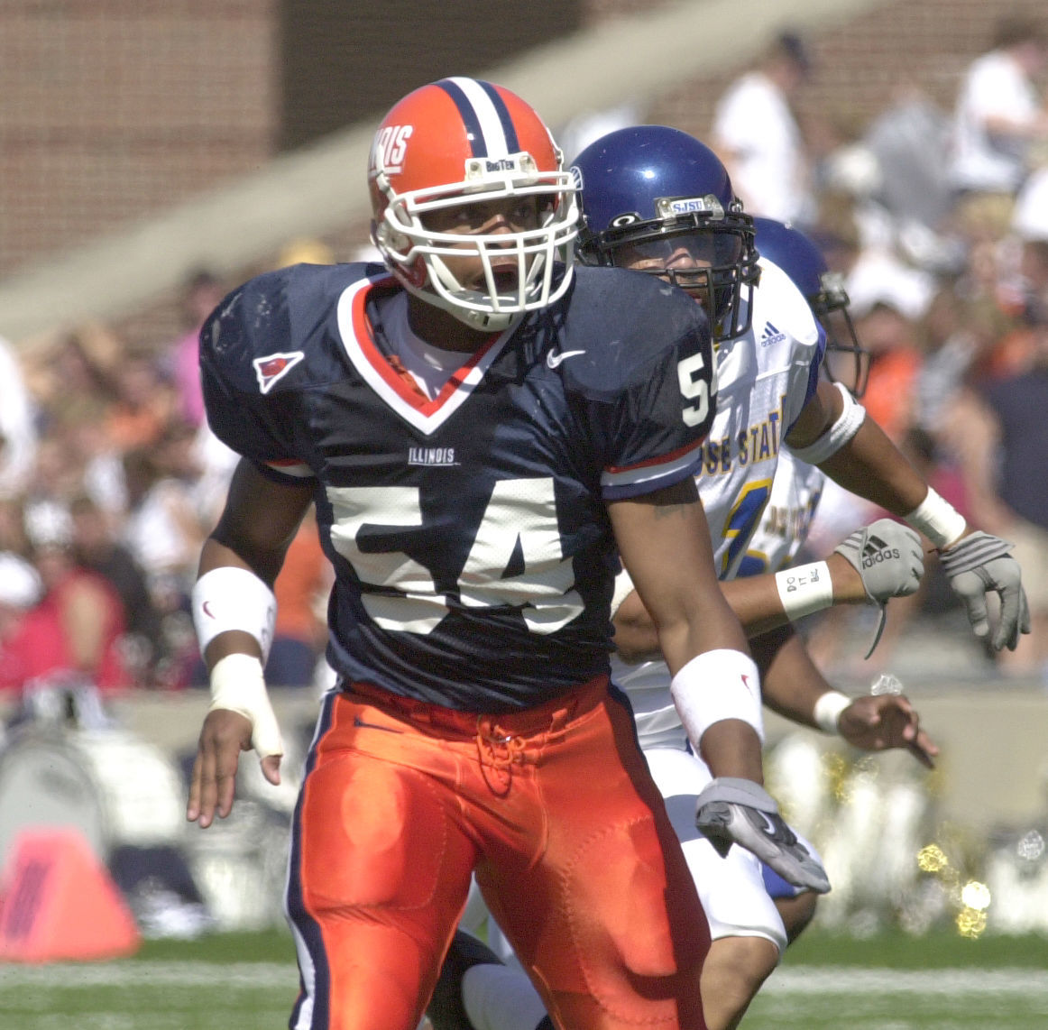
21 hours ago, Brave-Bird 08 said:
To me, Illinois in contrast looks best like this:
Replace Giants script with Block I and we have a winner.
-
1
-
-
On 7/24/2023 at 11:53 AM, bowld said:
Jets NEED to bring this helmet back full time or at least slap this decal on the current ones. Just look at how much better it looks than the current generic font does
I like the current font with football, just need to add the exhaust and Jet above.
-
3 hours ago, DG_ThenNowForever said:
Has anyone coined WFWS yet? Because I feel like we're in the WFWS era.
I prefer WFSS, white for snows sake.
-
44 minutes ago, AstroCree said:
They needed to do more with the collar. I dunno what stopped them from using a normal collar than, whatever this is.
The glossy crest is just ugly. Should've just went with a gold and call it a day. Depending on the light the logos can disappear or look green.
When I saw highlights of the Wrexham match I thought these were the football equivalent of summer league jerseys, if not it's just atrocious.
-
20 hours ago, wentvoltage123 said:
NC State with new uniforms
Just terrible uniforms from NC State under Adidas, they get treated like a MAC program.
-
1
-
 1
1
-
-
4 hours ago, sayahh said:
I know that at this point Mitchell and Ness is essentially Fanatics and also sell casual lifestyle (read: not authentic/accurate) jerseys, but for them to be labeled Hardwood Classics just grinds my gears (unless I was wrong and these styles were actually worn, even if just once).
Can't lie the Magic one would make a great Sunday alternate if they could ever get their Purple jersey back to normal looking.
-
4
-
-
4 hours ago, solvetica said:
New Kansas uniforms on the way. Should be revealed this evening.
Everything looks improved but why would they adopt the striping of their biggest rival?
-
26 minutes ago, Sykotyk said:
Yeah, I agree there that his insistence on not changing the name led to the desire for a fullscale rebrand. But, that would've been like Cleveland losing the red/white/blue colors in a rebrand.
Everything about the Washington name change was done so haphazardly. So many college teams went from (Commanders) to Redhawks, Orangemen to Orange... etc, that it seemed like such an easy thing to change up to that point. But by digging in their heels they couldn't then just go 'oopsy, my bad' and go with a minor tweak.
But with Snyder gone... I think giving the fans the 'Skins' name they still love would go a long way to ingratiating themselves into the fanbase and staying true to the desire to no longer be a native themed team.
Not to mention the Guardians, which has gone incredibly well when compared with the Commander
-
3 hours ago, monkeypower said:
The current one stinks. It's a modified RCAF logo with a jet slapped on and a notch in the top the celebrate the ownership group.
Plus I hate the maple leaf usage, it's one of my logo pet peeves. The Jets aren't the only Canadian team in the NHL and one other team who is also Canadian already uses that as their name.
It looks like a bad clipart, it took away the best part of the roundel, which is it's universal simplicity, and superimposed a photo realistic jet over the top.
-
44 minutes ago, M4One said:
Would be disappointing if the Jets went full retro, especially as there's nothing really wrong with what they have now and is unique to them. They would also become the fourth team to use that same three stripes pattern.
If they do a full rebrand, I rather they go with something new and use the aviator blue as the primary colour.
Probably an unpopular opinion but every primary Jets' logo past or present has been terrible.
-
3
-
 1
1
-
-
8 hours ago, mahnkej said:
You could argue the Seahawks are iconic. That was Nike's flagship, the first ones they made after taking over from Reebok (I think). That was 10 years ago already though, practically a different era. Chargers and Bengals are the only really good ones I can think of.
As you mentioned, half their "rebrands" have just been corrections of previous rebrands that they butchered (Bucs, Browns, Jags. Jags still aren't even good). That's not great. Lol.The Vikings belong in the group with Chargers & Bengals.
These Cardinals uniforms suffer the same issue as the Commanders, neither feels curated and look like they threw 3 teamwear unis together.
-
3
-
-
18 hours ago, Geoff said:
These new FSU unis are basically what I had been hearing for months. Last I had heard about them, it was going to happen but it was a matter of when Nike would actually roll them out if it was this year or next.
They're so beautiful. I love them so much.
They look like FSU again. The only thing they need is to go back to being a one helmet school.
-
4
-
-
24 minutes ago, McCall said:
How were the previous ones unique? They had the same piping that lots of uniforms have had in the past and especially since the beginning of the 2000's with the resurgence of the classic looks. The gold was completely forced. The navy alt with classic script and gold outline looked like a cheap fashion jersey you buy from Walmart. And the gold drop shadow was in no way unique. Many teams have had drop shadows. The Giants literally have gold drop shadows on their uniforms. And the "blob" is also literally the shape of the state of Minnesota. I guess you just need to brush up on your geography.
It's too cute by half but I think the issue they were running into is that the new set is streamlined and the Minny and Paul logo is inherently not.
-
4
-
-
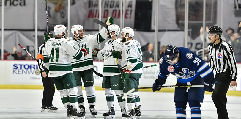
1 hour ago, seasaltvanilla said:
And the color hierarchy doesn't match either. Red is the secondary color on the whites but wheat is the secondary color on the greens. It's a big pet peeves of mine. I wouldn't even mind if they went to being a green/wheat team but at least adjust the whites to reflect that, like the Iowa Wild.
The red numbers are the defining element that makes the Wild white jersey great.
-
5
-
1
-
-
48 minutes ago, spartacat_12 said:
While the initial Edge era for the Wild was a mess, I wouldn't really say "nothing matches" for them now. Sure, their home & away jerseys aren't perfect inverses of each other, but they match just as much as Montreal or Chicago do. They use the same logo & font on both jerseys, and the striping on the sleeves is close.
It's a lot better than when they had a red home jersey with a roundel logo & block font, and a mostly green road jersey with the jagged custom numbers & the logo on it's own.
The green sleeves match the white, so some consistent elements between the two. The Wild white jersey is terrific, the green needs to lose the chest stripe and match the hem striping of the white.
-
1
-
-
San Antonio would require ownership from Texas, there is no way Jerry is allowing an outsider to move a team in there.
-
 1
1
-
 1
1
-
-
Looks like a bad off brand gas station logo, this is likely to be Pepsi's shortest lived rebrand.


NFL 2023 Changes
in Sports Logo News
Posted
A great patch; simple and straightforward just like Bud.