


stumpygremlin
-
Posts
1,458 -
Joined
-
Last visited
Posts posted by stumpygremlin
-
-
14 hours ago, kb105 said:
There's already a University of Indianapolis called UIndy, so they probably wouldn't want to nickname themselves something so close
In fact, IU-Indianapolis just hired the men's basketball coach from UIndy.
-
D2 school North Greenville changed their nickname to the Trailblazers and introduced this beaut

Designed by Rickabaugh
-
 1
1
-
-
I like the look, but I'd choose a different number font. The 4 on this font treads uncomfortably close to the 4 on the German soccer team's jerseys. That 4 famously caused an uproar that now prevents people from ordering customized 44 jerseys.
-
6
-
-
I like 'em. Know what else would help? TV numbers on the shoulders
-
1
-
-
- On the David Starr scheme, I hate flames on cars. I just think it's cliched and tacky. The ONLY exception I have is when William Byron runs the Liberty scheme because of LU being called the Flames.
- Hamlin's scheme is tweaking me, since the number and the Mavis logo are not at the same angle.
-
1
-
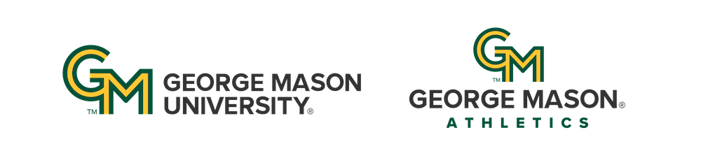
George Mason has updated their athletic and academic branding to a new interlocking "GM" logo. All I have to say is...woof...
-
2
-
 1
1
-
 1
1
-
 1
1
-
 1
1
-
 4
4
-
-
Can we please retire the Days of Thunder throwbacks and get something new?
-
1
-
-
On 4/10/2024 at 2:36 PM, dont care said:
Not the first, Chase Elliot’s unveiled his Dale Jr. 2014 Daytona 500 throwback 2 weeks ago. There could have been others. This looks really good, almost like a coors silver bullet with guitar frets instead of mountains.
I do wish they'd match the number font, though
-
On 3/30/2024 at 12:10 AM, Germanshepherd said:
R.I.P IUPUI, Hello IU-IndianapolisI wonder how many times this guy is going to call his new job (IU Indianapolis) by his old job (Univ. of Indianapolis).
-
1
-
-
16 hours ago, MDGP said:
Hey thanks for the comment! This project has been a real fun challenge for me so I'm happy to see that at least so far the quality has been up to snuff!
On the specific points.
- I've had that cross design hidden up my sleeve for years now, just waiting for the right time to use it, and I knew immediately that Holy Cross was the perfect time.
- I've always liked UML, they've been a fun alternative to BC and BU over the years, and I could not agree with you more about the Phoenix designed logos. The teeth on the bird is bad enough, but a wordmark that is literally Impact font is brutal.
- Thanks! It really is too bad that submitted designs are pretty much a legal non-starter since the whole Ravens fiasco.
- Here's the thing about the Cornell design. You're right, and I know you're right. But my brain just refuses to read it as Cornell. You could not believe the amount of time I spent going back and forth on this. I'll probably end up changing it to the top version as you suggested. Thanks for the C&C on that.
I'm sure you could give it a try with Merrimack, though. Even if you work out a contract with them where they pay you a few bucks and some season tickets or something, since you did the work "pro bono" as it were.
The bird-with-teeth thing at Lowell is something that they've always had. Since they became the River Hawks in 1994, they've had teeth. Before they went to Phoenix, they used this:
-
I have a feeling that the athletics will eventually merge to save money, much like the LIU campuses did. The difference is that I think that despite Findlay's athletic success at D2, they might merge down to D3 to save money.
-
2
-
-
I have loved all of your work. Absolutely fantastic.
- I love the cross sleeve stripe on Holy Cross.
- I'm so happy that you moved UMass Lowell away from both the Phoenix-designed logo and the Under Armour catalog jersey font
- Absolutely love what you did with Merrimack. You should submit that to them. No joke.
- Minor nitpick: with Cornell, you have the big wraparound "C", no need to put another "C" in the wordmark. It makes the jersey read as CCORNELL.
-
22 hours ago, tBBP said:
Minor point of correction: those Texans numbers—along with the rest of the Texans brand identity, as well as the refreshed brand identities of the Atlanta Falcons, Cincinnati Bengals, and Seattle Seahawks circa '02—were actually the work of Mark Verlander. Those were the last independently-designed brand identities prior to the league-wide contract model, in this case by Reebok, for that 2002 season.
Ah, yes...good ol' Apex One. (That is still my second-favorite major pro sports uniform of all-time.) And to @Ted Cunningham's point...I hadn't thought about it, but I believe that was indeed the first instance of italicized jersey numbers in the NFL. Shoot—it may have been one of the first instances of italicized jersey numbers period...the only other ones I can think of right off the top of my head prior to those were the Tampa Bay Lightning circa '95 or '96, which is when those Patriots uniforms hit the field. (I half-remember an NBA All-Star uniform using italicized numbers, too...I think it was the Phoenix one.)
Except when you can't see the giant numbers provided on the front and back of said jersey...
...Or when they're partially obscured.
Not as big an issue when watching live because one can see the players before they get tackled or tied up, but the point remains...TV numbers would have helped in each of these instances. But they're also no longer a requirement, so it is what it is...
THIS is why TV numbers are necessary. Or how often do you see an injured player with training staff over them, and we can't tell who it is for a while because their torso is being obscured?
-
1
-
-
4 hours ago, pepis21 said:
Not bad although shoulders look kinda empty so small TV numbers would be nice addition, red on horn should end higher and red facemask indeed look better than navy. Houston wordmark is in acceptable size. Overall it might be an upgrade
Seriously... why do pretty much all the new NFL uniforms not have TV numbers? Cardinals, Patriots, Rams, Commanders, Chargers (they have helmet numbers), now Texans. I hate it.
-
5
-
1
-
2
-
-
14 minutes ago, WSU151 said:
Is this the first Mountain Dew car in Cup series since Dale Jr retired?
Nope. Chase Elliott has run one a few times, and Justin Haley ran one in the 31 last year.
-
3
-
-
For Brown, I'd put either the B or their current bear head on the shoulders. Other than that, stellar work.
-
22 hours ago, VDizzle12 said:
Agree completely. After Gordon and Jr retired, I didn't have anyone to root for so I stopped watching. Now I have about a dozen different racers I'm pulling for. It's cool to see guys like Michael Jordan investing in the sport and the Cup Series adding new events. Like the Clash in LA, street course in Chicago (potentially NYC too) and dirt race in Bristol. Instead of the same oval after oval we saw for some many years. They've seen how popular F1 is becoming and I don't see anything wrong with copying their formula. Let fans get to know the drivers, their personalities and find new and exciting places to race.The dirt Bristol oval is gone, as is the Indy road course. Both are going back to their old layouts.
-
They should've gone with a different color than purple. I associate that color with Max and, to a lesser extent, Roku.
-
1
-
-
18 minutes ago, Germanshepherd said:
UMass back to MACtion
I wonder if the MAC invites WKU again to even out the numbers, now that they would only need them and not MTSU.
-
2
-
-
On 2/23/2024 at 1:12 PM, VDizzle12 said:
It's not horrible, but has to be one of the biggest downgrades I've seen in a LONG time.
The previous logo was great and has aged well. It was simple and modern. A and an abstract E placed on the east side of the letterform with color variations to match each member school.
Really would like to know the reasoning for this and I don't want to hear "the schools are by the same highway" BS.
I agree completely.
The conference, in their press release, emphasized "unity, toughness, and unyielding resolve," as well as the fact that they're a tightly-knit league. Oh yeah, and that the schools are on the I-95 corridor...
-
On 2/18/2024 at 9:06 PM, johne9109 said:
Jacksonville JaguarsXRed Jumpsuit Apparatus
Not many bands call Jacksonville home, but while looking I found this gas mask logo for RJA. I recolored it to match the Jags design and it turned out pretty good
Jacksonville is home to Molly Hatchet, Limp Bizkit, and Lynyrd Skynyrd
-
1
-
-
15 hours ago, DCarp1231 said:
Well, LMC proved me wrong. This one is a good one and another favorite of mine
This is nearly perfect. My one complaint is that the numbers should've been red. With LMC forcing their gold drop shadow on the numbers, the Family Dollar yellow doesn't provide enough contrast.
-
1
-
-
46 minutes ago, CaliforniaGlowin said:
University of Tennessee wants their colors back too

Well UT-Southern is part of the University of Tennessee system. Has been since 2021.
That said, I like most of that logo package. For some reason I can't put my finger on, the full-body firehawk isn't doing it for me. Other than that, I wish they'd have made the "S-hawk" hybrid the primary. If they were to ever get football or lacrosse, then they could separate the hawk head from the S.
-
4
-
-
7 minutes ago, DCarp1231 said:
Looks like Joey Gase Motorsports (Xfinity) is getting a new name soon
Nice. I hope that means Frankie's going full-time
-
1
-


Utah Yetis NHL
in Concepts
Posted
I hate the name, but that's not on you. You managed to turn in a stellar identity based on that name. I absolutely love all the logos, especially the secondary/tertiary ones. If it were me, I would make the "UY" badge the primary. I am in love with the "Y" logo with the state shape and the hockey stick in it. I'd build your wordmark and number font around that letter. The snowflake you built from the "UY" is also incredible.
My one nitpick is that your two jerseys have different number fonts.