


stumpygremlin
-
Posts
1,459 -
Joined
-
Last visited
Posts posted by stumpygremlin
-
-
New falcon logo for Air Force
-
 3
3
-
-
On 6/2/2022 at 2:41 PM, TheGiantsFan said:
Regarding the state outlines on designs, I do try to restrain myself from going overboard with those designs (even though I will have at least another one coming up). Some states are wide enough to be easy license plates (Kansas and Nebraska, for example), and many states already have state outlines at some point in their license plate history. I'm personally also a huge fan of using state shapes as dividers, so there's that

As for alternate license plates, maybe that's something I can explore later on in the series like I had done for Hawaii! I know Utah definitely does something like that IRL (even though the standard plate tries to touch on all parts of the state)
I'll admit I did have a difficult time making a NH plate without the Old Man of the Mountain, so I really appreciate the feedback from a NH resident!
Would you suggest reverting the purple on the plates back to green like it is in real life? I decided to go with purple to distinguish New Hampshire from the other blue plates in New England as well as future-proofing myself for my upcoming Vermont design.
You do have a great point about including references to the ocean, though! I was a bit hesitant to include references to the state's tiny shoreline, but I'll include it if you think the NH shoreline is relevant enough to the state as a whole.
Thank you so much for all these insights!
")
---
Back from a quick little vacation for the next state!
The state does have a tiny shoreline, yes, but Hampton Beach is a big tourist spot in the state. Rye is where most of the wealthiest in the state live, and there are some gorgeous oceanfront houses there. Portsmouth is also a pretty decent tourist spot with its downtown area.
An idea for the purple, maybe make it reddish, to match the coloring of the state bird, which is the purple finch.
Or you could match the main color of the red-tailed hawk, which has been the state raptor since 2019, after it took two tries for some school kids to make that happen. The first try failed so gloriously as to be featured on "Last Week Tonight with John Oliver"
-
 1
1
-
-
On 5/27/2022 at 3:11 PM, FinsUp1214 said:
It is pretty cool, though I do have to say as a UVU alum that we beat them to it 14 years ago")

All that time, I never noticed that that was the shape of the state haha
-
On 5/24/2022 at 6:16 PM, TheGiantsFan said:
NEW HAMPSHIRE
The Old Man of the Mountain has graced New Hampshire license plates since 1987 despite its collapse in 2003. I decided to finally retire the cliff face in favor of a “Granite State” approach in my license plate redesign with a white/light gray gradient. At the bottom is the state tartan, with purple (from the lilac, which is the state flower) making its license plate debut.
Not a bad plate. I learned something with the tartan. It was created in association with the state's annual Highland Games in Lincoln (which funnily enough, my in-laws go to every year). The tartan, though, is hard to identify at a distance.
As far as the lilac, yeah it's the state flower. However, the city of Rochester specifically has had the Lilac festival for longer than the state has had the flower as the state flower. Rochester is also known as "The Lilac City," and puts that on all of its branding. So the lilac bit feels a bit too hyper-specific to Rochester, which is the fifth-largest city in the state.
Concerning the gradient, I like the idea of starting white. Might I recommend going from white to gray to a light blue? You could use the white to represent the White Mountains in the state, gray for the granite, and the blue to represent the Seacoast and the beaches.
Overall, not a bad go of it. I've been looking forward to this one, since I live in NH.
-
 1
1
-
-
1 hour ago, AthayaDZN said:
Yessir that's where the difference is.
Thanks for letting me know your opinion, mid is definitely the safest option as it's a combination of both Sharp and Edge.Honestly, the difference between "Mid" and "Edge" is negligible. Most people wouldn't notice the difference, and hell, I had to look really closely to notice.
-
From what I can tell, the only difference between "Mid" and "Edge" is that the point of the shield on "Edge" goes up a bit higher? Correct me if I'm wrong.
But, I'm leaning towards "Mid." The angles on the hilt of "Sharp" don't jibe with the rest of the logo, at least to my eye.
-
3 hours ago, kmccarthy27 said:
Little background. Dunkin Brands (BR and Dunkin) got purchased by Inspire Brands. They own Buffalo Wild Wings, Arbys, Sonic and Jimmy Johns as well. I get the feeling this logo change was done of new overlords wanting to change something to put their mark on the company. I expect Dunkin to have some modified logo soon as well.
This is the exact same move that Keurig did when they took over DrPepper/Snapple and changed the Snapple logo for sake of making changes to put their mark on the company.
I doubt Dunkin' will modify anytime soon. They just modified from Dunkin' Donuts to just Dunkin' in 2019, and had to deal with replacing all of that signage. I can't imagine they'd go through it again so soon.
-
Why the heck is Akron running away from the kangaroo? That makes them pretty unique. This new logo looks like a logo you'd find for a really old bank or accounting firm or some other such business that's been around for like 100 years.
-
8
-
-
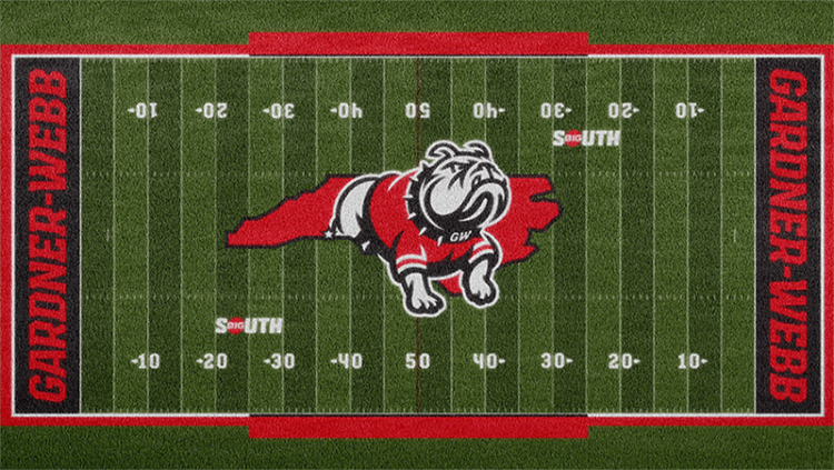
2 hours ago, WideRight said:
That may the most ridiculously huge midfield logo I have ever seen. From the 22 to the other 30? What the what? Why not just cover all the grass?
I want to see some wacko team do it. I mean, Arizona has "BEAR DOWN" sublimated on the field spanning from the 15 on one side to the 10 on the other.
-
2
-
-
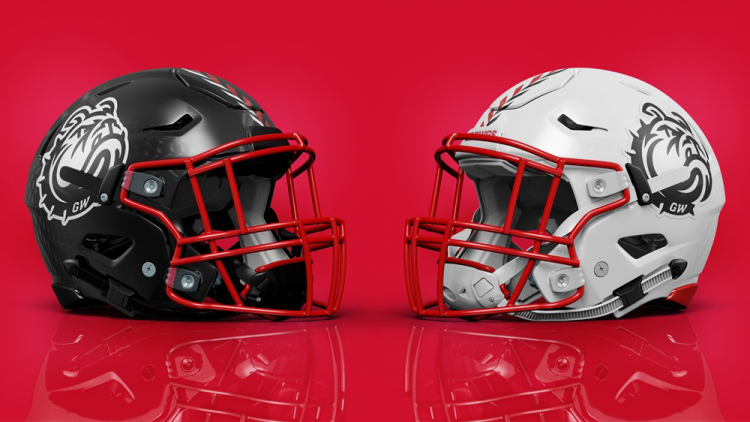
On 4/29/2022 at 4:20 PM, CDCLT said:
the bulldog isn't centered within the state in the logo.
I can give them a pass on that. If you notice, there's a star on the left side where the bulldog meets the state border. That corresponds to Boiling Springs, the town where G-WU is located.
-
1
-
-
This rebrand is fantastic. I've got a couple of TINY nitpicks.
-
They should've designed left-facing marks as well. That way you could have the bulldog face forward on both sides of the football helmet. As it stands, I have a sinking feeling that they'll go asymmetrical (probably numbers on the left), and asymmetrical helmets need to die.
-
The territorial mark is not centered on the football field. Notice it goes from the 22 on the left to the 28 on the right. They should've centered it on the 25's.
Other than that, they really took the ball and... ran home with it.
-
1
-
They should've designed left-facing marks as well. That way you could have the bulldog face forward on both sides of the football helmet. As it stands, I have a sinking feeling that they'll go asymmetrical (probably numbers on the left), and asymmetrical helmets need to die.
-
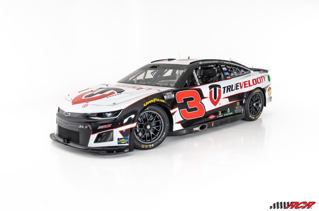
The Keselowski scheme is egregious with the new number placement. The blue circle in the scheme was originally designed for the number.
-
I like this a lot so far, but I do hope that other identities will have logos that aren't just monograms.
-
Massive downgrade. The previous logo definitely read as an ice cream brand. This new one looks like a brand for a bank. If they really wanted the brown and pink, they should've just recolored the previous one.
-
1
-
-
21 hours ago, Seadragon76 said:
Called it.
To be fair, it was a needed move for the NEC since they lost Bryant. Adding Stonehill gives the conference balance again. They might not be done yet...
I've been seeing people talk about New Haven and Bentley, the latter of which already plays D1 hockey.
-
29 minutes ago, GriffinM6 said:
I agree with this as well. I think you could keep the same design, but use green, white, and grey instead of the flag colors. Colorado is the only Western state that uses green as far as I'm aware. The only other two state that use it are Vermont and New Hampshire AFAIK.
New Hampshire uses green text, but otherwise is a very blue-heavy plate, with the sky on the left and the Old Man of the Mountain on the right.
-
UMass Lowell has a new blue alternate this year.
-
I'm still in shock that The Money Team is actually happening. They've been teasing for over two years.
-
3 hours ago, Seadragon76 said:
The NEC. Not only does it fit better with New Haven regionally, the school can also play some of their old NE-10 rivals like Bryant and Merrimack in the process.
And U. of New Haven would be among other private institutions in the NEC, whereas the AmEast will be all public institutions once Hartford leaves.
-
-
51 minutes ago, Seadragon76 said:
The CAA adding those three schools makes sense - Hampton's goal has always been to be in the CAA after leaving the MEAC. The Big South was just a stay over for them before making that move.
Monmouth and Stony Brook are big time grabs for the football side of things since they're losing a big time powerhouse in James Madison. Having them in the CAA will also help the league in other ways as well.
Just as a note, Stony Brook has been in the CAA for football since 2013.
Now I wonder who the other conferences will pick up to replace the departing members. The Big South will only have five football schools and the America East will only have eight members total once SB and Hartford leave.
Maybe the Big South and OVC merge their football operations?
As far as the AmEast, maybe they take on CCSU? Southern Connecticut State?
-
On 1/13/2022 at 1:14 PM, LAWeaver said:
NASCAR Euro Series champion Toine Hezemans
The Euro champion is Toine's son, Loris Hezemans. He was the Euro series champion in 2019 and 2021, and has run a handful of Xfinity races.
-
1
-
-
23 hours ago, DCarp1231 said:
How I wish that RCR would use a different font for Austin Dillon's 3. Earnhardt made that number/font combo so famous that it feels like an intrusion. Same with the Gordon 24 and Johnson 48.
-
4
-
-
I may be in the minority, but I love color vs. color. As long as the colors contrast, of course. So that means that that Chargers/Cowboys example would be a no-go, since they're both blue.
-
10
-


College athletics identity changes
in Sports Logo News
Posted
A photo of that logo