


Ted Cunningham
-
Posts
1,279 -
Joined
-
Last visited
Posts posted by Ted Cunningham
-
-
On 5/16/2024 at 2:14 PM, VDizzle12 said:
The "piping" era in college football was so absurd. Teams literally just had curved lines all over their uniforms that made no sense.
If I recall correctly, Missouri bought into that look pretty heavily.
-
2 minutes ago, tBBP said:
What I do know, however, is that the phrase "creatures of habit" has never been more true than in the characteristic patterns that tend to show up in Nike-led or Nike-designed number sets...
Thank you for the all the examples. I thought of Wake Forest and Minnesota specifically, but as you illustrated, there are so many more. The only explanation I can think of (beyond "It looks cool") is it's an attempt to create sets of numbers that are unique while maintaining a "signature" that identifies a set of numbers as Nike's.
Sure, these numbers may be unique, set to set, while keeping that opposite corners theme. But (rhetorically), did these designers ever ask if including that particular thing was a good design choice. (Or if any of these sets are actually good?)
-
1 hour ago, DCarp1231 said:
The full Texans number font- 4, 6, & 9 are the only three digits with a separate set depending on if it’s first or second for double digit numbers

Legitimate request: Could someone who has worked in sports-related branding and who would potentially have knowledge of this please explain the obsession with making so many custom number sets have mixed/opposite-end round and square corners? I do not understand the infatuation with having some corners be pointy and others be rounded. And then rigidly sticking with that, even where it makes certain numbers look so overwrought (like the 2 in this particular set). And yet! The 6 doesn't have a square bottom left corner? Why.
It's a shame too. If one were to use the 5 or 6 (or both) as a starting point and build out a set of numbers from there, it would look like a logical evolution from the set they had on their original uniforms. Something along these lines:
-
 9
9
-
-
22 minutes ago, Carolingian Steamroller said:
For the record.
Washington operated as The Football Team for two whole seasons using the 80's uniforms and nobody had a problem with it. None of the folks, myself included, who wanted the old moniker dropped had beef with the uniforms themselves.
The Commanders got new uniforms because the team, inventing a new nickname, wanted new uniforms to go with the rebrand.
So there's no straw manning the uniforms as potentially offending anyone.
Personally, I would've loved it for Washington to stay the Washington Football Team and roll with the numbers on the helmets.
This is basically where I am, too. I do understand the argument that, without another definitive mascot/name, calling them the Washington Football Team and keeping a look that they used for so many years under the offensive moniker could be perceived as a constant reminder that they used to have another name and the lack of a conventional mascot/name would equate a wink and nod to the previous name. ("Hey, we're just called 'Football Team' now because we can't use our real name. But you guys remember it, right??")
I don't agree that that's what would happen, but I can see the logic to the argument. And of course, regardless of what the team is called, you'll have old heads who use the old name out of habit without any necessary intent to cause offense and people who like to use the term "snowflake" who will intentionally use the old name, but I think they're well in the minority.Otherwise, yes: just keep using the old uniforms, use the new helmet (with the gloss/car paint/deep finish that they used in the 2000s), and perhaps include a logo-less throwback to the dark burgundy/old gold/khaki pants era. Given this is a team with a significant history and decent pedigree (on the whole, anyway), they should retain a look familiar to the franchise. If they want to go in a new direction, do so wholesale: Buy the DC Defenders identity from the UFL and rebrand as them, or go completely in another direction without either burgundy or gold.
-
2
-
-
1 hour ago, TenaciousG said:
Also a lot of people - especially on the East Coast - think Washington means DC.*** They should have been the Evergreen State Wolfpack IMO.
***But not people from or who have lived for any length of time in DC.
-
2
-
-
23 minutes ago, DCarp1231 said:
Not a fan of the new WV jerseys
It's unfortunate from a branding standpoint that WVU's arguably most consistently successful stretch of seasons were in the Pat White/Geno Smith uniforms as those are the uniforms that much of a broader national audience associates with WVU. While I think that design was essentially a far more tasteful application of the original 1997 Denver Broncos striping and is fairly tame by standards of the time, each redesign since they went to the navy helmet and the flying WV (1980) has been unnecessary tinkering (to outright eschewing) with that original look.
A modernization of the original look would be my preference (if not an outright return to that look; though that's unrealistic given Nike's coherent branding across the University's sports programs). And I don't hate some of the changes and added elements that the 2019 redesign brought: there's more emphasis on the navy-gold-navy striping. I liked the Country Roads alternates for a big game, etc. And while the flying WV is the mark that the team should use, I don't mind it within the state outline as an alternate logo.
These new ones are slightly worse than what they replace. (There's too much gold on these for the navy jerseys, just like there was too much gold on the navy jerseys in the 2019 set.) But they're still better than the pickax uniforms or either of the jerseys Pat White wore (taking the timeline back to 2002, which wasn't really great either because they had inexplicably added white drop shadows to the numbers that year).
1 hour ago, 4_tattoos said:WVU's new shoulder stripes don't make me think of the Pat White era. They remind me of the Brian Brohm Louisville teams that were a rival to WV when they were in the Big East together.
While this was not the first thing I thought of when I saw those stripes (I figured they were going for what Pat White/Geno Smith wore, but I also thought Houston Texans or even USC since they didn't have the side panel/Broncos stripes), this is an interesting point.
-
1
-
-
On 4/20/2024 at 8:39 PM, DCarp1231 said:On 4/20/2024 at 8:36 PM, tBBP said:
Time out—did they just turn that panther head logo 90 degrees, crop it, and create a pants "stripe" out of its neck?? That's what they did, didn't they???
Yeah it took me a bit to realize that too. It’s a bit awkward and more noticeable on the gold pants.
I don't even think it's a bad look, necessarily. If they were starting from scratch, I could see what they were going for. But knowing what those pants replaced, it's certainly a downgrade.
-
1
-
-
58 minutes ago, Chromatic said:
One thing about the Broncos the jerseys, I think the "mountain" design on the sleeve cap is going to have a similar effect as the Seahawks "feather", where its going to look like one thing on the players wearing them over shoulder pads, but extra stupid on the jerseys fans buy with the extended sleeves.
This is an interesting point given that sleeves have actually made a very limited comeback recently. I noticed it started with Tyreek Hill last year, and now some players in the UFL have been sporting longer sleeves. I presume this is a "quarterback cut" jersey style or something a la Peyton Manning or Tom Brady. (Though frankly, I didn't know they were still available.) I'm now curious what the Broncos' new sleeve design will look like on this particular cut of the jersey.
-
1
-
-
1 hour ago, bbush24 said:
Y'all are getting soft. These are awful. Screams mid-major college program.
This is exactly right. This is Illinois/Syracus/Boise State over the last decade or so, regurgitated.
-
20 minutes ago, DCarp1231 said:
I still think Tennessee could revert to the Oilers uniforms but keep the Titans name.
Do they keep the thumbtack? Or just straight up go everything Oilers including the derrick and just call themselves the Titans?
The latter idea is wild, and I don't hate it.
-
Just now, MJWalker45 said:
Houston needs to just wear either a white or a blue helmet and call it a day.
Or even just go back to the 2020 uniforms (with the new logo, for obvious reasons). That dark silver helmet was miles better than even a white or blue iteration of the current helmet would be.
Just now, MJWalker45 said:The all red for the Panthers works when playing the Stallions as well, I just don't like that look.
Oh yeah, I'm with you here: It would have looked better burgundy over gold.
-
2
-
 1
1
-
-
7 hours ago, MJWalker45 said:
Michigan going all red today

Yeah, when I first saw a picture of what they were wearing, I wasn't looking forward to it. But the two teams against each other didn't look awful. Burgundy vs. red and white with gold mixed in on both sides; it wasn't a bad looking game. Not ideal, but I would take that over the San Antonio/Memphis matchup from yesterday.
I also thought, for as red-heavy as it was, Houston/DC wasn't terrible either. Houston's helmet is garbage, but I liked the other three contrasting elements: white jerseys, blue pants, and red socks. And DC is just a pair of white pants away from having the best (OK, maybe second or third best) uniforms in the league.
Lots of caveats there. And everything I said was "this is not bad" vs. "this is good". Ha. But my point is, this league is at least colorful and the matchups are pretty easy to watch (both aesthetically and it terms of quality of the games, come to it).
-
1
-
-
On 3/30/2024 at 1:53 PM, MJWalker45 said:
I don't know why they even have white pants.
Noticed that the skill players on offense all have the green comms dot on their helmets. Did USFL do that last year?
On 3/30/2024 at 1:56 PM, Sodboy13 said:USFL revived two red/gold teams with the Stallions and Stars, and needed to differentiate. So they moved Philly to athletic gold and gave Birmingham the white britches.
Not arguing the aesthetics one way or the other, but there is historical precedent for Birmingham wearing white pants on the road: They did so in 1984 and 1985, too. I'm not sure if having Birmingham go with white pants in 1984 was a deliberate decision related to the similarities with the Stars, as Sodboy suggests. (It seems at least plausible for a fledgling league attempting to establish brands.) But it predates 2022.
-
2
-
-
I like that facemask-swapping idea for the Browns depending on the uniform combinations, especially any league interference notwithstanding.
I wonder how that would go over with league officials from a branding standpoint. Up to this point, they apparently haven't made much of a fuss when teams change their facemask colors. Those have been in generally one-off situations (like the Browns' and Jets' [from before the uniform change] white facemasks) or else a permanent change (like the Bills going to white facemasks). But if a team (that uses its helmet as its logo) did that regularly (resulting in essentially three variations of their logo), I would presume that would give the league pause? It's an interesting thought exercise anyway.
-
2
-
-
18 hours ago, SFGiants58 said:
So, how legit is this source?I think because it involves the Broncos and is stated with such confidence with no apparent legitimacy to back it up (about "all five upcoming changing uniforms", no less!), are we sure that Jesse Schultz isn't just Nick under a pseudonym? The portrait even kind of looks like him, aged to today.
(This post is for the oldheads, I guess. But that's absolutely the first thing I thought of. Haha.)
-
4
-
-
5 hours ago, Discrim said:
You forgot the Patriots
Ha. I was wondering if anyone would notice. I intentionally left them out because, while it was a unique look to the NFL, that set of numbers looked like they belonged in the NHL. (Probably because around that time the Lightning and Flames had both featured italicized numbers briefly, and the NHL was the only placed I'd seen italicized numbers. So that's how I classified that look in my head. In other words, the general style of that set of numbers didn't look entirely new to me, even if they were unique, unlike the Ravens, Eagles, et al. which felt like entirely new designs.)
-
Custom number fonts, especially of late, are an excellent encapsulation of "just because we can doesn't mean we should".
Since it used to be that suppliers (at least to a degree) dictated what number styles were available, there was more uniformity, at least in concept, among number sets. And differences in generally similar styles led to interesting (but tame) quirks and differences (like the "Champion" numbers essentially being "block" but with the curved 7, etc.). Because of certain teams sticking with styles over time, even after changing suppliers, we ended up with some teams with contextually unique numbers. (Two examples that stick out there are the Bears, and to a lesser degree, the Red Sox.) But somewhere around the mid-to-late 90s (I suppose starting with the Ravens, Eagles, and then Broncos), that changed. Those number sets were, at least, somewhat coherent in their designs though. Now, with numbers like the Texans, Dolphins, Seahawks, Titans, etc., it just seems like numbers are designed first and foremost to not look like other numbers, and then Nike et al back into some brand-speak, brand-related explanation for why they look like they do.
(That's not to say all modern numbers that are currently unique are like this. Cleveland's an example that seems a little more coherent and intentional. Though even there, the half-serif on the 7 is questionable.)
-
5
-
 2
2
-
-
Yeah, the spacing in that scorebug is weird. Other than that, I like the simplicity.
-
1
-
-
3 hours ago, leopard88 said:
Thanks for finding this.
For the record, in my opinion, the old color looks more what I think of as burgundy than the post -1969 colors.
Agreed. I realize there are more precise definitions for these words, but as a shorthand, I usually use the two words interchangeably (with a preference for "burgundy"). However, (again) that's shorthand when distinguishing between red and a darker shade of red. If I were asked to define the two, I would likely define burgundy as having a little purple to it, where maroon is just a straight up dark red. As for however Washington would describe their colors, I would certainly think "maroon" would more closely fit it. And neither really fits Michigan, though I think the Panthers would be closer to burgundy. ("Plum", a reddish shade of dark purple makes more sense than either burgundy or maroon, as others have stated or indicated previously.)
-
3
-
-
6 hours ago, Kiltman said:
Hoping the alleged tweak they’ll be getting by the 2025 season has some of those changes. Anything beyond just updating the word mark on the jersey to the new one would be a plus.
Adding silver back in would be nice, especially since it’s back for at least two games now for the Kelly greens. Marry the two looks more. That plus a new font is a doable change.
Wish they would either drop the black uniforms for a white alt of the Kellys
or if they must keep it, make a new one based on the throwback style instead of the home uniforms.
I've often thought that simply adding silver (or a lighter grey, as Nike has been essentially unable to produce silver on fabrics to this point) would certainly improve their current look. I don't mind Philadelphia's current uniforms. Even though the "midnight green" is a byproduct of the late 90s to mid 00s NFL dark era, it's a unique color in the NFL and I don't hate it. As a general rule, I like away uniforms that go primary/white/secondary/socks when the primary color is dark and the secondary color is some shade of gold or silver. I think that works for balance. (Digression: I also think that's why gold pants work so well for Washington.)
With that context, the one broad thing about the regular home and away looks I have never really liked was the balance of the away uniform: green/white/white/socks. Silver pants would add a lot of balance to that look, and would still look good, too, with the home uniforms (maintaining that dark-over-light look and avoiding two-tone dark-over-dark looks like Tampa's current iteration of the pewter uniforms).
-
1
-
-
12 hours ago, upperV03 said:
The Ducks just dropped their absolutely gorgeous throwback unis:
Perfection. No notes.
Yeah, these are nice.
I'm curious about the overlap of the E where the jersey buttons. While Ebbets doesn't have a home jersey (that I could find) from 1954, they do have the road version that shows some creative spacing to avoid cutting a letter over the placket.
Photos from that season show the word is evenly split, 3 letters by 3 letters.
-
9 hours ago, Silver_Star said:
Should be more italicized. This one looks half done!
Yeah. The kerning feels weird somehow, too.
-
1
-
-
1 hour ago, Cujo said:
Did the Mets switch to blue and red this offseason?
That looks so bad. The comparison of the Mariners jerseys further up the thread looked bad, but it just looked like an authentic compared to a cheap replica (even though that's not the actual case in the tweet). But when the on-field product looks like the lowest-tier for-fans replica jerseys, that looks like something done by an amateur operation. It's just ugly. I am no longer surprised by anything MLB does, as an organization. But you'd think something with that much history would collectively care a little more about how they present their brand(s).
Everything is too low on the jersey: the MLB logo seems too big somehow (thus pushing the name and number further down the back), and the lettering looks comically small. On a few personal projects, I've sewn letters and numbers onto the backs of sweatshirts and jerseys. My own personal preference is to keep everything higher up on the back, so perhaps I am a little biased, but I always thought that the name and numbers were noticeably higher on baseball jerseys than what's in that preview picture. And aren't the letters generally something like 3" tall? There's no way those are that big.
-
1
-
-
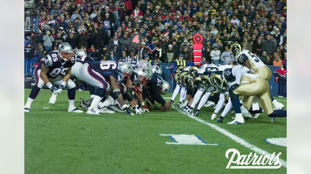
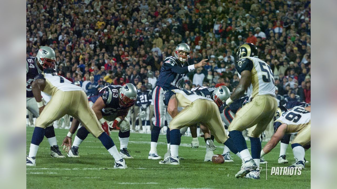
On 1/30/2024 at 1:35 PM, Pleepleus75 said:
Super Bowl XXXVI Outdoors
Haha. Just as drab as it was indoors. These two teams right here are pretty good examples of taking designs with bright colors and desaturating/darkening them in an attempt to, I don't know, chase trends? Make themselves look "tougher"? The late 90s into the 00s were a dark time for NFL uniforms in more ways than one.
-
4
-


College Football - 2024
in Sports Logo News
Posted
Ah yeah. I specifically remember watching a game in which Clemson played Wake Forest in purple and it was a competitive game (i.e. they were on the same mid-major level).