-
Posts
2,954 -
Joined
-
Last visited
Posts posted by tohasbo
-
-
This may already be in this thread, but I stumbled upon it today and thought it couldn't hurt to add it on here. Thought it was kinda cool how they made the ribbon for the 116 wins come off the sides of the '01 banner.
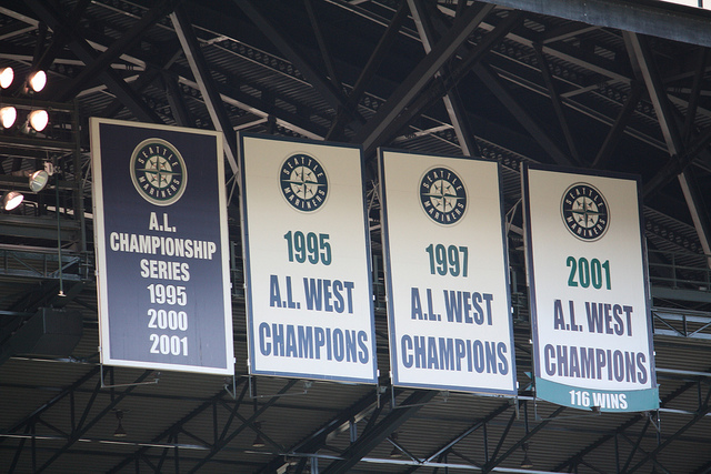
I'm not sure if that's new or is a part of the original banner.
-
Interesting, I have never seen those Rams uniforms before. Didn't the early designs feature block numbers, though?
I'm pretty sure they did that. I think it may have been only for the 2000 season but I'm not sure.
-
The Phillies and Flyers have a tiered system too. The team HOF, which honors players but doesnt include retiring their numbers. that is saved for players that enter the League HOF, which is why it took so long for mark howe's #2 to get retired, he only was recently entered into NHL HOF..
Agreed. The Blue Jays have a two-tier system (a "Level of Excellence" for the team's great players; you get your number retired if you go into the HoF as a Jay). The Level of Excellence had the players' numbers on it until it was re-done last year, and rightfully so. There's no need to emphasize the number if you're just "honouring" it.The thing with the "ring of hono(u)r" and "forever a flame" is that they should leave out the number, and just hono(u)r the player.
Related, I wish teams who had two-tier systems would have specific requirements like the Jays. There's no reason why Nieuwendyk and MacInnis shouldn't have their numbers retired. The way the Flames do it seems so arbitrary.
I think that's dumb. If there's even a chance that you may want to retire a guy's number, at least hold it out of circulation for a while so 20 other players don't wear it before it's retired. The whole point of retiring a number is that it's become forever associated with that player, or because nobody will ever be able to do honor t that number like the guy for whom it's getting retired, etc. It's stupid that numbers get retired after other players wear them. The HOF thing is stupid as well - if Adam Oates makes the HOF, does 77 get retired? Granted Mark Howe was a pretty big part of some good Flyers teams, but they obviously didn't think he was number-retired worthy when he left.
Seeing as Oates is in the HHOF, I could see it being retired by the Caps but the Caps fan in me sees Bondra and Kolzig retired before Oates.
-
I'm pretty sure it's either TD Garden or United Center
-
Wow so in fact they did change the look of the Stars retired number banners.
-
-
The Boston Bruins used to clog the rafters of the old Boston Garden with Adams Division and Wales Conference Championship banners (they were envious of all the banners the Celtics had). Now, only the Stanley Cups get their own banner and everything else is consolidated.
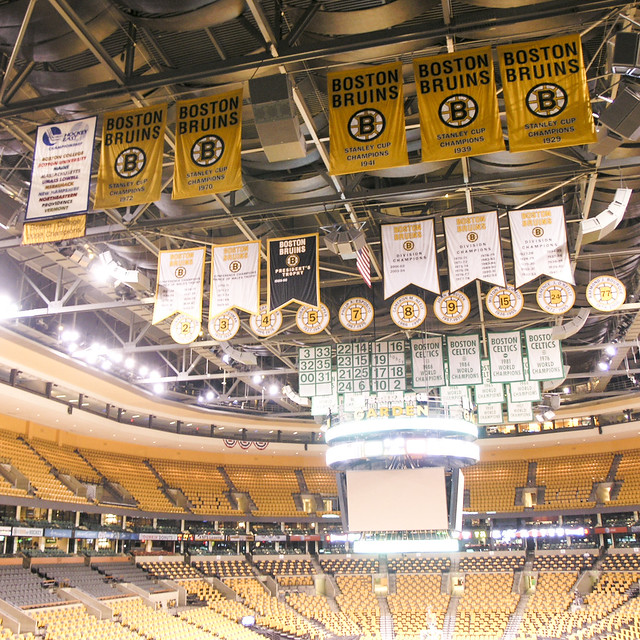
In 2011, they re-did the Stanley Cup banners with period correct logos.
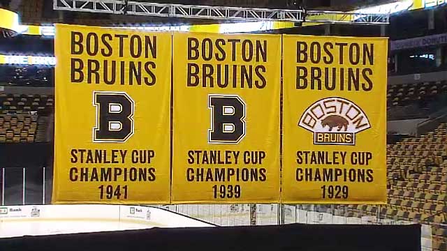
I'd be fine if the Capitals did the same thing the Bruins do. It would look a little nicer, IMO
-

I think it would look a lot better with the logo at the top instead. Since their logo basically is a wordmark, I don't see the benefit of writing out "WASHINGTON CAPITALS".
I agree and it would look a hell of a lot better if they altered the colors of the banners AND eliminated the two "Regular Season Eastern Conference" and the "Presidents' Trophy" Banners.
-
-
It's a little hard to see but it seems as if the Bullets lone championship banner has been changed...again

-

This is a little lame. The Wild Card banners that is...
UPDATED: Includes all banners since the Orioles move to Baltimore
-
The Texans' 2011 banner that's not visible on the site:

Tampa Bay Rays:


-
Talk about a lame one. Found this ages ago and have been meaning to post it.

-


The only place I have ever seen the 2004 Cardinals Blue Alt is on ESPN NFL 2K5 and eBay.
I don't think they ever wore it.
That always was a fashion jersey like the gold 49ers, yellow Packers, silver Raiders, and navy Dolphins that were all out at various times in the 1990s and 2000s.
On ESPN NFL 2K5 it was listed as their alternate jersey.
If I'm not mistaken, 2k5 had a few of these jerseys for teams as alternates, but were never more than fashion jerseys, like this cardinals one.
I seem to remember that they had a bizarre yellow alternate for the Vikings...
Yup exactly, I almost used that very example, but started to doubt myself that it actually happened.
As well as a Redskins Yellow/ gold one as well
-
Retiring 42 made sense and still does to this day. I feel the same about Gretzky's 99 being retired league wide for the NHL. I don't feel the same about Jordan, however.
-
You know, the one banner I have been trying to find over and over again with no luck is the Arizona Diamondbacks 2002 and 2007 NL West Banners as well as the original 2001 World Series Champions banner....
That's because there aren't any.
If you look at this picture below on the left side of the scoreboard, the logos are the representation of the Division/NL titles. It uses the logo from the time and it has the yeah (02, 07, etc.) attached in a circle on the logo. The World Series title is above the Miller Lite logo on the right.
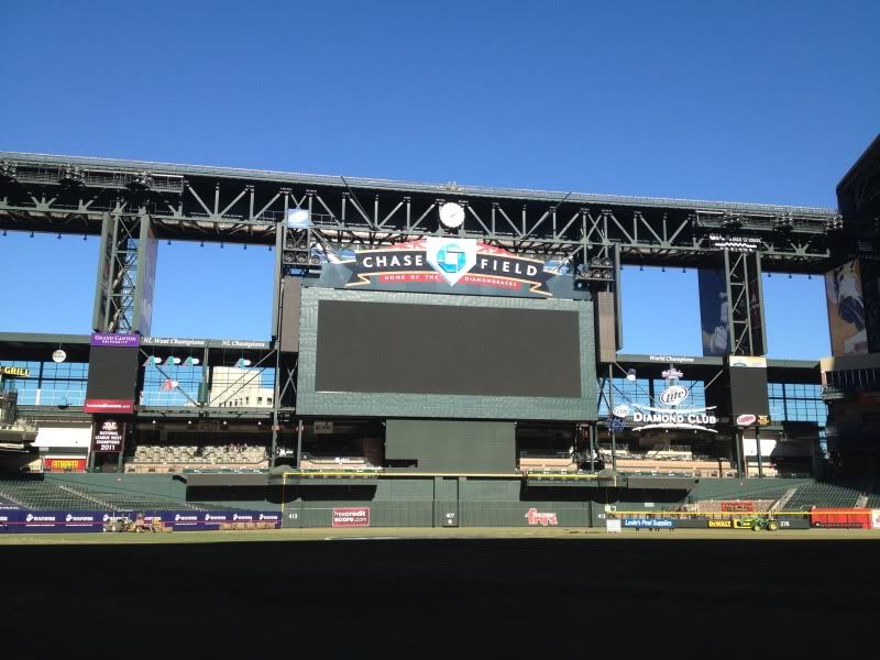
Odd because I KNOW that there was a World Series Banner as well as a 2002 NL West banner. I remember that because I was there in Arizona in 2003 and saw them but I guess they went to the new format sometime before the 2007 season...
-
You know, the one banner I have been trying to find over and over again with no luck is the Arizona Diamondbacks 2002 and 2007 NL West Banners as well as the original 2001 World Series Champions banner....
-
What are these numbers (in the squares)?
http://www.flickr.com/photos/syume/4485318886/
The Blue Jays banners after retiring Alomar's number:
http://www.flickr.com/photos/55976115@N00/6067386236/
I've always liked how the Leafs put the players' pics on the banners:


The numbers in the squares are all the Celtics retired numbers.
-
Here are some more...


Now on these, I think it would make a lot more sense if they put all of these together in chronological order..


-
Here are a bunch of random ones I have found over the years...


(Let me just say, I think the Capitals need to seriously reconsider the divisional banners to one much like Boston and REMOVE the Regular Season Eastern Conference Championship banners)


-
No pics yet, but a description of the Cardinals' World Championship rings:
World Series rings have nods to historyFor the second time in club history and for the first time to commemorate a World Series championship, the Cardinals' 2011 title rings will feature their distinctive bird-on-a-bat logo.
Cardinals president Bill DeWitt III said the team has finalized the design of the championship rings and that the manufacturer, Jostens, is in the process of acquiring stones and constructing the rings.
"I'm excited about all of the elements that we're bringing together," DeWitt said. "It should be some visual."
The top of the ring will feature a solo bird on a bat, with the bird crafted out of faceted rubies. The bird will be outlined in yellow gold and perched on a bat made of yellow gold, but the rest of the ring will be white gold, DeWitt said. In 2004, the team's National League champion rings were the first in team history to use the bird logo ? like the team's Sunday caps ?on a title ring, and that bird was crafted from a cultured ruby instead of being made of multiple rubies.
Making history is only part of the ring.
Marking history is its theme.
DeWitt described Wednesday how many designs on the ring will be new ? "trailblazing," he said ? while focused on the team's championship past. Some details DeWitt said will be present on the 2011 ring:
? One side panel of the ring will feature the number "11" made out of rubies to signify the 11th championship in club history.
? The other panel will have the team's interlocking "STL" logo in rubies.
? Busch Stadium's Musial Bridge motif will be featured in relief on the ring, and there will be room for the player's name on one side.
? The years of the 10 other championships will be etched on the shank of the ring to give history "a prominence," DeWitt said.
? The phrase "World Champions" will appear on the face of the ring framing the solo bird, but the diamonds will be set behind the letters to create what DeWitt described as "an additional bling factor."
The rings will be presented to players on April 14 at Busch Stadium during a ceremony before the second home game of the regular season. All of the players who appeared in the majors with the Cardinals last season will receive a ring, as will all of the team's living Hall of Fame players and other team officials. There are several versions of the ring, with the same general design, that will also be presented to club employees.
While DeWitt said the team sought to enhance upon the 2006 championship ring design ? which was built around the interlocking "STL" on a baseball diamond made of diamonds ? he also wanted to make sure they could be displayed together.
"I want to be cognizant of the need for them to be different, but also make it possible for them to sit beside each other and share the same qualities," DeWitt said "They're the same size. There are similar touches. There's a nice symbolic thing that (comes from) ... the team's history."
Well, it sounds a bit busy but I will let the pictures do the talking.
-
Selling on DenverBroncosAuthentic.com:

They're asking $119.99
Obvious fake. The numbers are a part of the current set.
-
Wonder what the new ring will look like? I hope it's something different tired of seeing copies of other rings.
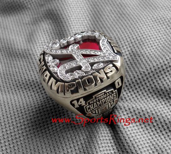
Well we can be guaranteed that Alabama will NOT get 3 rings.
-
I am wondering the same thing. Did anything carryover from when they were in San Diego?


CCSLC Championship Ring Thread
in Sports Logo General Discussion
Posted
This one is far better than that College Football Playoff one