


29texan
-
Posts
2,921 -
Joined
-
Last visited
-
Days Won
5
Posts posted by 29texan
-
-
I take it the 2nd Austin is dedication to the Longhorns, right?
-
Forget the uniforms, I want that flag:

-
 10
10
-
 2
2
-
 1
1
-
-
1 hour ago, Pigskin12 said:
Some heat = their standard home uniform that they’ve admitted isn’t as good as brown over orange.
...yeah, that's a weird tweet.
-
1
-
-
12 hours ago, WestCoastBias said:
TCU should have saved these for a night game.
They break them out for October.
Not sure when they decide what time of the day the games will be, though. -
15 hours ago, WSU151 said:
I had no idea that Amon was very much built into/below ground
It was, a little.
Of course, the bowl is also the only part of the original stadium (along with a couple medallions and an old door) left over.-
1
-
-
23 hours ago, Webfooter said:
So what are we exactly looking at besides there being red light coming from inside the stadium?
The red light is the point . . .
-
1
-
-
. . .
-
2
-
 1
1
-
-
Very... old school.
What made you go with that design? -
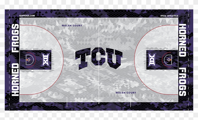
5 hours ago, WestCoastBias said:
TCU going all in on the red now? Is this the first time the basketball team has used it?
That striping is awesome though, get rid of the red and these uniforms are some of the best in the country.
The basketball team is, at least. The court already has red in it and even the football field's goalline has it.
I don't mind the red... honestly, I kinda wanna use it more. Purple, Black and Red is a very underrated color scheme, but it has to be done right.
The Football team's latest "Bloodline" uniforms are a prime example of how NOT to do it. Basketball team is almost perfect . . .-
3
-
-
TCU's new Southwestern Zig Zag uniforms:
Only thing I'd change is on the purple uniforms, the stripe is black in between the white instead of more purple. It would make the red stand out more.
-
8
-
2
-
 1
1
-
-
On 9/10/2022 at 11:47 AM, TheAnt755 said:
I know it looks pretty bad, but I couldn't figure a design to do this.....
It's not the design, it's Dunkin'.
Just doesn't feel right seeing this.-
1
-
-
On 9/10/2022 at 1:39 PM, TrueYankee26 said:
Are there a lot of Dunkin's in Texas for real?
We have them, but there's like ONE in all of Fort Worth and it's in the far northern suburbs...
There's more in Dallas and Arlington and the other suburbs in the Metroplex. Never seen one in Houston or Austin.-
1
-
-
On 7/13/2022 at 9:06 PM, TheAnt755 said:
Dunkin' Cotton Bowl Classic
Bowl Name: Dunkin' Cotton Bowl Classic
Stadium: AT&T Stadium
Location: Arlington, TX
Conference Match-Ups: CFP
Notes:
I know the logo is underwhelming but the name "Dunkin' Cotton Bowl Classic" sounds pretty dope ngl. Oh I used the old Cotton Bowl wordmark but refresh it.
. . . man, that doesn't look right.
-
Meanwhile, at the Fort Worth Central Station mural...
-
4 hours ago, TrueYankee26 said:
If a certain rumor about Miami, Florida State, Clemson and North Carolina going to the SEC is true, we can add this logo too.
Yup... times are changing again. -
On 7/2/2022 at 6:20 PM, TrueYankee26 said:
Not even a full year ago . . .
On 10/5/2021 at 7:23 PM, Cujo said:
How the tables have turned.-
4
-
-
3 hours ago, colinturner95 said:
Not every team needs a helmet with a script on it...
...But I would love to see a white helmet for TCU with this script on the side.
...you might be on to something:-
2
-
1
-
-
I didn't know where to post this, but Homefield Apparel just dropped their TCU line and the reviews have been QUITE positive . . .
And this has become my favorite throwback logo.-
3
-
-
3 hours ago, oldschoolvikings said:
I'm not sure why purple dominant teams adding black became such a thing. Certainly isn't because it looks good. Just muddy and dark and lacking in contrast. TCU's purple with black sucks. Northwestern's sucks. Sacramento Kings, Colorado Rockies... all crappy, color-wise. Purple is an awesome color. The black isn't adding anything.
TCU... black helmets... 1938.
I feel like you're in the minority when you say TCU's purple with black "sucks", because that's all I ever see when it comes to the concepts on this forum.-
11
-
-
15 hours ago, oldschoolvikings said:
My recipe for the perfect TCU uniform...
Start here;
Trade purple for the cradinal.
Trade "horned Frogs" wordmark for "Arkansas".
Trade cartoon horny toads for the cartoon pig.
Never change again.
Yuck...
And as far as the 1996 look, no one wants to go back to that. Sure, there are some older alumni who want to bring back the "Flying T" uniforms, but the majority of TCU supporters don't want to be reminded of when 3 win seasons where the norm.
I'd like to keep the spike collar, myself, but if they make it more subtle, within the collar, and apply it with the same subtlety on the sleeves like the early Mountain West days, I'd be all for it. -
Soooooo.... these are just practice uniforms ( I want to stress that)... but I think the Frogs may be seeing some changes with the new regime coming in:
"Funky Town" is photoshopped, but just a thought. -
On 2/25/2022 at 12:13 PM, WideRight said:
Inter Miami Dos
Vancouver 2nd Wave
Minnesota FC 2nd Born Twin
NYCFC 2 Train
LA Binary Galaxy
LAFFCC
CIncinnatwo FC
Philadelphia Union 2nd Shift
Montreal CF Deux
Chicago FIre 2nd City
On 2/26/2022 at 5:09 AM, Digby said:
Colorado CreeksSeattle Lakers
New England War of 1812
On 2/26/2022 at 10:21 AM, MJWalker45 said:Crew Live 2 would've been a nice one.
I know I'm late to the party, but:2nd shot of New York Red Bull
Orlando City 2: Simba's Pride
San Diego Aftershocks
Portland Two-thpicks
Two-ronto FC
St. Louis Double Arches (just change the blue to yellow)
Houston 2nd Ward Dynamo (this would actually have some legit meaning since the neighborhood is just three blocks away from the stadium...)-
1
-
-
I feel like it wouldn't be much of a problem if it WASN'T Street Fighter or another IP with decades of longevity.
-
2 hours ago, NH4 said:
Thanks for the feedback it's actually great you're a TCU fan so you can tell me exactly what the fans would like with this logo. I created two designs, one without red under the eye and one with red.
- Separated the feet from the legs. I tried to do individual toes like the current logo has but it didn't look good
- Separated the tail from the body
- Increased the spacing on the front legs from the body
- Added more shading (right legs, feet, and body)
- Added purple spikes to the right legs
- Straightened out the part between the tail and the back leg and in-between the two right legs and body
Thanks again for the feedback and let me know what you think
Fits much better.
And that's exactly what I thought with the red... it's subtle, yet still stands out. If the school does modernize the logo, I could imagine something like what you see on the right work out well.-
1


/cloudfront-us-east-1.images.arcpublishing.com/gray/5XNN5EQWONDNPNWSGLECOZOEPM.jpg)


College Football 2022
in Sports Logo News
Posted
10 days late, but yeah, they're going with the all whites.
It'll be interesting... another battel of traditional vs. modern.