

nuordr
-
Posts
5,913 -
Joined
-
Last visited
-
Days Won
1
Posts posted by nuordr
-
-
I have never understood why some people consider this to be Oregon's best set.
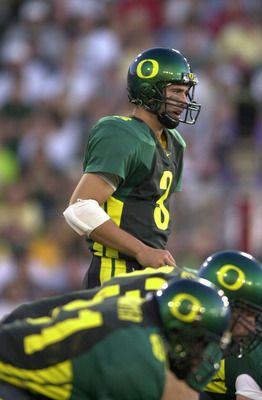
The set after these (Kellen Clemens era) was solid.
These uniforms? They were ok. Not bad, but not good.
Oregon's uniforms are always so close to being good, for me. All of their uniforms for the last decade or so have been a few tweaks away from being good. It's always close, but no cigar.
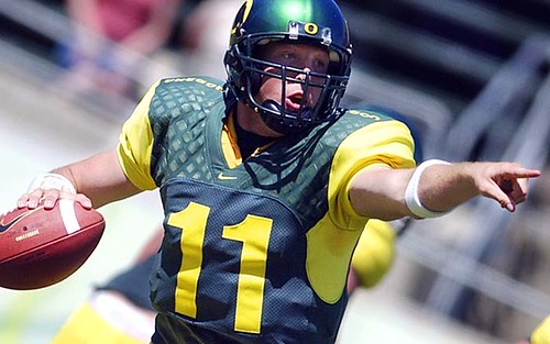
These were my favorite Oregon uniforms ever:

-
I don't post about the NFL here, so I'm not sure if this is unpopular, but I think the Broncos were much better off with navy at home as opposed to orange.
This one I know is unpopular: the LeBron-era Cavaliers set wasn't all that good, and their current set is they best they've ever worn.
I completely agree! I hate the orange jersey's full-time.
-
I love monochrome football uniforms.
I love Black-Out football uniforms from team with no black in their color scheme.
I love the new gray/dark gray trend in NCAA Football, especially the Washington State dark gray.
I hate all-white football uniforms.
I hate football uniforms with no striping on the pants.
-
2012

2011

1998

-
David Justice - I loved him when he was with Atlanta and the Indians, but the Yankees made him a trader as well with the Athletics. Maybe because I hate the Yankees and any other American League team besides Cleveland and Boston.


-
Any uniform that is not a Colts uniform for Peyton Manning!
-

The above jersey was a true modern classic and the best the Sabres have looked in their 41 year history. the absence of Sabres on the front is irrelevant in my books because there are tons of so called "classic" logos that do not depict the teams namesake.
The Canadiens do not feature a Canadien, The Islanders classic logo does not depict an Islander, etc..
Lastly the Sabres so called "classic" crest is the most overrated logo in the history of the NHL. To be frank, it's awful.
I completely agree with the bold text. This jersey and logo has always been my favorite since the first time I seen them.
-
Boston Red Sox and Celtics - From my dad and grandfather
Cleveland Browns and Miami Dolphins - From my dad (however, when the Browns left for Baltimore I quit loving them like I once did and became a fan of the NFL).
Kentucky Wildcats - From Kentucky and they are the only team in basketball according to my whole family throughout our history.
Colorado Avalanche - When the Browns moved to Baltimore I was so pissed that I wanted to pick up a new sport and I started watching hockey. My favorite player was Peter Forsberg and I have loved this team since.
NFL - I love the league as a whole, but there are two teams I absolutely hate and they are the Cowboys (Because they were never America's Team and Jerry Jones) and the 49ers (Because Joe Montana was good, but if Marino had all that talent then he would have won all those Superbowls too)!
-
I love the current Seahawks set ? as long as the lime green stays as a trim color, not the primary body color!
You are not alone...their current set is perfect!
-
Classy banners on Boston's part.
I agree, very well done.
-
How about you guys?
This is one of my favorite logos of all-time and I do not know how anyone else would feel about it because I have never seen it on here in recent memory.
-
I actually liked the Dallas Stars' "Mooterus" logo.
And I agree with you about the Nordiques logo. Looking at it nowadays, it just seems so dated and old. Though I actually like the Jets and North Stars logos.
Dated and Old is how I feel about these team uniforms:
Kansas City Chiefs
Minnesota Viking (Throwback Uniforms)
Cleveland Browns
New York Yankees
Dallas Cowboys
-


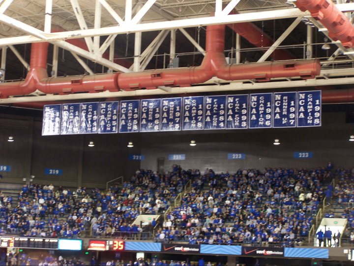
Rupp Arena - Home to the Greatest College in the NCAA.
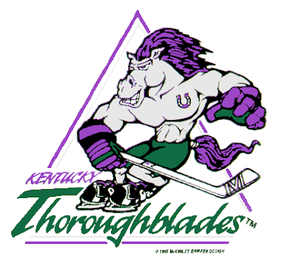
Logos associated with failure.
in General Design
Posted
Some of these teams have championship rings, but not in the era with these logos:
Cleveland Browns (They have championships, but no Superbowl appearances - Oh and were my favorite team until 1995 so I can trash them a little bit)
New England Patriots (Worst loss ever in a Superbowl)
St. Louis Cardinals (football)