

nuordr
-
Posts
5,913 -
Joined
-
Last visited
-
Days Won
1
Posts posted by nuordr
-
-
2 hours ago, WSU151 said:
I believe it’s the font Sullivan/Foxboro Stadium had in the 80s, with the blue endzones and red letters. Very close to a TNR font that never appeared anywhere else.
Here was the endzones from 1985-1990 at Foxboro:

-
 4
4
-
-
New scoreboard and uniforms for the Minnesota Twins next year.
Since you cannot see the whole article as it costs money, here it is:
Construction cranes are working behind Target Field for the North Loop Green building that will be completed by 2024.The three-game series with the White Sox starting Tuesday at Target Field will be the final time that fans will ever see Luis Arraez, Joe Ryan and Jhoan Duran in Twins uniforms.Oh, the players will probably be back next year. Those uniforms won't.The Twins' offseason will include some substantial and noticeable changes, and not just to a roster that fell well short of its goal of winning the AL Central. The ballpark, the team's logos and the winter calendar will be distinctly different in 2023 — starting with the clothing on the players' back."Our uniforms are going to evolve and take a step toward the future. There is always a sensitivity to paying respect to the history and the heritage of the franchise," team president Dave St. Peter said. "But there's also a desire to move it forward, much like we did in the mid-'80s."Will fans appreciate a new look? "Well, that reaction is always in the eye of the beholder," he said of a topic that always generates debate among fans of any sports team.The uniforms, which are complete but won't be revealed until after the season ends, are just the most obvious aspect of a general rebranding of the 62-year-old franchise, St. Peter said, one that will include "tweaks or in some cases, more than that" to the team's brand identification: the lettering, the logos, the look of the team. The colors won't change — "This franchise has embraced the base colors of red, white and blue since 1901," when it was the Washington Senators, St. Peter pointed out — but he believes a new look is well-timed."We're in a little bit of a different world today, and we've seen several brands go through a refresh. The Padres are a great example — they went with a refresh that actually reached back to their origins, but they did it in a really bold, dynamic way," St. Peter said of San Diego's re-embrace of its brown-and-gold, swinging-friar history. "It wasn't just a cookie-cutter of what Steve Garvey wore in 1984. And our goals are the same. How do you pay tribute to that history and heritage, but do it in a very modern way?"The team also will introduce a special City Connect uniform, a distinctive and nontraditional look that will emphasize some aspect of Minnesota culture, sometime next summer, but the team won't wear them until 2024. City Connects have been wildly popular with fans in other cities, and the Twins hoped to include theirs next year, but MLB is staggering their introduction with just a half-dozen or so each season.Minnie and Paul, their handshake across the Mississippi having symbolized the Twin Cities since 1961, will still be part of the franchise's icons and will continue to loom over center field in Target Field. But that logo, too, will be "tweaked," St. Peter said.Caravan returnsThe team's offseason schedule, disrupted by COVID-19, has been restored, he said, with the winter caravan across the upper Midwest planned for mid-January, the first in-person Diamond Awards banquet since 2020 set for Jan. 26, and TwinsFest to follow on Jan 27-28. The festival will be different, St. Peter said, and will only partly be staged at Target Field."We're working on some changes to what TwinsFest means, and how we can engage our players with the community," he said. "There will be changes to the scope and the lineup, doing some things a little differently to expose our brand to younger demographics. But we also understand that there is a core group of people who love to gather here and speak the gospel of Twins baseball every January."New scoreboardsWhile at TwinsFest, fans will notice a few big changes at Target Field. There will be cranes on the field from November to early March, installing new scoreboards, including a huge video board in left field that is 76 % larger than the current one. The $30 million project, with costs shared by the Twins and the Minnesota Ballpark Authority, will upgrade and in most cases expand every video board in the ballpark, with some new video hardware added.-
9
-
 1
1
-
-
1 hour ago, Durden said:

I believe it is going to be absolutely beautiful look and since it will be used only a few times a year that is not bad.
-
14
-
-
1 hour ago, Durden said:
That looks even worse than I imagined. Just f'ing awful!
You do realize they are not wearing the current uniforms on Thursday with the white helmet. They are actually wearing the former color rush uniform:
-
2
-
-
17 hours ago, spartacat_12 said:
Ramsey in the yellow socks again. Either he got fined & doesn’t mind paying, or he avoided the fine last week and decided to press his luck.
I wish the entire team wore yellow (sol) socks as they look a lot better than blue on blue.
-
4
-
-
11 hours ago, ltjets21 said:
Thats supposed to be a sword holster?
The exact wording "The uniforms also include angled silver striping on the pant legs, which are meant to invoke a sword's sheath. "
-
UNC:
FIU:
UCF:
-
5
-
1
-
-
45 minutes ago, oldschoolvikings said:
You forgot the Commanders. By the criteria you're using for the Jags, Washington is worse. The Jags have that useless little black detail at the bottom. The Commies have three pairs of pants with absolutely nothing.
Thank you....I am still not used to the Commies new uniforms. But they are definitley tied for worst.
-
21 hours ago, ramsjetsthunder said:
Dare I ask who is worst?
That is easy, the Jaguars as they wear junior high school pants.
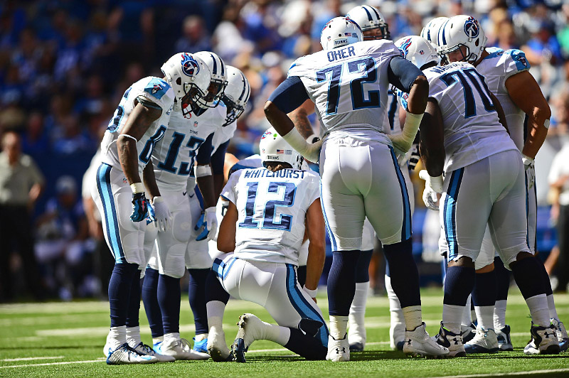
Worst pants in the league in my opinion:
- Jaguars & Commies (plain and boring, very generic)
- Titans (The sword holster is awful compared to previous set)
- Jets (sad excuse for a stripe)
- Falcons (sad excuse for a stripe, especially considering their previous set was damn near perfect)
- Rams (make the stripes consistent on the bone, sol, and blue pants)
- Saints (hate the solid white and solid black pants, the gold pants stripe should match the helmet)
-
2
-
22 hours ago, Pigskin12 said:
I also miss when they looked like the Titans and had a unique identity rather than opting to look very similar to another team in their own division.
I miss those pants...the Titans had the best pants in the NFL, now they have the second worst.
-
4
-
5
-
-
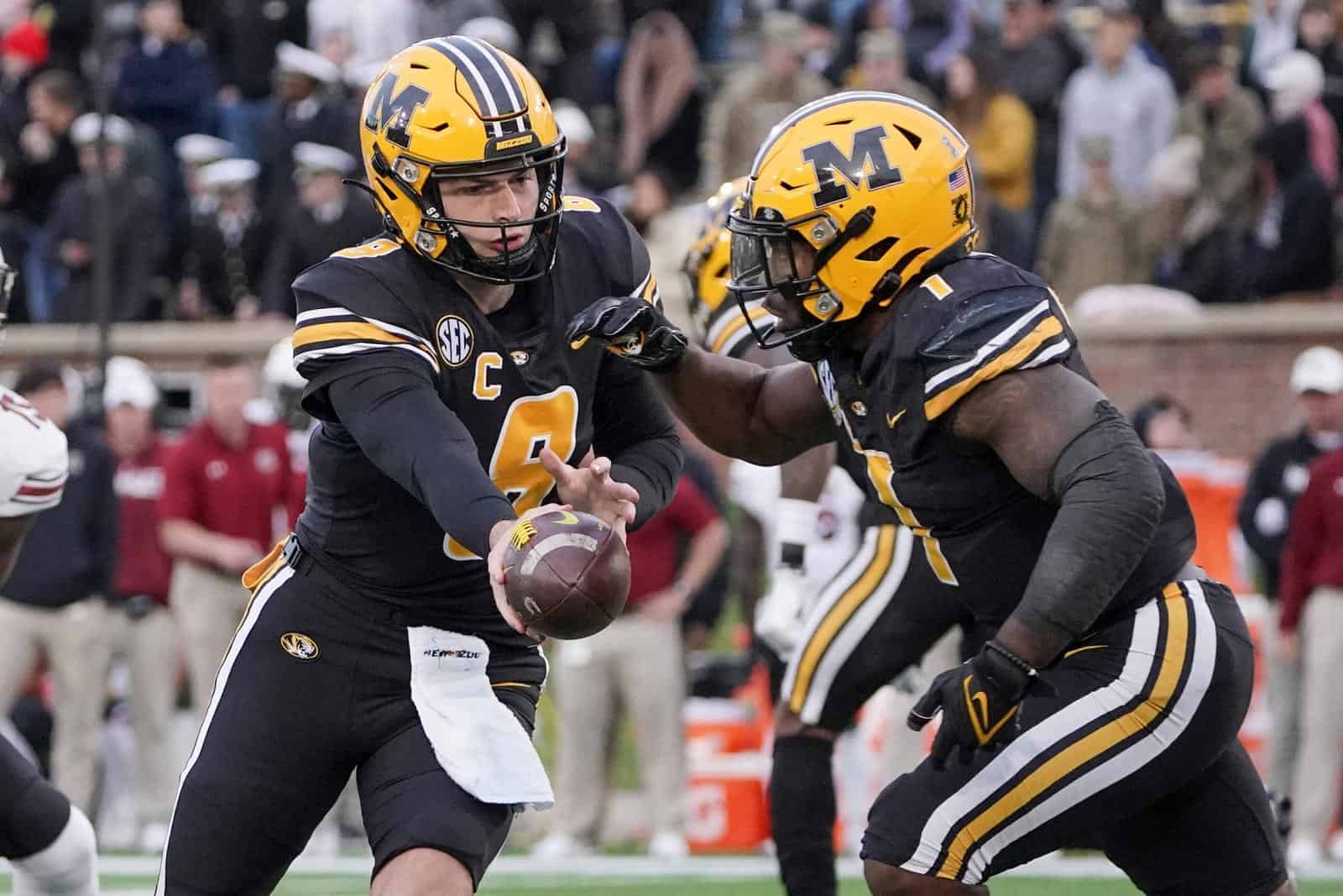
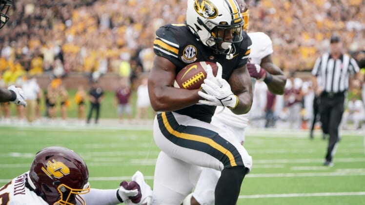
1 hour ago, WSU151 said:
The black helmet with the M is so much better than any other helmet they wear.
These are my favorite helmets from Missouri with the current uniform template:
-
Just now, LA Fakers+ LA Snippers said:
Cleveland finally decided on the field design. They had a Twitter poll a while back, but that was it.
The link said new uniforms, not new field design.
-
What could the Browns be unveiling?
https://www.clevelandbrowns.com/video/sneak-peek-new-browns-uniforms-coming-soon
This was posted 4 hours ago, but it looks the same as the video posted in 2020.
-
10 hours ago, GriffinM6 said:
Is there a grey stripe above the shorts cuff and in between the side stripes?
-
1
-
-
Here are some teams that changed their logos over the last two years that made their debut on their football helmets:
Akron:
Gardner-Webb:
North Alabama:
Taylor:
Vanderbilt:
Allegheny:
Utica:
-
5
-
-
21 hours ago, upperV03 said:
The play on the field was about as ugly as it gets (though in retrospect that probably should’ve been expected going up against the reigning champs in the 1st game with a new coaching staff), but aesthetically speaking I really did think the Ducks looked quite good in their mono-green with yellow facemasks. I wasn’t completely sold on the yellow masks when the combo was announced, mainly because the fade on the wings goes from yellow to green where they meet the masks, but in action I found myself liking the look more and more. Definitely liked it better than the regular mono-green with green masks that they wore against Oregon State last year. As @oldschoolvikingssaid on the previous page, yellow pants would’ve been better. I’m hoping they wear that combo later this season, preferably with the yellow masks again. I know the shiny elements, shoulder design, etc. aren’t everyone’s cup of tea, but to me this entire uniform set is the best the Ducks have had since the Mariota era. I said that on here last year, but it’s worth repeating.
Looking forward to next week, the Ducks are asking fans to wear black to their home opener against Eastern Washington. I personally think they’ll debut their new nightmare green jerseys, but I don’t know that. I’ve also heard there have been tweaks to the yellow helmets and wouldn’t be surprised to see those this week.
The best thing about this matchup was that a traditional looking team destroyed a modern looking team. However, I have a had time saying Oregon's uniforms are "modern" because Penn State, Texas, and Notre Dame have done plain pants for years.
-
My favorite uniform matchups of week 0 and of course 1 fail.
Vanderbilt at Hawaii
UCONN at Utah State
Charlotte at Florida Atlantic
Worst Matchup:
Nevada at New Mexico State
-
4 hours ago, bbush24 said:
Not sure how others feel but I'm just gonna throw it out there that I much prefer the old way of doing this. I know it's not necessarily supposed to be a prediction thread, but I used to really enjoy looking through these and seeing the potential matchups, even if they weren't all confirmed. Having a bunch of TBDs of uniforms that don't even exist with the plain white pants just doesn't do it for me. Maybe others prefer this though, and I appreciate all the work as always!
It definitely feels like the No Fun League on the page with the "TBDs".
-
7
-
-
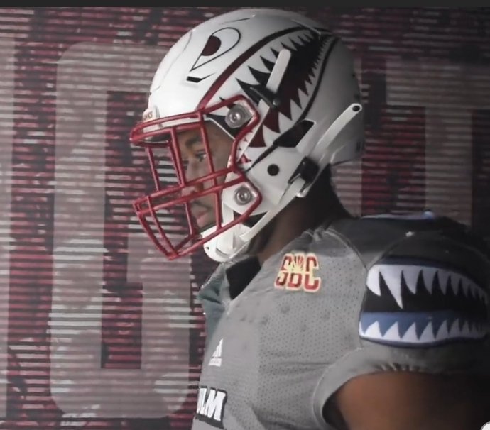
5 minutes ago, frosty06306 said:
I didn't even notice the alternate helmet for ULM - I actually dig it as a changeup.
It is a modified design of their previous alternate uniform:
-
New ULM Warhawks Uniforms:
-
8
-
-
On 8/19/2022 at 3:12 PM, KG_grfx said:
Thanks for the feedback, that was something I went back and fourth on myself. I debated just leaving the pants plain without any striping at all, but it looked like it needed something more, and same goes for the helmet. It felt blasphemous to remove some kind of stripe from a Broncos helmet, so I thought the classic stripe looked best, but I definitely get your point.
Definitely leave the stripes as plain pants would make this beautiful set become a quick failure.
-
3
-
-
On 8/12/2022 at 11:06 AM, fouhy12 said:
It's strange to me that the Patriots' silver pants have been confirmed, but not seen or announced yet. I can't tell if they want to wait to announce them for a specific game, or if they're just keeping it low-key and they'll show up wearing them on a random Sunday.
I'm also not going to be shocked if we see them on the road before we see them at home, that seems like something the players would like. Can get the ICY road look and then the TOUGH all-blue at home.
Been confirmed? Can you provide a link to the source?
-
23 hours ago, DCarp1231 said:
How does burgundy helmet/white jersey/gold pants look?
You can see some of the options on this YouTube video:
-
6
-
-
2 hours ago, Brave-Bird 08 said:
I still don't see how this
is considered terrible
Compared to this
So much cleaner. The Falcons uniforms are not traditional, but they are a massive improvement over the generic piped out Reebok set they had before. New uniforms are simple and brand centric. You can't compare them with the Titans, which have a ton of flaws (logo on helmet has too many keylines, the dumb armpit inserts, the randomnness of the floating inserts on the pants).
Both the Falcons and Jets have good, contemporary uniforms -- the issues only come from when they wear combinations that don't look good, which is a mistake even teams with traditional uniforms can make.
For me, the silver facemask without silver used on the jersey and pants ruins the look for me. At least with the last set, the black facemask matched the rest of the uniform.
-
1
-


/cdn.vox-cdn.com/uploads/chorus_image/image/69910249/usa_today_16789804.0.jpg)

College Football 2022
in Sports Logo News
Posted
Oregon Ducks to be worn on October 22, 2022Already posted.