

nuordr
-
Posts
5,913 -
Joined
-
Last visited
-
Days Won
1
Posts posted by nuordr
-
-
1 hour ago, NH4 said:
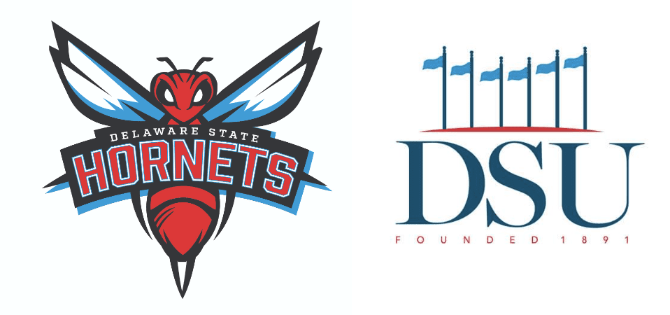
Delaware State received a new logo
They also have a new Academic Logo as well: https://www.desu.edu/news/2023/08/university-unveils-new-academic-athletics-logos

-
 3
3
-
-
The Siena College Saints refreshed their athletics logos yesterday.
-
3
-
 1
1
-
 1
1
-
-
Old Dominion Monarchs will wear this beautiful throwback helmet during homecoming this year:
-
6
-
 5
5
-
-
14 hours ago, NH4 said:
Basically what everyone pretty much predicted. No stripes but a red collar and sleeve cuffs and the logo on the sleeve caps
Glorified practice uniform.
-
3
-
-
New uniforms for the Southern Jaguars. I'm not a fan of 3 different jersey templates for the whole set.
-
4
-
-
21 minutes ago, BigEd76 said:
Immediately thought of the 96-98 alternate Ravens logo that had to be replaced
FYI: This was already posted under College Identity changes.
-
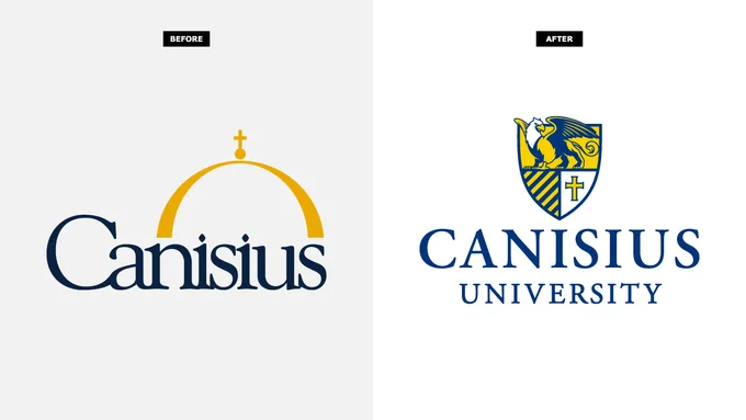
Canisius College is now University starting today. The new academic mark was unveiled in early June and features the legendary Griffin, the mythological king of birds and beasts and the official mascot since 1933, at the top of the shield.
-
3
-
-
New uniforms for The Citadel:
https://twitter.com/CitadelFootball/status/1686018830089236480?s=20
In other news, Notre Dame & Under Armour just agreed to a new 10-year contract extension.
-
1
-
-
Olivet College of Michigan and NCAA DIII recently changed their name to The University of Olivet prompting logo changes. OC is now UO. The dual letters continue to overlap but with new serifs and strokes. Red is noticeably different.
The University of Dallas Crusaders of NCAA DIII recently unveiled a new UD monogram. The new mark was designed with the university’s love of tradition in mind, though it is a stark departure from the previous long-standing emblem.
The Dakota Wesleyan University Athletics and Marketing teams have made the decision to formally introduce “Vintage Wesley” to the brand
-
1
-
-
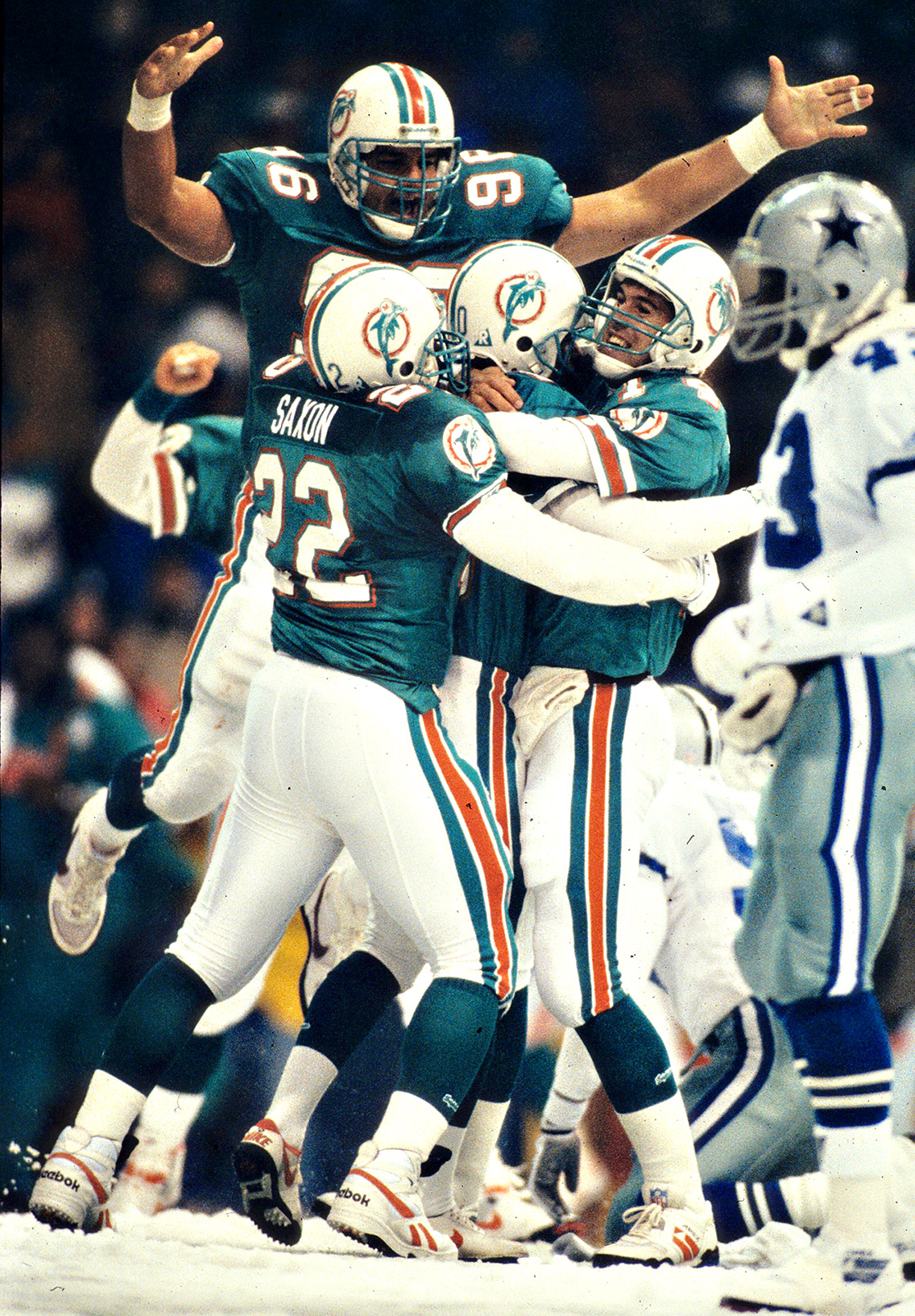
3 minutes ago, Michael Bolton said:
I like to think someone in the marketing department pitched the Dallas game as an homage to the infamous Thanksgiving snow game in '93, in which the Dolphins wore these uniforms, and how this is the 30th anniversary of that game. Probably just a coincidence though.
They didn't wear these ^^^ throwbacks in that game, but what they wore was better than the current throwback. They stopped wearing the gray facemask after the 1979 season.
-
5
-
1
-
-
Delete. I didn't see that someone already posted.
-
Since there are rumors that the Broncos are getting new uniforms soon. I believe they introduced the white helmet to get fan feedback only. They are not concerned about it looking awful on the all-orange as it is only a temporary placeholder. I believe it only makes sense to get a feel of the fan reaction before moving towards a permanent change. With that being said, I also believe this exactly what the Detroit Lions are doing with their blue helmet.
-
13
-
-
21 hours ago, MJWalker45 said:
It's Brett Bielema, it was always going to be something safe and bland. I'm just surprised he didn't copy Iowa or Wisconsin.
For me, this is anything but bland. This uniform is near perfection. When I think of bland, I think of Oregon, Texas, Penn State, basically any team with no stripes and basically plain.
-
12 minutes ago, 8BW14 said:
Yikes. Not what I was expecting and hoping for. Do not get the UCLA stripes. Erase those and they would be great. Now they looks like Syracuse.
Putting the stripes on the shoulders actually helps to differentiate them from Syracuse along with not coloring the collar.
-
The Mizzou Tigers changed the seats in their arena from yellow to black:
-
2
-
 1
1
-
-
The Vikings look good with the helmet shell and everything neck down. However, they should have been like Cleveland and not rolled out gray facemask. Purple or white would've been so much better.
-
1
-
 2
2
-
-
3 minutes ago, Pigskin12 said:
The Browns are wearing all-white for the ONE game on their schedule I specifically wanted to see them wear brown for: Week 6 vs. the 49ers. Why must this always happen with inter conference matchups I'm excited for?
This is what we got in 2015:
And this is what I was fully expecting and hoping for this year:
They are wearing them in 3 games:
-
1
-
-
On 7/18/2023 at 10:24 AM, oldschoolvikings said:
So if that's he same throwback pants as before, the stripes on the helmet won't match the stripes on the pants?
No like.
They are the same pants and they don't match the helmet. But I'm fine with that. I'm just happy they used a brown facemask.
-
10
-
-
1 hour ago, stumpygremlin said:
Old:
New:
Changes:
-
6
-
-
A month ago, USC Salkehatchie Indians of the NJCAA began using this vertical sharp arrowhead logo with an S molded inside it. Includes 2 tones of garnet & gold each. Until recently, the school was still using a Native American head logo. @College_Logos on Twitter
D3's Centennial Conference has unveiled their new identity. The new look was guided by Skye Design Studios (SDS). The conference turned 30 years old in 2022. @College_Logos on Twitter.
Last August, UW-River Falls Falcons made some updates to their typography. "UWRF" went from thin serif to thick sans-serif. The falcon logos were unchanged. More examples below.
This image shows what changed and didn't for the UW-River Falls Falcons. The UWRF on the mascot logo was updated as well to the academic version.
This image is the academic mark that was also replaced in 2022. The new RF design is unique for having a falcon design in the middle of the R. @College_Logos on Twitter.
-
7
-
-
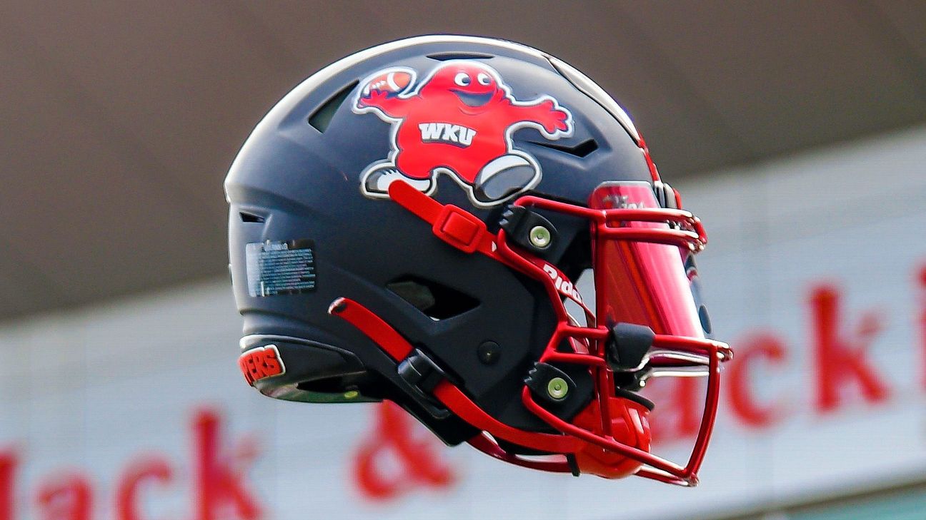
2 minutes ago, FinsUp1214 said:
I’m a sucker for drop shadow numbers, so I’m a big fan of WKU bringing them on across thier whole set. All in all, I like everything they’re doing from the neck down - the uniforms have this sort of late 90’s vibe to them - but I don’t like the chrome helmet and don’t think they need two white helmets. I’d prefer just the towel logo white helmet, as the “Tops” helmet looks too much like a Maryland helmet to me as well.
Last year they introduced a helmet with Big Red as the logo. I fully expect them to do it again this season as that is something the students and fan base had been wanting them to do for years.
-
8
-
1
-
-
11 hours ago, Brave-Bird 08 said:
WKU has a great helmet logo with the towel (sounds funny to type that, but I am serious).
Why go with a Maryland knock off when you have something unique to your brand?
There was nothing unique with their previous uniforms....plain and boring:
On 6/23/2023 at 6:59 PM, oldschoolvikings said:The chrome helmet is terrible.
The Hilltoppers have worn them longer than most teams and for me, I've become accustomed to them wearing them. They are not amazing, but they are the best in the NCAA followed by the Kentucky Wildcats chrome.
-
1
-
-
I know people have posted links of the new WKU Hilltoppers uniforms, but I prefer images myself. I absolutely love this new uniform from head-to-toe as it has everything I love:
1. Stripes on all parts of the uniform.
2. TV numbers
3. Same facemask for all helmets (no gray)
4. No logo on the shoulders/sleeves
5. Every jersey/pant/helmet will mix and match easily.
-
15
-
-
12 hours ago, WSU151 said:
Those pants stripes just don’t make any sense
The stripes on the gold pants match the helmet.
The stripes on the purple pants should be purple-white-purple
The stripes on the white pants match the jersey, so maybe they will wear a white helmet with it with matching stripes.
There is a lot of unanswered questions with only releasing these 4 images and only 1 helmet shown.


/cdn.vox-cdn.com/uploads/chorus_image/image/71291653/usa_today_16818944.0.jpg)


2023 NFL Season week by week uniform match-up combos: From HOF Game to Super Bowl LVIII
in Sports Logo News
Posted
The Titans last set was good, but their pants were perfection for all three sets. The pants for their current set is nearly as bad as the Jaguars and Commanders.