

nuordr
-
Posts
5,913 -
Joined
-
Last visited
-
Days Won
1
Posts posted by nuordr
-
-
The winner with the most fan votes of the Browns Dog logo goes to Emily Morgan. However, the official Top 5 voting starts tomorrow at this site: Make Your Vote Count! (witcontests.com)

Design Your Ideal Cleveland Browns Dog Logo Winners - Wit Webapp (witcontests.com)
I thought this was the worst one of the Top 5. The CLE feels forced and those teeth are awful.
-
 6
6
-
 1
1
-
 1
1
-
-
My grades (A-F) on each of the the Arizona Cardinals uniform parts after more thought on them.
- New white helmet = B - While I would've preferred a black or red facemask, the silver now ties into other parts of the uniform. Final thought = Upgrade from previous helmet.
- New red jersey = D - While I love the TV numbers on the jersey, I am not a fan of ARIZONA across the chest and I believe the jersey needs stripes like the white & black jerseys. Final thought = Slight upgrade from previous jersey.
- New red pants = F - There is not one thing I like about the plain red pants. They need to have stripes like the white & black pants. Final thought = Downgrade as I'd rather have the weird piping over plain.
- Black Helmet = A - Nothing new to say as I liked the introduction of the helmet last year. Final thought = Push
- Black Jersey = B - I love the new black jersey, but wish they included the TV numbers. Final thought = Upgrade from previous jersey.
- Black Pants = A - Love the pants and the stripes. Final thought = Upgrade from previous black pants.
- White Jersey = B - I love the new white jersey, but wish they included the TV numbers. Final thought = Upgrade from previous jersey.
- White Pants = A - Love the pants and the stripes. Final thought = Upgrade from previous white pants.
- Socks = D - I would've loved to seen stripes on the socks. Final thought = Push
-
Monochome looks = I used to love monochrome uniform looks as they were not very popular, but now I am sick of them. So I hope the team doesn't go monochrome all the time and mix and matches moving forward.
-
I believe these would be their best combinations:
- White/Red/White
- White/White/White
- Black/Black/White
- Black/White/Black
-
I believe these would be their worst combinations:
- White/Red/Red
- Black/Black/Red
- Black/White/Red
- White/Red/Black
-
I believe these would be their best combinations:
Overall Grade: B
-
 2
2
-
20 hours ago, 4_tattoos said:
Question. Are the breakers pants white or silver/light gray?
Definitely gray. You can see the Royal Blue, Powder Blue, and White Stripe on them.
-
1 minute ago, DCarp1231 said:
I don’t know how many times it has to be said that it’s not TruColor’s fault. TC truthfully yet cautiously believed what was being told was legitimate. Including the actual photo evidence of the actual helmet which was essentially confirmed.
Getting bent out of shape for letting your imagination get the better of you is you’re own fault.
I completely agree! At least he was willing to put his neck out on the line and try to help out the community.
-
6
-
-
2 minutes ago, HOOVER said:
So you're telling us you hated the Tillman-era uniforms, too?I liked them back then, but my tastes have changed drastically. I used to be the person that wanted all college teams like Texas, Alabama, and Penn State to come out with Pro Combat uniforms and go modern. But I grew out of that as well as growing out of liking the Tillman uniforms.
But to be honest, the Tillman uniforms only looked great because the last set was bad. I've never been a fan of the Cardinals uniforms mainly because of the horrid gray facemask. But thankfully with this new set, the silver facemask ties into other parts of the uniform.
-
1
-
-
Got ketchup?
-
4
-
 4
4
-
-
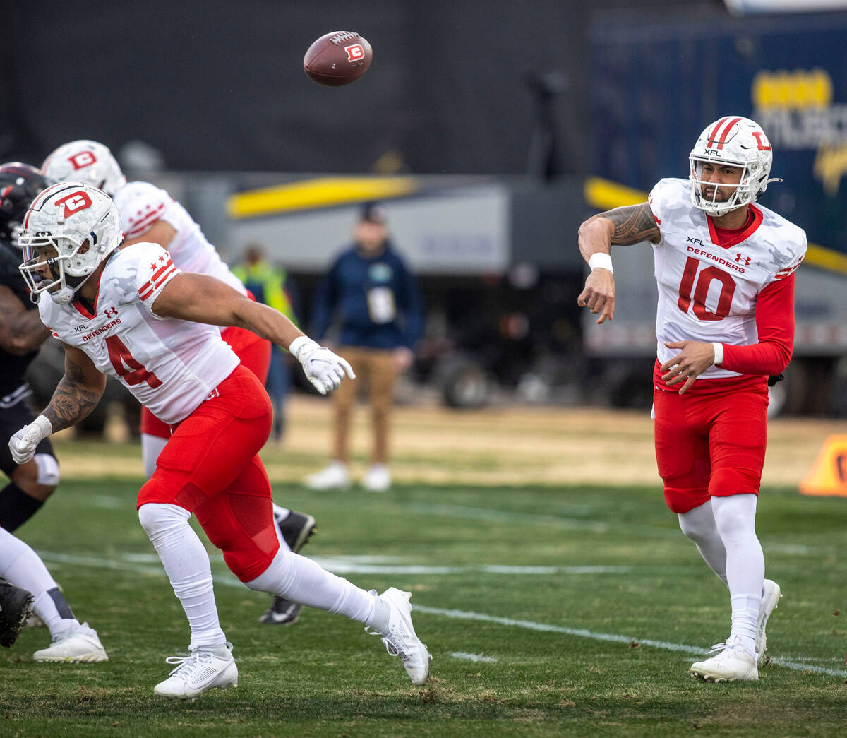
2 minutes ago, plastictaxicab said:
I know there have already been suggestions/mocks for fixes, but if they just stop with the monochrome, this set could be half-decent. They just need to field the right parts together.
It just occurred to me, but the Cardinals white over red look reminds me of the DC Defenders 2023 road uniform:
-
4
-
-
2 minutes ago, IceCap said:
Counter-point- The Cards have a history of their red and white jerseys not being mirrors of each other
Good point about the jerseys, but I will counter with their pants always had stripes starting in 1948.
-
1
-
-
13 minutes ago, monkeypower said:
I think alternate jerseys should have some leeway because that's their point, to be alternate. The home and the road should be matching and parts should be interchangeable (when it comes to football pants and socks) but having a different alternate is fine when it is self contained, but still recognizable.
Like that Stamps alternate still does look like it's from the same team and still has the same flavour as the home and road. The pants are black versions of the white pants.
I can understand your point about the alternate being different. But the home and road should at least be the same and unfortunately that is not the case with the Cardinals.
-
10 minutes ago, eRay said:
I'm genuinely interested in why people believe this. I don't necessarily disagree but I think it's not a cut and dry belief I hold anymore. Is it so fans wearing the jerseys and apparel out in the real world/in the stands all look like they are repping the same team? Or is it so photos of one game match photos of another game perfectly? The red jersey will not be worn next to the white jersey in any other setting than the uniform unveiling, so what's the importance of them matching exactly?
As a brand/logo designer my thoughts have evolved on the subject because it used to be important to "see the logo the same in every application", but it's become more common practice to have application specific logos that all come together to form a cohesive visual of a brand. Why are sports uniforms any different?
If the Cardinals decide to wear the white jersey with the red pants, then the pants really won't tie into the uniform without the stripes. But if they decide to wear the black jersey with the white pants, the stripes are aligned, and it makes the look cohesive. Then again, if they wear the red jersey with the white or black pants, the jersey doesn't have the stripes and once again it is not uniform, rather it is asymmetrical.
I just like all parts of the uniform to match for cohesiveness and symmetrical design. This is why I agree with the person that designers should have OCD, that way all parts of a design is cohesive and aligned.
I have the same problem with the new Calgary Stampeders uniforms as their alternate uniform uses a different template than the home and road uniform.
-
3
-
-
1 minute ago, seasaltvanilla said:
I'm glad they erred on the Jaguars end of the spectrum and not the Buccaneers end.
The red uniform is like Jacksonville, but the white and black is more like the new Buccaneers uniform which is great thing. Anything plain like the red uniform is awful!
-
Just now, HOOVER said:
Not so much clever as it is a return to an older design principal. Sometimes we get locked in on "all the stripes have to match" that we also think they need to go on every component of the uniform (helmet, jersey, pants, socks). Classic example of less is more.
It's a damn shame the Cardinals didn't have the wherewithal to trot this combination out last night, because it would've been a much bigger hit.I disagree as I believe all parts of the uniforms should match. Not only the stripes, but TV numbers and the wordmark. The best comment I've seen yet came from my Sports Aesthetics Facebook page, "this is why designers NEED to have OCD" so mismatched uniforms would not exist.
-
15 minutes ago, MJWalker45 said:
You can see the tiny specks in there. But unless you're watching up close on TV, it probably won't stand out.
The best thing about this uniform change is the addition of silver....now the facemask is tied to other parts of the uniform.
-
5
-
-
My new Bottom 10 Uniforms in the league after this unveiling:
32) Jacksonville Jaguars - Loathe the plain uniforms
31) Washington Commanders - Loathe the plain pants on different templates for home/away/alternate
30) Tennessee Titans - They went from the best pants in the league to the 3rd worst.
29) Atlanta Falcons - Not a fan of the uniform, should have added gray pants to tie in the facemask.
28) New York Jets - Bad stripes, the black is not needed.
27) Denver Broncos - Not a bad uniform, but they need to change it up and do a modern Elway set.
26) Arizona Cardinals - Like the white & black uniform, loathe the red uniforms since it doesn't match the other two.
25) Detroit Lions - Like their uniforms, except I loathe the plain gray & white pants.
24) New Orleans Saints - Just need to fix the gold color throughout the uniform and get rid of the plain black & white pants.
23) LA Rams - Lose the bone and make the pants stripes uniform on across the board.
-
1
-
-
Red uniform = F
Black uniform = B
White uniform = B
I do not understand for the life of my why the red uniform is different from the other two, it is not uniform at all. Overall, it is a small upgrade, but that red uniform really sucks!
-
6 minutes ago, jerrylawless3 said:
Wasn't someone on the main thread a couple of months ago complaining about how this offseason was going to be boring?
For the record, it has been boring, in fact the last couple of years have. I want next year to be like 2020 with 6 team unveiling new material.
-
6
-
-
Here is the Detroit Lions big announcement:
-
1
-
-
41 minutes ago, VDizzle12 said:
Some of the results are definitely.....interesting.
https://web.witcontests.com/browns/contest/design-your-ideal-cleveland-br-230405
Not that it's unexpected, given it's a fan contest. I started up top but I'm sliding.
I just voted for your entry! Good luck!
-
 1
1
-
-
@TruColor has your contact told you anything about the Detroit Lions new helmet or the new Carolina Panthers jerseys?
-
Since @TruColor simply jumped over my question on the pants, I am guessing they are going to be plain with no stripes. Which will be awful.
As far as colors, I am guessing the orange is one of these:
-
8
-
-
15 minutes ago, j'villejags said:
The Titans, Falcons, Jaguars (below neck) were all worse than their previous set.
-
2
-
-
1 minute ago, HOOVER said:
So facemask is either Grey/Silver/Chrome or Black…On a Arizona Cardinals sports podcast, the announcers said the facemask was silver/chrome.
-
2
-
-
49 minutes ago, TruColor said:
I feel like we're playing Wheel of Fortune...
The helmet isn't as extreme as some of you are making it.
As an additional hint, keep in mind that the Black alt helmet from last season remains in this new set...
Maybe, just maybe, the design of that helmet was a hint as to what was to come...?
(And it's still a White helmet.)
I'm more worried about the pants, do they have stripes on them?
-
1 hour ago, TruColor said:
Helmets aren't correct at all...colors are close.
I hope the pants have striping! I am sick of the plain pants trend!
-
8
-


NFL 2023 Changes
in Sports Logo News
Posted
I edited my post. Emily won the fan votes, but the Top 5 submissions will be voted on again, starting tomorrow.
Make Your Vote Count! (witcontests.com)