

nuordr
-
Posts
5,913 -
Joined
-
Last visited
-
Days Won
1
Posts posted by nuordr
-
-
22 hours ago, DCarp1231 said:
I don’t know how many times this has to be said, but Snyder wasn’t directly responsible for the new uniforms. It was his wife, Tanya who was “heavily involved with the uniform design”.
That is precisely why I said Snyder, if I meant him I would have said Dan Snyder...calm down.
-
 2
2
-
-
On 8/13/2022 at 3:22 PM, Cujo said:
Commanders white unis looking like straight ass

If they just kept the previous uniforms and changed the logo, then it would have been perfect. But nope, leave it up to the Synders to screw it all up. It has been a train wreck from the moment they decided to change the name...the name itself, the logo, the uniform, the anthem, and now the mascot.
-
 5
5
-
-
20 hours ago, Cujo said:
A very Cujo-esque troll post.
And no.
It's not a troll post considering my hatred of gray facemasks on teams without gray anywhere else. It is standard nuordr (New Order) procedure.
-
8 hours ago, Cujo said:
Funky-angled striped sleevesNon-saloon 49ers wordmarkDouble-striped sleevesHopefully the Niners done fxcking around with their uniforms.Need to add a red facemask.
-
4
-
 10
10
-
-
The Hillsdale Chargers of DII updated their logo:
-
2
-
-
10 minutes ago, Germanshepherd said:
As for these, I like the “The Ville” on the front but otherwise these do nothing for me and go in the GFGS trash pile.
This uniform fits in perfectly with the rest of their dumpster fire set.
-
-
3 minutes ago, MJWalker45 said:
After this, last year's unis were the best they've looked outside of a couple alternates
I only liked the throwback uniform...the rest were trash for me.
-
1
-
-
18 hours ago, pokecat12 said:
This has been out for a few days. UofL is unveiling new unis. Probably more of the Power Wings Shoulder Asymmetrical Gelato Rice stuff.
I did try to lighten it up and it just said "Unveiling 8:11:22" lol. I did see a gray possible version in a couple local stores here in town. Not looking good imo.
They haven't had a good looking uniform since the Bridewater era:
-
13
-
 2
2
-
-
New helmets for the Saint Francis Red Flash:
-
New white helmet for VMI, they've worn gold helmets exclusively since 1999 (and the current design, seen below, since 2010)
-
15 hours ago, NH4 said:
Yep thank goodness they came to their senses and got the number off one side
LOVE the navy facemask on both helmets and that they removed the number from the side of the helmet!
-
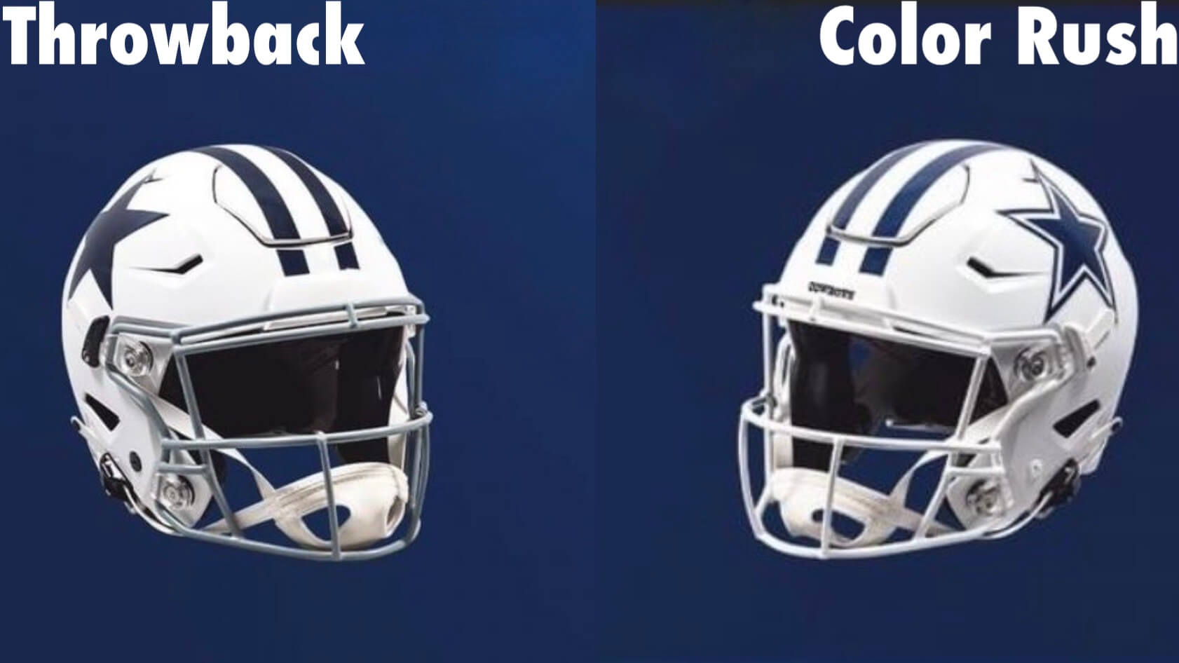
From Paul Lukas,
There was a bit of confusion earlier this week when the NFL tweeted a graphic showing all of the new throwback and alternate helmets that had been released so far for this season. The confusing part was that it showed two different white helmet designs for the Cowboys: the standard throwback model with the solid-blue star, the grey facemask, and the blank nose bumper, which the team unveiled last week, and a separate design with the team’s primary outlined-star logo, a white facemask, and a “Cowboys” bumper, which was listed in the Twitter graphic as an alternate.
Many fans quickly surmised that the Cowboys planned to use the alternate version with their Color Rush uniform. That uni design has a white jersey, white pants, and white socks, and of course it’s not a throwback, so using the primary logo and a white mask seemed like a logical move.
But the Cowboys hadn’t announced anything about that, and I hadn’t heard any chatter about it either. Could the graphic have been wrong? I emailed the Cowboys — no response. I followed up — still no response.
Yesterday, however, I was interviewing a league executive about something else and got confirmation: The Cowboys will indeed be wearing both versions of the white helmet this season — one with their throwback uni and one with their CR uni. The league hadn’t initially planned on this when it allowed teams to add a second helmet color, but the Cowboys asked if they could give the white shell two different design treatments. Since the throwback and CR unis are both alternates (which means it’s permissible under league rules for them to be paired with an alternate helmet color), the league said yes.
-
4
-
-
4 hours ago, bobt said:
Perhaps The Dolphins will make the switch we fans have wanted for years?
Make the facemask Aqua though.
-
15
-
1
-
-
2 minutes ago, WestCoastBias said:
Not a fan of the ND uniforms, idk what it is exactly but they just strike me as boring. Their regular away jersey but with gold numbers and monogram, both with blue outlines, would of been better imo.
I am not a fan either. This is the 4th time in the series that the team has chose to go with plain pants and I believe they need to have stripes for one-offs considering their normal pants are plain.
2013
2011
2010
-
3 minutes ago, MJD7 said:
Alright, so after collecting my thoughts:
And then the Bengals decided to quite possibly ruin what was easily the best “new” helmet design by inexplicably pairing it with their old Color Rush. The current away jersey would have worked so much better, and it almost seemed like that jersey was designed with the possibility of this alternate helmet in mind, so I’m honestly shocked they didn’t take advantage of it.
I actually think the Color Rush uniform is the best possible choice for the white striped helmet because it has less orange on it compared to their current white uniform.
Color Rush Orange Elements:
- Logo on chest
- Nike Logo creep on shoulders
- NOB outline
Current All-White Orange Elements:
- Bengals Workmark on chest
- Nike Logo creep on shoulders
- Numbers outline
-
1
-
-
1 hour ago, tBBP said:
Now THAT is HOT. Definitely the best Shamrock Series uniform yet, and probably the best alt ND has ever had.
I wanna see one of these jerseys in person...
In my opinion, last years Shamrock uniform was the best of the series:
-
9
-
 1
1
-
-
Here are the coaches for the 2023 season with what I am guessing the primary color of the team to be in the background:
Arlington and Houston
Las Vegas and Orlando:
San Antonio and Seattle
St. Louis and Washington D.C.
-
33 minutes ago, NH4 said:
I think we’re finally done (thank goodness). Also this says the Cowboys will be wearing their white helmet with a white facemask and current primary logo, which I didn’t know before.
I don't think we are done...we still haven't seen the Bills red helmet
the Steelers yellow helmet
and the Broncos throwback helmet.
-
1
-
-
Notre Dame to wear green jerseys on September 17 vs Cal.
https://twitter.com/NDFootball/status/1542584015487733760?s=20&t=1Ip_LTy5rzgksZfqXNjnSQ
-
The Rockford IceHogs, the AHL affiliate of the Blackhawks, unveiled a new logo.
-
 1
1
-
-
The Brown Bears have updated thier logos:
-
8
-
-
On 6/22/2022 at 4:58 PM, Lights Out said:
The helmet logo is clunky and awkward, and WVU just looks better in blue helmets rather than white.
I completely agree with you about the blue helmets. I wish they'd bring that striping patten to all of their uniforms.
-
1
-
-
1 hour ago, fouhy12 said:
Some pictures.
These are perfect! I thought they may screw them up with a gray facemask.
-
1
-


/cdn.vox-cdn.com/uploads/chorus_image/image/69848930/1339886915.0.jpg)


College Football 2022
in Sports Logo News
Posted
These are beautiful! Great job by Adidas which is rare.