

mafiaman
-
Posts
1,406 -
Joined
-
Last visited
-
Days Won
1
Posts posted by mafiaman
-
-
On 9/17/2019 at 11:15 PM, monkeypower said:
Oh no Estevan, what are you doing?

Literally laughed out loud when I saw this.
-
7 hours ago, Dolphins Dynasty said:
Plus, the i not having a dot bothers me.
I was a fan of Dan Marino back in the day...how on earth have I not noticed the missing dot all these years. Can’t unsee it now.
-
Our long national nightmare is over! Well done, Pitt!
-
 2
2
-
-
On 10/30/2018 at 10:51 PM, Chromatic said:
Also I never understood what was so great about the Houston Oilers identity. The colours were pretty unique, beyond that they had a clip art oil derrick for a logo and a a generic striping pattern. Nothing about it screams "untouchable" or "iconic" to me.
Along the same lines, what's so "untouchable" or "iconic" about the New York Yankees, Chicago Bears, or Boston Celtics?
-
1
-
-
8 hours ago, Quillz said:
Even if they wanted to, they couldn't retain the name for legal reasons. And "Oilers" doesn't really fit in Tennessee, although that hasn't stopped plenty of other teams from keeping names that don't make sense in new cities.
What “legal reasons” prevented the owner of a sports team from keeping the name “Oilers” after he moved the franchise?
-
1
-
-
On 8/14/2018 at 6:56 PM, Earl said:
Northeastern University in Boston released new logos: http://gonu.com/news/2018/8/13/northeastern-athletics-reenergizes-visual-identity-with-new-brand-and-logos.aspx
Old

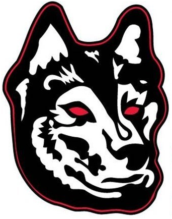

NEW


The old Huskie dog logo was so bad that I can’t even believe it was being used in 2017. Looks like a 7-year old won a contest to design the school logo and he drew in some red eyes to make it look like the devil’s pet. The new Huskie head reminds me of the 1980’s Washington Huskie logo.
-
2
-
-
On 4/13/2018 at 7:45 PM, FinsUp1214 said:

I loved this logo on all of my Fleer, Donruss, and Topps cards in the 1970's...now I can't unsee Mel Gibson the pirate.
-
1
-
-
On 3/8/2018 at 2:24 PM, WSU151 said:
This road uni is far better than what the Cubs wear today, and probably the best (or maybe Top 3) the Cubs have worn all time. I think my only critique is it only needed one sleeve patch, and though the Cubs patch looks nice, the 80s/90s bear patch was probably a better choice and synced with the home jersey:
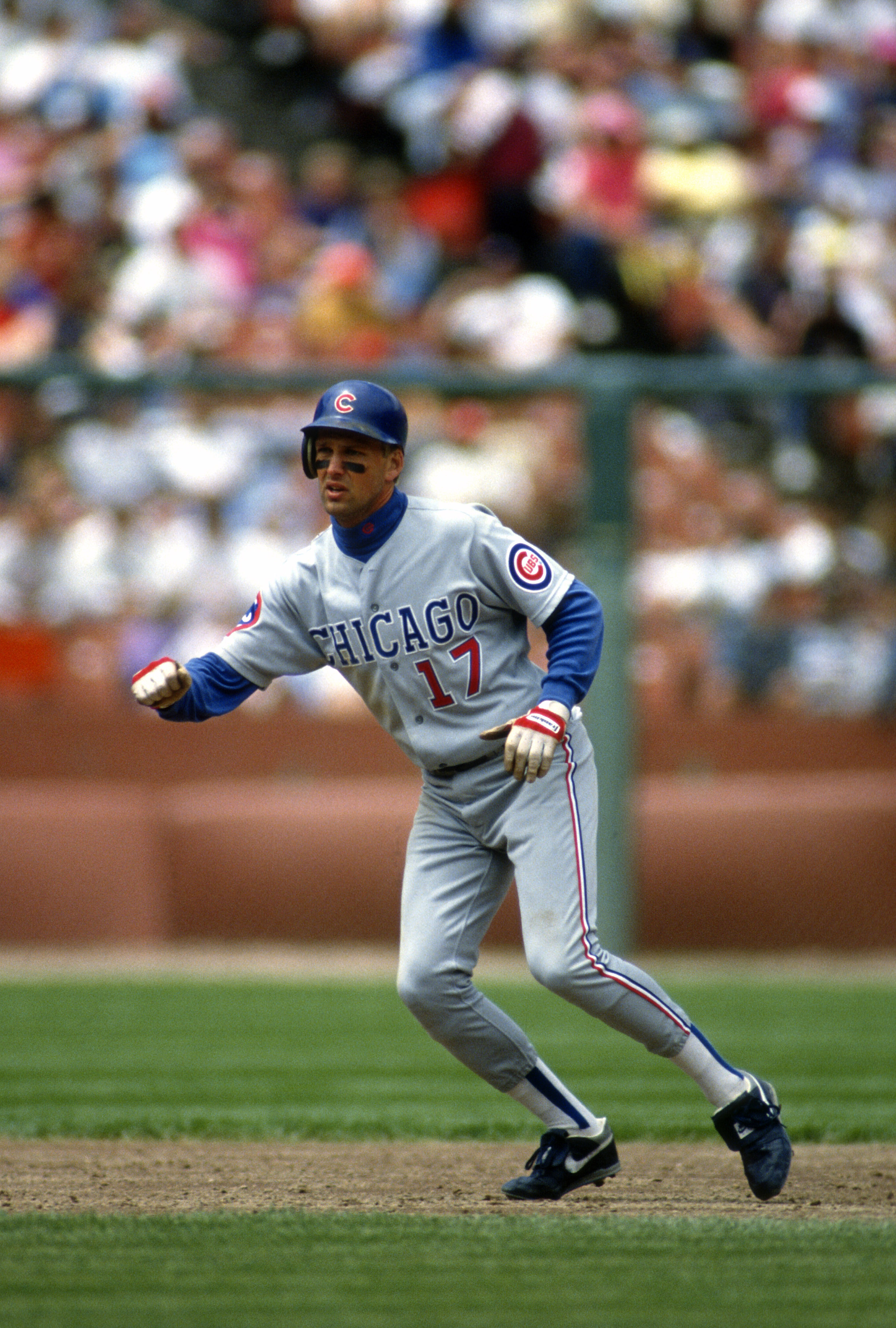
The Montreal Expos of Chicago
-
3
-
-
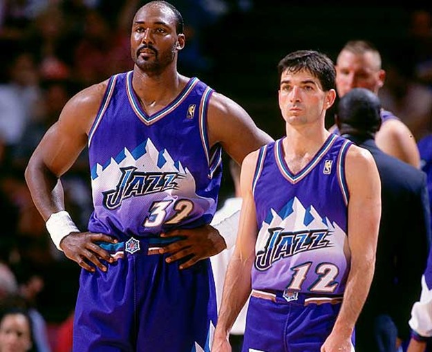
3 hours ago, Ice_Cap said:
I would rather see baseball teams wearing baseball uniforms and not pajamas.
 1 hour ago, ChicagoOakland said:
I think the Jazz set would be one of the best and most interesting in the NBA if they lopped off the sleeves.
Speaking of pajamas...
-
7 hours ago, DNAsports said:
MLB teams need to bring back the pullover jerseys
And powder blue ones at that!
-
1
-
-
On July 23, 2016 at 9:16 AM, Germanshepherd said:
Charles Barkley in the Phoenix Suns' western look. Worn only for one preseason while the new sunburst uniforms were being prepared.

Oh, the golden days of yore...LOVED that Phoenix jersey set, especially the home whites!
-
On June 16, 2016 at 11:30 PM, smzimbabwe said:
OK, I am not quite sure how "unpopular" these are, but seems to go against the grain of the board from what I've read:
2. I like European hockey jerseys with all the ads all over them. Part of it might be that I don't know what the company being advertised is, but I think they look really cool.
Unpopular x infinity!
-
1
-
-
Nice find there, odor31!
-
Way late to the party but I second this motion.I like this Vikings wordmark.

-
3
-
-
Double post in error
-
I would LOVE to see the BELFIELD BANTAMS get an update...
Anyone want to give this one a stab? The Belfield (ND) Bantams...
-
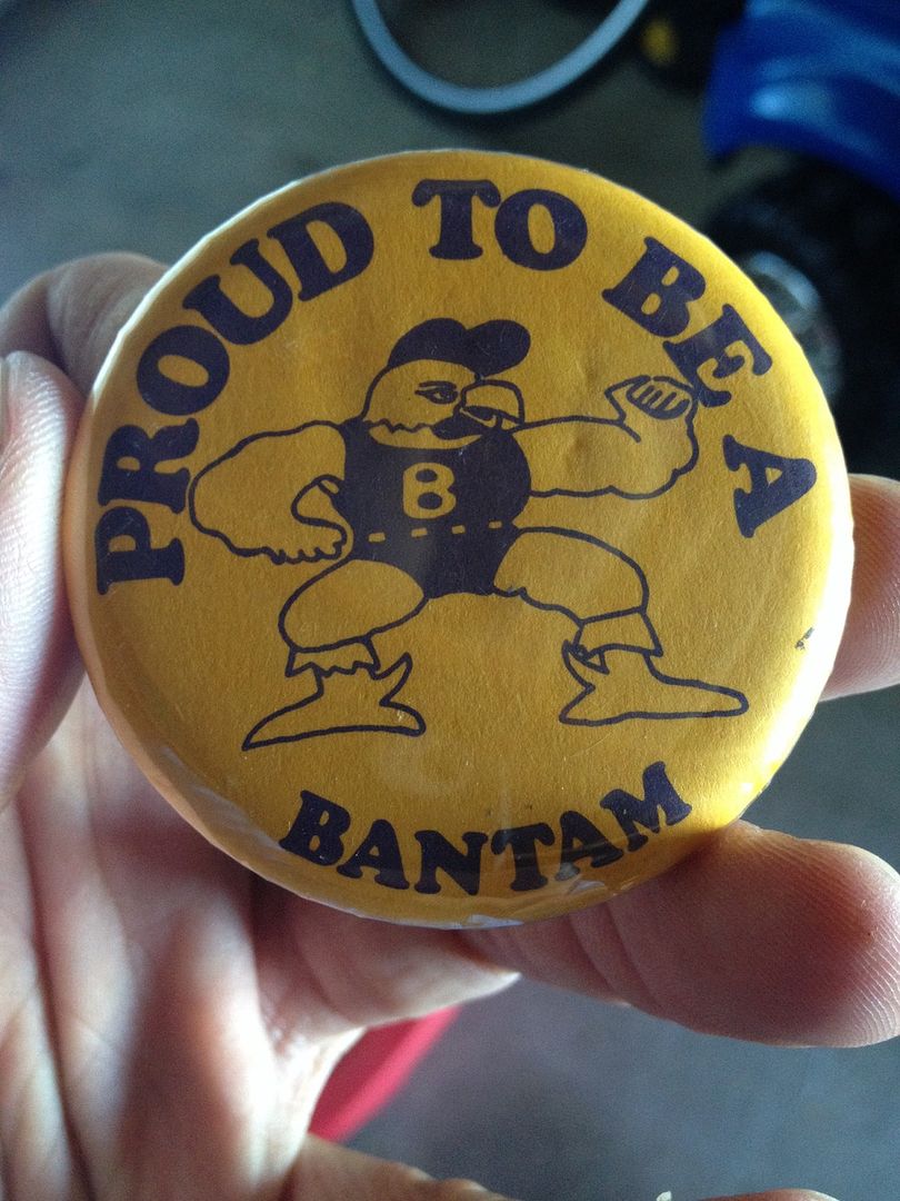
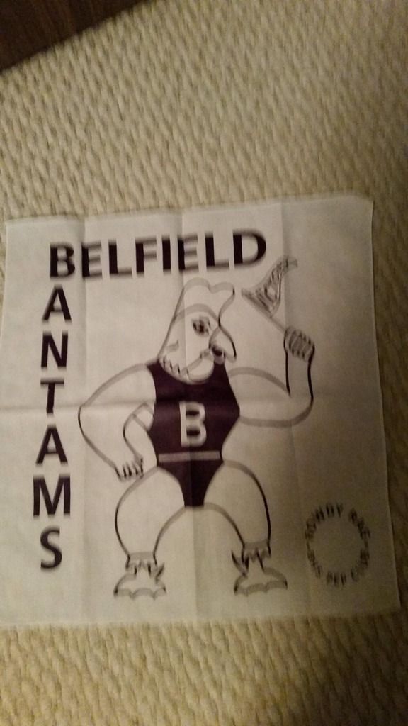
Another version that needs some work...this was the center court logo in our gym. School now co-ops with neighboring South Heart and this logo has totally vanished. Bring it back!
-
I would LOVE to see the BELFIELD BANTAMS get an update...
-
NO!
YES!
This was perfect for them in my opinionThe Jazz have the worst color scheme in sports
Yeah, it really is terrible. Should have gone back to purple instead of adding navy blue.
Purple, Light Blue & White with Copper accents
-
1
-
-
The A's with kelly green hats like the 1970's and 1980's were far superior to the darker green worn today.
-
2
-
-
Just like Los Angeles and Oklahoma City, Philadelhpia is too long to put on a jersey.
Having PHILA on the jerseys also eliminates the potential for spelling errors.
-
I think Tampa Bay's current jerseys and logo are far superior to the 2004 look.
-
I like the iverson era 76ers uniforms better then their current ones.
I like the Gold wizards jersey.
I like the oilers pre edge jerseys the best, including the meteor alternate.
I think some NHL teams should incorporate brown into their uniforms more often (gloves, pants, helmets)
I think the mid 90's cavs template is the best.
It was an oil drop, not a meteor:

i stand corrected.
still a great look though.
As a fan of traditional jerseys, I thought these were actually pretty cool - as an alternate jersey. Something completely outside-the-box that's worn sparingly. What makes it super-awesome is the five rivets on the gear, symbolizing the Oilers' five Stanley Cup championships. Nicely done.
-
I was stunned this past season when Greg Coleman, a former Viking player, commented that the new uniforms would take some getting used to because he is an "old-school" guy. The above uniform is what was replaced. Could not believe his comment given the hot piping and funky collar mess this thing is. The new Viking uniform is closer to what Tommy Kramer and the gang wore back in the day than this monstrosity.There were many things wrong with these Vikings uniforms, but the collar wasn't one of those things. I don't have any problem with any of the other "toilet bowls" either, so long as they aren't those gargantuan Nike collars introduced a few years ago. Small ones like this? Perfectly fine, even good.


College athletics identity changes
in Sports Logo News
Posted
You spelled "hate" wrong.