


officeglenn
-
Posts
13,556 -
Joined
-
Last visited
-
Days Won
1
Posts posted by officeglenn
-
-
At least it's a pretty horizontal logo so it ends up being relatively small, I guess?
-
 2
2
-
 2
2
-
-
Yeah, we don't need this in two places.
-
1
-
 4
4
-
-
-
 Uruguay Nike kits for Copa América 2024
Home:

Away:
-
3
-
-
1 minute ago, CaliforniaGlowin said:
Would Utah release the name itself mid-season, or would they release name and branding together next season?
 I mean, the same ownership group just released uniforms that their basketball team won't wear until 2025-26, so anything is possible.
-
1
-
-
Member MalibuSunrise has been banned after admitting to being a dupe account of Fowler.
-
3
-
 2
2
-
-
 Bayer Leverkusen home:
FC St. Pauli away:
Holstein Kiel home and away for their first-ever Bundesliga season:
Bayer Leverkusen home:
FC St. Pauli away:
Holstein Kiel home and away for their first-ever Bundesliga season:
 RC Lens home:
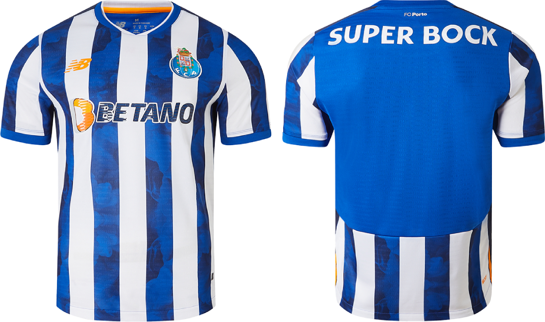
 FC Porto home with a smoke effect in the blue stripes:
-
2
-
-
OK, so first off, the way you have the U and the C squared off and the way you have all the letters butting up against each other, they're all melding together and are kind of indistinguishable from one another. You have to establish a visual hierarchy, even with initials. If you look at the logo the team is using on NHL.com, "UTAH" is much larger than "HOCKEY" or "CLUB," so in the same way I think your U has to be much larger than your H or your C.
The mountains need to be more prominent, too. The initials overtop really obscure them. I'd move them a bit closer to the top of the hexagon, and keep the initials in the white of the mountain. A little shading in the mountains would go a long way. Also, some of the peaks are very rounded and others are sharper. They should be more consistent across the board.
I like the hexagon shape that plays off the Beehive State thing. But like the mountains, some of the corners are more rounded than others and it's a bit visually jarring. Again, you need more consistency there.
I have an Adidas hockey template I can send you. What program are you using?
-
Canada v Netherlands today on the 80th anniversary of D-Day. All Canadian players are wearing a black armband with a poppy design, and their pennant for the match also had a poppy pattern in the background:
-
3
-
-
24 minutes ago, WSU151 said:
Whatever it was, it looks like it's been taken down.
New Magic uniforms?
I had tried to edit the post to embed the tweet earlier, but it wouldn't embed for some reason.
Here's a screenshot of the tweet, noting that the artwork is a concept by the original tweeter and should not be taken as a representation of what the purported uniforms would look like:
-
7
-
 1
1
-
-
-
4
-
1
-
-
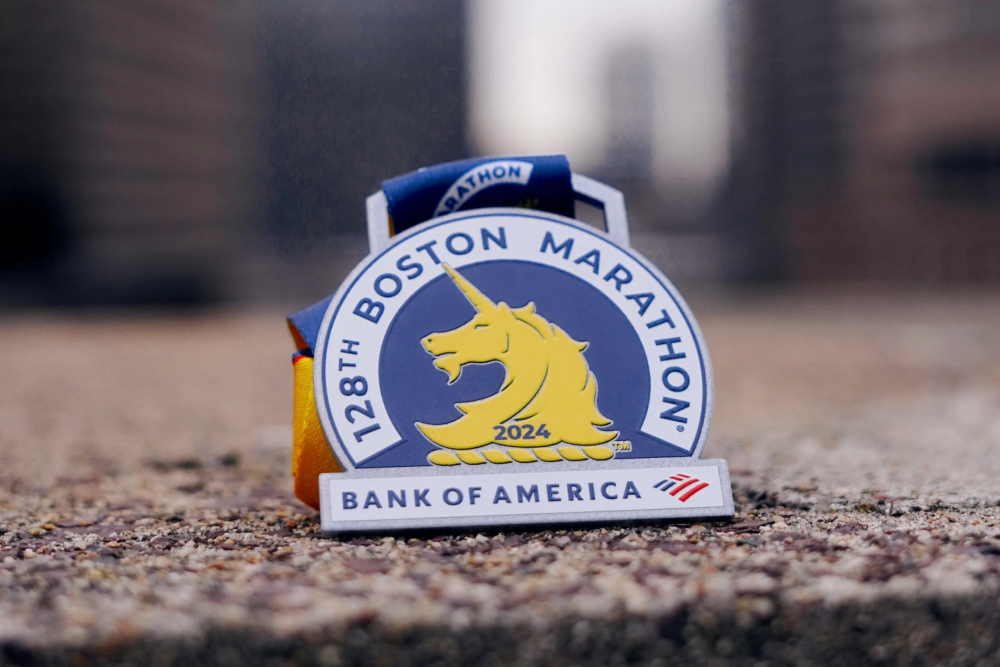
3 minutes ago, jerrylawless3 said:
So much for that "Northeast Spike". At least it looks like the sponsor could easily be milled off the medal.
Sorry, I should have been clearer. The medal pictured is from the 2024 race, which already took place in April. The first race for the new logo will be 2025, and we don't know what those medals will look like yet.
-
For clarity:
2024-25
2025-26
-
14
-
2
-
-
I guess some folks aren't too happy about the prominence of the sponsor logo in the new race logo. They also weren't too happy about the BoA logo being on the medals this year.
-
1
-
-
 New Real Madrid home kits:
The houndstooth pattern on the front, back and sleeves is made up of shapes modified to look like Rs and Ms:
-
5
-
-
 Tottenham Hotspur home:
FC St. Pauli home:
RC Celta de Vigo home:
FC Nantes home:
Tottenham Hotspur home:
FC St. Pauli home:
RC Celta de Vigo home:
FC Nantes home:
 Rangers FC away:
-
4
-
-
Ottawa should have used this opportunity to get a new number font, or at least get rid of the notches on this font. Other than that, it's a really nice update, save for the lack of striping on the pants and socks.
-
5
-
-
 Possible Blue Jays City Connect cap leak:
OP says it was found in Mexico, and the base color is navy blue, not black.
-
10
-
 1
1
-
 1
1
-
-
2 hours ago, Kevin W. said:
Because, like, soccer is in their DNA, man!
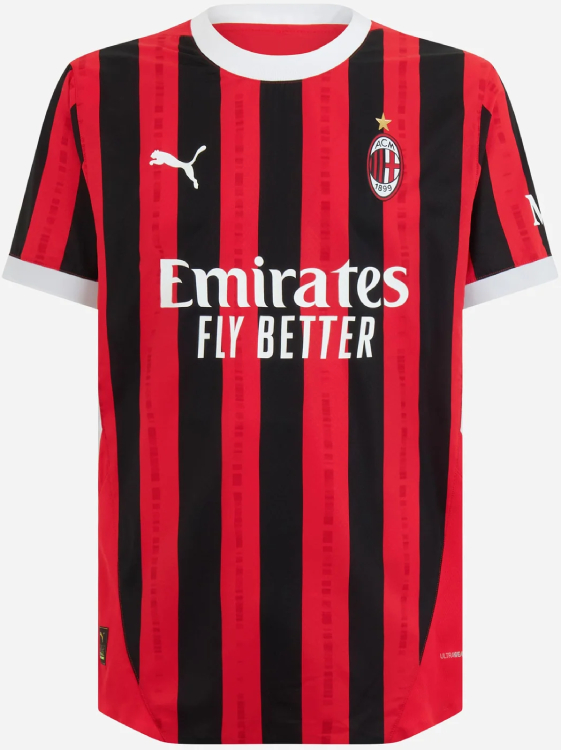
QuoteWhere red meets black, football meets family, with the classic colours portraying a visual representation of the human genome – the essence of the Milanismo. It represents the passion that flows like blood through the veins of fans, a tradition passed on through generations, and donned by some of the greatest to ever play the game.
-
 AC Milan 24-25 home kit, with tonal segmented stripes inside the red stripes that are a "visual representation of the human genome":
-
2
-
 1
1
-
-
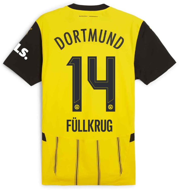
52 minutes ago, Berlin Wall said:
Does the Ligue 1 get a new font?
Yup, we also saw it when PSG unveiled their new home kit last week.
-
Borussia Dortmund home, with a new name/number font on the back:
ACF Fiorentina home:
Bologna FC home:
Athletic Bilbao away:
-
@tsizer -- When posting images, right-click on the image itself and select "Copy image address", then paste that right into the reply/compose box here on the boards. The image should then embed automatically. Make sure you're doing this and not copying the URL from the address bar, as that won't embed the image.
-
Officially official home kits released for
Manchester City and Arsenal:
It's the first time Arsenal has used this version of a cannon on a home kit, and it's the first time since 1989-90 that they've used any cannon on its own as a badge on a home kit.


Xtreme Ball - A fictional sport on a world scale
in Concepts
Posted · Edited by officeglenn
@AndesMts27, first of all, thank you for fixing the broken image links.
But this is veering too far into sports fan fiction territory. Please refer to the Concepts Forum Guidelines, specifically the part that reads:
You're focusing too much on simulating results and not enough on the graphic design here. The results of matches don't have any bearing on artistic choices. Why does the team from China have a pirate on the front of their uniforms? That's more interesting and germane than who they beat to get to the playoffs.
I'm willing to leave this open to give you a chance to rectify things, but other mods may feel differently so it might get shut down. But if you're still more interested in the simulation side of things, then I would suggest taking this to a separate website or fictional sports forum.