


officeglenn
-
Posts
13,499 -
Joined
-
Last visited
-
Days Won
1
Posts posted by officeglenn
-
-
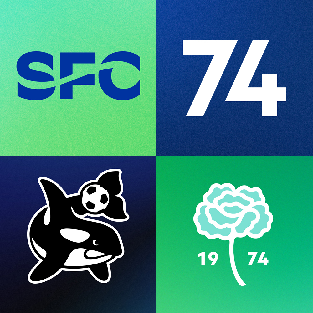
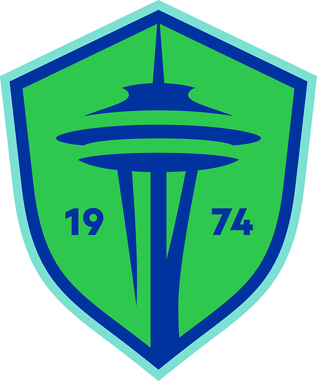
The team is currently using a secondary logo as their Twitter profile pic. The chrome circle/lines without the rest of the shield with "SD" replacing "FC" in the middle:

-
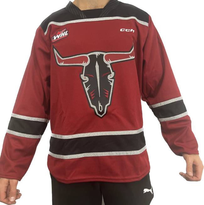
New alternates for the WHL's Red Deer Rebels:
-
 2
2
-
 1
1
-
-
Barcelona to have the Rolling Stones' logo on their jerseys for El Clasico on Oct. 28:
-
-
Three new jerseys for the ECHL's Norfolk Admirals:
-
2
-
-
-
-
20 minutes ago, wentvoltage123 said:
I'm not able to login with Twitter anymore. Is there anyway we can fix this because I don't have a password.
How are you logging in to post now then? There's an email associated with every account, so use that and the Forgot Password tool if need be. Also, checked your account on the back end and it says "Reauthorization required" under Twitter, so that's something you'll have to take care of on Xitter if that's the way you want to go.
-
Here's the Indigenous-inspired logo for the REDBLACKS:
More details on the team's website.
QuoteInside the logo, there are two significant elements. The first one is what is known as the medicine wheel. It’s a white, yellow, red, and black wheel that has been used for generations for health and healing. But the meanings are nearly endless, [designer Mike] Ivall says.
“It represents direction, unity, elements of the culture, and all of the races,” Ivall said. “It’s everything that we hold value for.”
The second major element is on the bottom right side. Ivall describes it as a “squiggly line,” but adds that it means far more than that.
To him, it’s the creator. It symbolizes everything that is, was, or ever will be.
“I put him in everything,” Ivall explained. “For me, he is everything. The creator is me, and it’s you. We’re all connected through that. He surrounds everything. It’s a big part of me right now.”
-
1
-
-
New maroon jerseys for the Peterborough Petes, with corresponding white jerseys making their debut at their home opener tomorrow:
-
 1
1
-
-
Aston Villa are going to ditch their new crest after only one season, and start consultations to come up with a new one in time for their 150th anniversary in 2024.
Quote... [T]he club has been assessing the impact of the change from local, global and commercial perspectives and have concluded that the current crest has not had the impact which had been hoped when it was introduced.
-
 1
1
-
-
58 minutes ago, vtgco said:
Should say 1994-2002 for the orca, and the 1974-1982 logo should also say 2003-2008
Thanks for that. I've corrected the infographic on the mothership.
-
1
-
-
-
-
-
-
Tiger-Cats release Indigenous-inspired logo in time for the National Day for Truth and Reconciliation. No plans to wear it in a game, as far as I can tell, but it will be printed on T-shirts and sold, with proceeds going to a local Indigenous organization.
-
1
-
-
Here's a fun one: La Liga is sponsoring a club in the fifth tier of Welsh football and paid for a new town welcome sign because the town has several double-Ls in its name (the longest place name in the UK) and it matches up nicely with the league's new logo ...
-
2
-
-
Moderator here. Again, knock it off with the "World Champions" discussion. It's clear we can't have a civil discussion about it, never mind the fact it's taking place in a Sports Logos News thread.
Any further derailment of the thread will result in suspensions.
-
3
-
-
New home, road and alt for the USHL's Fargo Force, who also dropped blue from their color scheme:
-
1
-
-
Charlotte Checkers jersey for the AHL Outdoor Classic in January:
-
 1
1
-
-
New alternate jersey for the OHL's Sudbury Wolves:
-
1
-
 2
2
-
-
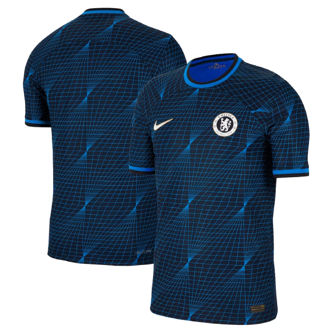
 Chelsea officially releases their away kit:
Everton third -- like most clubs outfitted by Hummel, they get a kit inspired by the 1986 Danish national team:
Chelsea officially releases their away kit:
Everton third -- like most clubs outfitted by Hummel, they get a kit inspired by the 1986 Danish national team:
 RB Leipzig third:
 Olympique de Marseille third:
 AC Monza third:
-
15 minutes ago, tBBP said:
I know I missed it somewhere, but what's the reason NYC's thirds are green? Whatever the reason, these fit, at least in my mind, what a "third" kit should be, at least in soccer/futbol: something that extends beyond the brand—or at least something about either team locale or nickname—but not completely disconnected from it. (I'm guessing the green deals with Central Park??) Also, that little bit of light blue looks great with the two-tone green, IMO.
It's an homage to all NYC parks, not just Central Park. https://news.sportslogos.net/2023/08/16/going-green-nycfc-releases-third-kit-paying-homage-to-citys-parks/soccer/ The NYC Parks logo is on the jock tag.
-
1
-


PWHL Branding and Uniforms 2023-24
in Sports Logo News
Posted
"Boston Wicked"? They may as well have called them the Boston Vanilla NutTaps.