


officeglenn
-
Posts
13,519 -
Joined
-
Last visited
-
Days Won
1
Posts posted by officeglenn
-
-
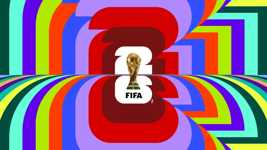
I'm trying to compile host city logos for the mothership and OH DEAR LORD is this frustrating. Some have them posted to their Twitter pages, some don't. Some have them available to download on their host city websites (which are all separate from FIFA for some reason), some don't. Some are on transparent backgrounds, some on on solid. Vancouver has 4 different ones available to download, but they all have different color schemes. There's no uniformity at all. I can't make heads or tails of it.
-
 7
7
-
-

Anyway, here's the story I wrote for the mothership if you care to read any more about this abomination.
EDIT: Also, just look at this presentation of it. LOOK AT IT. Why pick one background color when you can pick ALL OF THEM.
-
 2
2
-
 1
1
-
-
So the Alouettes announced their home game themes today, and buried in the notes about the July 1 "Family Game" is a little nugget about unveiling a third uniform (see below). Not sure if it means they'll be worn during that game or just unveiled at some point during it. Here's the announcement in French; interestingly it isn't mentioned in the English-language announcement.
QuoteEnfin belle surprise avec le dévoilement du 3e uniforme de l’équipe. (Finally, a big surprise with the unveiling of the team's third uniform.)
-
 1
1
-
-
Moving to Sports Logos General Discussion.
-
New home kit for
 Juventus with a brush stroke finish on the stripes to make it look like an actual zebra:
-
 1
1
-
-
-
3
-
 1
1
-
-
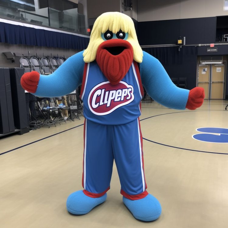
Me: Mom, can we stop and get Los Angeles Clippers?
Mom: We have Los Angeles Clippers at home.
The Los Angeles Clippers at home:
-
1
-
4
-
 2
2
-
-
News from Italy: Both Inter Milan and AS Roma dropped DigitalBits' logo from the front of their shirts after they missed payments on their contracts.
Inter went blank ...
... while Roma replaced it with "SPQR," which stands for “Senatus PopulusQue Romanus” (“The Senate and the People of Rome”). They've worn the acronym on their kits before, but the last time was in 2017.
-
4
-
1
-
-
New home, away and third kits for South Africa's women's national team:
More details on the mothership.
Also new home and away kits for the Denmark women's team, which flew under my radar until recently:
-
2
-
1
-
-
10 minutes ago, AdobeDesignBG said:
Where is this thread?
5 minutes ago, AdobeDesignBG said:Also are these jerseys?
Being discussed here:
Keep this thread focused on the Cardinals, please.
-
Atlético Madrid has officially unveiled their 120th anniversary kits, which they'll wear against Mallorca on Wednesday, April 26 — 120 years to the day after the club's founding:
Also a new goalkeeper kit (maybe a preview of Nike GK patterns for 23-24?):
-
1
-
-
On 4/21/2023 at 4:47 PM, monkeypower said:
This was a teaser for an promotion where 90 fans can pay to get their name in the logo on the helmet for the home opener

-
2
-
-
13 hours ago, SailorOfSilence102 said:
I apologize if moderators here don't like this sort of thing, but I was editing some stuff on my profile, and I noticed the gender options don't make a whole lot of sense. I don't wanna make a big stink out of this, I am just trying to give a suggestion or two, but I don't quite understand why Transgender Male/Female are separated from just Male/Female, well another option is just Gender Non Conforming. Personally, I would prefer if Male/Female were just that, no need to specify if the user is Trans, but I also get that a lot of times in life you need to specify what your assigned sex at birth is and that it's fairly standard. But what I don't get is why the option is GNC, as, well there are some people who identify as that, it's much more of a description then it is the proper term for people who are Non-Binary, which is what I assume Non Conforming is the stand in for a 3rd gender option. I think if you're going to go with more legal standard terms, then you should use Non-Binary (or Third Gender or even just an X).
Again, I am not trying to cause a big stink over this, it's just something I found interesting and potentially worth changing if moderators here are interested in such a thing.
This is a fair critique, and I appreciate you bringing it to our attention. Looking at the back end, we can add and delete options from that particular profile field. Here's what I'm thinking to change it to, but I'll open it up here for feedback:
- Female
- Male
- Non-binary
- Prefer not to say
Also, would people like to see a "pronouns" field added?
-
5
-
 1
1
-
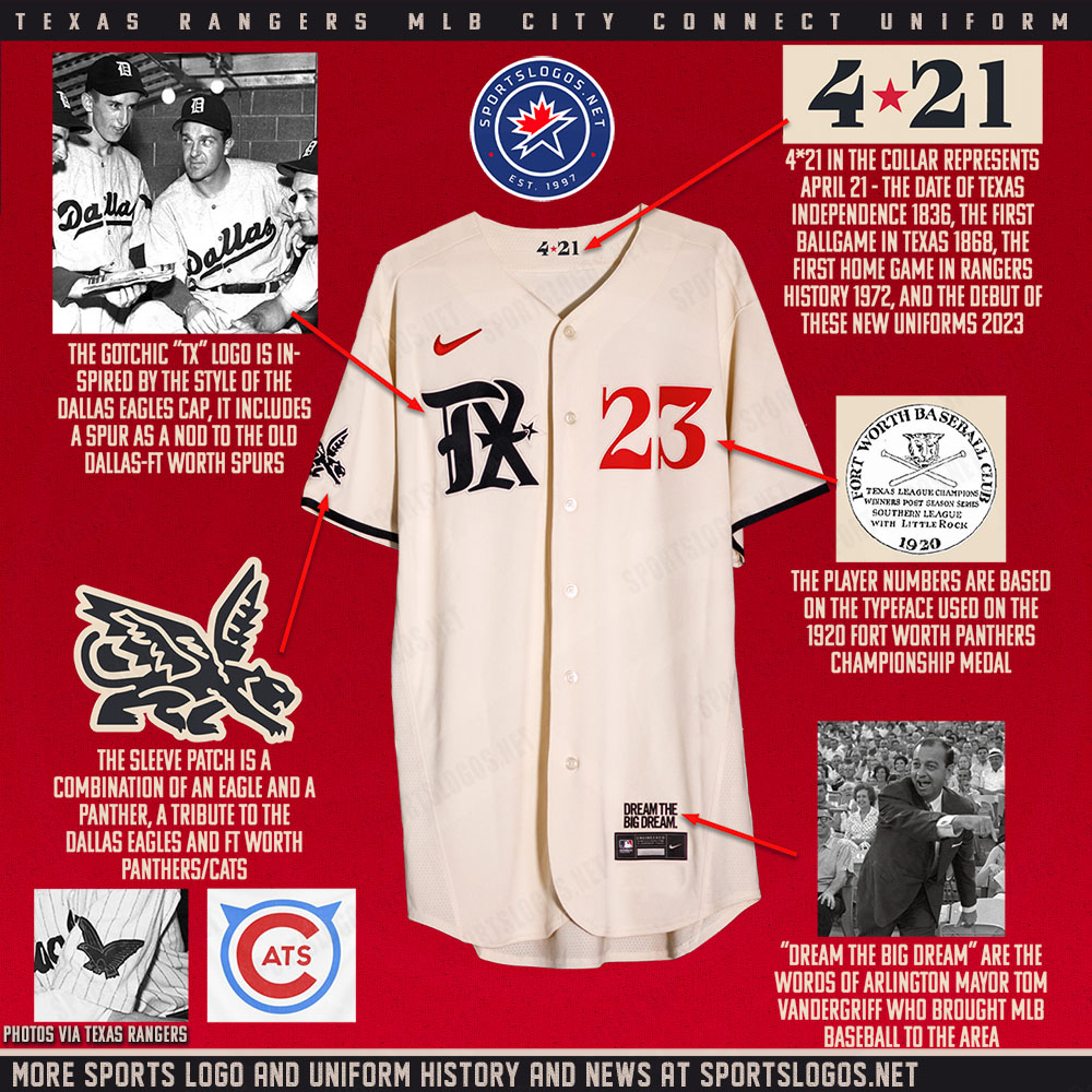
New road jersey is what we thought it was. Home jersey gets current logo on the sleeves instead of the retro logo. Black alts remain untouched.
-
11 minutes ago, AdobeDesignBG said:
Buddy this style guide is nowhere on the internet
Look, I know we're all getting punchy waiting on the Cardinals' reveal, but let's dial it back here. There's no need to get your hackles up.
That said, this is an NFL thread; don't gum it up with college media guides. If anyone wants to get their hands on what you have, they can PM you and you can work out the details there.
-
1
-
-
I've compiled all the Parley jerseys here on the mothership.
-
Couple of graphics from the mothership:
Also worth noting that it's a very dark navy blue, not black.
-
3
-
-
Hi @Exceed_Idiot, the history parts of your concepts are getting too far into story territory and it's detracting from the artwork. Please refer to the Concepts Forum Guidelines, specifically this portion:
QuoteThis is a graphic design forum. All concept threads must be focused on graphic design.
- Sports fan fiction, simulation league and other story-based concepts are not permitted.
- Only provide enough background information to make any artistic choices make sense.
- Artwork must be the focus of both the post and any feedback.
- If a thread is unbalanced toward stories or simulations, with little effort put into design, it will be locked. This determination will be made at the moderators’ discretion.
-
After talking about it for almost a year, Premier League clubs have "agreed to withdraw gambling sponsorship from the front of clubs’ matchday shirts." They're doing this voluntarily before the U.K. government imposed a ban on them. But to allow for a transition period, the ban won't take full effect until the end of the 2025-26 season.
-
1
-
 1
1
-
-
Three of England's starting lineup last night against Australia were without names on the backs of their jerseys to represent the 1-in-3 people born in the UK today who will develop dementia at some point in their lives. Plus different players wore nameless jerseys in the second half "to draw attention to the confusion and memory loss often experienced by those living with dementia."
-
4
-
-
New kits for Cavalry FC of the Canadian Premier League. Red is primary, black is alternate. Bottom left corner of the primary includes a mountain landscape with a bison.
-
New 2023 kits for Canadian Premier League's Pacific FC:
Primary — depicting "one of the province’s most treasured animals, the spirit bear— the rare, white-coated black bear that calls the coastal temperate rainforests of Northwestern British Columbia home")
Alternate — white with a light teal pattern that is "a collage of imagery such as ocean waves as well as of the surfing, camping and paddling activities that are reminiscent of the true Island long weekends, warm nights and salty summers that make this area of British Columbia unique"
They'll also keep their popular alternate from last year, with a print created by a Coast Salish artist, around as a third kit.
-
5
-
1
-
1
-
-
Primary kit for Atlético Ottawa released on their social media channels:
And their alternate kit that was leaked on Reddit:
-
2
-
-
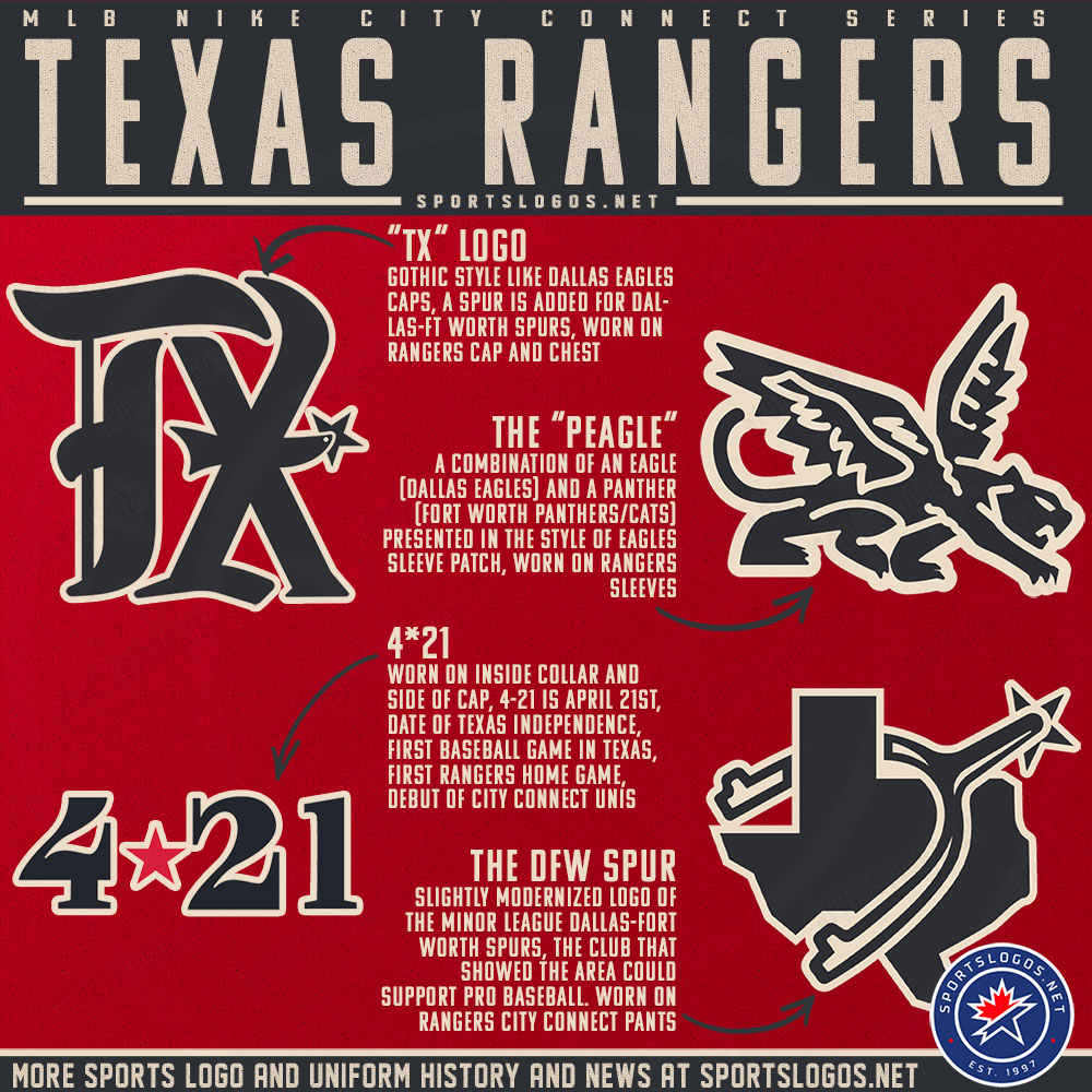
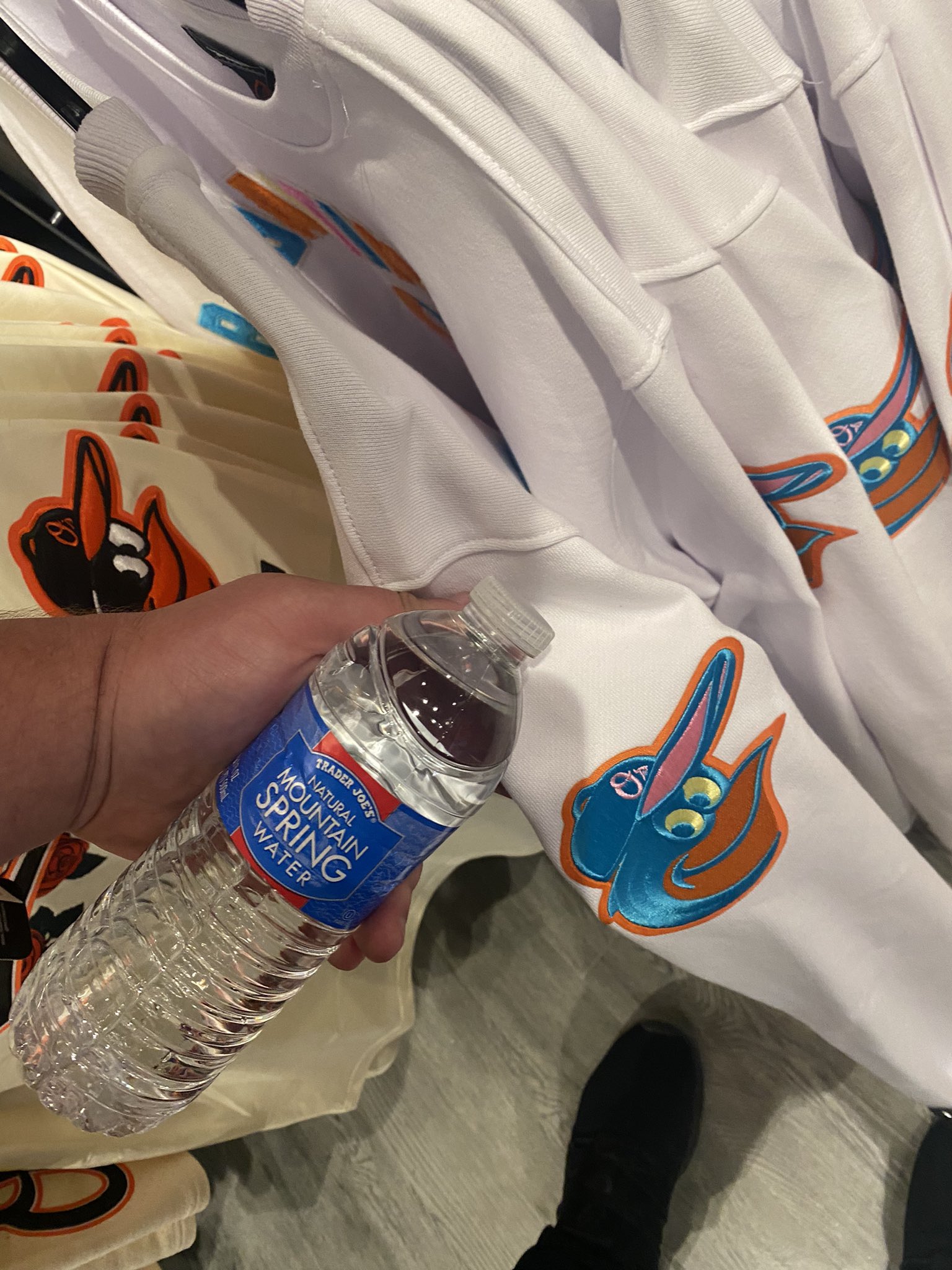
16 minutes ago, Bill0813 said:
Color leak or fashion jersey? (I hope the latter)
Looks like a crew neck sweatshirt rather than a fashion jersey, but it could be indicative of the City Connect colors. The thread on the sleeve logo looks like it's iridescent and changes color depending on how the light hits it.
-
2
-


 Borussia Dortmund have
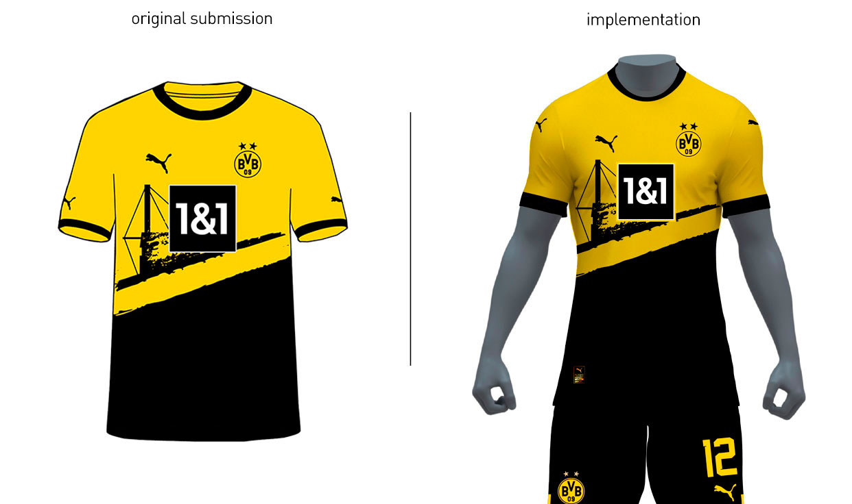


2023 International (National Team) Soccer Kits
in Sports Logo News
Posted
New kits for the Philippines national women's team ahead of the World Cup this summer -- white home, blue away and red third along with goalkeeper kits in this photo: