


officeglenn
-
Posts
13,519 -
Joined
-
Last visited
-
Days Won
1
Posts posted by officeglenn
-
-

Anyone know what the font used for this is?
I've seen this font everywhere, and I really want to use it.
Not sure what the "official" name is, but I've seen free versions under Aachen or Aardvark.
-
Anyone know these fonts?

Thanks in advance!
Both are Berthold City Bold; "Osseo-Maple Grove" is just stretched vertically a little more than "Hockey" is. You may be able to find it for free under Civic Bold.
-

Dark Crystal. Google 'dark crystal font' and you should be able to find it.

The "World Series" font, s'il-vous plait?
Trajan Pro.
-
I like when teams use black.

Same here. Granted, they can go overboard, like the Detroit Lions' black alternates, but not only do I like black in some colour schemes (i.e. Detroit Lions, Calgary Flames), I think's it's wholly necessary.
-
Not sure if this has already been asked or not...but does anyone know what these fonts are?

The Target Field text
"Inaugural Season 2010" is Gotham Extra Bold or Black. "Target Field" is Bank Gothic, but that D at the end might be modified.
-
I am designing uniforms, and need to know what font the mascot name fonts are. Any help would be awesome!


Trojans = Trajan Pro
Eskimo Dogs = Hemi Head 426
Bobcats - Helvetica, likely Ultra Condensed or Black Condensed
-

Any help would be appreciated.
It's a version of Myriad with motion serifs added and other modifications. It may be floating around the Interwebs under the name "Silverado," but it's likely not readily available.
-
I'm trying to ID both of the fonts in this:

Heh. Actually, there are three fonts in that picture - I'm just looking for the two at the top.
"Best of the Big Bands" is Futura Extra Bold.
-
I'm looking for the name of the font on the back of these guys jerseys. There's a guy I know on a different site who's planning on using the same numbers these jerseys have.

If you have the latest version of eriqjaffe's NHL fonts, it's the same as the Washington Capitals use.
-
Hi guys.. i just joined up and this has been a great site! my question is does anyone know the font that UNC Greensboro uses on their Spartans logo?

http://www.sportslogos.net.com/~asgsport/images4/UNCG_3.gif
Thanks everyone and Im so glad I joined!
The "UNC Greensboro" part is Serpentine Bold. The "Spartans" part ... I don't know. Could be custom. Might be a modified Compacta.
-
To us Canadians,both of them are traitors.
Speak for yourself there. I don't harbour any ill will towards Hull, and frankly, I had no idea Parise could have played for Canada, so it's no skin off my Canadian back. The first I saw of Parise was during the Mac's Midget Tournament many moons ago when he played for Shattuck St. Mary's, a prep school in the States. If we was born there, raised there, went to school there, spent his formative hockey years there, and wants to play for them, I've got no quarrel with that.
-
Does anyone know of a similar font to what Adidas is using for international football? More the text than the numbering. I don't need an exact match just close.

Thanks
Best bet is probably HandelGothic BT, but that has squared-off ends rather than rounded.
-
"We Never Stop" - I know I've seen that one on some of the free font sites, but I can't put my finger on it right now.
"Pride, Passion" - Aside from the Ps (obviously) I think it's Century Gothic.
"Cast Your Vote/Sanchez" - Spammy's right; it's Copperplate.
Thank you.
"We Never Stop" is Weltron Urban, or something of the like. It's on dafont.com for sure.
-
"We Never Stop" - I know I've seen that one on some of the free font sites, but I can't put my finger on it right now.
"Pride, Passion" - Aside from the Ps (obviously) I think it's Century Gothic.
"Cast Your Vote/Sanchez" - Spammy's right; it's Copperplate.
-
Looks like Serpentine, in italics.
Thank you thats perfect. Now is there anywhere I can download that for free because I'm only finding it where I have to pay.
IIRC, the old Ottawa Senators Alt font that eriqjaffe had is Serpenite, or a replica of it.
Thats which one it was. I knew I had somthing similar to it already but couldn't find it. Thanks alot.
Actually, the picture you posted looks like it doesn't have the serifs that Serpentine has, so Enter Sansman might be even closer to what you want.
-
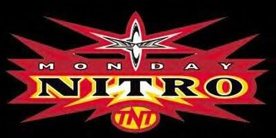
What's the font for the word 'NITRO'?
I was originally going to say Wide Latin, but the R in that font is all wrong. My best guess would be a super-bold, super-stretched-out version of Matrix.
-

Any ideas?
SF Transrobotics, with a modified A.
-
I'm having difficulty trying to find the font used on the (Mighty) Ducks ice when their arena was still "Arrowhead Pond of Anaheim".
Thanks in advanced.
Friz Quadrata. You may be able to find free cersions listed as "Fritz," but I've never seen them at the weight used in the photo.
-
I'm looking for the font used on the North Carolina Tar Heels basketball jersey; can anyone help? Thanks in advance!

Berthold City. Might also be able to find free versions under the name Civic.
-
"Berlin" looks like Bank Gothic, with the B, E and R modified.
The other two, I don't know. I've seen the "Dragons" one before, but I can't think of it off the top of my head.
-
The Pepsi fonts are custom proprietary fonts. They are not commercially available ? or, at least, not easily. Same, I would guess, with the number font on the Philippines uniform.
"Phone Pals" is Futura Extra Bold. The first "13" is Bolster.
-
Univers, either Extra Bold or Black.

Could someone tell me what font "2K5" is?
Eurostile.
-
A friend's daughter is named Victoria, and wants to create something in her room with this (not the "Gift Bag" part):

Any idea? Thanks.
that looks like Times New Roman to me.
Look like Trajan. If it ain't Trajan, then it's mighty close.
My first thought was Trajan, but looking at the character map, there are some subtle differences, especially in the R and the S.
-
Can someone give me a hand here. I lost the original file I did for this about 6 months ago, now all I have is a low res proof and I need to recreate it. Can anyone tell me what font I used for "Saffron" and what font "Indian Cuisine" is. I know they are two different fonts, and whatthefont.com has been no help thus far.

Having trouble seeing the images, Joel. My browser keeps telling me it contains errors.


Name That Font!
in General Design
Posted
Kinda hard to tell because it's so small, but I would venture a guess that it's Futura Extra Bold or Futura Black.
First one is a modified version of Emigre's Matrix, while the second looks to be Friz Quadrata.