


shaydre1019
-
Posts
2,782 -
Joined
-
Last visited
Posts posted by shaydre1019
-
-
9 minutes ago, 5ss22 said:
I don't mind the redundant purples assuming the city jersey will only be used next year (so it won't overlap). It would be nice if one of them actually said Jazz, and I don't think the black jersey is necessary at all.
I'm guessing just going "UTAH" is a workaround/loophole to use the old school aesthetic without actually reverting back to old logos, which is prohibited.
-
 1
1
-
-
2 hours ago, MDGP said:
Show me the rule, because literally the only place I have ever seen it referenced is on this forum and a single post on reddit.
Meanwhile there are plenty of examples through 2018 of teams not having to wait 5 years.
Philadelphia 76ers 2007-2009, 2 seasons
Minnesota Timberwolves 2008-2012, 2 seasons
Phoenix Suns 2013-2017, 4 seasons
Denver Nuggets 2015-2017, 2 seasons
Los Angeles Clippers 2015-2017, 2 seasons
Sacramento Kings 2016-2017, 1 season
Denver Nuggets 2017-2018, 1 season
Memphis Grizzlies 2017-2018, 1 season
And if they HAVE implemented a 5-year jersey rule since 2018 then it's pretty damn pointless seeing as the league completely reclassified how jerseys work and every team in the league unveils new jerseys every season with half of them wearing those "alternates" more than their supposed primaries.
To my understanding it's a nike thing.
Nike's general timelines are a lot longer than Adidas' were. Apparently teams would sometimes get wind of incoming Adidas alts months before they were released. Whereas Nike has ~2 years lead time for every new jersey and very strict deadlines along the way. -
19 hours ago, MDGP said:
Is this another situation where people took an actual NFL rule and applied it to every other league? Because people are constantly citing the five year rule for other leagues despite it being repeatedly noted that it only applies to the NFL.
The same thing happens during jersey leak season on here. Someone will post a rumor or a wishlist and then 5 pages later everyone's talking about it as though it's 100% fact that has been revealed to us by the league itself.
The 5 year rule is a real thing in the NBA as well.
-
On 5/18/2024 at 4:19 AM, truepg said:
I agree with you on the Mavs' identity having been solid from the beginning, until Nike got their hands on the league and made it a mess. The 90s' blue-green cowboy hat brand is a bit lame and not up to par either. However, the current look has run its course, in terms of aesthetics, no less. I would welcome the addition of green to their palette.I don't put the other "double-blue" teams, as people tend to call them here, in the same equation, since double-blue is not the main thing any of their identity is based on. Memphis used to have a great identity, and a more all around-solid than the Mavs ever from the 00s' rebrand, but got watered down over time first with the removal of the inline in their jersey numbers (one of many downgrades that were introduced with Adidas' Rev30 unis) and blanded out in this latest rendition.
Reposting what I put in the other thread bc it felt relevant re: Mavs' identity.
I never really thought about it or questioned that the Mavs' only hav blue black and silver on their logos.
But their primary uniforms have always had royal, navy, and silver no black.
Like BFBS doesn't even exist for them, if anything it's NFNS. I can't believe I never noticed that.
Is there a story on the conception of their 2000s rebrand? I'm very curious how they ended up going those routes. -
On 5/20/2024 at 8:54 PM, tscuzzy said:

The Mavs completely abandoned this set. Hasn't been worn since April 4th. Meanwhile they continue to wear a black R&B tribute uniform designed by a musician. And the court design has GUITARS in the paint. The NBA is bonkers man
I never really thought about it or questioned that the Mavs' only hav blue black and silver on their logos.
But their primary uniforms have always had royal, navy, and silver no black.
Like BFBS doesn't even exist for them, if anything it's NFNS. I can't believe I never noticed that.
Is there a story on the conception of their 2000s rebrand? I'm very curious how they ended up going those routes. -
5 minutes ago, SantosD_ said:
This has been a reliable source...
My question with these are:
1. it's not a throwback
2. If it's a color rush, would it be replacing green?
3. If it is in fact legit, why would they use that hybrid font and Agency nameplate font? is that even allowed or does it have to be current or legacy typefaces being used?-
2
-
-
1 hour ago, DCarp1231 said:
Just noticed that the stupid H-Town Alt numbers have a crappy shiny plastic finish.

Honestly, my biggest gripe with the last set was that the color rush numbers (red on navy) were hard to see. So brightening the red and adding some shine, along with darkening the navy is a win for me.
As far as the set: I'm a traditionalist and a Texans fan who loved the original set.
I like em. Don't love em, but they are farrrr better than they could've been. I was expecting something along the lines of the broncos/old jags/old Bucs.
Are they perfect? No? There are a lot of things I would change. but they still look like the Texans. And the Color rush is pretty unique as far as the rest of the league goes. -
52 minutes ago, Brave-Bird 08 said:
Everyone give this baby one last good look (always loved it and will never apologize for it, just didn't mold well onto modern templates)
Some of my earliest NFL memories were watching John Elway and the Broncos winning the Super Bowl in these. I was young enough to not really know what a uniform was supposed to look like, I just knew these were so cool that I had no choice but to root for them. Elway was my favorite player until he retired.-
2
-
-
2 minutes ago, DCarp1231 said:
So when exactly are the Texans going to unveil the new set?
Tuesday morning. I believe 10am. With a a jersey party later in the day.
1 minute ago, rfraser85 said:I saw something odd in the Texans story on Uni-Watch. The uniform pictures are from a screenshot of Photoshop. Since the lighting and angles are the same on the Broncos screenshots, it looks like that is Photoshop as well.
This doesn't mean the uniform pictures are wrong (accuracy at least), but it leaves enough room for doubt. And even if the pictures are accurate, the triangles may cause the same problem as the side panels. I'm assuming the three triangles are for the Super Bowls won, but if so what will the Broncos do if they win another Super Bowl in the next five years?
It's not so much photoshop files as it is Illustrator/PDFs on a screen. In fairness, these are samples of artwork for retail jerseys not the on field jerseys, but I would venture to guess there will be little to no changes on the final product. As a Texans fan, I hope I'm wrong, but I just don't think that will be the case.
-
38 minutes ago, Lights Out said:
The Texans' old uniforms were as boring, mediocre, and anonymous as their play on the field for 99% of the time they were in use. Frankly, the horn stripes from the new set are the kind of thing they should have done all along instead of recoloring the USC template from a catalog.
The new uniforms might be "trying too hard" (I don't think so) but the old ones weren't trying at all. They finally have a real identity now.
The only thing I don't like is neither of the home jerseys matching the road and alternate, but that's nothing we haven't already seen countless times in the NFL.
Their previous uniforms were great. When they were introduced USC didn't even wear that design and the Texans owned that look in the NFL. Pair that with a great number font and it was a solid set that aged well for over 2 decades.
I don't personally mind sets that aren't cohesive across the board (love the giants, cowboys are iconic), but how do they have a really identity now with mismatched sets, different color schemes and different helmet logos? And how can we say that before they've even been officially unveiled??-
8
-
-
32 minutes ago, LogoFan said:
When I shared the comments from the Texans on the new unis a few months back, I said it was going to be a show. Doesn't appear to be disappointing.
Hell, let's throw it all together: a single uniform with piping, gradients, alarm clock numbers, swoosh striping, side panels, toilet seat collar and let's do it all in bright magenta pink just because it's different. If you're going to fail, might as well be epic with it.
In fairness they said throughout the process that the 4th uniform will be a little crazier and the 3 main uniforms will be more traditional with the alternative being "bull like"-presumably horns on the helmet.
I'm gonna wait and see the whole set before forming a full opinion but I dont 100% love the new alt H mark.
I was relieved when I saw the aways however, was honestly expecting way worse.
Also side note, but if you look on the crown of the helmet in the video, near the top left of the decal, there appears to be some red metallic flake in the finish. Could be a cool little detail. -
1 minute ago, JustABallCoach said:
Thinking of the 3 shell rule. Would it be possible for the Texans primary home uniform to have a white helmet, even if their primary road helmet is navy blue? Would they then be able to interchange those? They hinted there are 3 helmets and the road and one alt has one shell, so I'm curious. There's a graphic list they released that I read as the home uniform might be white helmet red top.
The home partially blurrily leaked earlier this week and was confirmed with a navy helmet.
BUT, according to a story they put out yesterday they can indeed mix and match the core helmets with the core uniforms. But Color rush helmet can only be mixed with color rush (and possibly the alt, ill have to reread it). -
2 minutes ago, fouhy12 said:
I'm assuming that Texans helmet is going to be the 2nd alternate used with uniform No. 4 from their graphic.
That's my understanding. However this appears to be the same navy base shell, so I wonder if white (or light blue) is still in play.
I know Buffalo switched out their facemasks a few years back. -
LEAK:
-
5
-
 2
2
-
 2
2
-
 7
7
-
 1
1
-
-
Solid leak from the Lions.
I don't mind the perforated numbers, my only issue is that they were "inspired" by the stadium exterior for the Cardinals.
I hope there isn't a story for the Lions and Texans using perforated numbers. I'd rather that element just go unspoken tbh.-
1
-
-
Third helmet confirmed.
Presumably White - possibly "H-Town" Blue-
1
-
 1
1
-
 2
2
-
-
On 4/5/2024 at 4:55 PM, Brave-Bird 08 said:
Because you are in Houston I am going to give the benefit of the doubt for maybe not being willing to accept it.
But, there's so much wrong with the Rockets logo. The "banner" stops at the keyline but the words keep wrapping around. The font is not the Rockets font and does not tie into the R monogram that is just lazily slapped on top of the ball. There is black and two separate shades of grey -- and again, a random red logo at a completely different scale with thin white trim just PLOPPED DOWN on top of a graphic that otherwise looks like it was whipped up by an amateur in a high school Graphic Design 101 class.
The Thunder logo is congruent and professionally done, it's just incredibly generic and boring. It means...nothing.
Still, one is INFINITELY worse than the other. It actually is kind of hurting my brain that anyone on these boards would be convinced otherwise.
Again, I'm not arguing that the Rockets logo is great, just that the thunder logo is worse. I'm not even saying most of your points aren't valid.
The Rockets logo uses the Rockets font that is on all of their core uniforms.
The Thunder uses two different typefaces, one of which was lifted straight from the Steve Nash era Suns uniforms and didn't appear on any uniform until this season's City.
The Thunder logo just has way too much going on for a logo that literally means nothing. Good craftsmanship or not.-
2
-
-
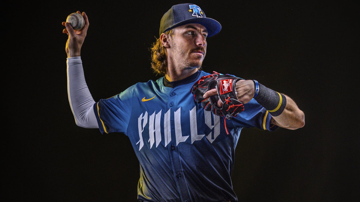
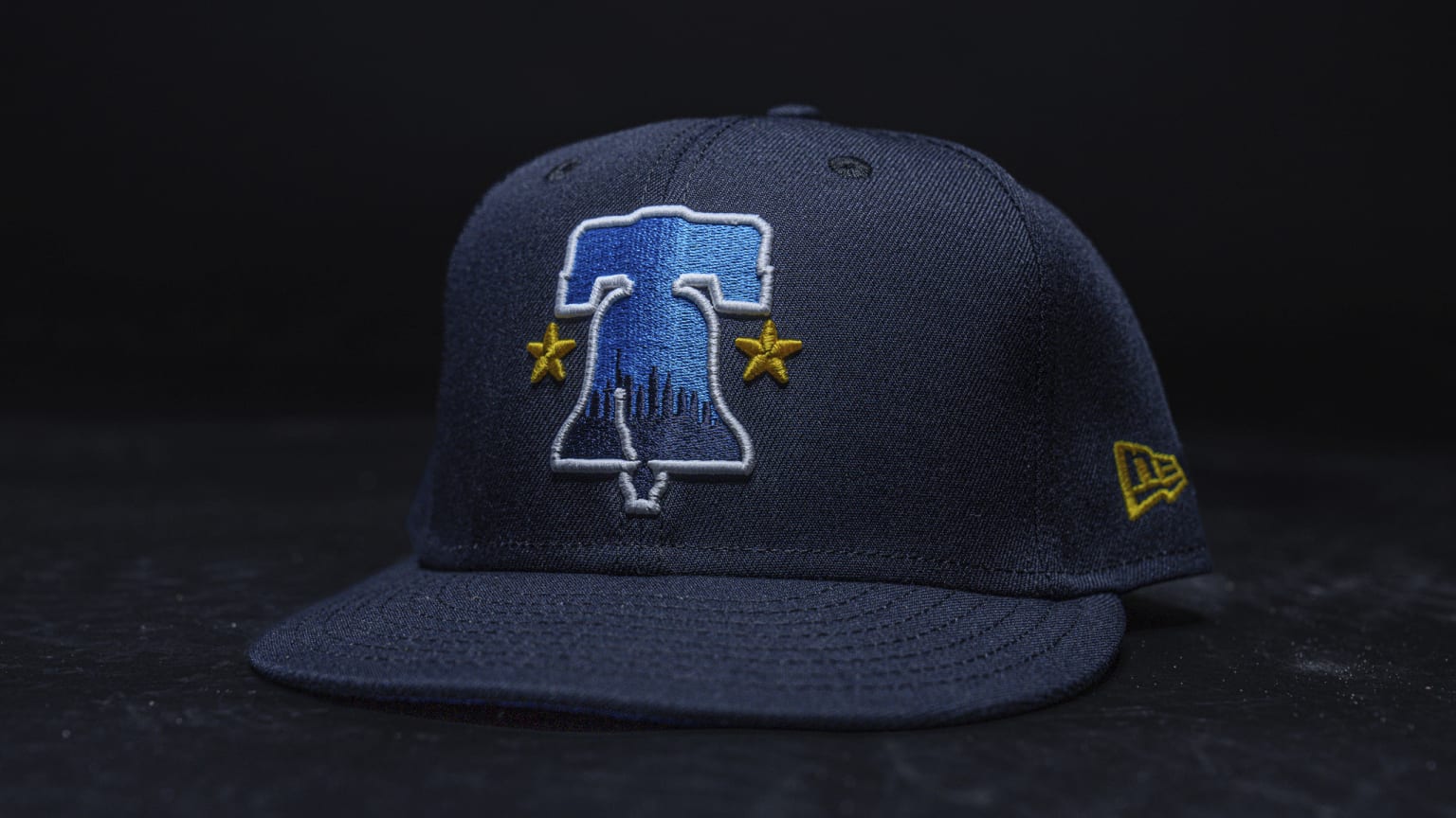
On 4/5/2024 at 2:21 PM, coco1997 said:
“This text is reminiscent of those found in the historical documents throughout the city.”No, I read that, but I can't find an actual visual example of that. Is there a document or something with type that resembles this new Phillies word mark?
-
3
-
-
4 hours ago, BadSeed84 said:
The hat is the only thing I like.
Can somebody who's more well versed with Philly/US History explain the typeface? Is it supposed to look like ripped paper?
-
2
-
-
23 hours ago, Brave-Bird 08 said:
I cannot emphasize enough how wrong of a take that is. Is the Thunder logo a bit generic? Yeah, like egregiously generic.
But there's a different between stylistically being off and what the Rockets logo is, which is slapping an existing logo on top of some haphazardly thrown together graphic just to retroactively meet a league requirement.
If anyone on these boards had to actually watch someone make that terrible rendering and then just place a scaled-down Rockets logo on it, you would think it's an April Fool's joke.
That Thunder logo, whatever you may think of it, took some actual graphic design skills. Not a lot. It's pretty bad. But that Rockets logo is on an entirely different level of bad.
The Rockets logo isn't perfect by any means, but you can at least read the full team name which should be one base line for global marks, and you can see some semblance of an abstract planet/ring/space tie in.
I couldn't describe the Thunder OKC logo if I had to. When it initially leaked I thought it was an abstract fish. But it's also not generic enough to work like a Brooklyn Nets type logo. -
14 hours ago, BBTV said:
nike can’t control how people wear things.
As I and others have said for years, the teams look exactly like how they want to look.
This might become a chicken or egg question...but the no white bottoms were a direct result from the color rush initiative.
Was color rush a Nike or an NFL idea? -
16 hours ago, Brave-Bird 08 said:
Sorry to quickly pivot, but seeing "global logo" made me think for a second about each team's "global" logo -- and man.
Is the Houston Rockets technically official logo the worst in American pro sports?
OKC would like to have a word...
-
12
-
-
First official look at the new "H-Town Blue".
-
8
-
 1
1
-
-
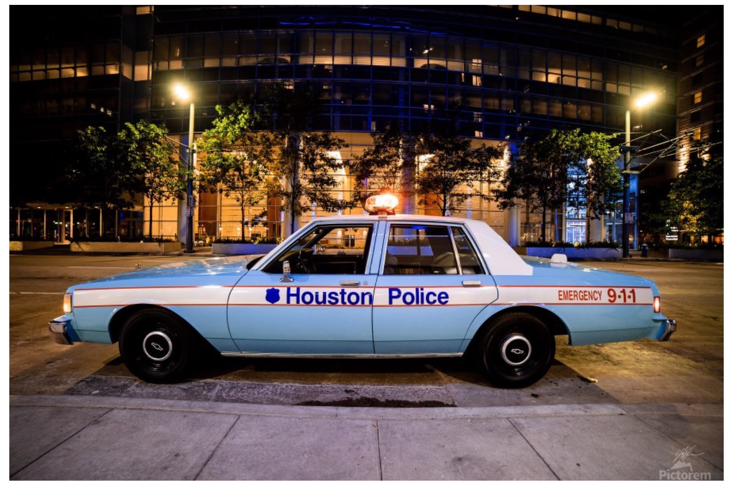
1 hour ago, MCM0313 said:
Yeah, I get the feeling this will be lighter and greener than Columbia blue.
I was of the understanding that the “Houston blue” would be trim-only even on the alt(s).
…the light blue which neither team truly wants to fully embrace anyway.
I've heard the same about the H-Town Blue.
I know their VP mentioned that the light blue color has a history in Houston outside of football/oilers, so I'm curious which route they decide to go with the story.
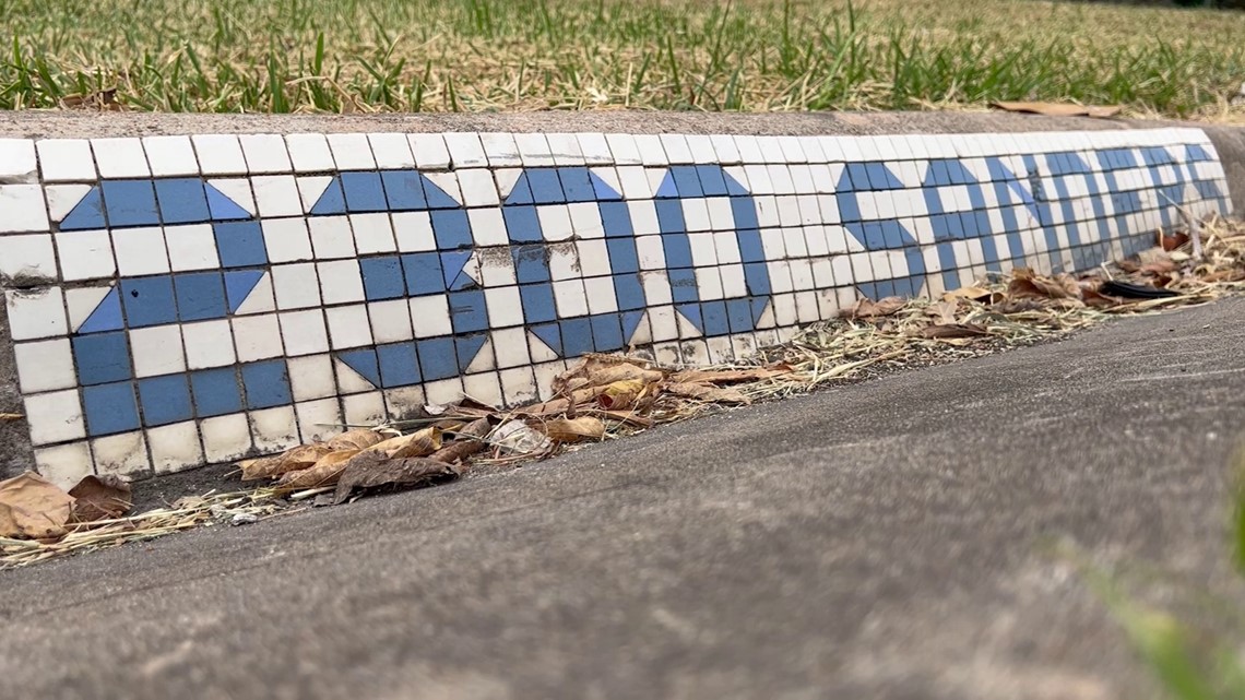
He specifically mentioned the old police cars and the street tiles.


:format(jpeg)/cdn.vox-cdn.com/uploads/chorus_image/image/48650395/GettyImages-1497208.0.jpg)
 show. Doesn't appear to be disappointing.


24-25 NBA changes
in Sports Logo News
Posted
If I had to guess, ownership paid a hefty fee to break the 5 yr rule.
Will next season be the 4th in the new set?