-
Posts
675 -
Joined
-
Last visited
Posts posted by LogoFan
-
-
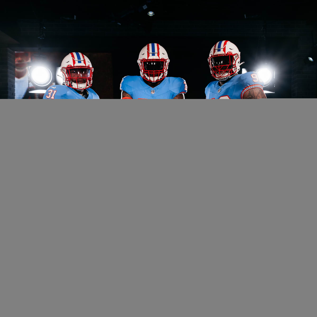
Still More Info on Houston Texans’ Upcoming Uniforms Emerges
UniWatch reported:"Last week I wrote about how we were starting to learn more about the Texans’ upcoming 2024 uni redesign. The main things in that first wave of info were the following:
- The team will have four new uniforms.
- “H-Town Blue” — i.e., the Oilers’ old shade of Columbia blue — will be an accent color, not a main color.
- The team’s primary logo will not be changing.
- The new uniforms will be unveiled during the lead-up to the draft in late April."
Also:
"Vosik added the four versions of the uniform will be completely different from each other and not simply a repeat in various colors. That would be a way to make sure everyone gets what they want. Before drawing up designs, the team set up a fan council, which provided feedback that varied from fans who wanted to keep the uniforms traditional to others who wanted a drastic change. Players also gave their input on what they’d like to wear starting next season."
This already sounds like a trainwreck.

-
 8
8
-
 1
1
-
 1
1
-
On 1/3/2024 at 10:38 PM, HOOVER said:
YES! The away unis desperately cry for help. To me, the all-whites with the pale blue look like pajamas. The red stripe in the light blue numbers is horrible. What you propose is far superior and delivers a more cohesive/consistent look. One the home sets, I'd add some more black...they looked sharper that way.-
 1
1
-
-
On 1/5/2024 at 12:17 PM, gosioux76 said:
The league was under new ownership that also brought on a new apparel partner. They were never going to just roll out the looks from a prior regime.
Based on the popularity and the recentness of the 2.0 version, I would've expected them to have kept the close to the originals for at least brand recognition's sake.
Everything they touched was a downgrade IMHO.-
 1
1
-
-
On 8/1/2023 at 1:02 PM, PlayGloria said:
Well,. it doesn't help that the Cards rolled out an epic failure of what appears to be the laziest effort at a redesign ever. It looks more like pajamas...or a pee wee league that couldn't afford more than just the bare basic templates.
The whole solid color sock thing is just a horrible idea...it's already dated just like all the piping crap that was so popular for about 20 years.
I've always liked flashy uniforms and don't mind new looks at all. The problem is, Nike pushes the envelope until they tear it into a million pieces...like a drunk who just doesn't know when to quit.
The throwbacks you show are all great looking. One of the best not included is the Falcons.-
 3
3
-
 2
2
-
-
I love the silver with the Eagle's throwbacks. It's unique and helps stand the Eagles apart from the Jets.
Now if they'd only add a silver outline to the numerals...-
 2
2
-
-
On 7/26/2023 at 4:13 PM, IceCap said:
The Chargers had been a navy blue team for most of my life when they started wearing powder blue throwbacks regularly. I didn't throw a fit about them "not looking like the Chargers."
What a strange position.
Same here, but I will always grumble we don't have the royal blues as the norm.

-
On 7/21/2023 at 6:08 PM, MJWalker45 said:
Agreed. We know the situation in Houston is stadium availability. LV not selling tickets yet indicates to me they may wind up being moved back to LA as the Wildcats.-
 1
1
-
-
On 5/20/2023 at 5:59 PM, BadSeed84 said:
That looks SO cheap. Agree the gold should be metallic. Even gold chrome plating would help, but this looks like something slapped together in an hour on one of those Design Star shows.-
 1
1
-
-
On 7/21/2023 at 11:48 PM, GDAWG said:
Mascots and cheerleaders is something I don't think the XFL will ever have. Don't know if that's a good thing or bad thing.
Which is very ironic given that the original 1.0 vision was to create wrestling-world like drama with relationships between the players and cheerleaders.
McMahon failed to understand at first that these guys are professional athletes, not actors. Careers above entertainment drama. -
On 5/15/2023 at 4:25 PM, HOOVER said:
The position of the stripes on the new jerseys reminds me of straps on bib-overalls. Particularly the light blue that looks like a light denim color.
The old unis were far, far superior in so many ways. -
"You'll poke your eye with that thing".
-
9 hours ago, ManillaToad said:
Agree. They made a huge mistake by not going with a metallic gold for the pants. I think a better shade would've made them nice instead of putrid.
-
 1
1
-
-
On 5/26/2023 at 1:57 PM, MCM0313 said:
Nike has relegated striped socks to the “uncool” bin, where they reside alongside dazzle fabric and full sleeves.
I'll agree on the "dazzle" fabric and I get why we don't have the full sleeves anymore. But there's no excuse to rejecting stripes.
This classic is a perfect example. This uniform is beautiful: nice, traditional design, no wild-ass gradients, piping, panels, stripes etc, no crazy different-for-different's-sake numeral font and the those socks really help no only top off the set but make them unique.
I hate most of what Nike has done to the NFL. Sometimes they've delivered but more often than not there crap is an eyesore.
(Mod Edit: Photo removed for Deceptive Host. )-
 1
1
-
-
I'm not sure which I hate more, solid color socks that match the pants color, creating a "tights" effect, or pants so freaking short they look like biker shorts.
I'm old-school on wanting white socks with contrast colors on the upper half. It just looks better IMHO. Looking at the above pic of the Ravens, they look like ballet dancers.-
 1
1
-
-
3 hours ago, Sec19Row53 said:
I get different. Clever isn't the word I would use, though. I'll throw distracting in there, as it really was a tough visual during games.
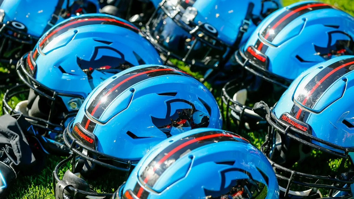
For me, the Roughnecks helmet is Exhibit A in the argument "just because you can do something doesn't mean you should".-
 2
2
-
-
5 hours ago, MJWalker45 said:
"It's a good start, but you should really ditch the black".
Gotta disagree on that one. I think the black a perfect contrast color with the sky blue and it's unique, especially with minimal red accents.
-
 4
4
-
-
-
3 hours ago, MJWalker45 said:
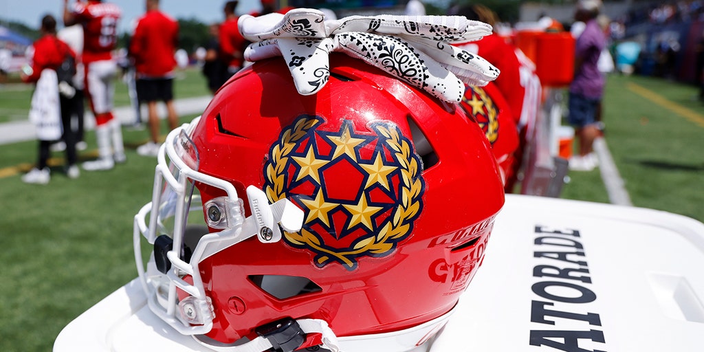
Because shoulder boards normally only have the stars on an officer's uniform.
I get the shoulders only have starrs and no leaves. However, after finding some decent pics today of actual game jerseys, the star on the shoulders are exactly the same as those on the primary. So, not sure what the new registration implies, as the shadowing on the stars is different.
-
7 minutes ago, MJWalker45 said:
Those are the shoulder stars on the jersey.
I didn't realize the stars were different than the primary. I wonder why.
-
Caught this interesting logo variation on TESS. Not sure why they would be seeking to possibly change it. The current stars are better.

-
On 2/18/2023 at 8:11 AM, WideRight said:
The poll is up everyone. This is a the first of a series of polls related to the 2006 and 2008 USFL expansion:
1. Pick Atlanta's helmet.
2. Pick the St. Louis Logo/Helmet.
3. Pick the identity from 3 possible names for 2008 Expansion Team #1
4. Pick the city & identity from 3 options for 2008 Expansion Team #2
Here are your three Atlanta choices. You can vote at the USFL Lives Alt History Website (Ignore the URL saying Boston, Wix won't let me change the URL from the last poll I did.)
Design1 is the best "flame/fire" helmet design I've ever seen. Holy cow, I love that one!
-
On 4/16/2023 at 10:45 PM, RO_ said:
Howdy everyone - Well the XFL season is almost over, and while I've enjoyed most of the games I've watched I'm not crazy with most of the unis. I do like that each team's primary color is different, the problem is.. they all kinda suck. So here's my attempt to fix it. As a challenge I wanted to make sure each team was unique, so no two teams share a primary color or the same color helmet. Also, I've expanded the league to 12 teams (I guess this would only make sense if they merged with the USFL):
To make the league slightly more unique, it would be broken down into three four-team divisions, a 14-game schedule, and a 4 to 6 team playoff:
There will be some relocations, new color palettes, and of course a few new teams. Can you guess who is who? I'm just gonna go from left to right starting with red:
DC Defenders
XFL East
Despite having two pairs of red pants for some reason, DC still has one of the better looking sets this year. So this one doesn't change much, I removed the marbling from the helmet and put the alt logo on the helmet. Added white pants with a floating stripe just to switch it up a bit, nothing too crazy for this first one:
Next up: the maroon team. Who's it gonna be?
I know Dani and Dwayne focused on "the little things" for each team's look, but this is a great example of what happens when your "little things" are the WRONG thing. All their focus on making unneeded changes turned a great uniform into a bland one with stupid details that sometimes can't be seen on tv.
Your tweak is not dramatic but it does wonders to make this a major upgrade. Your changes make these so much better! Great job!-
 1
1
-
-
On 4/19/2023 at 3:46 PM, MJWalker45 said:
Their jerseys for sale are absolutely horrible. And even at that, they managed to get right the one thing I hate about their '23 look: the centerline striped on the numerals. They almost look like reflectors you put on clothing for running in the evening/night. Their original look was so sharp....what a downgrade. -
On 5/3/2023 at 1:25 PM, mafiaman said:
Still horrible. Maybe if the ATL was bigger I would like them more. More side stripes too.
That and some more gradients and piping. And how much better would they look like with the old toilet-seat collars?
Or jacquard Falcon watermarks all over the jersey. OMG. Tweed. Mix threads of red, black and silver into the fabric. Winner.-
 2
2
-


UFL Branding & Uniform News 2024
in Sports Logo News
Posted
I know it's supposed to be "UFL" bracketed by an abstract football, but as executed is see it as <UFL> every time, like it's in parenthesis. Is the "UFL" silent?