


LogoFan
-
Posts
675 -
Joined
-
Last visited
Posts posted by LogoFan
-
-
1 hour ago, gosioux76 said:
I could never tell if the Showboats helmet logo was supposed to be the paddle of a steamboat or a roulette wheel. I guess if it's a riverboat casino, it could be both. Regardless, I always found it to be one of the USFL's more underwhelming helmet designs.
That wordmark, however, is really clever. I'd much rather see a helmet made to use that "S."
Same here on the old logo. I always took that it was supposed to be the paddle but could never figure out why it was designed the way it was as I've never seen a paddle that looked like that. For some reason, it makes me think of a carnival.
That "S" logo is sharp...it inspired a re-design for a project I was working on prior to the USFL coming back was announced.
-
 3
3
-
-
I drilled down and was able to get a bigger image. It's not a speedboat, it's a steamer. And it doesn't work at all for me other than as a secondary logo; it's not primary material.
-
6
-
-
17 hours ago, McCall said:
Literally the opposite was done with St. Louis.
One of the few exceptions where it actually gained harder angles.
-
2 minutes ago, Cujo said:
Fixed.
Notice all the hard angles on this logo? Almost without exception, the new logos have been "softened" down and look weaker.
-
1
-
-
Not trying to be funny here, but WTF am I looking at with that stupid Viper logo? It doesn't look like an open mouth like the original was, not sure what the black line dividing the top and bottom parts is supposed to be. Is it supposed to be 2 Vipers facing each other? It's pathetic!
And what does the bulky, clunky secondary have in common to the sleek whateveritis? Complete disconnect, and that's not even addressing the inconsistency with adding the "L" back in after being removed in the primary. My God these are awful.
-
 1
1
-
-
3 hours ago, PERRIN said:
I highly doubt any of these logos took hours to make; most of them feel like first drafts rather than final primary logos.
Poor job across the board.
Ditto here. The Sea Dragons primary looks like it was the first rough sketch from brain-storming on the toilet. Clearly inspired by the original Dragons secondary logo, but about as poorly executed as if a kid did it.
-
1
-
-
I've searched TESS to see if the XFL has anything new registered and didn't find anything. Does anyone know if they will hold submissions in secret/unavailable to the public until the registerer is ready for public release?
-
31 minutes ago, AnPheitseog said:
Trident for VA Beach
Ah. I see it now. Hidden in plain sight. -
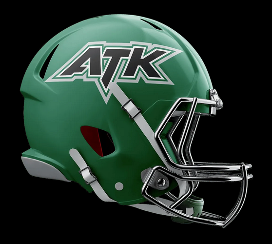
4 teams are viewable on their site but only 3 cities announced: Canton (Force), Virginia Beach (Armada) and Little Rock (Attack). No idea where the Airborne are located.
?? Airborne
Virginia Beach Armada
Not really sure what that's supposed to be...I see the V and A but that doesn't looks like a boat or really anything to me.
Arkansas AttackOhio Force
-
Anyone know who designed the two previous logo sets in both 2001 and 2020?
-
42 minutes ago, Cujo said:
My bad. Could've sworn 90% of the new USFL teams wore red
All because of the original color palettes. Birm, TB, Philly amd NJ all have red, so 50%
1 blue, 1 maroon, 1 black (with red trim) and 1 purple.
-
1
-
-
Just a side note on some observations of what we've seen on-field simce the initial uni reveals:
- Stallions added gold pants instead of just white. I still think the gold is too light and on tv often looks non-metallic...more like butter than gold.
- Maulers changed to silver pants from white. It was a needed move. Still, too much bright orange and the purple is too bright. The original Mauler's purple was darker and much better.
- Didn't realize until last night the Stars' dashed-stripe is half red and half orange. The helmets used in season are red in the front, orange in back. I went back and looked at the reveal photos, and it was originally orange in front with red in the back. Change-up also happens in the pants' stripe. While I love the yellow and red, I think some might like it better if the yellow was more standard gold-yellow and the red maybe a little bit darker.
These are 3 changes made since the initial reveal. I haven't noticed any others unless I missed something.
-
10 hours ago, M4One said:
Red and yellow looks fine. Maybe some don't like it because it reminds them of McDonalds? I will say that the tire tread strip down the sides and especially the helmet is kinda weird on the Stars.
They remind me of the mid-80s Iowas State Cyclones. I really like it.
-
1
-
-
4 hours ago, MJWalker45 said:
Glad Birmingham went with the gold pants tonight. Generals would be perfect without the toilet bowl collars.
The helmets don't appear to be metallic and their "gold" looks more like a weird butter color than gold.
-
2
-
-
18 hours ago, IceCap said:
Every single one of these uniforms is better than what the Washington Commanders projectile vomited at us.
What did you expect from a Dan Snyder operation?
NIKE
"They'll love it! Trust us...we're the experts!" More like captains of the Titanic when they get into full "innovation mode".-
3
-
-
1. Stars - they fixed everything I disliked about the original look.
2. Panthers - Beautiful update that is pretty true to the original.
3. Breakers - The original was a hard act to follow and while it's very nice, some tweaks could still make it the best set.
4. Bandits - All four of these tie in my book, being sensible updates that stayed true to the originals while still being fresh. All are very solid and a very pleasant surprise in how well tradition was honored.
4. Stallions
4. Generals
4. Gamblers
8. Maulers - Absolute dumpster fire. I would send the whole look back and make them start over. The logo is weak. The dropping of gray was a downgrade. They look like the old Euro League Galaxy or the offspring of the AAF Apollos. Not sure why they decided to deviate so far from the original look; purple, gray and orange was such a unique look and the old unis were prefect. The only things missing from this trainwreck are gradients and piping.
-
3 minutes ago, MJWalker45 said:
Nike would have added a gradient pattern.
QFT.
-
41 minutes ago, gosioux76 said:
I always found that a little odd about the original league. You had Birmingham and Philly (below) essentially sharing color schemes. Same for Tampa and Memphis, Houston and Oklahoma. Makes me wonder whether the league didn't just let owners do as they wanted when it came to branding choices.
Yep. I always wondered if Philly and Birm were influenced by the 49ers' SB victory right when the league was being founded as the color schemes were pretty much the same.
-
4
-
-
27 minutes ago, bowld said:
Stars coming up next and then we're all done. Seems like an awful lot of Red teams. 6/8 teams use some shade of Red
That was the original USFL for you. What's more is Memphis, Chicago and Arizona also used red.
-
1
-
-
23 minutes ago, oldschoolvikings said:
The original Breakers uniform is one of my all time favorite uniforms... ever. These are pretty nice, but I would've preferred the sky blue as the main jersey color, and the royal as secondary/trim.
Still nice, tho.
Same here. I, too, was hoping for the lighter blue but when I saw the coach's shirt, I figured the writing was on the wall.
-
7-1
Breakers are very good and I absolutely love the new Stars' look.
The only one I didn't like was the Maulers. They have the weakest logo but I was hoping a solid uni would save the day but it blows chunks...it's a real skunker. Not sure why they didn't try to stay truer to the originals or why gray was dropped from the design. -
Wish they'd gone with the lighter blue for the jersey like the old unis but it's solid and pretty much what I expected.
-
5-1 so far.
Panthers are awesome. Only drawback is the face should be all-maroon but still incredible. -
The Generals official jerseys have the stars on the shoulders but the replicas have the stars on the sleeves...


USFL 2023 - Uniforms and Logos
in Sports Logo News
Posted
I wonder if Joe Bosack designed this logo as well. I have a feeling we'll see a secondary logo.
EDIT: Found the secondary logo on Instagram. Nice.
Seeing it colorized, it's growing on me. Looks better than half the new XFL logos.