


LogoFan
-
Posts
675 -
Joined
-
Last visited
Posts posted by LogoFan
-
-
2 hours ago, MJWalker45 said:
They should have gone with gold pants instead of white, but not a bad look.

Not a bad look, but I think they should have added orange outline to the pants stripe, and like @gosioux76said, use the alternate logo for the sleeves. I hope the single color pant stripe isn't used on every team either.
I am massively disappointed with this one. The original Maulers had a great look. This looks like 2022 crapped back out the Frankfurt Galaxy. While they've maintained a trueness to the originals while doing an update on the Bandits, Gamblers and Stallions, this took a horribly wrong turn. The orange yolk just looks garish and removing the gray pants is a huge downgrade. Total fail, IMHO.
-
 1
1
-
 1
1
-
-
1 hour ago, nuordr said:
I just found another issue with the rebrand. Apparently, the team put the wrong years in their secondary logo for years they won the Super Bowl.
1983 should be 1982
1998 should be 1987
1992 should be 1991
The logo is the shame of the NFL. Too busy, too disjointed and just a hot mess of ideas, like a brainstorming session where they were asked what should be important in the new branding and the white board answers were:
"Let's throw in the W logo!"
"Yeah...and our founding year, too!"
"Guys, can't forget the name...make sure it's prominent!"
"What about the city's flag? Gotta be in there!"
"Don't forget we've won Championships. Have to mention that!""Make sure we don't get confused with Washington soccer, or Washington lacrosse. Need mention it's football".
Group leader reviews the board and says, "Okay, this is out top 5. Send it to the design team."
Design team gets email. "Ok, everyone. We've got to make all this fit. Let's get going."
Did ANYONE stop to consider this logo has to be updated if Washington wins another SB? How freaking crowded are you going to allow the ugly thing to get???
-
 5
5
-
-
Deleted accidental double post
-
Still absorbing this head-on train collision. So disjointed it's like elements for each jersey were pulled separately out of a hat. The circle logo is the busiest, cluttered, disjointed mess of crap I've ever seen from a professional designer. I'm surprised they didn't squeeze in years of division titles, founder, current owner and GPS coordinates of the stadium.
This whole hellish nightmare is like someone proclaiming Oregon's crazy sets to be the worst it can get, and Nike said, "hold my beer".
-
4
-
-
4 hours ago, BigDmo said:
I wouldn't get your hopes up.
Agreed. I believe that was them. Leaked like the strange leak of the Stallions and Generals helmets.
-
45 minutes ago, Ferdinand Cesarano said:
Anyway, because the Gamblers are the only USFL team with a logo that is unchanged, I was hoping that this meant that they'd bring back the standard block number font.
Anyway, too bad about the side panels. There is evidently still no cure for Denver Broncos' Disease.
I agree. The standard number font just doesn't get enough love these days...everyone thinks they have to look different but IMHO it's waaay overdone. It's how we wound up with horrible bastard mutations like the Bucs calculator numbers and the hideous current Falcons and Titans. Just stop, already.
What strikes me in the video is how much darker the gray appears to have been from the original version.-
3
-
-
On 1/24/2022 at 11:03 PM, burgundy said:
Why The Titans Uniforms Are A Dumpster Fire [Abridged]
- Their shoulders are giant swords.
- The alternate logo that the shoulder swords are based on is no longer anywhere to be found on the uniforms.
- The swords add two shades of gray to an already crowded color palette on the jersey.
- There's more gray on the primary jerseys than Columbia blue.
- The Columbia blue pit stains look like an afterthought.
- The numbers are the bastard lovechild of the Bucs' alarm clock numbers and West Virginia's pickaxe numbers.
- The already overly-outlined logo was made worse by putting it on a blue helmet, requiring yet another outline.
- The only use of red on the jersey is to highlight the NIKE logo.
- Their.
- Shoulders.
- Are.
- Giant.
- Swords.
I absolutely loved the concepts floating around of the flame being the helmet decal. No other team uses flames/fire and it's so much better than the stupid thumbtack. Then add a simplified look, drop the dopey numbers and now you're talking.-
3
-
-
13 hours ago, DCarp1231 said:
They changed the pants last season
Uniform still sucks though
At least that got it back closer to the late 60s/70s look. I'd be great to see the pants and helmets match, but I'd like to see them meet in the middle some where, with the helmets having a little more blue to them and then the pants matching.
-
3
-
-
34 minutes ago, IceCap said:
To everyone who hates "32s"
Sorry you all hate fun.
That's me, man. I hate fun. You let people have fun, the next thing you know, they'll be listening to that damn rock & roll music and then...dancing. Might as well put a brothel on every street corner.
-
3
-
-
40 minutes ago, CS85 said:
Yeah, well, your moms.
Are saints. Yours on the other hand...
I mean, seriously, is this the kind of responses we're giving now if there's disagreement?-
1
-
-
7 minutes ago, CS85 said:
Because so many people know about the 1849 California gold rush, and celebrate the ways it hastened the demise of the remaining Native tribes in the west via disease and massacre. What a fine time to be an American! Glorify the name "49er."
Regarding my "glorify" part, it's called "sarcasm". BUT, if you want to get technical, there were people who were nicknamed "49ers" who participated in the gold rush. That makes sense. There's no relevant reference to 32 other than the trivia note that was the WTF, er, WFT establishment year.
On the serious side, 32s is just is incredibly lame, IMHO. Just can't see it polling well in fan surveys.-
7
-
-
13 hours ago, DCarp1231 said:
Pretty sure it’s just from someone poking fun at how the team is unveiling the new name on Groundhog Day
That's actually a logo from the TESS website...registered last week.-
3
-
-
2 minutes ago, CS85 said:
The 32s name came about because technically their name became Washington Football Team Established 1932, so shorten that sucker up to the 32s, and baby you gotta stew going.
Who wants to glorify a year in the height of the Great Depression? It just sounds lame and most people outside of diehards won't know what it's referring to.
-
3
-
-
-
On 11/25/2021 at 1:34 AM, ⋔ 4 ℞ ℞ $ said:
I noticed this right away, too! Plus, I dislike the inconsistency with the coloring of the hammer heads. On the primary, it is just purple & orange (the little splotch of orange could easily be filled with silver instead) on an orange backdrop, whereas the secondary is done properly with the heads being silver on an orange background.
I was playing with the color combos and I think this fixes the issue, IMHO. It provides consistency with the secondary logo as well as the original. The white inside the logo is just too stark and doesn't match anything else. The color change ties everything together better.
-
11
-
-
1 hour ago, MJWalker45 said:
Besides, a better Maulers logo is being used in the CFA.
Now that looks like a logo and not clip-art.
-
Has anyone else noticed the inconsistency with the Mauler's logos? The primary led me to believe they dropped silver from the color scheme because it's purple, orange and white. But the secondary is purple, orange and silver with no white.
What gives? And was this an uncaught error?
-
1
-
-
1 hour ago, Brian in Boston said:
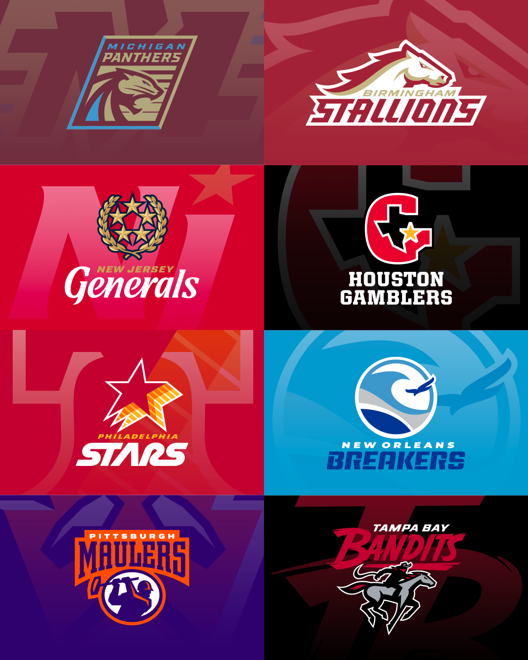
TOP TIER USFL 2.0 LOGO PACKAGES
In my opinion, the Pittsburgh Maulers are the class visual identity of USFL 2.0. Their primary logo strikes me as the best in the league and a vast improvement over that which was sported by their USFL 1.0 counterparts. Meanwhile, their secondary is also terrific.
I'd slot the New Orleans Breakers' visual identity just behind that of the Maulers. While I'd give the edge to Pittsburgh's primary mark, that's not to say that the Breakers' main logo isn't a tremendously effective update on the original design that graced USFL 1.0 teams in Boston, New Orleans, and Portland. I also love the simplicity of the Breakers' NOLA secondary mark.
The logo packages for these two USFL 2.0 teams are, to my mind, clearly a cut above the rest of the league.
MIDDLE TIER USFL 2.0 LOGO PACKAGES
Next up, I'd rank the New Jersey Generals' visual identity as the third best in USFL 2.0. The subtle alterations that have been made to individual components of the Generals' visual identity make for a significant upgrade in its overall feel. The word mark is rendered in a manner that seems less "fussy" than in the original logo. Similarly, the laurel wreath in the mark is depicted in greater detail, imparting a certain strength to the device. The decision to place the five stars in a tighter configuration within - as opposed to overlapping - the wreath, makes for a visually cleaner and bolder mark. And the manner in which the Navy Blue has been added to the color scheme makes everything "pop" just a bit more.
Trailing behind New Jersey in this middle tier of USFL 2.0 logo packages are the Michigan Panthers and the Houston Gamblers. Both teams have harkened back to their USFL 1.0 roots in putting their new logo packages together, but have traveled different paths in doing so,
The Michigan Panthers - checking in fourth in my USFL 2.0 identity rankings - have opted to alter the design of their original marks to a greater extent than Houston. Their primary mark is once again a stylized depiction of a roaring panther, with said big cat once again situated beneath the team word mark within a rectangular containment shape. As in the original version of the logo, alternating horizontal Royal Plum and Champagne Silver lines provide a backdrop for the depiction of the panther. In the new version of this mark the color balance is reversed, with the panther primarily Champagne Silver in color, rather than Royal Plum. Further, the word mark within the logo is rendered in Light Blue and Champagne Silver, as opposed to Royal Plum and Champagne Silver. Finally, the containment shape is now taller than it is wide, and pitched at an angle.
Frankly, there are two aspects of the new Panthers' identity package that bother me. First, in the primary mark, I'd have preferred it if the graphic designer(s) had figured out a way to render the panther primarily in Royal Plum. Other than that, I find said logo's design to be a dynamite modernization of the Panthers' original mark. Further, in the secondary mark, I'd have liked to have seen three Light Blue stripes on each side of the M, as that would have been a nod to the three Light Blue stripes that were featured in the sleeve striping on the original Michigan Panthers' uniforms.
The Gamblers are the USFL 2.0 team that clearly made the decision to hew as closely to their market's original visual identity as possible. That being the case, word mark font and the slightest of deviations in the shape of the State of Texas aside, the primary mark for Gamblers 2.0 is a virtual carbon copy of the original main logo. Personally, I always thought that the original Houston mark was a bit overrated, so aping it this closely here doesn't impress me much. The secondary mark, while not necessarily pushing the envelope design-wise, is nicely rendered. All things considered, the Gamblers have turned in a safe - if unremarkable - logo package. I'd rank it fifth amongst USFL 2.0 identities.
BOTTOM TIER USFL 2.0 LOGO PACKAGES
In my bottom tier of USFL 2.0 visual identity systems - in a dead heat, three-way tie for eighth place - we find the Birmingham Stallions, Tampa Bay Bandits, and Philadelphia Stars.
The Birmingham Stallions can celebrate little more than the the fact that the equine mascot in their primary mark is better-rendered than the candidate for the glue factory featured in the main logo of the Tampa Bay Bandits . As LogoFan opined earlier in the thread, Birmingham's primary mark looks like it could be adorning the athletic teams at a middle school. That said, Tampa's primary mark takes the school theme a step further by resembling a homework assignment that a student poured time and effort into early on, only to forget said project's due date until the night before it was to be turned in, and was then forced to slap the final third together on the morning it was to be presented in class. Tampa Bay's word mark is solid, if unremarkable. The bandit is more of the same. However, the horse just says, "I've grown tired of this... I'm not comfortable drawing horses... aaaaaaand, this is going to have to be good enough." The horse's mane, it's face, it's right foreleg... I don't know what to say beyond, "The old gray mare , she ain't what she used to be... and she needs to be put down."
Now, where the Stallions could use some help is in the secondary logo department. Is that supposed to be a "B", or did the folks in Birmingham know I was going to rank them co-eighth place finishers and adopt a stylized "8" as their secondary?
As for the Philadelphia Stars, their secondary mark is reasonably well-designed and would make a lovely addition to the identity system of a World Football League 2.0's Philadelphia Bell. Beyond that, the team is plagued by the fact that the original USFL franchise that bore their name played three seasons (including one in Baltimore) sporting a logo that already looked dated the minute it was rolled out in 1982. Electing to pay visual homage to said identity going on 40 years later is recipe for graphic design disaster. Speaking of recipe's their old primary mark wouldn't have looked out of place on a late-1970s-to-mid-1980s fast-food restaurant marquee. Despite being well-rendered, the same holds true for the modern update.
So, the standings as I see them...
NORTH DIVISION
Pittsburgh Maulers 10 - 0
New Jersey Generals 6 - 4
Michigan Panthers 6 - 4
Philadelphia Stars 1 - 9
SOUTH DIVISION
New Orleans Breakers 9 - 1
Houston Gamblers 4 - 6
Birmingham Stallions 3 - 7
Tampa Bay Bandits 1 - 9
Funny how tastes vary. IMHO, I absolute hate, loathe and despise the Maulers logo. It and it's secondary look like clip-art. I guess I'm one of the few that actually like the original Maulers logo, which, dated as it was, kind of fit back in the day.
On the other hand, I think one of the better logos is the Stars. I didn't hate the old logo but felt it was too dated, too busy and it just didn't stand out well on the helmet. The new design simplifies it and makes it a little clearer...plus I kind of like the yellow-orange-red transition. The bell logo design is okay, but making the main logo coloring "fade" looks really, really forced to me.
One thing I noticed this morning is, on top of how lazy the Gambler's secondary "H" is, the "H" font is similar but clearly doesn't match the primary "G".
All-in-all, the modernized logos underwhelm. It's like they all have potential and were at some state from the initial concept to final execution when their refinement stopped.
-
3
-
-
3 hours ago, MJWalker45 said:
Not direct. His is better.
True, his was better. What I meant when I called it a direct ripoff was the horse's pose (just changed which leg was bent and which is extended), and everything else is like a trace of a poor-quality copy.
-
2 minutes ago, gosioux76 said:
You asked how that Stallion would work on a helmet. If they're trying to go for a full recreation of the old USFL, I would assume they'll end up trotting out a full-body horse that will go on the helmet, much like the original.
But that's the unknown. We really don't know if they'll use the entire horse like the original version did on both the helmet and logo-wordmarks, or if it will be the head only.
-
52 minutes ago, WideRight said:
I am going to have to beg to differ on that. I think they did well on some, but some are definite downgrades from the originals.
Best: Breakers, good modern update. Gamblers, basically left it alone from 1984, Stallions, could be good but I need to see what the helmets look like.
Mediocre/Decent but not ideal: Maulers, a decent upgrade of a pretty odd logo to begin with. Generals, adding blue to the logo is a plus, but the placement of the stars entirely with the laurels seems odd to me.
Downgrades: Bandits-- While I get what they are going for, the awkward position of the horses legs make this a downgrade for me. The design made for the A11FL was better.
Stars-- Why add orange? It is like they are trying to recreate the original but could not figure out how to do that with just red and gold.
Panthers-- That panther is not as good as the original, too linear.
Not horrible by any stretch, but some odd choices made. The Philly secondary with the Liberty Bell is also a weird logo. I do like the Breakers logo as part of a NOLA look.
Let's see if the helmets come close to being as cool as the originals, especially keeping an eye out for Michigan and New Orleans.
The one logo I think of as an upgrade is the Stars. I always felt either the Stars or Stallions needed a third color added to differentiate them since they were both red and gold. I've tinkered with the Stars logo and felt like adding black or navy blue helped, but I think the orange is a good choice considering the star is changing from yellow to red and orange is in between on the spectrum.
-
2
-
-
I wonder if Brandon Williams has seen this as it looks like a direct rip-off of his logo design for the A11FL Bandits.
-
1
-
-
Other than the Stars logo, which I think improved, and the Gamblers logo which is virtually unchanged, the logos are a downgrade from the original classics, IMHO.
The Panther head really looks weaker without it being solid...the head blends into the same-color background.
The Stallions looks like a middle-school logo. There's nothing defining the bottom of the neck...how's that going to work on a helmet? The "B" logo looks like it took heavy inspiration from the Birmingham Steel.The Maulers looks like clip-art. The work definitely looks weaker than the original.
That's some thoughts off the top of my head. Just really disappointed.-
1
-
-
17 hours ago, Sidney said:
After a lot of revisions here the final version.
Much better.
-
1
-


USFL 2023 - Uniforms and Logos
in Sports Logo News
Posted
So far, extremely pleased with the Bandits, Gamblers, Stallions and Generals. All look like modernized updates.
All of these rate a solid B+ to an A with the exception of Pitt, which is an F for me.